
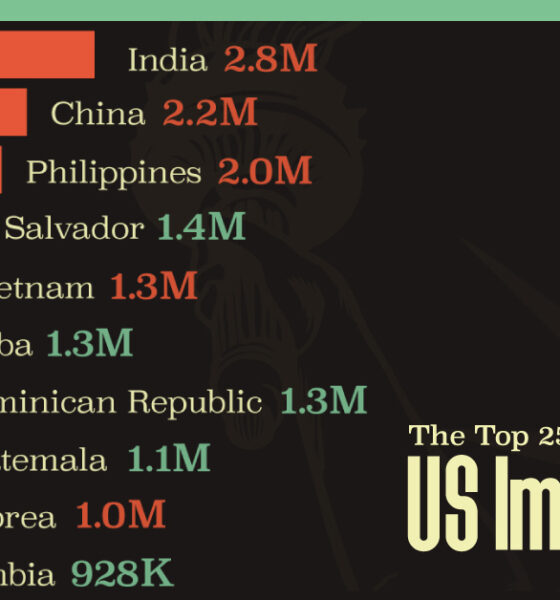
Mexico is the largest source of immigrants to the U.S., with almost 11 million immigrants.
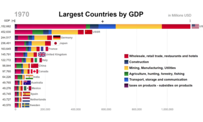

This animation looks at the top countries in the world by GDP, while also showing the components that comprised economic activity at the time.
A data-driven look at America's nuclear weapons arsenal – both location and deployment, and the costs associated with refurbishing an aging nuclear program.
Tesla is not only the top valued U.S. automaker, it's now worth more than Ford and GM combined. Will the rally continue, or will short sellers...
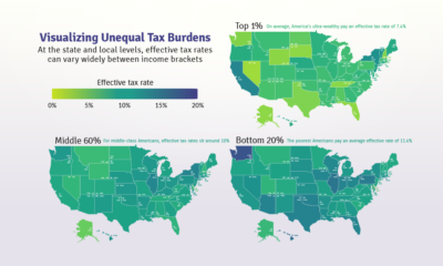

Poor families pay a higher share of their income towards state and local taxes than wealthy families. These maps show the inequitable tax burdens.
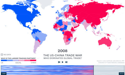

China has become the world's major trading partner – and now, 128 of 190 countries trade more with China than they do with the United States.
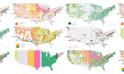

The U.S. covers an immense 3.8 million square miles—what is all this land currently used for, and what does that mean for the future?


This infographic explores the importance of closing the STEM education skills gap and how it is crucial for to help future proof an uncertain global economy.
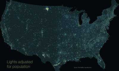

This unique map subtracts population from nighttime light output, giving us a unique perspective into America's rural light pollution hot spots.
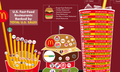

Every year, fast food chains rake in north of $200 billion in revenue per year. Here are the biggest chains, ranked by revenue and number of...
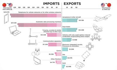

This infographic ranks the top 10 exports and imports of the U.S. and China, the two most significant global economic superpowers today.


