Ranked: The World’s 50 Largest Private Equity Firms
Top 10 Countries Most in Debt to the IMF
Ranked: The Top 6 Economies by Share of Global GDP (1980-2024)
Mapped: Europe’s GDP Per Capita, by Country
The Growth of a $1,000 Equity Investment, by Stock Market
Countries With the Highest Rates of Crypto Ownership
Mapped: The Number of AI Startups By Country
All of the Grants Given by the U.S. CHIPS Act
Visualizing AI Patents by Country
How Tech Logos Have Evolved Over Time
Visualizing America’s Average Retirement Savings, by Age
Visualizing the Tax Burden of Every U.S. State
Charted: What Frustrates Americans About the Tax System
Ranked: The Top 20 Countries in Debt to China
Mapped: Countries Where Recreational Cannabis is Legal
Which Countries Have the Highest Infant Mortality Rates?
Life Expectancy by Region (1950-2050F)
What Causes Preventable Child Deaths?
The Cost of an EpiPen in Major Markets
Who’s Building the Most Solar Energy?
Mapped: The Age of Energy Projects in Interconnection Queues, by State
Ranked: The Top 10 EV Battery Manufacturers in 2023
The World’s Biggest Nuclear Energy Producers
The World’s Biggest Oil Producers in 2023
Mapped: The Top Exports in Asian Countries
Mapped: U.S. States By Number of Cities Over 250,000 Residents
Mapped: U.S. Immigrants by Region
Mapped: Southeast Asia’s GDP Per Capita, by Country
The Biggest Salt Producing Countries in 2023
Visualizing Copper Production by Country in 2023
Where the World’s Aluminum is Smelted, by Country
Visualizing Global Gold Production in 2023
How People Get Around in America, Europe, and Asia
The Carbon Footprint of Major Travel Methods
Ranking the Top 15 Countries by Carbon Tax Revenue
Ranked: The Countries With the Most Air Pollution in 2023
Top Countries By Forest Growth Since 2001
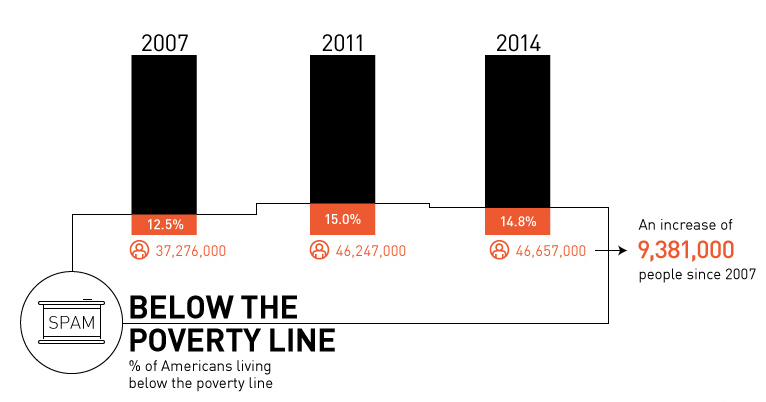
Is there really a recovery? Most recent data shows that there are 9.4 million more Americans in poverty than 2007, with growing inequality.
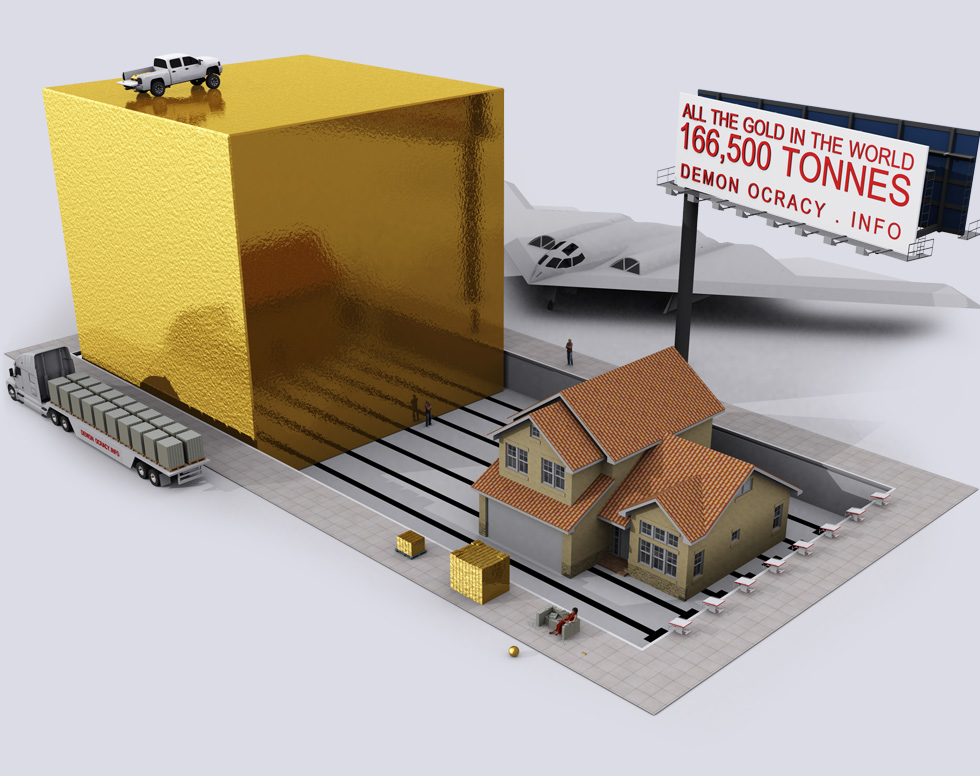
How rare is gold? This set of 3D visualizations show the world's gold in bullion bars.
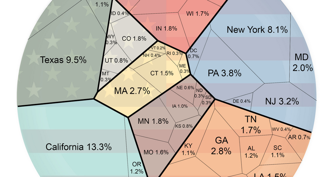
Ever wonder how your state compares in terms of economic output? This simple visualization compares the economies of every U.S. state.
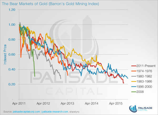
These five charts show why gold stocks have never been cheaper.
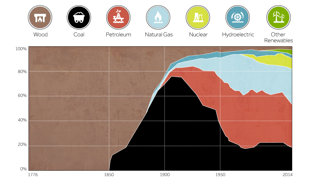
This chart shows the history of America's energy supply based on energy source. This brief history covers all from wood-powered locomotives to solar panels.
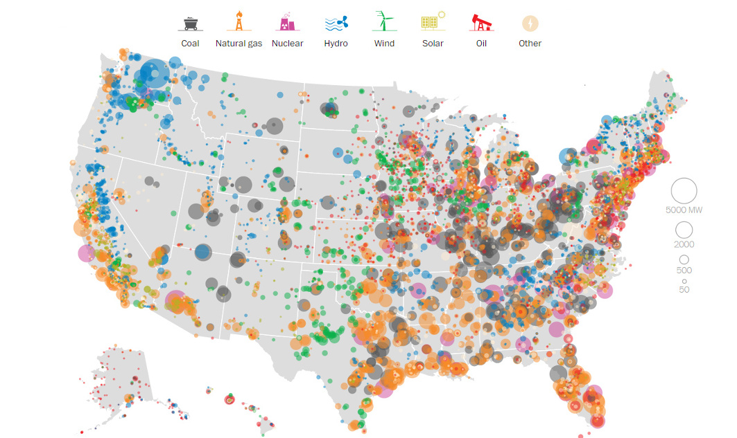
This series of data visualizations shows how the United States has generated its electricity so far in 2015 by energy source and size of each power...
In the finale of our four part infographic series of silver, we look at the case for holding silver as an asset.
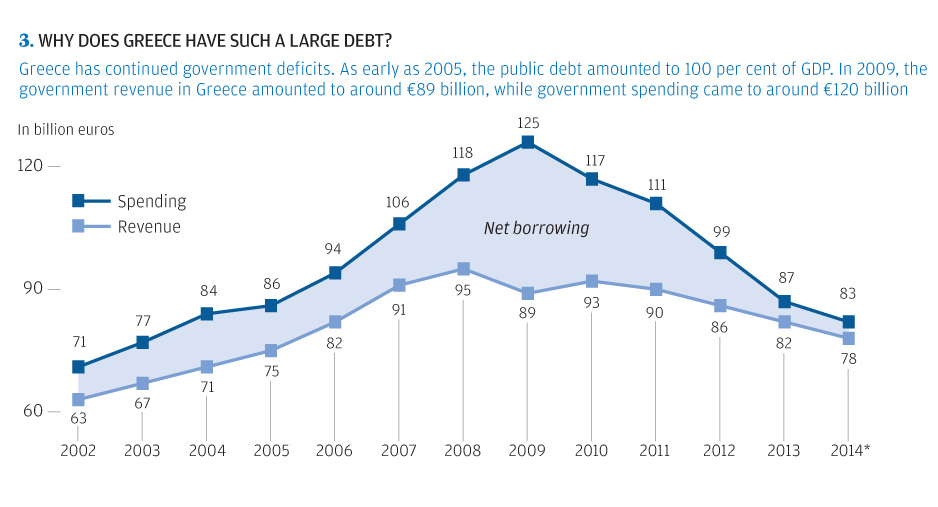
The story of Greece's debt crisis through charts. The origin of the Greek crisis shown in bond yields, population, unemployment, timeline, and more.
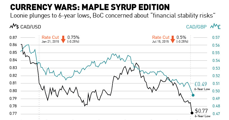
With the Canadian dollar plunging to 6-year lows after the second rate cut in six months, we look at the Maple Syrup version of a currency...
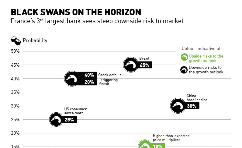
France's third largest bank, SocGen, sees more negative black swan events on the horizon than potential upside.