Top 10 Countries Most in Debt to the IMF
Ranked: The Top 6 Economies by Share of Global GDP (1980-2024)
Mapped: Europe’s GDP Per Capita, by Country
The Growth of a $1,000 Equity Investment, by Stock Market
Mapped: The Most Valuable Company in Each Southeast Asian Country
Countries With the Highest Rates of Crypto Ownership
Mapped: The Number of AI Startups By Country
All of the Grants Given by the U.S. CHIPS Act
Visualizing AI Patents by Country
How Tech Logos Have Evolved Over Time
Visualizing America’s Average Retirement Savings, by Age
Visualizing the Tax Burden of Every U.S. State
Charted: What Frustrates Americans About the Tax System
Ranked: The Top 20 Countries in Debt to China
Mapped: Countries Where Recreational Cannabis is Legal
Which Countries Have the Highest Infant Mortality Rates?
Life Expectancy by Region (1950-2050F)
What Causes Preventable Child Deaths?
The Cost of an EpiPen in Major Markets
Who’s Building the Most Solar Energy?
Mapped: The Age of Energy Projects in Interconnection Queues, by State
Ranked: The Top 10 EV Battery Manufacturers in 2023
The World’s Biggest Nuclear Energy Producers
The World’s Biggest Oil Producers in 2023
Mapped: The Top Exports in Asian Countries
Mapped: U.S. States By Number of Cities Over 250,000 Residents
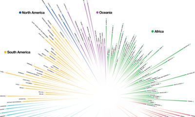
Mapped: U.S. Immigrants by Region
Mapped: Southeast Asia’s GDP Per Capita, by Country
The Biggest Salt Producing Countries in 2023
Visualizing Copper Production by Country in 2023
Where the World’s Aluminum is Smelted, by Country
Visualizing Global Gold Production in 2023
How People Get Around in America, Europe, and Asia
The Carbon Footprint of Major Travel Methods
Ranking the Top 15 Countries by Carbon Tax Revenue
Ranked: The Countries With the Most Air Pollution in 2023
Top Countries By Forest Growth Since 2001
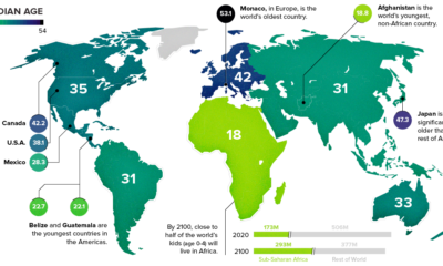
How do countries around the world compare in terms of age? This compelling visualization shows the median age for every country in the world.
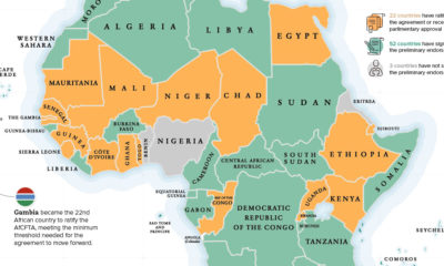
The Gambia recently became the latest country to ratify the African Continental Free Trade Area (AfCFTA), helping the landmark agreement reach critical mass to move forward.
This chart takes a look at the median age of every continent, while also breaking down the youngest and oldest countries in the world.
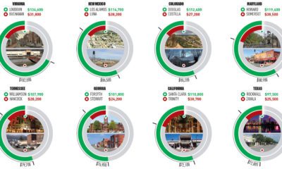
This infographic uses the measure of median household income to contrast the wealthiest and poorest counties in every U.S. state.
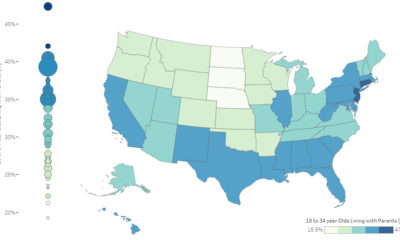
It's estimated that 34.5% of young adults (18-34 years old) in the U.S live at home with their parents. Here's how it varies by state, as...
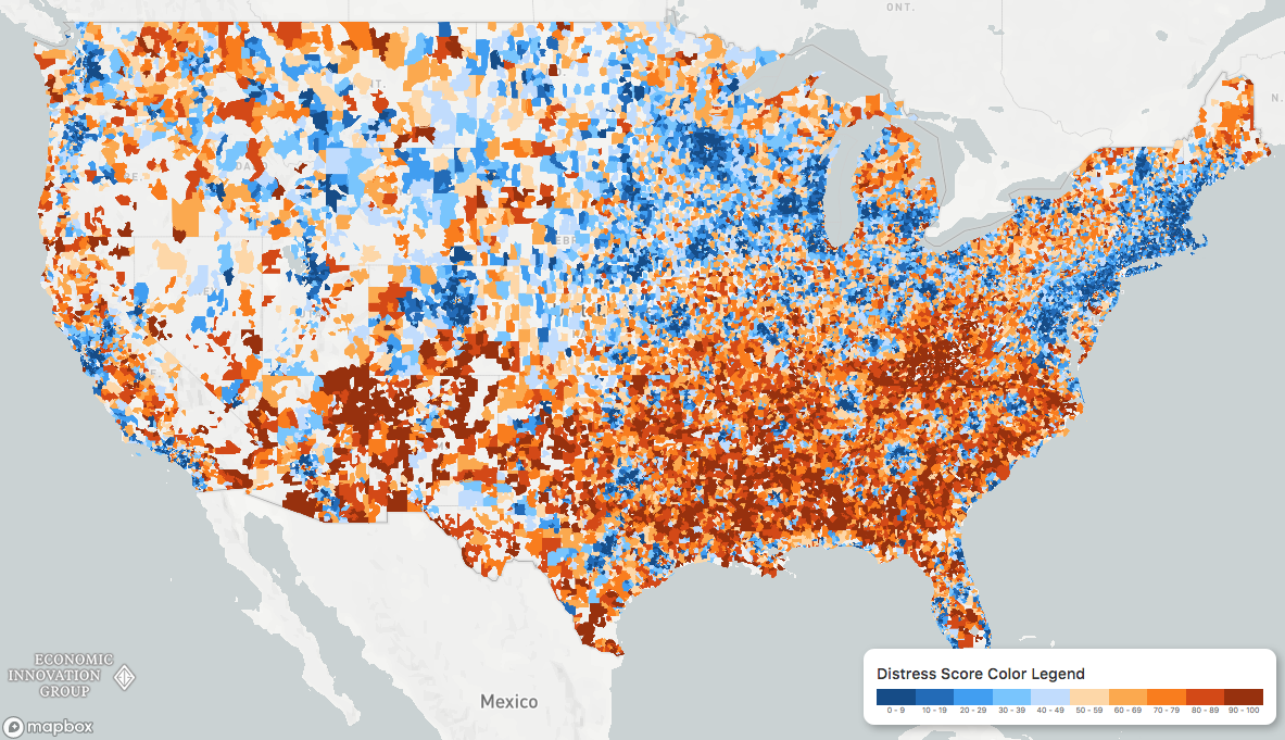
While the U.S. economic picture remains quite rosy, things change quickly when you zoom to the local level. This map shows the country's distressed communities.
Embark on a visual tour of the human body, where each and every part of the human anatomy is re-imagined as a subway stop.
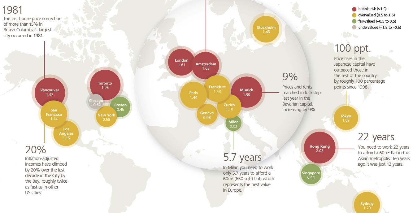
UBS says cracks are starting to show at the top end of the property market, according to the bank's recent analysis of the biggest real estate...
Which countries receive the most money from international tourism? Each country is resized on this map based on dollars coming in from travelers.
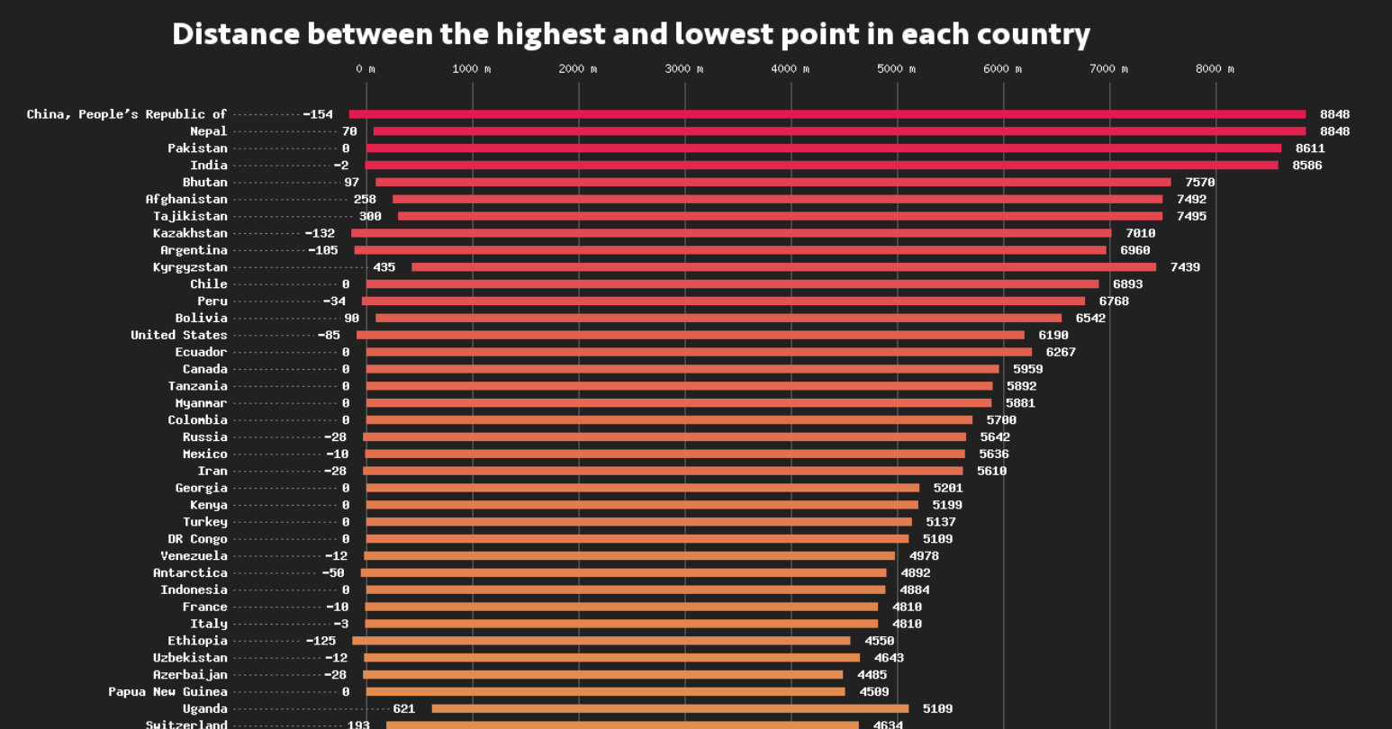
This data visualization compares the elevation span of every country, ranging from the mountain peaks of Bhutan, to the Dead Sea depression.