Mapped: The 10 U.S. States With the Lowest Real GDP Growth
Ranked: The World’s 50 Largest Private Equity Firms
Top 10 Countries Most in Debt to the IMF
Ranked: The Top 6 Economies by Share of Global GDP (1980-2024)
Mapped: Europe’s GDP Per Capita, by Country
Countries With the Highest Rates of Crypto Ownership
Mapped: The Number of AI Startups By Country
All of the Grants Given by the U.S. CHIPS Act
Visualizing AI Patents by Country
How Tech Logos Have Evolved Over Time
Visualizing America’s Average Retirement Savings, by Age
Visualizing the Tax Burden of Every U.S. State
Charted: What Frustrates Americans About the Tax System
Ranked: The Top 20 Countries in Debt to China
Mapped: Countries Where Recreational Cannabis is Legal
Which Countries Have the Highest Infant Mortality Rates?
Life Expectancy by Region (1950-2050F)
What Causes Preventable Child Deaths?
The Cost of an EpiPen in Major Markets
Who’s Building the Most Solar Energy?
Mapped: The Age of Energy Projects in Interconnection Queues, by State
Ranked: The Top 10 EV Battery Manufacturers in 2023
The World’s Biggest Nuclear Energy Producers
The World’s Biggest Oil Producers in 2023
Mapped: The Top Exports in Asian Countries
Mapped: U.S. States By Number of Cities Over 250,000 Residents
Mapped: U.S. Immigrants by Region
The Biggest Salt Producing Countries in 2023
Visualizing Copper Production by Country in 2023
Where the World’s Aluminum is Smelted, by Country
Visualizing Global Gold Production in 2023
How People Get Around in America, Europe, and Asia
The Carbon Footprint of Major Travel Methods
Ranking the Top 15 Countries by Carbon Tax Revenue
Ranked: The Countries With the Most Air Pollution in 2023
Top Countries By Forest Growth Since 2001
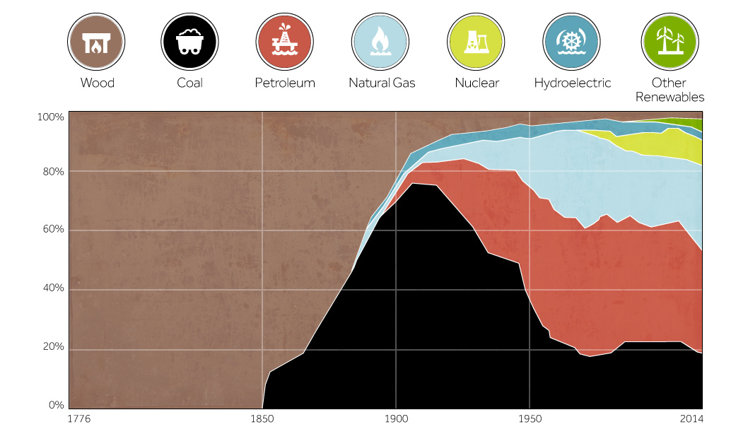
This chart shows the history of America's energy supply based on energy source. This brief history covers all from wood-powered locomotives to solar panels.
In the finale of our four part infographic series of silver, we look at the case for holding silver as an asset.
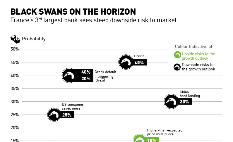
France's third largest bank, SocGen, sees more negative black swan events on the horizon than potential upside.
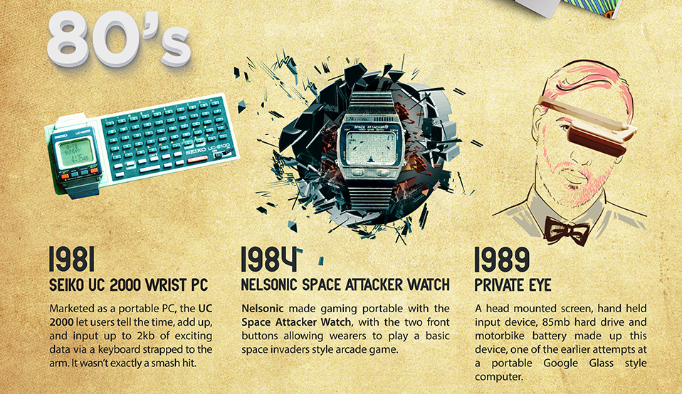
The history of wearable technology is littered with many failures and a few commercial successes. View hundreds of years of innovation in this infographic.
This infographic presents the data in the cases for millennial entrepreneurs as both the best and worst possible entrepreneurial generations.
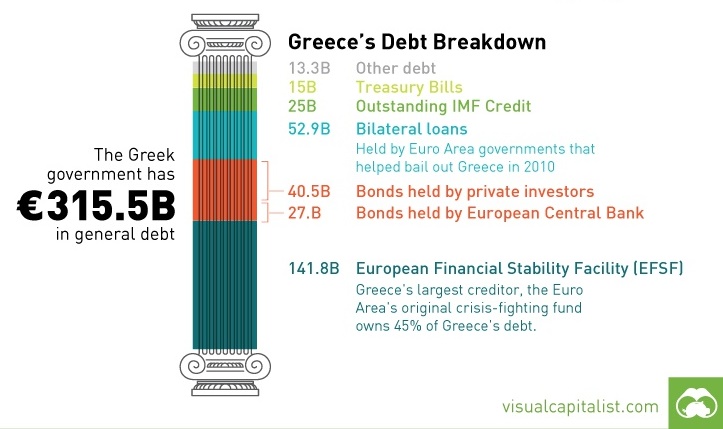
Today's Chart of the Week looks at Greece's debt and which countries and entities are on the hook if a default takes place.
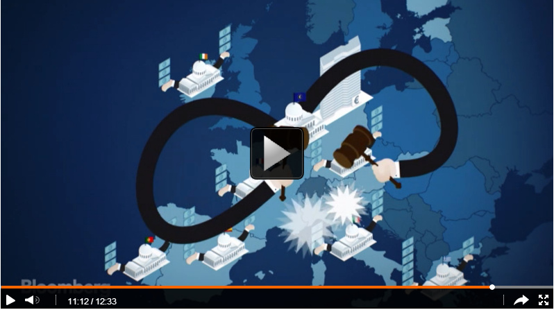
How did the European Debt Crisis begin? This video explains how countries in the Eurozone built up such troublesome debt.
2015 is set to be one of the more exciting years on record for those interested in space exploration.
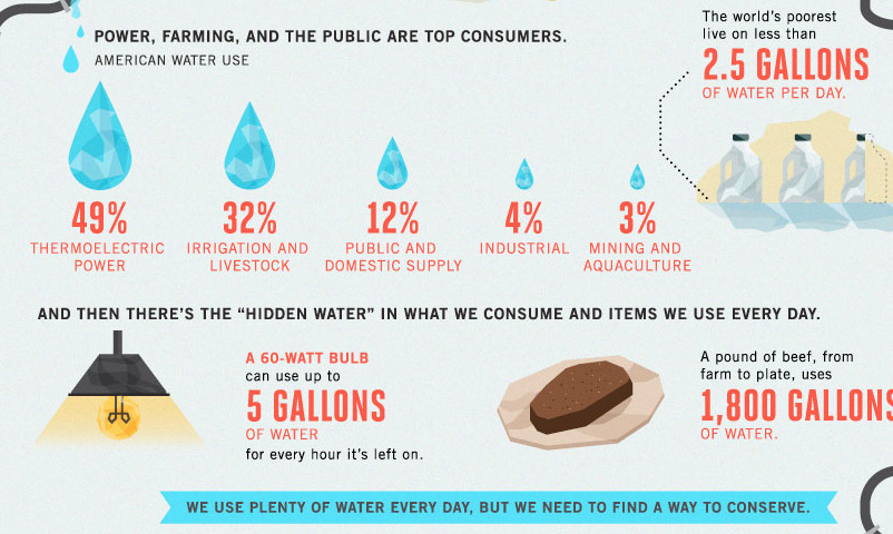
Less abundant water supply, aging infrastructure, and inefficiencies are compounding America's water crisis as seen in this infographic.
A battle for space supremacy is taking place in the private sector.