Money
The Decline of Upward Mobility in One Chart


The Decline Of Upward Mobility In One Chart
For decades, a majority of Americans have been able to climb the economic ladder by earning higher incomes than their parents. These improving conditions are known as upward mobility, and form an important part of the American Dream.
However, each consecutive generation is finding it harder to make this ascent. In this graphic, we illustrate the decline in upward mobility over five decades using data from Opportunity Insights.
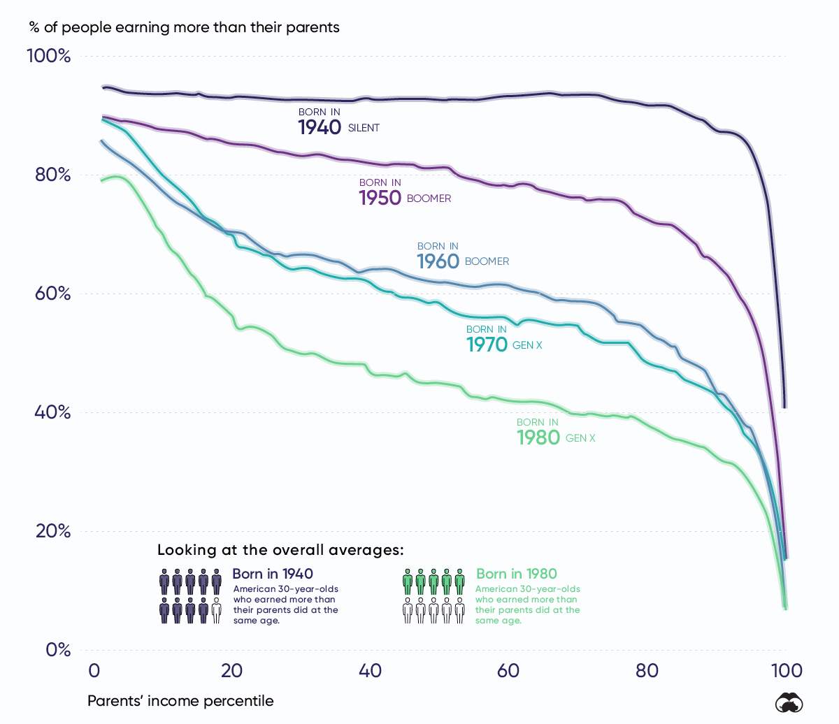
Understanding The Chart
This graphic plots the probability that a 30-year-old American has to outearn their parents (vertical axis) depending on their parent’s income percentile (horizontal axis). The 1st percentile represents America’s lowest earners, while the 99th percentile the richest.
As we move from left to right on the chart, the portion of people who outearn their parents takes a steep decline. This suggests that people born into upper class families are less likely to outearn their parents, regardless of generation.
The key takeaway, though, is that the starting point of this downward trend has shifted to the left. In other words, fewer people in the lower- and middle-classes are climbing the economic ladder.
| Decade Born | Chance of Outearning Parents (Bottom Percentile) | Chance of Outearning Parents (50th Percentile) | Chance of Outearning Parents (Top Income Percentile) |
|---|---|---|---|
| 1940 | 95% | 93% | 41% |
| 1950 | 90% | 81% | 15% |
| 1960 | 86% | 62% | 7% |
| 1970 | 90% | 59% | 16% |
| 1980 | 79% | 45% | 8% |
Declines can be seen across the board, but those growing up in the middle-class (50th percentile) have taken the largest hit. Within this bracket, individuals born in 1980 have only a 45% chance of outearning their parents at age 30, compared to 93% for those born in 1940.
Stagnating Wage Growth a Culprit
One factor behind America’s deteriorating upward mobility is the sluggish pace at which wages have grown. For example, the average hourly wage in 1964, when converted to 2018 dollars, is $20.27. Compare this to $22.65, the average hourly wage in 2018. That represents a mere 11.7% increase over a span of 54 years.
However, this may not be as bad as it sounds. While the prices of some goods and services have risen over time, others have actually become more affordable. Since January 1998, for example, the prices of electronic goods such as TVs and cellphones have actually decreased. In this way, individuals today are more prosperous than previous generations.
This benefit is likely outweighed by relative increases in other services, though. Whereas inflation since January 1998 totaled 58.8%, the costs of health and education services increased by more than 160% over the same time frame.
Income Distribution
While wages have been stagnant as a whole, it doesn’t paint the full picture. Another factor to consider is America’s changing income distribution.
| Income Class | 1970 Share of U.S. Aggregate Income | 2018 Share of U.S. Aggregate Income |
|---|---|---|
| Upper | 28% | 48% |
| Middle | 62% | 43% |
| Lower | 10% | 9% |
Source: Pew Research Center
Like the data on upward mobility, the middle class takes the largest hit here, with its share of U.S. aggregate income falling by 19 percentage points. Over the same time frame, the upper class was able to increase its share of total income by 20 percentage points.
Is It All Bad News?
Americans are less likely to earn more than their parents, but this doesn’t mean that upward mobility has completely disappeared—it’s just becoming less accessible. Below, we illustrate the changes in size for different income classes from 1967 to 2016.
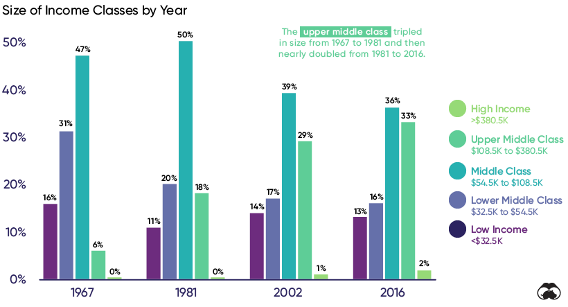
The upper middle class has grown significantly, from 6% of the population in 1967 to 33% in 2016. At the same time, the middle class shrank from 47% to 36% and the lower middle class shrank from 31% to 16%.
The data suggests that some middle class Americans are still managing to pull themselves up into the next income bracket—it’s just not an effect that was as broad-based as it’s been in the past.
Does The American Dream Still Exist?
The American Dream is the belief that upward mobility is attainable for everyone through their own actions. This implies that growth will be continuous and widespread, two factors that have seemingly deteriorated in recent decades.
Researchers believe there are numerous complex reasons behind America’s stagnating wages. A decline in union membership, for example, could be eroding employees’ collective bargaining power. Other factors such as technological change may also apply downwards pressure on the wages of less educated workers.
Income inequality, on the other hand, is clearly shown by the data. We can also refer to the Gini-coefficient, a statistical measure of economic inequality. It ranges between 0 and 1, with 0 representing perfect equality and 1 representing perfect inequality (one person holds all the income). The U.S. currently has a Gini-coefficient of 0.434, the highest of any G7 country.
Long story short, the American Dream is still alive—it’s just becoming harder to come by.


Markets
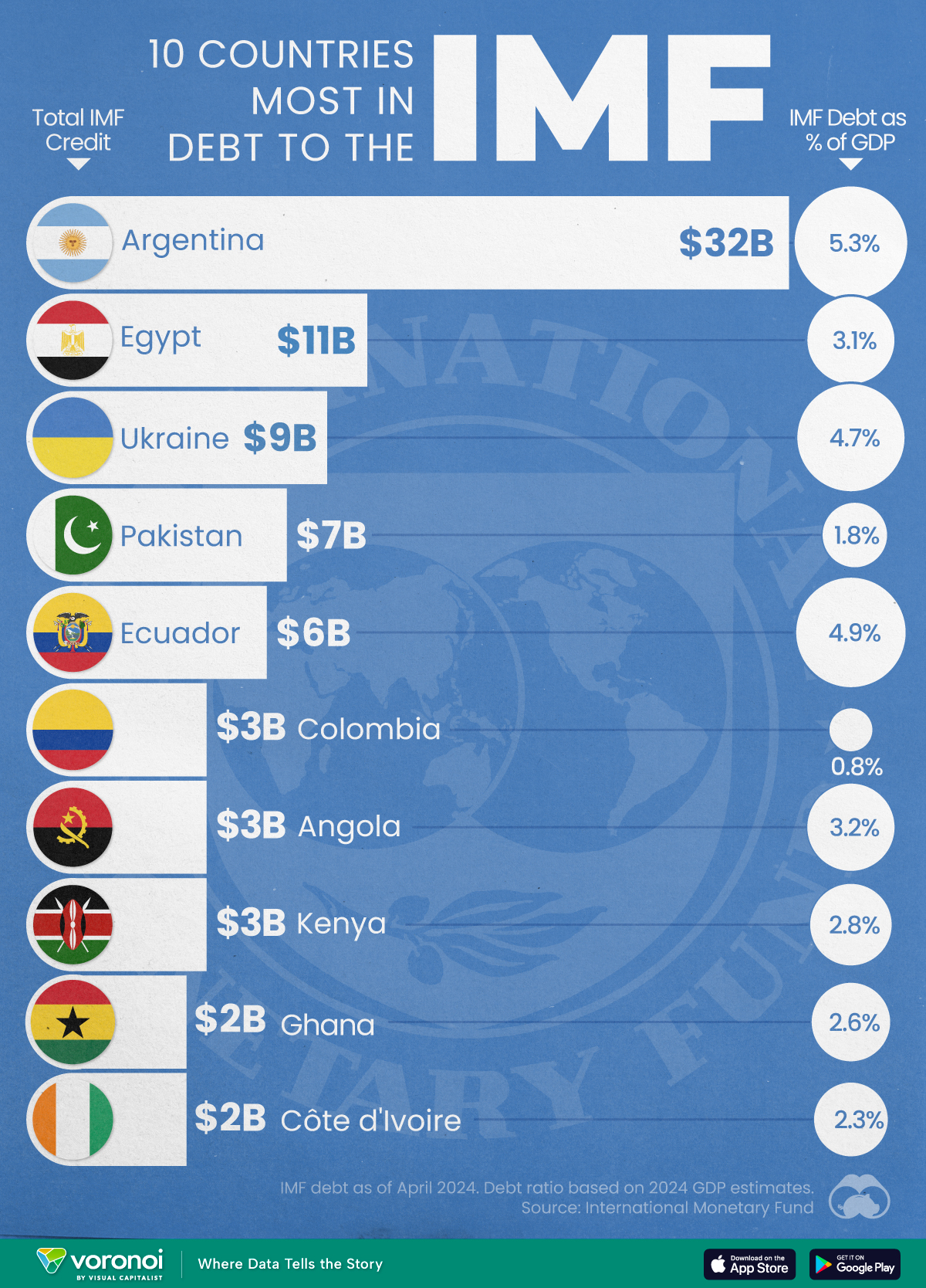
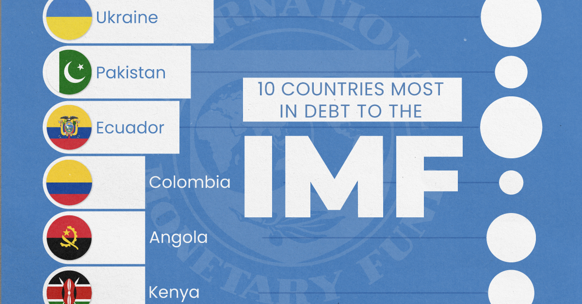
Top 10 Countries Most in Debt to the IMF
Argentina tops the ranking, with a debt equivalent to 5.3% of the country’s GDP.
Top 10 Countries Most in Debt to the IMF
This was originally posted on our Voronoi app. Download the app for free on iOS or Android and discover incredible data-driven charts from a variety of trusted sources.
Established in 1944, the International Monetary Fund (IMF) supports countries’ economic growth by providing financial aid and guidance on policies to enhance stability, productivity, and job opportunities.
Countries seek loans from the IMF to address economic crises, stabilize their currencies, implement structural reforms, and alleviate balance of payments difficulties.
In this graphic, we visualize the 10 countries most indebted to the fund.
Methodology
We compiled this ranking using the International Monetary Fund’s data on Total IMF Credit Outstanding. We selected the latest debt data for each country, accurate as of April 29, 2024.
Argentina Tops the Rank
Argentina’s debt to the IMF is equivalent to 5.3% of the country’s GDP. In total, the country owns more than $32 billion.
| Country | IMF Credit Outstanding ($B) | GDP ($B, 2024) | IMF Debt as % of GDP |
|---|---|---|---|
| 🇦🇷 Argentina | 32 | 604.3 | 5.3 |
| 🇪🇬 Egypt | 11 | 347.6 | 3.1 |
| 🇺🇦 Ukraine | 9 | 188.9 | 4.7 |
| 🇵🇰 Pakistan | 7 | 374.7 | 1.8 |
| 🇪🇨 Ecuador | 6 | 121.6 | 4.9 |
| 🇨🇴 Colombia | 3 | 386.1 | 0.8 |
| 🇦🇴 Angola | 3 | 92.1 | 3.2 |
| 🇰🇪 Kenya | 3 | 104.0 | 2.8 |
| 🇬🇭 Ghana | 2 | 75.2 | 2.6 |
| 🇨🇮 Ivory Coast | 2 | 86.9 | 2.3 |
A G20 member and major grain exporter, the country’s history of debt trouble dates back to the late 1890s when it defaulted after contracting debts to modernize the capital, Buenos Aires. It has already been bailed out over 20 times in the last six decades by the IMF.
Five of the 10 most indebted countries are in Africa, while three are in South America.
The only European country on our list, Ukraine has relied on international support amidst the conflict with Russia. It is estimated that Russia’s full-scale invasion of the country caused the loss of a third of the country’s economy. The country owes $9 billion to the IMF.
In total, almost 100 countries owe money to the IMF, and the grand total of all of these debts is $111 billion. The above countries (top 10) account for about 69% of these debts.

-

 Personal Finance1 week ago
Visualizing the Tax Burden of Every U.S. State
-

 Misc6 days ago
Visualized: Aircraft Carriers by Country
-

 Culture6 days ago
How Popular Snack Brand Logos Have Changed
-

 Mining1 week ago
Visualizing Copper Production by Country in 2023
-

 Misc1 week ago
Charted: How Americans Feel About Federal Government Agencies
-
 Healthcare1 week ago
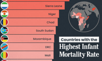
Which Countries Have the Highest Infant Mortality Rates?
-
 Demographics1 week ago
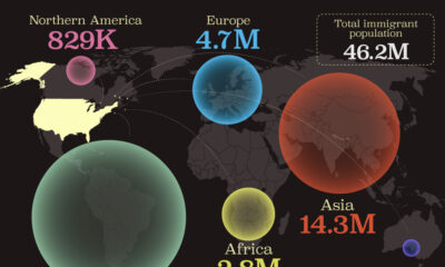
Mapped: U.S. Immigrants by Region
-
 Maps1 week ago
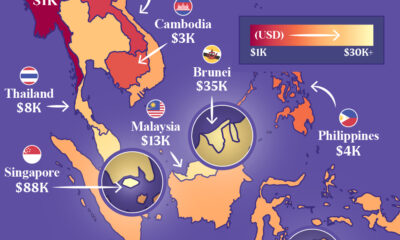
Mapped: Southeast Asia’s GDP Per Capita, by Country