Mapped: The 10 U.S. States With the Lowest Real GDP Growth
Ranked: The World’s 50 Largest Private Equity Firms
Top 10 Countries Most in Debt to the IMF
Ranked: The Top 6 Economies by Share of Global GDP (1980-2024)
Mapped: Europe’s GDP Per Capita, by Country
Ranked: The Top Startup Cities Around the World
Visualizing the 5 Most Common Cybersecurity Mistakes
Countries With the Highest Rates of Crypto Ownership
Mapped: The Number of AI Startups By Country
All of the Grants Given by the U.S. CHIPS Act
Visualizing America’s Average Retirement Savings, by Age
Visualizing the Tax Burden of Every U.S. State
Charted: What Frustrates Americans About the Tax System
Ranked: The Top 20 Countries in Debt to China
Mapped: Countries Where Recreational Cannabis is Legal
Which Countries Have the Highest Infant Mortality Rates?
Life Expectancy by Region (1950-2050F)
What Causes Preventable Child Deaths?
The Cost of an EpiPen in Major Markets
Who’s Building the Most Solar Energy?
Mapped: The Age of Energy Projects in Interconnection Queues, by State
Ranked: The Top 10 EV Battery Manufacturers in 2023
The World’s Biggest Nuclear Energy Producers
The World’s Biggest Oil Producers in 2023
Mapped: Indian States with Cities Over 1 Million People
Mapped: The Top Export in Each EU Country
Mapped: The Top Exports in Asian Countries
Mapped: U.S. States By Number of Cities Over 250,000 Residents
The Biggest Salt Producing Countries in 2023
Visualizing Copper Production by Country in 2023
Where the World’s Aluminum is Smelted, by Country
Visualizing Global Gold Production in 2023
How People Get Around in America, Europe, and Asia
The Carbon Footprint of Major Travel Methods
Ranking the Top 15 Countries by Carbon Tax Revenue
Ranked: The Countries With the Most Air Pollution in 2023
Top Countries By Forest Growth Since 2001
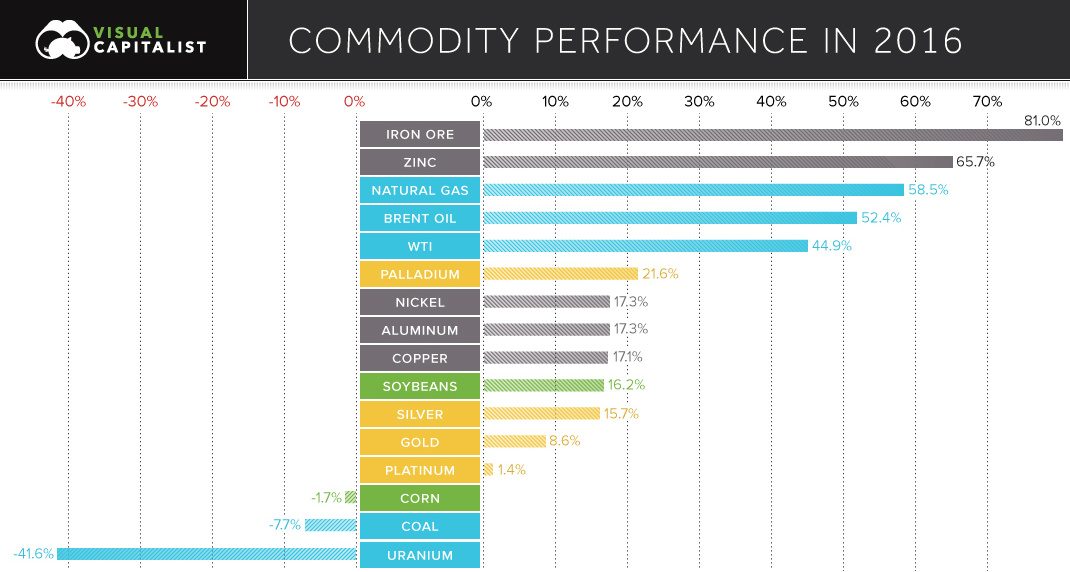
See the winning and losing commodities for 2016 in this chart.
We roundup the best infographics, charts, and data visualizations that were posted over the year. Don't miss Visual Capitalist's Top Infographics of 2016!
Everything you ever wanted to know about consumer debt in one infographic. We show the historical context, as well as the latest numbers for each category.
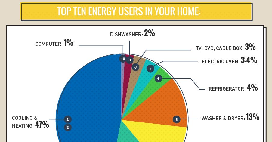
The average U.S. household spends $1,368 per year on energy, and a whopping 35% of that is wasted by appliances. See what uses the most energy...
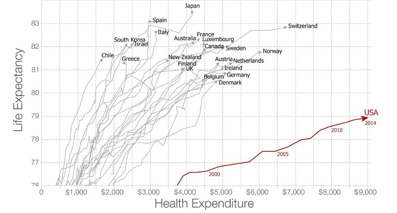
Americans spent more than $3 trillion, or 17.5% of GDP, on healthcare in 2015. Are they getting any bang for their buck?
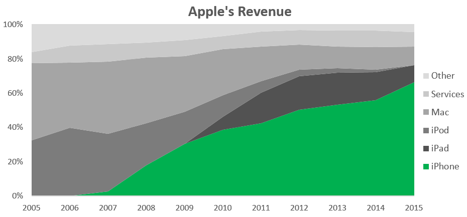
With iPhone sales making up over 60% of revenue, investors are becoming increasingly worried that Apple is a one trick pony.
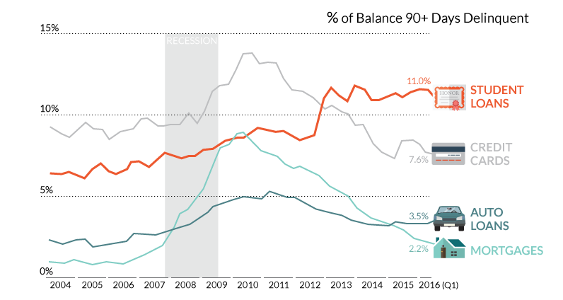
What's happened to the higher education market? Student loan debt has mounted to $1.3 trillion, and now student loan delinquencies have skyrocketed.
The world's largest factories are anything but ordinary. Built to mass-produce cruise ships, airplanes, and cars, some are the size of entire cities.
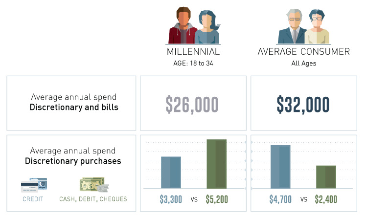
How do millennials spend their discretionary income in comparison to other groups? We dive into the latest survey results on millennial spending habits.
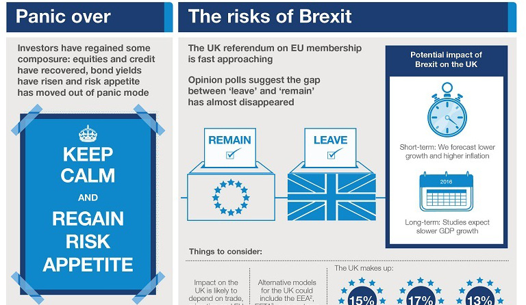
The global economic climate finally has composure, according to asset management firm Schroders. It may be the calm before the storm, though.