In this graphic, we break down global salt production in 2023. China is currently the top producer, accounting for almost...


click for more →


Scan with your phone's camera or QR code app to view
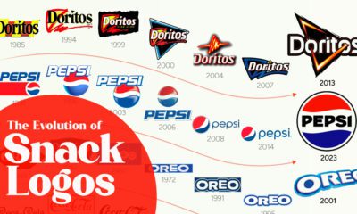

From Coca-Cola's evolution since 1890, to Pepsi's recent nostalgia rebranding, this graphic illustrates the development of logos for popular snack brands.
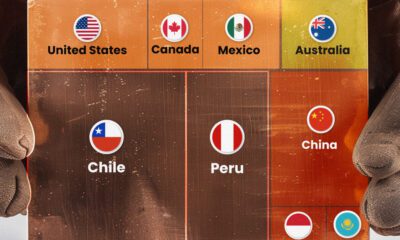

Chile and Peru account for one-third of the world's copper output.


Fourteen of 16 federal government agencies garnered more favorable responses than unfavorable ones. But what were the outliers?
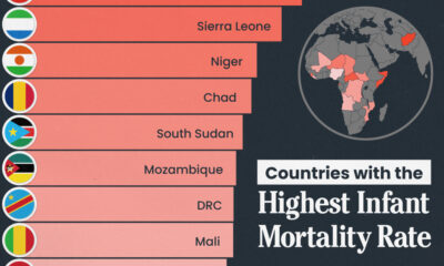
We visualize the 15 countries with the highest infant mortality rates, including countries from Africa and the Middle East.
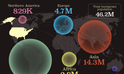
This map shows which regions U.S. immigrants came from, highlighting Asia and Latin America as the biggest sources.
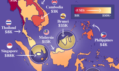
Indonesia, the region’s largest economy, makes the top five in this map exploring Southeast Asia’s GDP per capita levels.
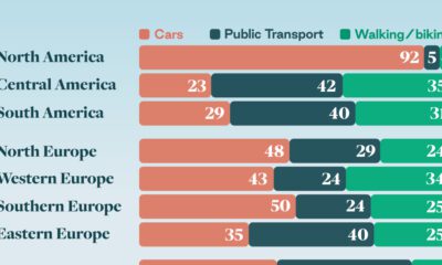
Examining how people get around using cars, public transit, and walking or biking, and the regional differences in usage.
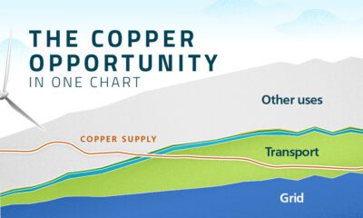

This infographic from Sprott shows how early investors may benefit from the rapidly increasing demand for copper.

Tax burden measures the percent of an individual's income that is paid towards taxes. See where it's the highest by state in this graphic.

This infographic shows estimated aluminum smelter production by country in 2023, based on data from the USGS.