Healthcare
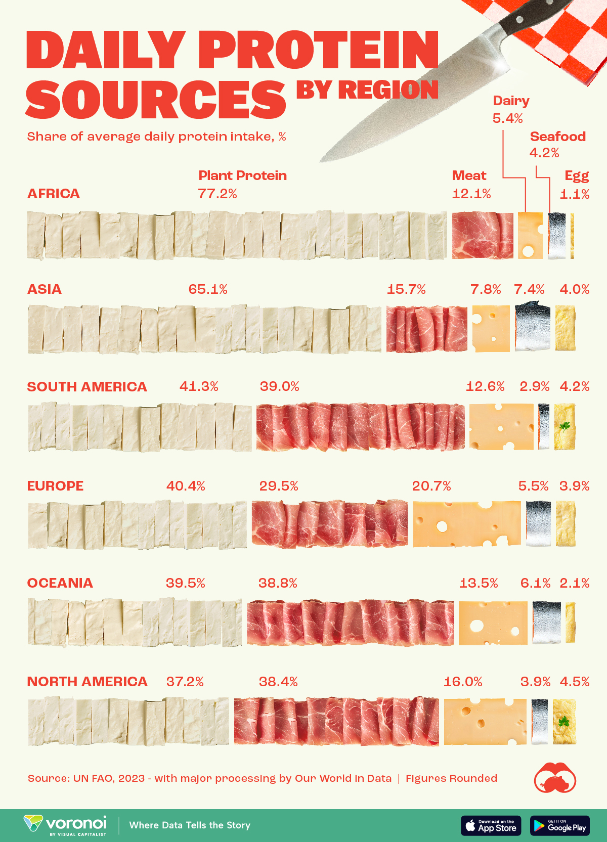
Visualizing Daily Protein Sources by Region
![]() See this visualization first on the Voronoi app.
See this visualization first on the Voronoi app.


Visualizing Daily Protein Sources by Region
This was originally posted on our Voronoi app. Download the app for free on iOS or Android and discover incredible data-driven charts from a variety of trusted sources.
Protein plays a vital role in creating and maintaining every cell in our bodies.
This graphic breaks down how people in different regions of the world get their protein intake. The figures come from the UN Food and Agriculture Organization (UN FAO), accessed via Our World in Data.
The figures we present here reflect the distribution of daily protein intake across regions, with each region’s total adding up to 100%. It’s important to note that this is distinct from the actual amount of protein consumed per person, often measured in grams.
Developed Countries Have More Access to Meat and Dairy
Protein has many benefits for our bodies. It is a building block of bones, muscles, cartilage, and skin. Our hair and nails are comprised mostly of protein. It is also used to repair tissue, oxygenate the body, and make enzymes, which aid in digesting food.
People in more developed regions (like North America or Europe) get a larger share of their daily protein from meat and dairy.
| Region | Plant protein (%) | Meat (%) | Dairy (%) | Seafood (%) | Eggs (%) |
|---|---|---|---|---|---|
| Africa | 77.2 | 12.1 | 5.4 | 4.2 | 1.1 |
| Asia | 65.1 | 15.7 | 7.8 | 7.4 | 4.0 |
| South America | 41.3 | 39.0 | 12.6 | 2.9 | 4.2 |
| Europe | 40.4 | 29.5 | 20.7 | 5.5 | 3.9 |
| Oceania | 39.5 | 38.8 | 13.5 | 6.1 | 2.1 |
| North America | 37.2 | 38.4 | 16.0 | 3.9 | 4.5 |
When only considering meat, South America, with big producers like Brazil and Argentina, takes the lead as the most important protein source.
Meanwhile, Asia, with top fish producers China and India, leads in protein intake from seafood.
In Africa, where many developing countries in the world are located, plant protein is the most important protein source for the population.


Healthcare
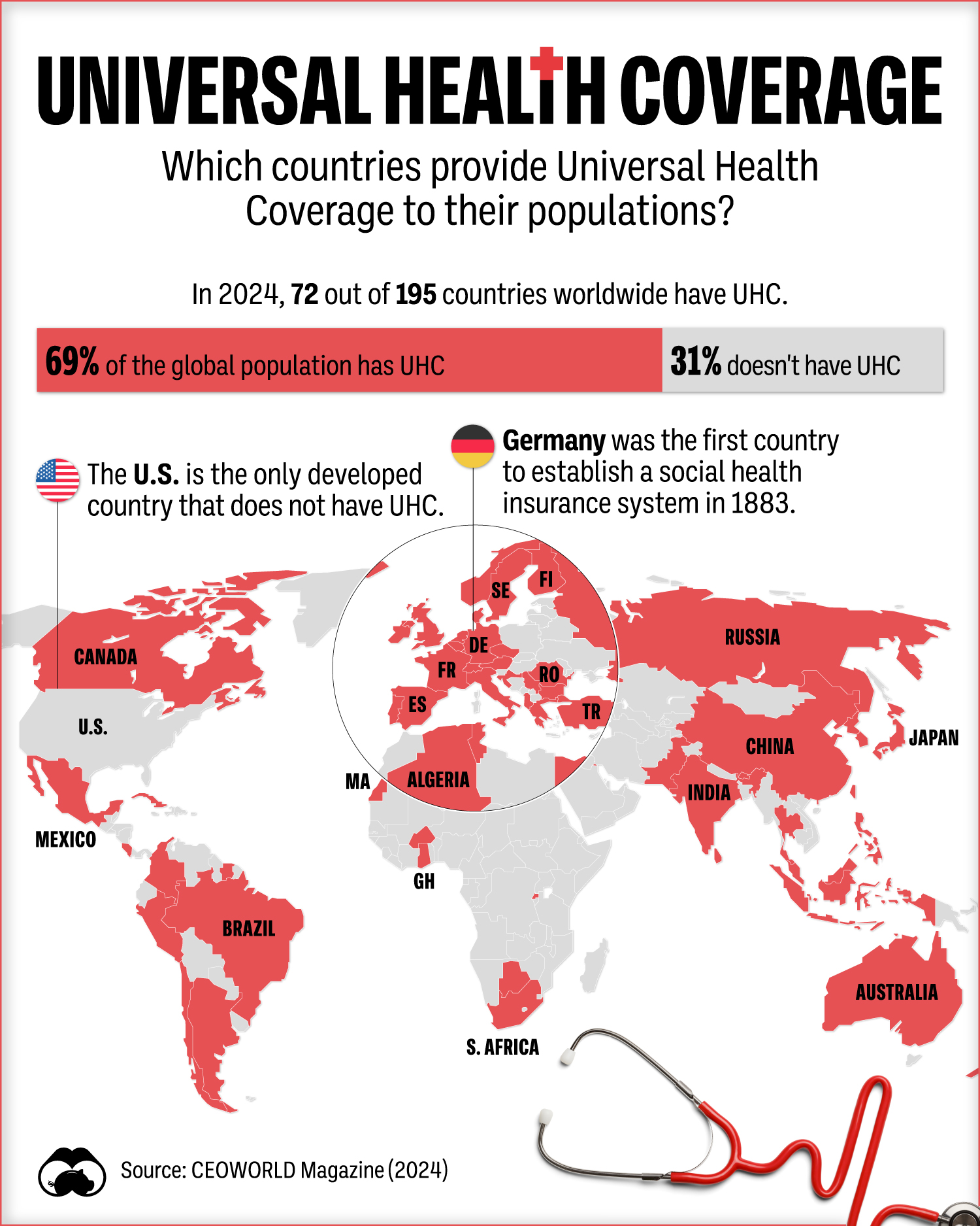
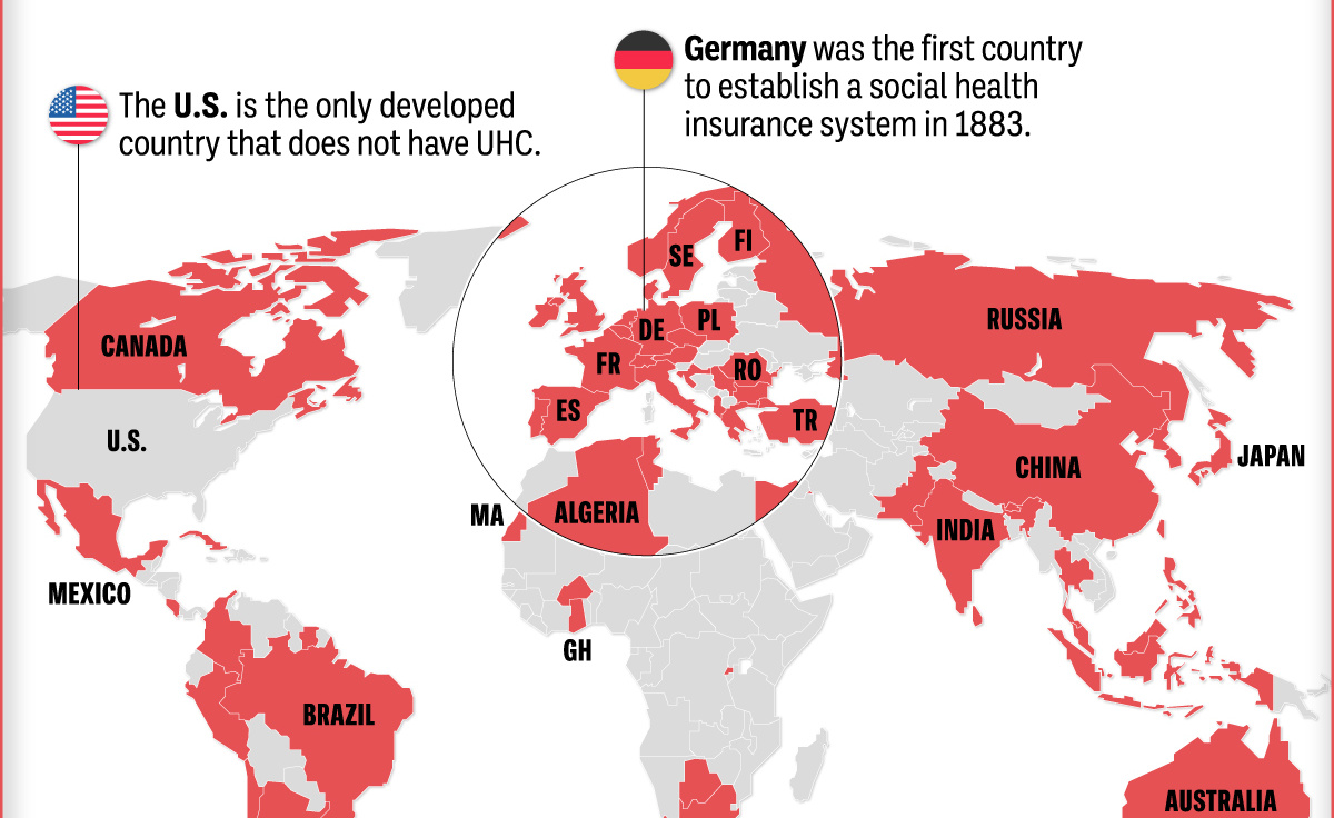
Which Countries Have Universal Health Coverage?
Most of the world population has universal health coverage (UHC). This map shows which countries do and don’t provide public health coverage.
Which Countries Have Universal Health Coverage?
This was originally posted on our Voronoi app. Download the app for free on iOS or Android and discover incredible data-driven charts from a variety of trusted sources.
According to the World Health Organization (WHO), Universal Health Coverage (UHC) means that everyone has access to a full range of health services—from emergency interventions to palliative care—without financial difficulty.
In this graphic, we use data from CEOWorld Magazine to visualize the countries that have UHC versus those that do not, along with how UHC coverage breaks down in terms of the global population.
The State of Universal Health Coverage in the World
In 2024, 73 of the 195 countries worldwide had UHC, resulting in around 69% of the world’s population having some form of universal healthcare.
| Country | UHC? |
|---|---|
| Albania 🇦🇱 | Yes |
| Algeria 🇩🇿 | Yes |
| Argentina 🇦🇷 | Yes |
| Australia 🇦🇺 | Yes |
| Austria 🇦🇹 | Yes |
| Bahamas 🇧🇸 | Yes |
| Belgium 🇧🇪 | Yes |
| Bhutan 🇧🇹 | Yes |
| Botswana 🇧🇼 | Yes |
| Brazil 🇧🇷 | Yes |
| Bulgaria 🇧🇬 | Yes |
| Burkina Faso 🇧🇫 | Yes |
| Canada 🇨🇦 | Yes |
| Chile 🇨🇱 | Yes |
| China 🇨🇳 | Yes |
| Colombia 🇨🇴 | Yes |
| Costa Rica 🇨🇷 | Yes |
| Croatia 🇭🇷 | Yes |
| Cuba 🇨🇺 | Yes |
| Czech Republic 🇨🇿 | Yes |
| Denmark 🇩🇰 | Yes |
| Egypt 🇪🇬 | Yes |
| Finland 🇫🇮 | Yes |
| France 🇫🇷 | Yes |
| Georgia 🇬🇪 | Yes |
| Germany 🇩🇪 | Yes |
| Ghana 🇬🇭 | Yes |
| Greece 🇬🇷 | Yes |
| Hong Kong 🇭🇰 | Yes |
| Iceland 🇮🇸 | Yes |
| India 🇮🇳 | Yes |
| Indonesia 🇮🇩 | Yes |
| Ireland 🇮🇪 | Yes |
| Israel 🇮🇱 | Yes |
| Italy 🇮🇹 | Yes |
| Japan 🇯🇵 | Yes |
| Kuwait 🇰🇼 | Yes |
| Liechtenstein 🇱🇮 | Yes |
| Luxembourg 🇱🇺 | Yes |
| Macau 🇲🇴 | Yes |
| Malaysia 🇲🇾 | Yes |
| Maldives 🇲🇻 | Yes |
| Mauritius 🇲🇺 | Yes |
| Mexico 🇲🇽 | Yes |
| Morocco 🇲🇦 | Yes |
| Netherlands 🇳🇱 | Yes |
| New Zealand 🇳🇿 | Yes |
| North Korea 🇰🇵 | Yes |
| Norway 🇳🇴 | Yes |
| Pakistan 🇵🇰 | Yes |
| Peru 🇵🇪 | Yes |
| Philippines 🇵🇭 | Yes |
| Poland 🇵🇱 | Yes |
| Portugal 🇵🇹 | Yes |
| Romania 🇷🇴 | Yes |
| Russia 🇷🇺 | Yes |
| Rwanda 🇷🇼 | Yes |
| Serbia 🇷🇸 | Yes |
| Seychelles 🇸🇨 | Yes |
| Singapore 🇸🇬 | Yes |
| South Africa 🇿🇦 | Yes |
| South Korea 🇰🇷 | Yes |
| Spain 🇪🇸 | Yes |
| Sri Lanka 🇱🇰 | Yes |
| Suriname 🇸🇷 | Yes |
| Sweden 🇸🇪 | Yes |
| Switzerland 🇨🇭 | Yes |
| Taiwan 🇹🇼 | Yes |
| Thailand 🇹🇭 | Yes |
| Trinidad and Tobago 🇹🇹 | Yes |
| Tunisia 🇹🇳 | Yes |
| Turkey 🇹🇷 | Yes |
| United Kingdom 🇬🇧 | Yes |
The United States is the only developed country without health coverage for all of its citizens.
As of 2022, the Census Bureau estimated that only 36.1% of Americans were covered by public health insurance. Private health insurance covered 65.6% of the population. This along with other facts has led the U.S. having the world’s highest healthcare spending figure per capita.
The History of Public Health Coverage
Germany was the first country to establish a social health insurance system. Launched in 1883, the program began by covering only blue-collar workers, then slowly expanded its net of those covered.
The first international declaration underlying the need for adequate health care was the Declaration of Alma-Ata in 1978 at the International Conference on Primary Health Care in 1978. The conference’s target was to achieve global UHC by 2000.
The Ottawa Charter for Health Promotion of 1986 also reiterated the “Health for All by the year 2000” goal, ultimately paving the way for more countries to adopt UHC.

-

 Automotive5 days ago
Mapped: Where Tesla and BYD Make Their Cars
-

 Technology2 weeks ago
Charted: How Many Data Centers do Major Big Tech Companies Have?
-

 Globalization2 weeks ago
Charted: Countries Offering Digital Nomad Visas
-

 Politics1 week ago
Mapped: Unauthorized Immigrants by State
-

 Technology1 week ago
Visualizing the 15 Most Valuable Bitcoin Addresses
-

 Demographics1 week ago
Which Countries Have the Most and Least Women in the Workforce?
-
 Mining1 week ago
Visualizing Raw Steel Production in 2023
-

 Crime1 week ago
Charted: The World’s Highest Homicide Rates, in Each Region