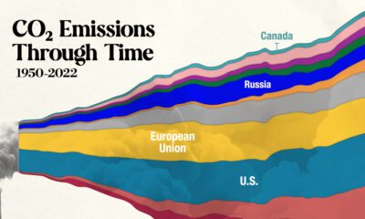

In this streamgraph, we break down global CO2 emissions between 1950 and 2022 using data from Berkeley Earth and Global Carbon Project.
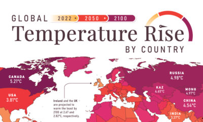

In this set of three maps, we show the global temperature rise on a national level for 2022, 2050, and 2100 based on an analysis by...
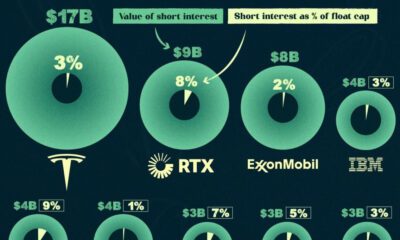

In this infographic, we list the 15 most shorted stocks in the U.S. in the Fall of 2023, ranked by the value of their short interest.
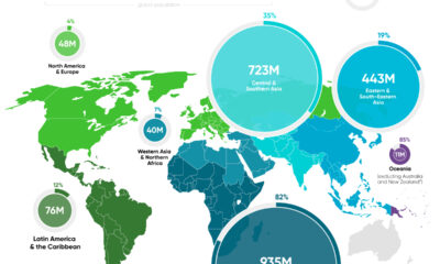

In this graphic, we map the number of people relying on harmful cooking fuels by region, using data from the World Health Organization.
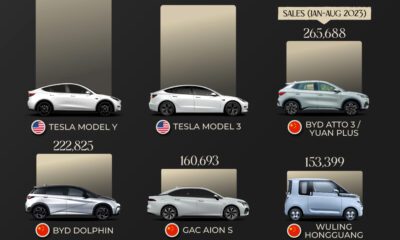

Today, electric vehicle sales make up 18% of global vehicle sales. Here are the leading models by sales as of August 2023.
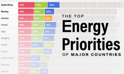

This infographic lists the top energy priorities in 28 countries, based on an Ipsos survey involving 24,000 people.


Here's a preview of our much-anticipated 2024 Global Forecast Series, the U.S. military's annual report on China and and much more.
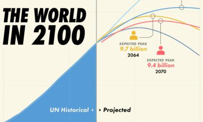

Population projections from the UN suggest that there will be over 10 billion people by 2060, though other organizations disagree.
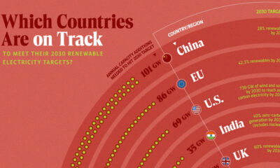

In this graphic, we visualize whether major electricity-consuming countries are on track to meet their 2030 renewable energy targets.


Join the waitlist now to be one of the first to use Voronoi.


