Mapped: The 10 U.S. States With the Lowest Real GDP Growth
Ranked: The World’s 50 Largest Private Equity Firms
Top 10 Countries Most in Debt to the IMF
Ranked: The Top 6 Economies by Share of Global GDP (1980-2024)
Mapped: Europe’s GDP Per Capita, by Country
Countries With the Highest Rates of Crypto Ownership
Mapped: The Number of AI Startups By Country
All of the Grants Given by the U.S. CHIPS Act
Visualizing AI Patents by Country
How Tech Logos Have Evolved Over Time
Visualizing America’s Average Retirement Savings, by Age
Visualizing the Tax Burden of Every U.S. State
Charted: What Frustrates Americans About the Tax System
Ranked: The Top 20 Countries in Debt to China
Mapped: Countries Where Recreational Cannabis is Legal
Which Countries Have the Highest Infant Mortality Rates?
Life Expectancy by Region (1950-2050F)
What Causes Preventable Child Deaths?
The Cost of an EpiPen in Major Markets
Who’s Building the Most Solar Energy?
Mapped: The Age of Energy Projects in Interconnection Queues, by State
Ranked: The Top 10 EV Battery Manufacturers in 2023
The World’s Biggest Nuclear Energy Producers
The World’s Biggest Oil Producers in 2023
Mapped: The Top Exports in Asian Countries
Mapped: U.S. States By Number of Cities Over 250,000 Residents
Mapped: U.S. Immigrants by Region
The Biggest Salt Producing Countries in 2023
Visualizing Copper Production by Country in 2023
Where the World’s Aluminum is Smelted, by Country
Visualizing Global Gold Production in 2023
How People Get Around in America, Europe, and Asia
The Carbon Footprint of Major Travel Methods
Ranking the Top 15 Countries by Carbon Tax Revenue
Ranked: The Countries With the Most Air Pollution in 2023
Top Countries By Forest Growth Since 2001
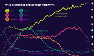
Social connections evolve throughout our lifetimes. Here we chart how much time Americans spend with others, and who that time is spent with.
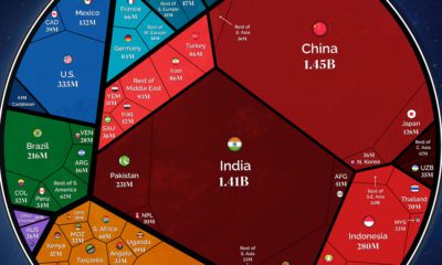
Our population will soon reach a new milestone—8 billion. These visualizations show where all those people are distributed around the world
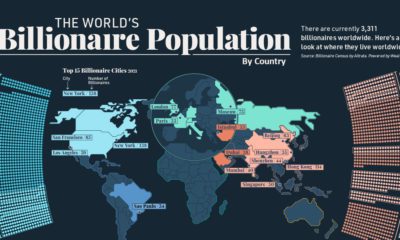
Collectively, worldwide billionaire wealth is nearly $12 trillion. This map breaks down where these 3,311 billionaires live around the globe.
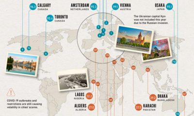
Which cities rank as the best places to live worldwide? This map reveals the world's most and least livable cities.
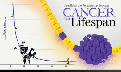
New research links mutation rates and lifespan. We visualize the data supporting this new framework for understanding cancer.
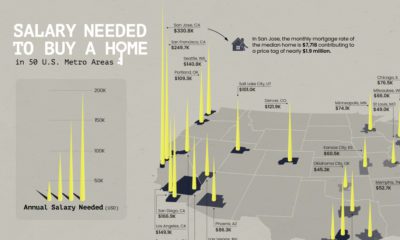
Is owning a home still realistic? This map lays out the salary you'd need to buy a home in 50 different U.S. metro areas.
This month, along with regularly scheduled features, Visual Capitalist founder Jeff Desjardins hosts a live Q&A session for VC+ subscribers.
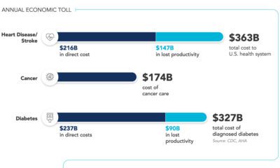
6 in 10 U.S. adults live with at least one chronic disease. What are the high costs of chronic diseases, and the challenges of treating them?
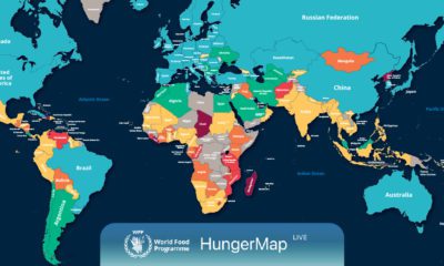
Every day, hunger affects more than 700 million people. This live map from the UN highlights where hunger is hitting hardest around the world.
Antimicrobial copper kills over 99.9% of certain bacteria within two hours of exposure. How does copper kill germs?