Demographics
Visualizing the World’s Plummeting Fertility Rate


Visualizing the World’s Plummeting Fertility Rate
At the dawn of the 19th century, the world population hit a big milestone: 1 billion people.
Over the next 220 years, the number grew to eight times that, or the 8 billion people who live on the planet today, with half of the growth occurring since 1975.
This continuous climb in global population has been possible thanks to advancements in healthcare and nutrition. However, the UN forecasts that rapid growth will slow down—and may even stop entirely by 2100—because of falling fertility rates.
What does that mean for modern nation states conditioned to expect a constant influx of new citizens and labor to power their economies? And how can those changing economies adapt to a shrinking population?
To understand that, we need to first untangle fertility rates, and why they’re falling.
Explained: Fertility and Replacement Rates
The total fertility rate is the average number of births per woman over a lifetime. This measurement makes two key assumptions, however:
- The woman will live to the end of her childbearing years
- The woman will bear children according to the age-specific fertility rates currently observed
Both assumptions add some uncertainty to future fertility rate projections. However, decades of past data collected by the World Bank help show some overall trends around the world, and in many countries.
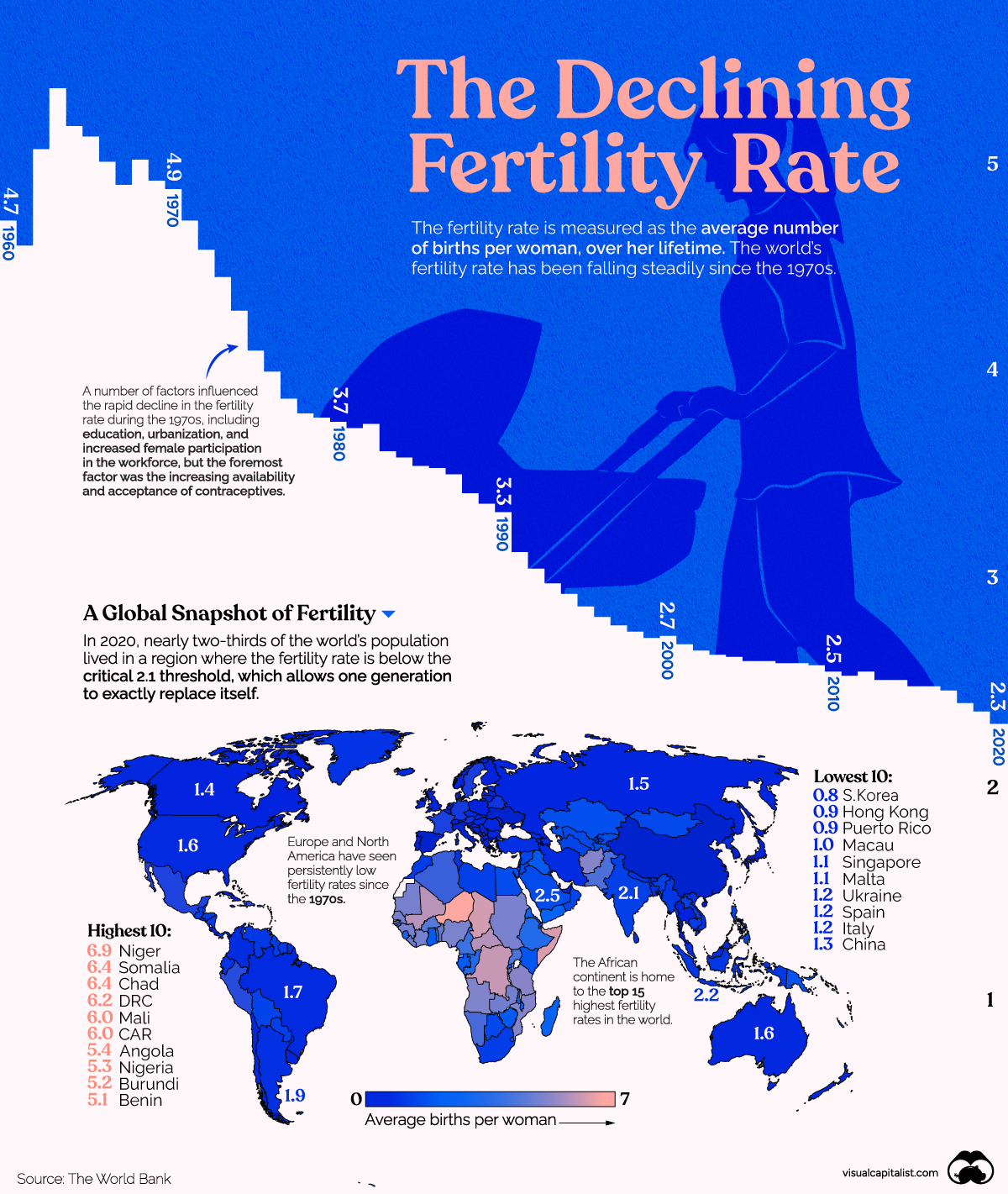
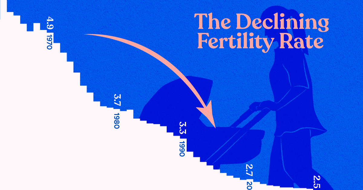
The world fertility rate (expressed as the number of children per woman) has been falling steadily since the 1970s.
In 2020, the world’s fertility rate stood at 2.3, slightly above the replacement rate of 2.1 births per woman, which allows for one generation to replace itself. This is down more than two times from 4.7 in 1960.
But the world’s average hides the vast disparities between the fertility rate of countries. We dive into the differences below.
Which Country has the Highest Fertility Rate?
According to the UN, nearly two-thirds of the world’s population lives in a region where the fertility rate is below the critical 2.1 threshold. In the table below, countries are ranked from the highest to lowest average births per woman in 2020.
| Rank | Country Name | 1960 | 1975 | 1990 | 2005 | 2020 |
|---|---|---|---|---|---|---|
| 1 | Niger | 7.53 | 7.54 | 7.81 | 7.62 | 6.89 |
| 2 | Somalia | 7.25 | 7.03 | 7.44 | 7.48 | 6.42 |
| 3 | Chad | 6.25 | 6.88 | 7.22 | 7.13 | 6.35 |
| 4 | Dem. Rep. of Congo | 6.08 | 6.42 | 6.70 | 6.60 | 6.21 |
| 5 | Mali | 7.00 | 7.24 | 7.25 | 6.72 | 6.04 |
| 6 | Central African Republic | 5.81 | 5.89 | 6.05 | 5.85 | 5.99 |
| 7 | Angola | 6.71 | 7.49 | 7.27 | 6.46 | 5.37 |
| 8 | Nigeria | 6.36 | 6.77 | 6.46 | 6.07 | 5.31 |
| 9 | Burundi | 7.00 | 7.24 | 7.37 | 6.71 | 5.18 |
| 10 | Benin | 6.28 | 6.85 | 6.73 | 5.68 | 5.05 |
| 11 | Burkina Faso | 6.25 | 6.91 | 7.01 | 6.18 | 4.87 |
| 12 | Tanzania | 6.73 | 7.00 | 6.20 | 5.61 | 4.80 |
| 13 | Gambia | 6.25 | 6.41 | 6.22 | 5.72 | 4.78 |
| 14 | Afghanistan | 7.28 | 7.54 | 7.57 | 6.91 | 4.75 |
| 15 | Mozambique | 6.32 | 6.69 | 6.22 | 5.61 | 4.71 |
| 16 | Uganda | 6.94 | 7.23 | 7.04 | 6.57 | 4.69 |
| 17 | Cameroon | 5.65 | 6.39 | 6.39 | 5.41 | 4.54 |
| 18 | South Sudan | 6.72 | 6.92 | 7.99 | 6.17 | 4.54 |
| 19 | Sudan | 6.65 | 6.93 | 6.17 | 5.04 | 4.54 |
| 20 | Guinea | 6.11 | 6.37 | 6.63 | 5.70 | 4.49 |
| 21 | Cote d'Ivoire | 7.69 | 7.91 | 6.73 | 5.46 | 4.47 |
| 22 | Mauritania | 6.35 | 6.68 | 6.06 | 5.19 | 4.46 |
| 23 | Senegal | 7.00 | 7.25 | 6.40 | 5.19 | 4.45 |
| 24 | Zambia | 7.12 | 7.39 | 6.53 | 5.71 | 4.38 |
| 25 | Equatorial Guinea | 5.65 | 5.79 | 5.99 | 5.56 | 4.35 |
| 26 | Togo | 6.72 | 7.15 | 6.13 | 5.07 | 4.32 |
| 27 | Ethiopia | 6.88 | 7.14 | 7.24 | 5.97 | 4.24 |
| 28 | Rep. of Congo | 6.09 | 6.36 | 5.21 | 4.66 | 4.23 |
| 29 | Liberia | 6.39 | 6.74 | 6.37 | 5.52 | 4.17 |
| 30 | Guinea-Bissau | 5.92 | 6.15 | 6.51 | 5.45 | 4.09 |
| 31 | Sierra Leone | 6.18 | 6.55 | 6.57 | 5.81 | 4.08 |
| 32 | Comoros | 6.79 | 7.12 | 6.50 | 5.03 | 4.05 |
| 33 | Solomon Islands | 6.97 | 7.07 | 5.66 | 4.48 | 4.04 |
| 34 | Samoa | 7.65 | 6.68 | 4.93 | 4.37 | 4.00 |
| 35 | Malawi | 7.03 | 7.40 | 6.81 | 5.91 | 4.00 |
| 36 | Eritrea | 6.48 | 6.59 | 6.34 | 4.93 | 3.93 |
| 37 | Madagascar | 7.30 | 7.10 | 6.16 | 5.10 | 3.92 |
| 38 | Sao Tome & Principe | 6.24 | 6.53 | 5.83 | 4.96 | 3.89 |
| 39 | Yemen | 7.94 | 8.40 | 8.61 | 5.58 | 3.89 |
| 40 | Rwanda | 8.19 | 8.22 | 6.87 | 5.44 | 3.87 |
| 41 | Vanuatu | 6.86 | 6.09 | 5.03 | 4.16 | 3.78 |
| 42 | Ghana | 6.85 | 6.77 | 5.71 | 4.54 | 3.62 |
| 43 | West Bank & Gaza | NA | NA | 6.78 | 4.84 | 3.57 |
| 44 | Pakistan | 6.80 | 6.81 | 6.36 | 4.64 | 3.56 |
| 45 | Iraq | 5.30 | 6.88 | 5.88 | 4.48 | 3.55 |
| 46 | Gabon | 4.42 | 5.39 | 5.46 | 4.21 | 3.55 |
| 47 | Zimbabwe | 7.22 | 6.98 | 4.87 | 3.67 | 3.55 |
| 48 | Kenya | 7.63 | 7.88 | 6.13 | 4.78 | 3.40 |
| 49 | Namibia | 6.21 | 6.54 | 5.32 | 3.56 | 3.35 |
| 50 | Kiribati | 6.55 | 5.03 | 4.64 | 3.80 | 3.33 |
| 51 | Papua New Guinea | 6.02 | 6.07 | 5.18 | 4.22 | 3.27 |
| 52 | Tonga | 6.89 | 5.43 | 4.64 | 4.18 | 3.27 |
| 53 | Timor-Leste | 6.32 | 5.19 | 5.81 | 5.71 | 3.25 |
| 54 | Tajikistan | 6.55 | 6.60 | 5.34 | 3.44 | 3.24 |
| 55 | Tuvalu | 4.78 | 3.50 | 3.91 | 3.63 | 3.19 |
| 56 | Kazakhstan | 4.53 | 3.39 | 2.72 | 2.22 | 3.13 |
| 57 | Lesotho | 5.82 | 5.90 | 4.76 | 3.44 | 3.05 |
| 58 | Kyrgyzstan | 5.38 | 4.66 | 3.63 | 2.50 | 3.00 |
| 59 | Egypt | 6.79 | 5.80 | 4.48 | 3.15 | 2.96 |
| 60 | Algeria | 7.50 | 7.37 | 4.56 | 2.56 | 2.94 |
| 61 | Israel | 3.87 | 3.55 | 2.82 | 2.84 | 2.90 |
| 62 | Mongolia | 6.83 | 7.13 | 4.23 | 2.03 | 2.90 |
| 63 | Uzbekistan | 6.61 | 5.89 | 4.07 | 2.36 | 2.90 |
| 64 | Eswatini | 6.75 | 6.75 | 5.25 | 3.68 | 2.89 |
| 65 | Jordan | 7.67 | 7.89 | 5.48 | 3.78 | 2.87 |
| 66 | Haiti | 6.21 | 5.69 | 5.48 | 3.83 | 2.87 |
| 67 | Djibouti | 6.83 | 6.77 | 5.98 | 3.99 | 2.85 |
| 68 | Botswana | 6.63 | 6.58 | 4.49 | 3.08 | 2.84 |
| 69 | Syria | 7.49 | 7.47 | 5.38 | 3.81 | 2.80 |
| 70 | Philippines | 7.15 | 5.60 | 4.35 | 3.49 | 2.78 |
| 71 | Micronesia | 6.69 | 6.68 | 4.96 | 3.60 | 2.75 |
| 72 | Turkmenistan | 6.59 | 5.90 | 4.24 | 2.66 | 2.70 |
| 73 | Oman | 7.25 | 7.75 | 6.61 | 3.05 | 2.69 |
| 74 | Bolivia | 6.36 | 5.79 | 4.89 | 3.56 | 2.65 |
| 75 | Guam | 5.91 | 3.91 | 3.05 | 2.76 | 2.59 |
| 76 | Lao | 6.29 | 6.29 | 6.08 | 3.67 | 2.54 |
| 77 | Libya | 7.37 | 7.96 | 4.97 | 2.77 | 2.51 |
| 78 | Paraguay | 6.50 | 5.21 | 4.55 | 3.04 | 2.50 |
| 79 | Fiji | 6.46 | 4.10 | 3.41 | 2.89 | 2.50 |
| 80 | Guatemala | 6.96 | 6.41 | 5.48 | 3.97 | 2.48 |
| 81 | Saudi Arabia | 7.63 | 7.37 | 5.83 | 3.24 | 2.47 |
| 82 | Guyana | 6.37 | 4.50 | 3.07 | 2.84 | 2.42 |
| 83 | South Africa | 6.16 | 5.19 | 3.72 | 2.51 | 2.40 |
| 84 | Honduras | 7.46 | 6.86 | 5.29 | 3.55 | 2.39 |
| 85 | Cambodia | 6.25 | 4.10 | 5.64 | 3.24 | 2.38 |
| 86 | Suriname | 6.61 | 4.73 | 3.27 | 2.75 | 2.37 |
| 87 | Morocco | 7.04 | 6.27 | 4.02 | 2.57 | 2.35 |
| 88 | Nicaragua | 7.16 | 6.50 | 4.60 | 2.77 | 2.35 |
| 89 | Panama | 5.84 | 4.42 | 3.10 | 2.67 | 2.34 |
| 90 | Dominican Republic | 7.56 | 5.24 | 3.41 | 2.61 | 2.30 |
| 91 | Faroe Islands | NA | 2.90 | 2.80 | 2.60 | 2.30 |
| 92 | World | 4.70 | 4.08 | 3.31 | 2.60 | 2.30 |
| 93 | Seychelles | NA | NA | NA | 2.20 | 2.29 |
| 94 | Venezuela, RB | 6.36 | 4.69 | 3.45 | 2.63 | 2.23 |
| 95 | Peru | 6.94 | 5.71 | 3.91 | 2.69 | 2.22 |
| 96 | Indonesia | 5.55 | 5.04 | 3.10 | 2.43 | 2.19 |
| 97 | Myanmar | 5.98 | 5.29 | 3.54 | 2.55 | 2.17 |
| 98 | Kuwait | 7.16 | 6.09 | 3.32 | 2.66 | 2.14 |
| 99 | Tunisia | 6.94 | 6.03 | 3.47 | 1.98 | 2.11 |
| 100 | Lebanon | 5.82 | 4.56 | 3.30 | 2.20 | 2.10 |
| 101 | Nepal | 6.03 | 5.75 | 5.21 | 3.14 | 2.06 |
| 102 | Ecuador | 6.72 | 5.43 | 3.74 | 2.80 | 2.05 |
| 103 | India | 5.92 | 5.20 | 4.05 | 2.96 | 2.05 |
| 104 | New Caledonia | 6.28 | 3.70 | 3.18 | 2.20 | 2.04 |
| 105 | Virgin Islands | 5.45 | 3.63 | 2.99 | 2.24 | 2.03 |
| 106 | Grenada | 6.74 | 4.02 | 3.49 | 2.34 | 2.02 |
| 107 | Greenland | NA | 2.35 | 2.44 | 2.38 | 2.02 |
| 108 | Bangladesh | 6.78 | 6.74 | 4.48 | 2.81 | 2.00 |
| 109 | Sri Lanka | 5.47 | 3.79 | 2.52 | 2.28 | 2.00 |
| 110 | Belize | 6.50 | 6.28 | 4.70 | 3.13 | 2.00 |
| 111 | Georgia | 2.94 | 2.53 | 2.31 | 1.61 | 1.97 |
| 112 | Vietnam | 6.28 | 5.64 | 3.60 | 1.96 | 1.96 |
| 113 | Turkiye | 6.38 | 5.07 | 3.13 | 2.22 | 1.92 |
| 114 | Argentina | 3.08 | 3.30 | 3.03 | 2.43 | 1.91 |
| 115 | Cabo Verde | 6.89 | 6.77 | 5.39 | 2.93 | 1.91 |
| 116 | Mexico | 6.76 | 5.79 | 3.45 | 2.50 | 1.91 |
| 117 | Gibraltar | 3.01 | 2.62 | 2.44 | 1.70 | 1.86 |
| 118 | Bahrain | 7.15 | 5.62 | 3.76 | 2.62 | 1.83 |
| 119 | France | 2.85 | 2.09 | 1.77 | 1.94 | 1.83 |
| 120 | El Salvador | 6.63 | 5.68 | 3.95 | 2.46 | 1.82 |
| 121 | Malaysia | 6.41 | 4.52 | 3.37 | 2.33 | 1.82 |
| 122 | North Korea | 3.57 | 3.05 | 2.35 | 1.96 | 1.82 |
| 123 | Qatar | 6.65 | 6.10 | 4.18 | 2.58 | 1.82 |
| 124 | St. Vincent & the Grenadines | 7.29 | 4.98 | 2.83 | 2.07 | 1.81 |
| 125 | Brunei Darussalam | 6.84 | 4.99 | 3.29 | 2.02 | 1.80 |
| 126 | Moldova | 3.33 | 2.53 | 2.39 | 1.53 | 1.77 |
| 127 | Montenegro | 3.50 | 2.40 | 1.94 | 1.69 | 1.75 |
| 128 | Colombia | 6.74 | 4.40 | 3.08 | 2.26 | 1.74 |
| 129 | Iceland | 4.29 | 2.65 | 2.30 | 2.05 | 1.72 |
| 130 | Maldives | 6.80 | 7.19 | 6.09 | 2.24 | 1.71 |
| 131 | Czechia | 2.09 | 2.43 | 1.90 | 1.29 | 1.71 |
| 132 | Iran | 7.30 | 6.01 | 4.86 | 1.78 | 1.71 |
| 133 | French Polynesia | 5.89 | 4.71 | 3.44 | 2.19 | 1.71 |
| 134 | Azerbaijan | 5.88 | 4.18 | 2.74 | 2.00 | 1.70 |
| 135 | Denmark | 2.57 | 1.92 | 1.67 | 1.80 | 1.67 |
| 136 | Sweden | 2.17 | 1.77 | 2.13 | 1.77 | 1.66 |
| 137 | Brazil | 6.06 | 4.42 | 2.91 | 1.97 | 1.65 |
| 138 | U.S. | 3.65 | 1.77 | 2.08 | 2.06 | 1.64 |
| 139 | Trinidad and Tobago | 5.35 | 3.24 | 2.38 | 1.68 | 1.63 |
| 140 | Ireland | 3.78 | 3.37 | 2.11 | 1.86 | 1.63 |
| 141 | Barbados | 4.33 | 2.39 | 1.74 | 1.79 | 1.63 |
| 142 | New Zealand | 4.24 | 2.33 | 2.18 | 1.97 | 1.61 |
| 143 | Curacao | NA | NA | NA | NA | 1.60 |
| 144 | Romania | 2.34 | 2.59 | 1.83 | 1.40 | 1.60 |
| 145 | Slovenia | 2.19 | 2.18 | 1.46 | 1.26 | 1.60 |
| 146 | Australia | 3.45 | 2.15 | 1.90 | 1.81 | 1.58 |
| 147 | Estonia | 1.98 | 2.04 | 2.05 | 1.52 | 1.58 |
| 148 | Armenia | 4.79 | 2.96 | 2.71 | 1.54 | 1.58 |
| 149 | Slovak Republic | 3.04 | 2.55 | 2.09 | 1.27 | 1.57 |
| 150 | Antigua and Barbuda | 4.60 | 2.77 | 2.25 | 1.83 | 1.57 |
| 151 | Isle of Man | 2.88 | 2.05 | 1.92 | 1.85 | 1.57 |
| 152 | Bulgaria | 2.31 | 2.23 | 1.82 | 1.37 | 1.56 |
| 153 | United Kingdom | 2.69 | 1.81 | 1.83 | 1.76 | 1.56 |
| 154 | Hungary | 2.02 | 2.35 | 1.87 | 1.31 | 1.56 |
| 155 | Costa Rica | 6.71 | 3.80 | 3.21 | 2.04 | 1.56 |
| 156 | Belgium | 2.54 | 1.74 | 1.62 | 1.76 | 1.55 |
| 157 | Latvia | 1.94 | 1.96 | 2.02 | 1.39 | 1.55 |
| 158 | Netherlands | 3.12 | 1.66 | 1.62 | 1.71 | 1.55 |
| 159 | Chile | 4.70 | 3.18 | 2.58 | 1.80 | 1.54 |
| 160 | Germany | 2.37 | 1.45 | 1.45 | 1.34 | 1.53 |
| 161 | Kosovo | 6.36 | 5.25 | 3.65 | 2.61 | 1.53 |
| 162 | Russia | 2.52 | 1.98 | 1.89 | 1.29 | 1.51 |
| 163 | Cuba | 4.13 | 2.85 | 1.80 | 1.47 | 1.50 |
| 164 | Croatia | 2.23 | 1.96 | 1.63 | 1.50 | 1.48 |
| 165 | Lithuania | 2.56 | 2.18 | 2.03 | 1.29 | 1.48 |
| 166 | Norway | 2.85 | 1.98 | 1.93 | 1.84 | 1.48 |
| 167 | Serbia | NA | NA | NA | 1.45 | 1.48 |
| 168 | Uruguay | 2.83 | 3.02 | 2.43 | 2.10 | 1.48 |
| 169 | U.A.E | 6.72 | 6.26 | 4.54 | 2.20 | 1.46 |
| 170 | Switzerland | 2.44 | 1.61 | 1.58 | 1.42 | 1.46 |
| 171 | Austria | 2.69 | 1.83 | 1.46 | 1.41 | 1.44 |
| 172 | Mauritius | 6.17 | 3.20 | 2.32 | 1.88 | 1.44 |
| 173 | Bhutan | 6.70 | 6.62 | 5.60 | 2.80 | 1.43 |
| 174 | St. Lucia | 6.97 | 5.46 | 3.40 | 1.68 | 1.41 |
| 175 | Albania | 6.46 | 4.52 | 2.90 | 1.80 | 1.40 |
| 176 | Canada | 3.81 | 1.82 | 1.83 | 1.57 | 1.40 |
| 177 | Portugal | 3.16 | 2.75 | 1.56 | 1.41 | 1.40 |
| 178 | Bahamas | 4.82 | 3.26 | 2.53 | 2.05 | 1.39 |
| 179 | Belarus | 2.67 | 2.17 | 1.91 | 1.25 | 1.38 |
| 180 | Poland | 2.98 | 2.27 | 2.06 | 1.24 | 1.38 |
| 181 | Finland | 2.72 | 1.68 | 1.78 | 1.80 | 1.37 |
| 182 | Luxembourg | 2.29 | 1.55 | 1.60 | 1.63 | 1.37 |
| 183 | Bosnia & Herzegovina | 3.91 | 2.36 | 1.79 | 1.20 | 1.36 |
| 184 | Jamaica | 5.58 | 4.50 | 2.85 | 2.06 | 1.36 |
| 185 | Thailand | 6.25 | 4.40 | 2.09 | 1.59 | 1.34 |
| 186 | Greece | 2.23 | 2.33 | 1.39 | 1.34 | 1.34 |
| 187 | Japan | 2.00 | 1.91 | 1.54 | 1.26 | 1.34 |
| 188 | Cyprus | 3.51 | 2.11 | 2.41 | 1.48 | 1.33 |
| 189 | Aruba | 4.82 | 2.51 | 2.30 | 1.78 | 1.33 |
| 190 | Bermuda | NA | NA | NA | 1.76 | 1.30 |
| 191 | North Macedonia | 3.97 | 2.59 | 2.19 | 1.50 | 1.30 |
| 192 | China | 4.45 | 3.57 | 2.51 | 1.62 | 1.28 |
| 193 | Italy | 2.40 | 2.17 | 1.33 | 1.34 | 1.24 |
| 194 | Spain | 2.86 | 2.77 | 1.36 | 1.33 | 1.23 |
| 195 | Ukraine | 2.24 | 2.02 | 1.85 | 1.21 | 1.22 |
| 196 | Malta | 3.62 | 2.27 | 2.02 | 1.38 | 1.13 |
| 197 | Singapore | 5.76 | 2.07 | 1.83 | 1.26 | 1.10 |
| 198 | Macao SAR, China | 4.93 | 1.60 | 1.74 | 0.83 | 1.07 |
| 199 | British Virgin Islands | 5.16 | 3.36 | 1.59 | 1.34 | 0.98 |
| 200 | Puerto Rico | 4.80 | 2.77 | 2.38 | 1.77 | 0.90 |
| 201 | Hong Kong | 5.07 | 2.67 | 1.27 | 0.96 | 0.87 |
| 202 | South Korea | 5.95 | 3.43 | 1.57 | 1.09 | 0.84 |
The African country of Niger currently has the highest fertility rate, at 6.9, which means on average, a woman in Niger will have seven children in her lifetime.
With the exception of Afghanistan (14th), all of the top 30 countries are found on the African continent. In fact, it’s estimated that Africa will add 2.5 billion new people by 2100, while most continents will actually flatline in terms of population growth.
At the bottom of the rankings, the country with the lowest fertility rate is South Korea, at 0.84.
Interestingly, many of the current most populous countries of the world—including China, India, and the U.S.—are all below replacement levels of fertility, with parts of Europe and North America having had persistently low fertility levels since the 1970s.
However, even the countries that currently have high fertility rates have seen a steep decline over the last 60 years. Why?
Why are Fertility Rates Falling All Over The World?
Declining fertility rates are a consequence of a confluence of many related factors, including (but not limited to):
- Better access to contraception
- Improving opportunities for women, outside of childbearing
- Robust healthcare that lowers mortality rates of children
In the past, a larger number of children meant more chances of some making it to adulthood since infant mortality was so high. Women were also restricted to childbearing and rearing, and lacked access to contraception which led to increased—and sometimes unwanted—pregnancies.
Declining fertility rates are thus a triumph of improved socioeconomic development for many countries.
Consequences of Declining Fertility Rates
Although there are obvious issues with our large global population today, a different set of issues arise when fertility rates fall below replacement levels.
Dropping fertility rates can lead to shrinking populations and a higher ratio of the elderly to working adults—which will have unwanted economic consequences like increased healthcare costs and a reduced tax base.
Short-term solutions like immigration can help until populations are shrinking in every country. Longer-term solutions—reducing the cost of raising a child, and providing better support for families with children—are common strategies deployed to ward off demographic disaster.
The current crop of humanity has never had to contend with shrinking populations on a global scale. How will this reshape human livelihoods, priorities and expectations from life? We might soon find out.
Source: The World Bank.
Data note: The World Bank uses a number of sources to aggregate their data including the UN population division, Eurostat, and several national statistics programs. Data for some years is missing and has been marked as “NA.” Please visit their website for more information.


Demographics
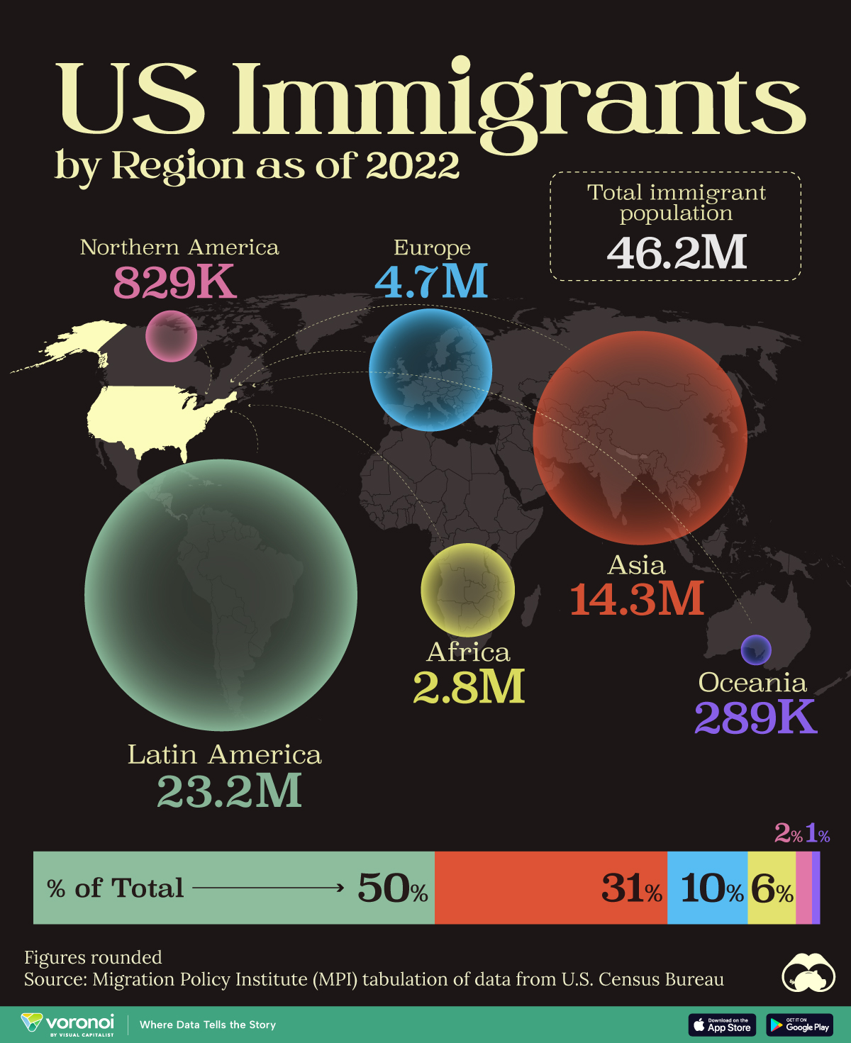
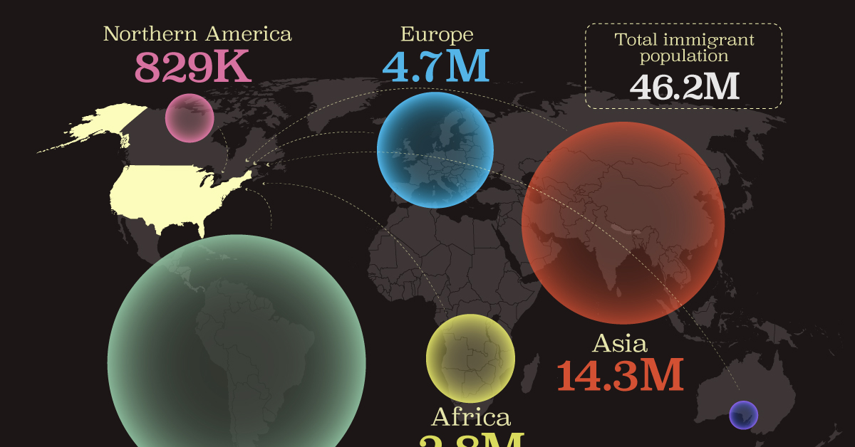
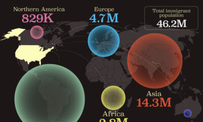
Mapped: U.S. Immigrants by Region
This map shows which regions U.S. immigrants came from, highlighting Asia and Latin America as the biggest sources.
Breaking Down America’s Immigrant Population
This was originally posted on our Voronoi app. Download the app for free on iOS or Android and discover incredible data-driven charts from a variety of trusted sources.
The United States is home to more immigrants than any other nation, surpassing the combined totals of the next four countries: Germany, Saudi Arabia, Russia, and the United Kingdom.
To add context to this impressive fact, we’ve illustrated the regions from which U.S. immigrants originated. “Immigrants” in this context refers to individuals who are residing in the United States but were not U.S. citizens at birth.
These statistics were sourced from the Migration Policy Institute, which analyzed data from the U.S. Census Bureau’s 2022 American Community Survey (ACS).
U.S. Immigrants by Region
From this graphic, we can see that Asia and Latin America emerge as the primary sources of immigration, collectively accounting for 81% of America’s 46.2 million immigrants.
| Region | # of Immigrants | % of Total |
|---|---|---|
| Europe | 4,728,948 | 10 |
| Asia | 14,349,080 | 31 |
| Africa | 2,752,965 | 6 |
| Oceania | 288,560 | 1 |
| Northern America | 828,702 | 2 |
| Latin America | 23,233,834 | 50 |
| Total | 46,182,089 | 100 |
Latin America alone contributes half of the immigrant population. Mexico stands out as the largest contributor to U.S. immigration, with 10.7 million immigrants, attributable to its geographical proximity and historical ties.
Economic factors, including wage disparity and employment opportunities, drive many Mexicans to seek better prospects north of the border.
From Asia, the two largest country sources are China (2.2 million) and India (2.8 million).
Learn More About U.S. Immigration From Visual Capitalist
If you enjoyed this post, be sure to check out Why Do People Immigrate to the U.S.? This visualization shows the different reasons why immigrants chose to come to America in 2021.

-
 Demographics7 days ago
Mapped: U.S. Immigrants by Region
-
 United States2 weeks ago
Charted: What Southeast Asia Thinks About China & the U.S.
-

 United States2 weeks ago
The Evolution of U.S. Beer Logos
-

 Healthcare2 weeks ago
What Causes Preventable Child Deaths?
-
 Energy2 weeks ago
Who’s Building the Most Solar Energy?
-

 Markets1 week ago
Mapped: The Most Valuable Company in Each Southeast Asian Country
-

 Technology1 week ago
Mapped: The Number of AI Startups By Country
-
 Healthcare1 week ago
Life Expectancy by Region (1950-2050F)