Mapped: The 10 U.S. States With the Lowest Real GDP Growth
Ranked: The World’s 50 Largest Private Equity Firms
Top 10 Countries Most in Debt to the IMF
Ranked: The Top 6 Economies by Share of Global GDP (1980-2024)
Mapped: Europe’s GDP Per Capita, by Country
Countries With the Highest Rates of Crypto Ownership
Mapped: The Number of AI Startups By Country
All of the Grants Given by the U.S. CHIPS Act
Visualizing AI Patents by Country
How Tech Logos Have Evolved Over Time
Visualizing America’s Average Retirement Savings, by Age
Visualizing the Tax Burden of Every U.S. State
Charted: What Frustrates Americans About the Tax System
Ranked: The Top 20 Countries in Debt to China
Mapped: Countries Where Recreational Cannabis is Legal
Which Countries Have the Highest Infant Mortality Rates?
Life Expectancy by Region (1950-2050F)
What Causes Preventable Child Deaths?
The Cost of an EpiPen in Major Markets
Who’s Building the Most Solar Energy?
Mapped: The Age of Energy Projects in Interconnection Queues, by State
Ranked: The Top 10 EV Battery Manufacturers in 2023
The World’s Biggest Nuclear Energy Producers
The World’s Biggest Oil Producers in 2023
Mapped: The Top Exports in Asian Countries
Mapped: U.S. States By Number of Cities Over 250,000 Residents
Mapped: U.S. Immigrants by Region
The Biggest Salt Producing Countries in 2023
Visualizing Copper Production by Country in 2023
Where the World’s Aluminum is Smelted, by Country
Visualizing Global Gold Production in 2023
How People Get Around in America, Europe, and Asia
The Carbon Footprint of Major Travel Methods
Ranking the Top 15 Countries by Carbon Tax Revenue
Ranked: The Countries With the Most Air Pollution in 2023
Top Countries By Forest Growth Since 2001
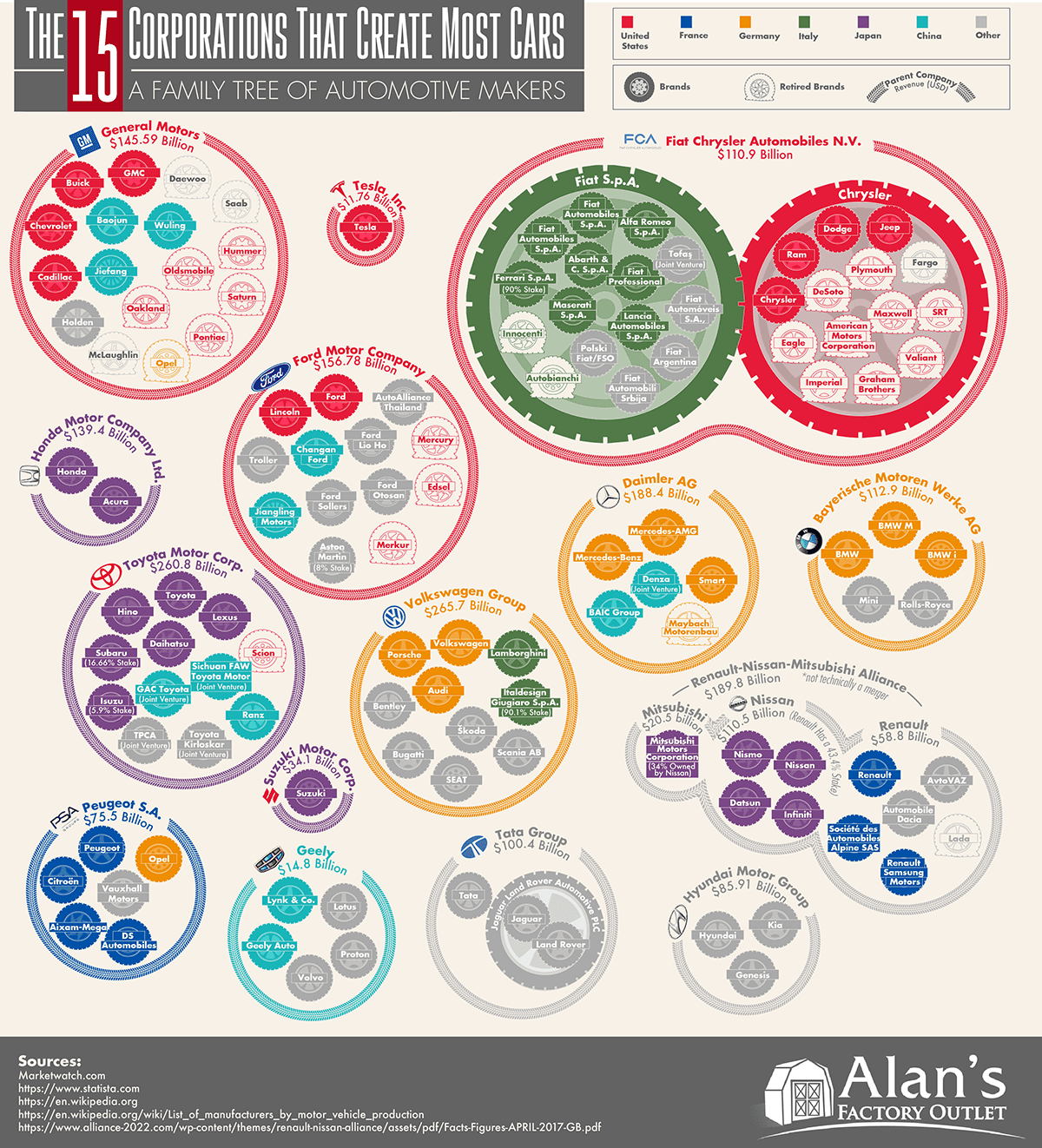
This massive infographic shows the 15 corporations that make the most cars, their annual revenues, and the brands owned by each automaker.
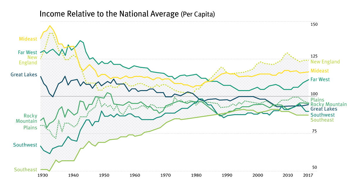
For most of the century, the geographical difference in per capita incomes has been narrowing - but it appears this trend has now reversed in the...
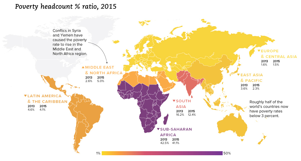
We look at the latest data from the World Bank, which reveals a drop in extreme poverty of 1 billion people globally since the year 1990.
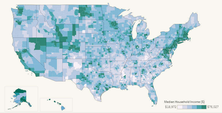
This interactive map allows you to pull data on median household income for all 3,000+ U.S. counties in existence, allowing for some interesting insights.
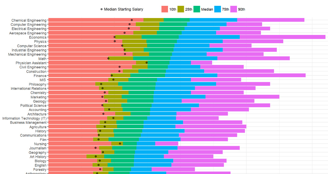
How do different college degrees compare for earning potential? This chart uses a data set from 1.2 million past students to compare 50 different majors.
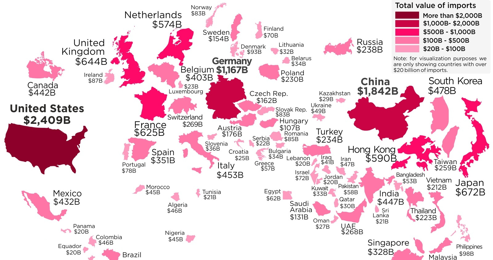
With protectionist policies gaining momentum and a global trade war underway, we look at the world's largest importers of goods in 2017.
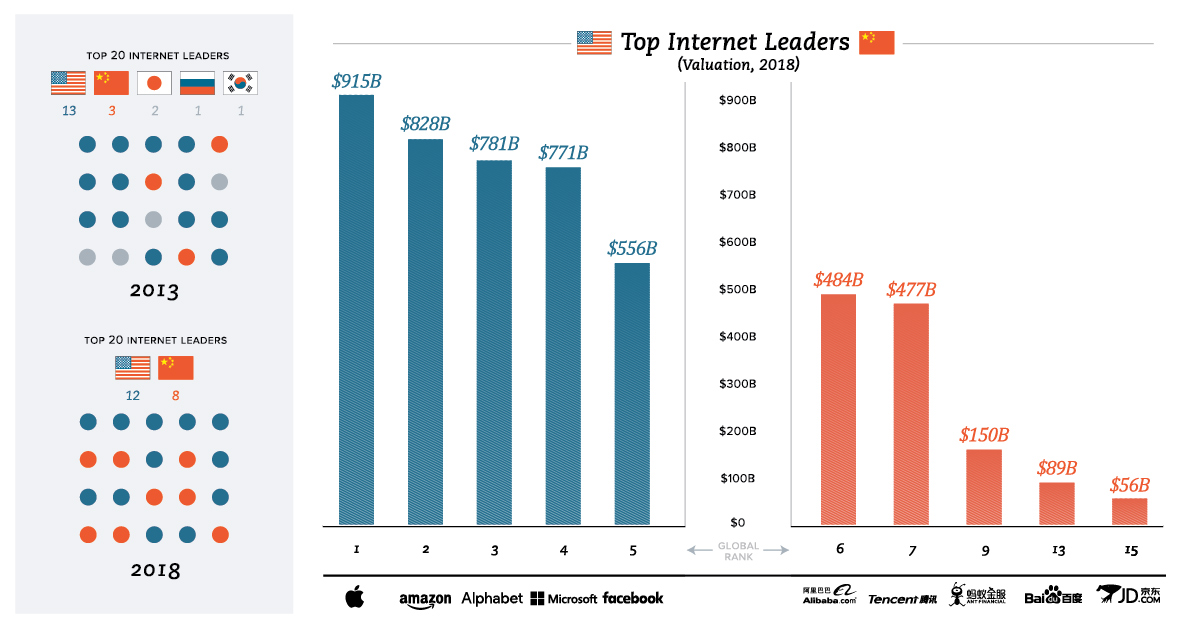
A total of 12 of the largest tech giants come from the United States, while eight hail from China. All other countries combine for zero.
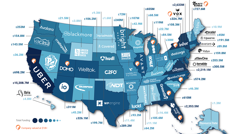
Silicon Valley may be the startup mecca, but there are now prominent, VC-backed startups in practically every state. See the best funded startup in yours.
Automation is coming to the workplace. Here are the 10 skills you need to survive and thrive in the future for career success.
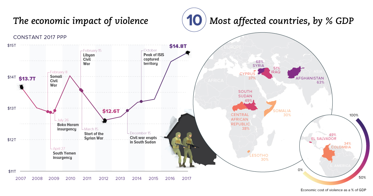
Aside from the obvious human toll, violence also hurts productivity and wealth creation. We visualize the real economic impact of violence in these charts.