Best of
The Best Visualizations of February on the Voronoi App
At the end of 2023, we publicly launched Voronoi, our free new data discovery app!
The initial response from both users and creators has been incredible. We now have millions of in-app views, and there are already hundreds of interesting visualizations to discover, many of which will not be published on Visual Capitalist.
For that reason, we’ve chosen to highlight some of the most popular visualizations and creators from February in this roundup. To see them and many others, make sure to download the app!
Let’s take a look at a popular creator worth highlighting, as well as the most viewed, most discussed, and most liked posts of the month.
POPULAR CREATOR
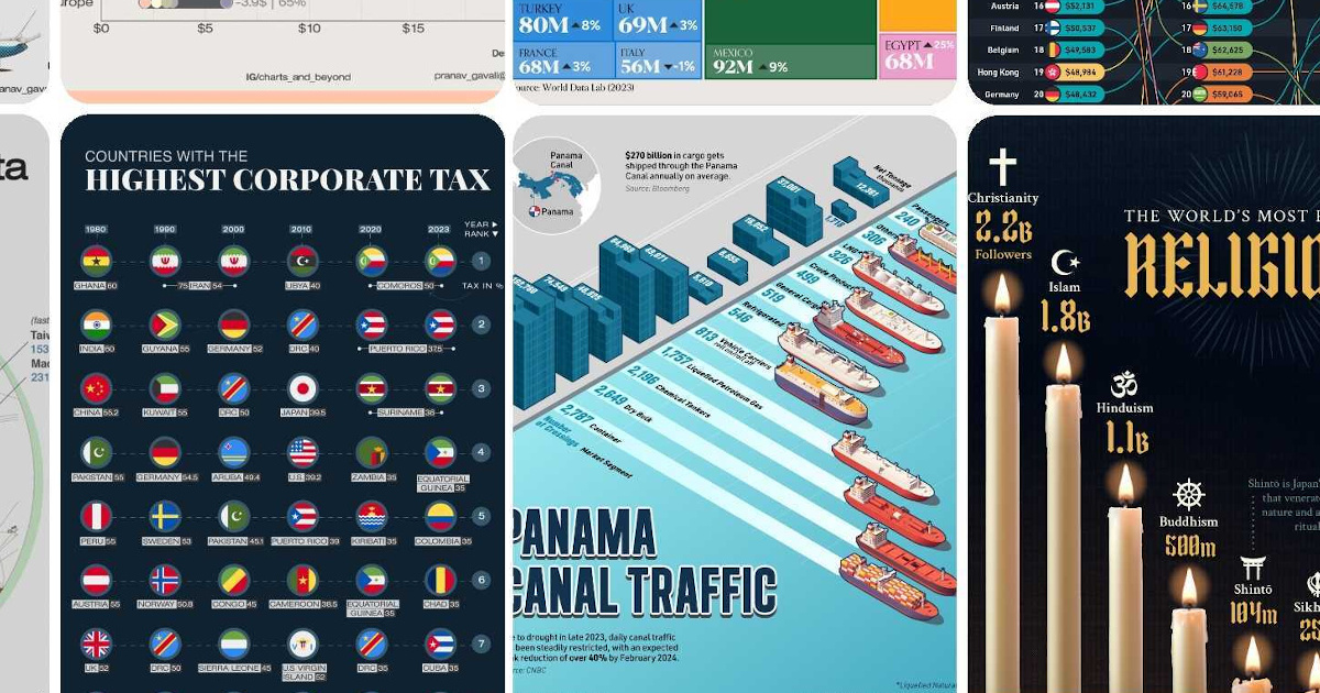
Pranav Gavali
Visual Capitalist isn’t the only creator on the Voronoi app.
Instead, it features incredible data-driven charts and stories from many of the world’s best creators, like Pranav Gavali.
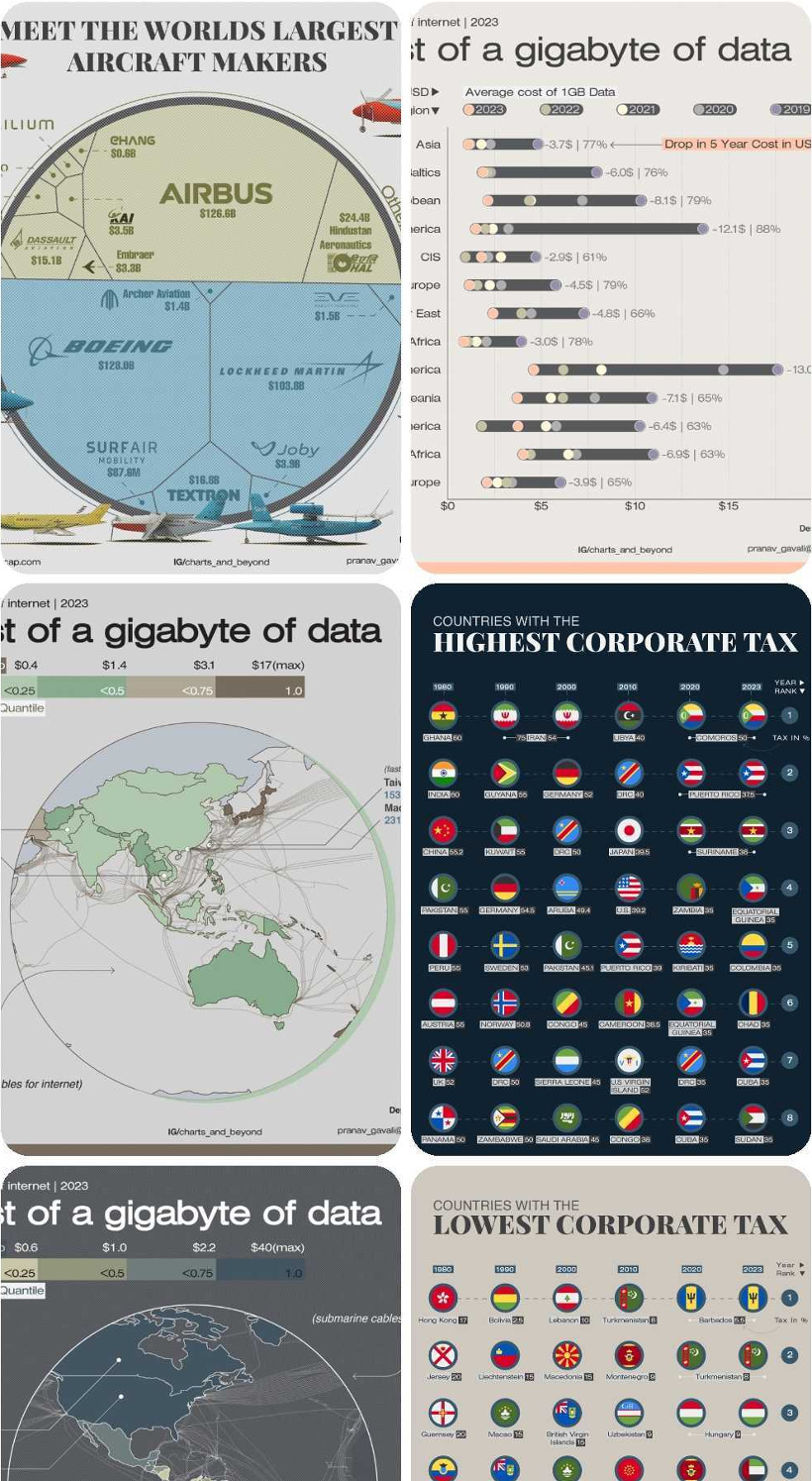
Pranav has been sharing many interesting datasets on Voronoi so far, including:
- The world’s largest aircraft makers
- The cost of a gigabyte of data in different countries
- The countries with the highest and lowest corporate taxes
- The largest solar power plants
Pranav is definitely worth a follow on the app, and we can’t wait to see what he posts next!
![]() View all of Pranav’s visuals on Voronoi today.
View all of Pranav’s visuals on Voronoi today.
MOST VIEWED
GDP Growth Projections for the G20 in 2024
How are the world’s biggest economies expected to do in 2024?
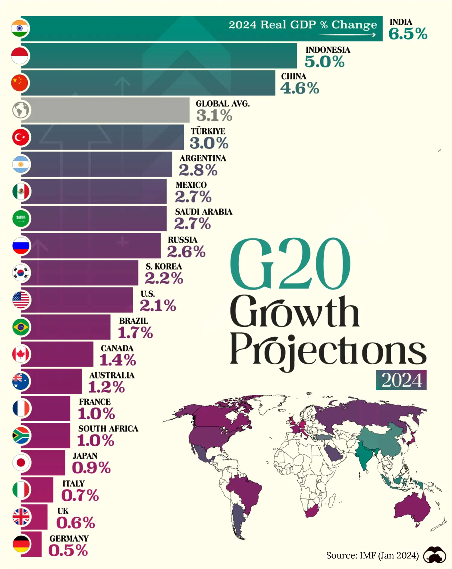
This visualization from Visual Capitalist was one of the most viewed by users, and it shows where global growth is happening in some of the world’s most crucial economies.
Interestingly, just three economies (India, China, Indonesia) sit above the average rate of 3.1%.
![]() Get the data behind this visual on Voronoi today.
Get the data behind this visual on Voronoi today.
MOST DISCUSSED
Panama Canal Traffic by Shipment Category and Tonnage
The most commented on visualization from Visual Capitalist showed annual traffic through the Panama Canal, and how it breaks down by shipment category and tonnage total.
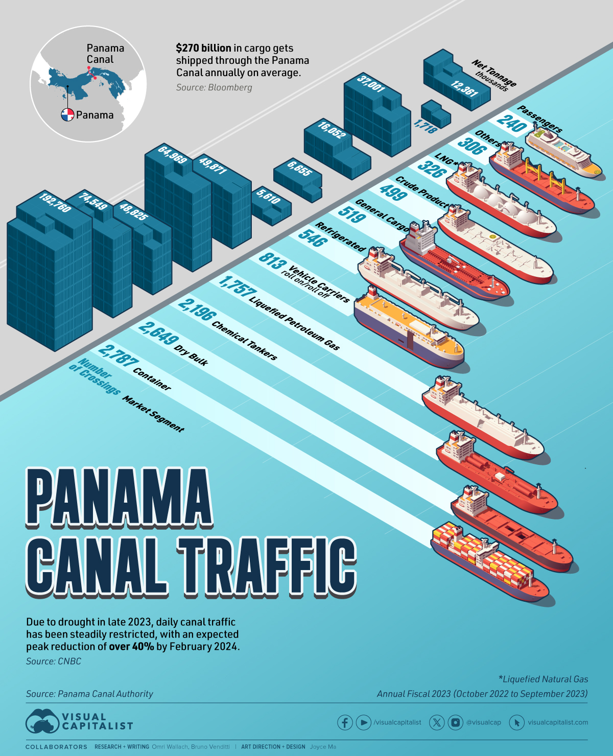
Various developments, including the Houthi attacks in the Red Sea, have led to a recent spotlight on shipping choke points around the world.
Users wondered if similar visuals for the Suez Canal are in the works, while other users remarked that it was unique to use ship illustrations to chart the data in this instance.
![]() To join the conversation, download Voronoi today.
To join the conversation, download Voronoi today.
MOST LIKED
Global Uranium Reserves
The most liked visual on Voronoi in February came from Visual Capitalist, showing the world’s uranium reserves.
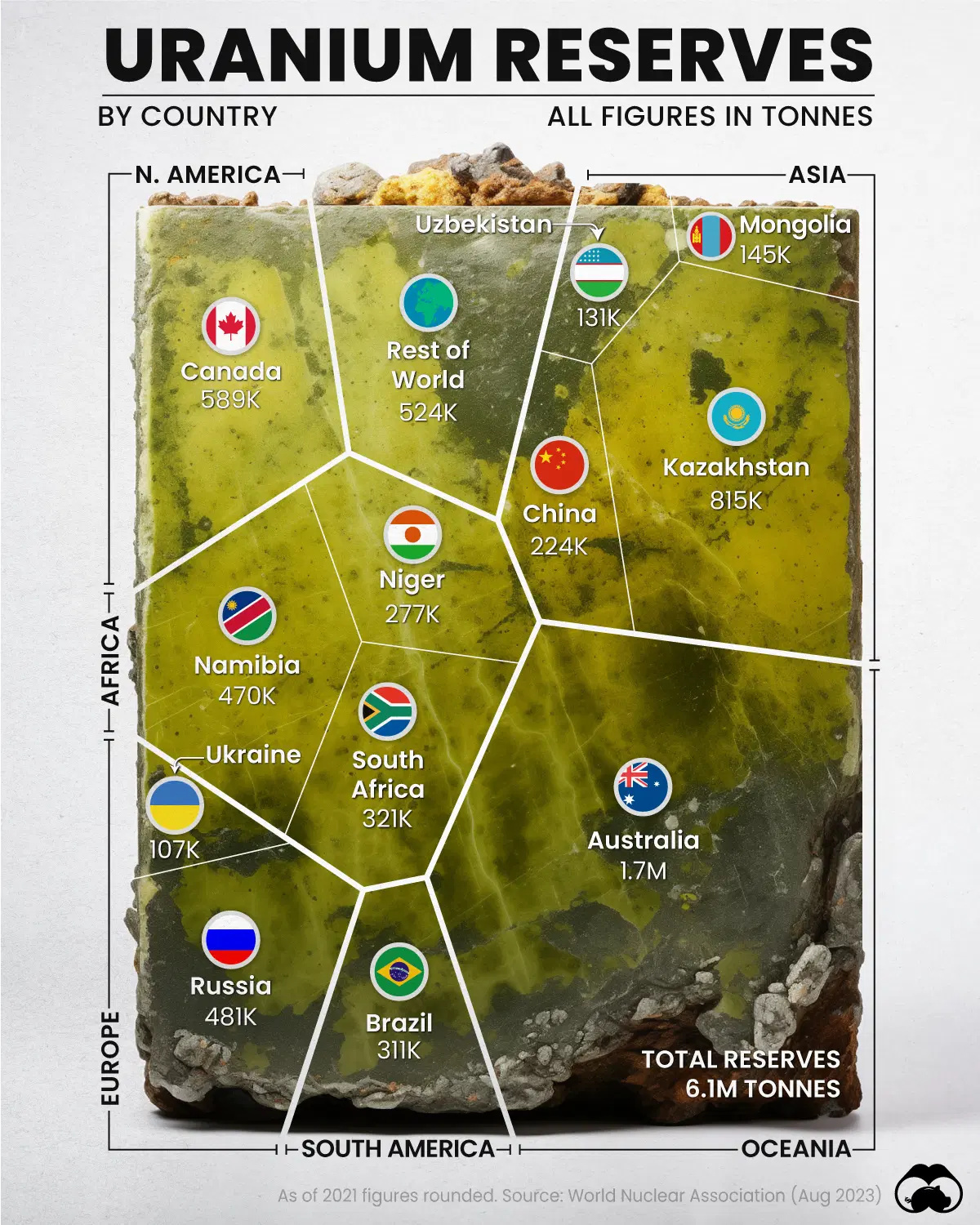
The data here is pretty interesting. Australia has the most reserves of uranium, yet only ranks in fourth place in global production.
Meanwhile, Kazakhstan ranks second in reserves, but is the world’s biggest producer by far with a 45% share of global production.
![]() Get the data behind this visual on Voronoi today.
Get the data behind this visual on Voronoi today.


Best of
Best Visualizations of April on the Voronoi App
We round up the most popular, most discussed, and most liked visualizations of the month on Voronoi, our new data storytelling platform.
At the end of 2023, we publicly launched Voronoi, our free new data discovery app!
The initial response from both users and creators has been incredible. We now have millions of in-app views, and there are already more than 1,000 interesting visualizations to discover, many of which will never be published on Visual Capitalist.
For that reason, we’ve chosen to highlight some of the most popular visualizations and creators from April in this roundup. To see them and many others, make sure to download the app!
Let’s take a look at a popular creator worth highlighting, as well as the most viewed, most discussed, and most liked posts of the month.
POPULAR CREATOR
Our World in Data
Visual Capitalist isn’t the only creator on the Voronoi app.
Instead, it features incredible data-driven charts and stories from many of the world’s best data sources, like Our World in Data.
Our World in Data is one of the world’s most important public repositories of data online, covering a wide range of subjects on economics, demographics, history, health, and more.
On Voronoi, you can find a growing collection of visuals from Our World in Data, showing:
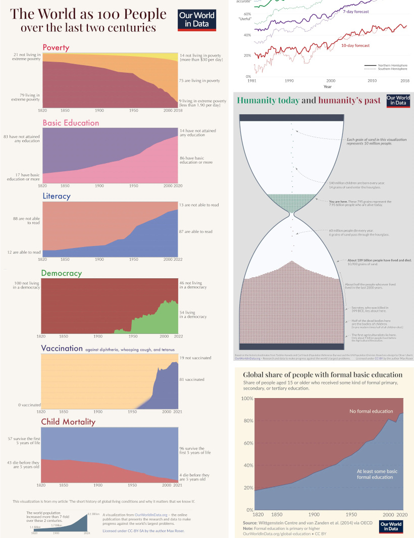
- Why weather forecasts are getting better over time
- Expected growth of the global population until the year 2100
- All of the humans that have ever lived, quantified
- Global poverty charted from 1977 until today
We highly recommend following Our World in Data on the app!
![]() View all of Our World in Data’s visuals on Voronoi today.
View all of Our World in Data’s visuals on Voronoi today.
MOST VIEWED
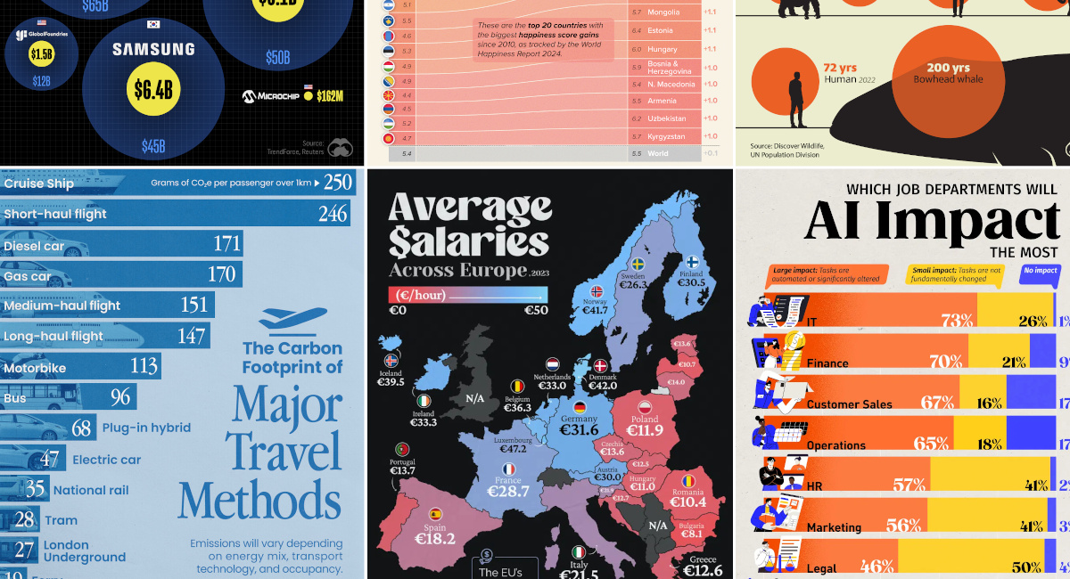
Mapped: Average Salaries in Europe
Europe is economically diverse.
Yes, the cost of living can be cheaper or more expensive depending where you go, but so are average wages:
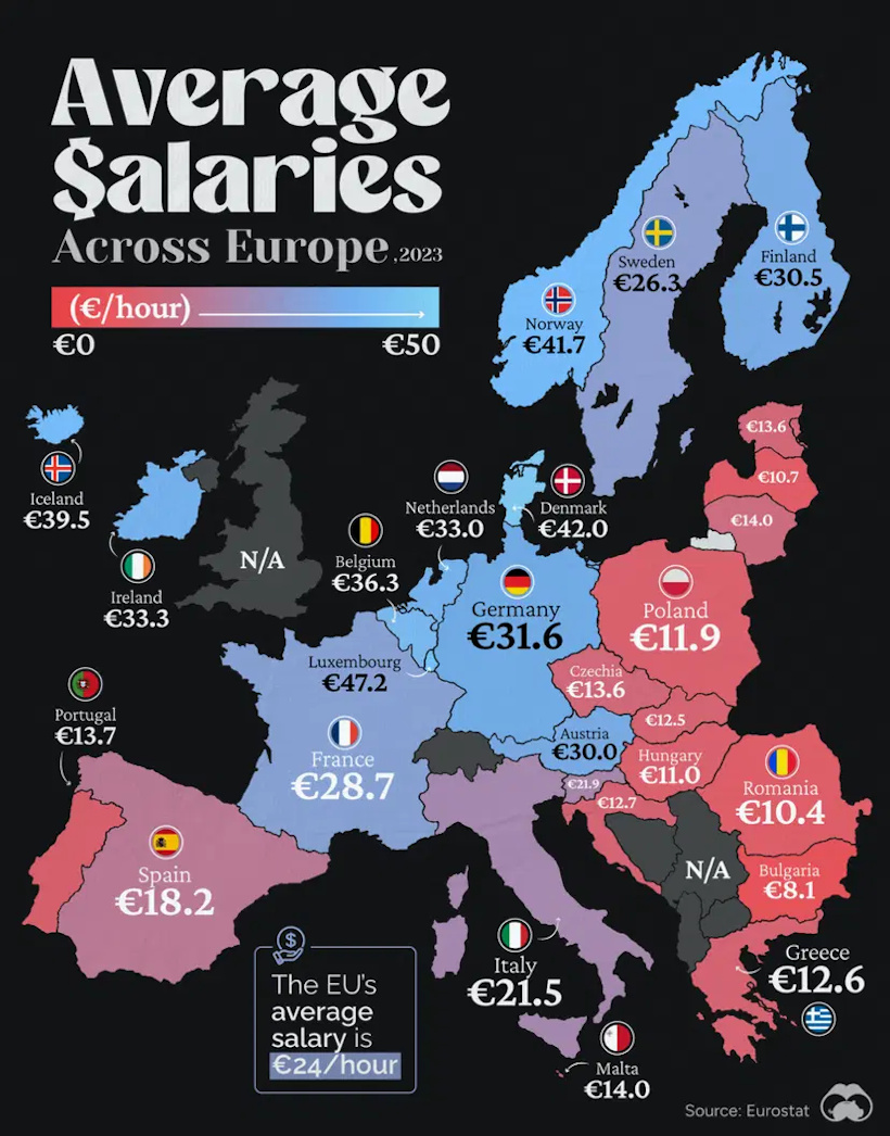
This visualization from Visual Capitalist resonated with our viewership this past month, garnering more views than any other visual published in April.
![]() Get the data behind this visual on Voronoi today.
Get the data behind this visual on Voronoi today.
MOST DISCUSSED
The Carbon Footprint of Travel
The most commented on visualization from Visual Capitalist showed the carbon footprints of many different common travel options.
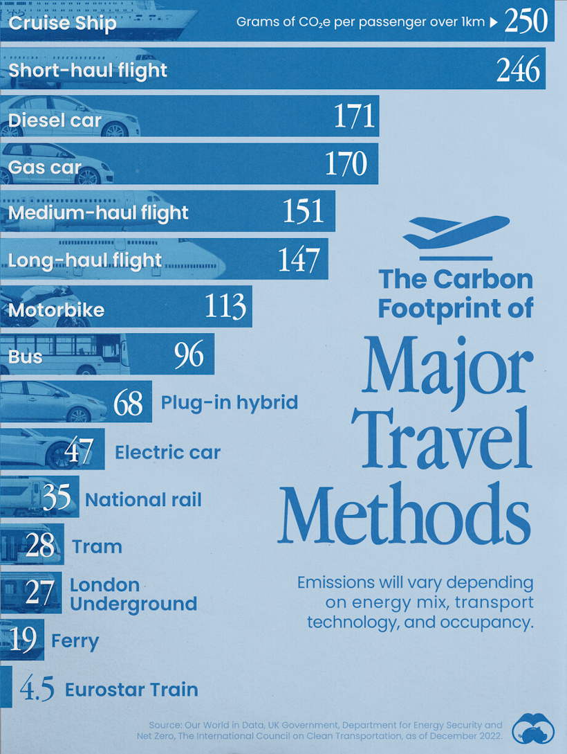
Interestingly, the most carbon-intensive form of transportation is cruise ships, and after that falls short-haul flights, gas-powered cars, and other options.
Commenting users wondered about ethanol-powered vehicles, which were not in the data set. They also asked how adding (or subtracting) passengers would affect the data.
![]() To join the conversation, download Voronoi today.
To join the conversation, download Voronoi today.
MOST LIKED
The Jobs Most Impacted by Artificial Intelligence
The most liked visual on Voronoi in April came from Visual Capitalist, showing the job departments that are most likely to be impacted by AI.
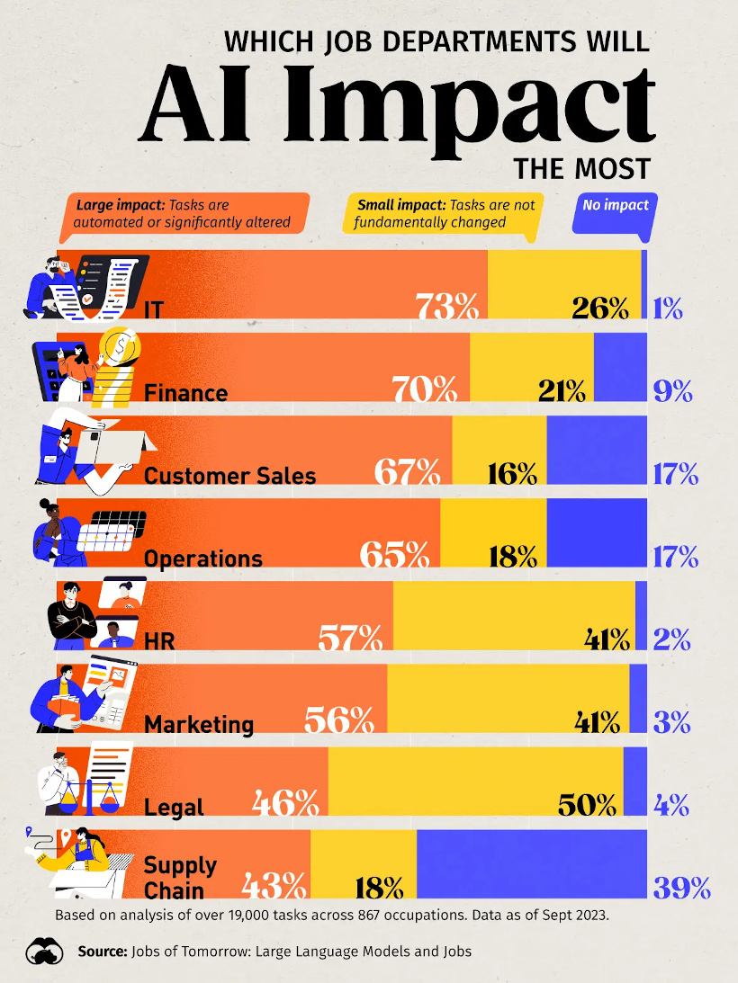
The data comes from an analysis of over 19,000 tasks across 867 occupations, and has IT and finance as the occupation areas most likely to be affected.
![]() Get the data behind this visual on Voronoi today.
Get the data behind this visual on Voronoi today.
-
 United States6 days ago
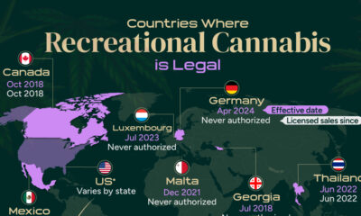
Mapped: Countries Where Recreational Cannabis is Legal
-
 Healthcare2 weeks ago
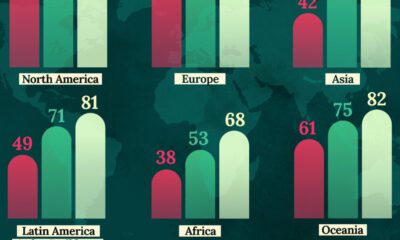
Life Expectancy by Region (1950-2050F)
-
 Markets2 weeks ago
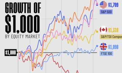
The Growth of a $1,000 Equity Investment, by Stock Market
-
 Markets2 weeks ago
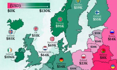
Mapped: Europe’s GDP Per Capita, by Country
-

 Money2 weeks ago
Charted: What Frustrates Americans About the Tax System
-
 Technology2 weeks ago
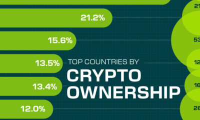
Countries With the Highest Rates of Crypto Ownership
-

 Mining2 weeks ago
Where the World’s Aluminum is Smelted, by Country
-

 Personal Finance1 week ago
Visualizing the Tax Burden of Every U.S. State