Mapped: The 10 U.S. States With the Lowest Real GDP Growth
Ranked: The World’s 50 Largest Private Equity Firms
Top 10 Countries Most in Debt to the IMF
Ranked: The Top 6 Economies by Share of Global GDP (1980-2024)
Mapped: Europe’s GDP Per Capita, by Country
Countries With the Highest Rates of Crypto Ownership
Mapped: The Number of AI Startups By Country
All of the Grants Given by the U.S. CHIPS Act
Visualizing AI Patents by Country
How Tech Logos Have Evolved Over Time
Visualizing America’s Average Retirement Savings, by Age
Visualizing the Tax Burden of Every U.S. State
Charted: What Frustrates Americans About the Tax System
Ranked: The Top 20 Countries in Debt to China
Mapped: Countries Where Recreational Cannabis is Legal
Which Countries Have the Highest Infant Mortality Rates?
Life Expectancy by Region (1950-2050F)
What Causes Preventable Child Deaths?
The Cost of an EpiPen in Major Markets
Who’s Building the Most Solar Energy?
Mapped: The Age of Energy Projects in Interconnection Queues, by State
Ranked: The Top 10 EV Battery Manufacturers in 2023
The World’s Biggest Nuclear Energy Producers
The World’s Biggest Oil Producers in 2023
Mapped: The Top Exports in Asian Countries
Mapped: U.S. States By Number of Cities Over 250,000 Residents
Mapped: U.S. Immigrants by Region
The Biggest Salt Producing Countries in 2023
Visualizing Copper Production by Country in 2023
Where the World’s Aluminum is Smelted, by Country
Visualizing Global Gold Production in 2023
How People Get Around in America, Europe, and Asia
The Carbon Footprint of Major Travel Methods
Ranking the Top 15 Countries by Carbon Tax Revenue
Ranked: The Countries With the Most Air Pollution in 2023
Top Countries By Forest Growth Since 2001
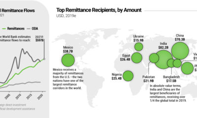
Every year, migrant workers send billions of dollars back to their home countries—reaching $550 billion in 2019. Where do these remittance flows wind up?
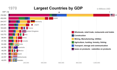
This animation looks at the top countries in the world by GDP, while also showing the components that comprised economic activity at the time.
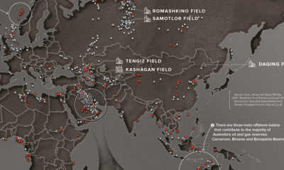
Since 1868, there had been 1,232 oil discoveries over 500 million barrels of oil. This map plots these discoveries to reveal global energy hot spots.
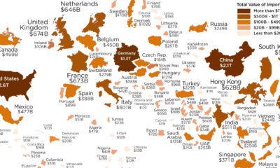
Which economies are the world's biggest importers of goods? See for yourself in this visualization, which resizes countries based on the value of imports.
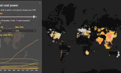
Today’s interactive map shows all of the world's coal power plants, plotted by capacity and carbon emissions from 2000 until 2018.
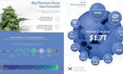
The Big Pharma industry is entering the cannabis space, by swapping patients for patents. But what are the impacts of such a takeover?
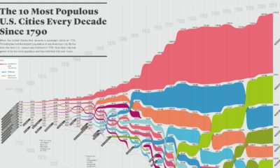
How has the list of the most populous U.S. cities changed over time? This infographic shows the top 10 cities of every decade since the year...
This chart resizes the world's countries based on population, while organizing them based on region. See where all 7.5 billion people live.
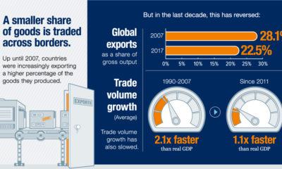
Evidence is growing that the nature of globalization is changing dramatically - and the countries, companies, and workers that benefit are changing as well.
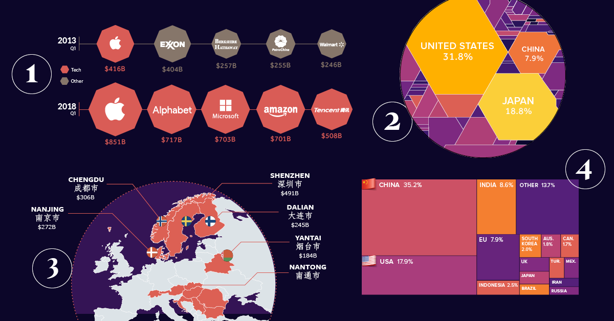
This special feature uses powerful charts and infographics to visualize the eight major forces that are shaping our global economy and the business landscape.