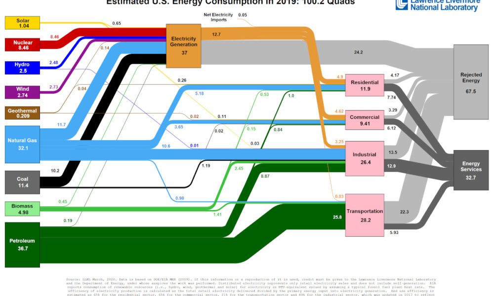
Visualizing America’s Energy Use, in One Giant Chart
This incredible flow diagram shows how U.S. energy use broke down in 2019, including by source and end sector.
Copy and paste this URL into your WordPress site to embed
Copy and paste this code into your site to embed