Money
Where Does the World’s Ultra-Wealthy Population Live Today?
Where Does the World’s Ultra-Wealthy Population Live Today?
The pandemic, geopolitical tensions, and supply chain disruptions have thrown the world into disarray in recent years, but that hasn’t stopped the world’s ultra-wealthy population from growing at a strong clip.
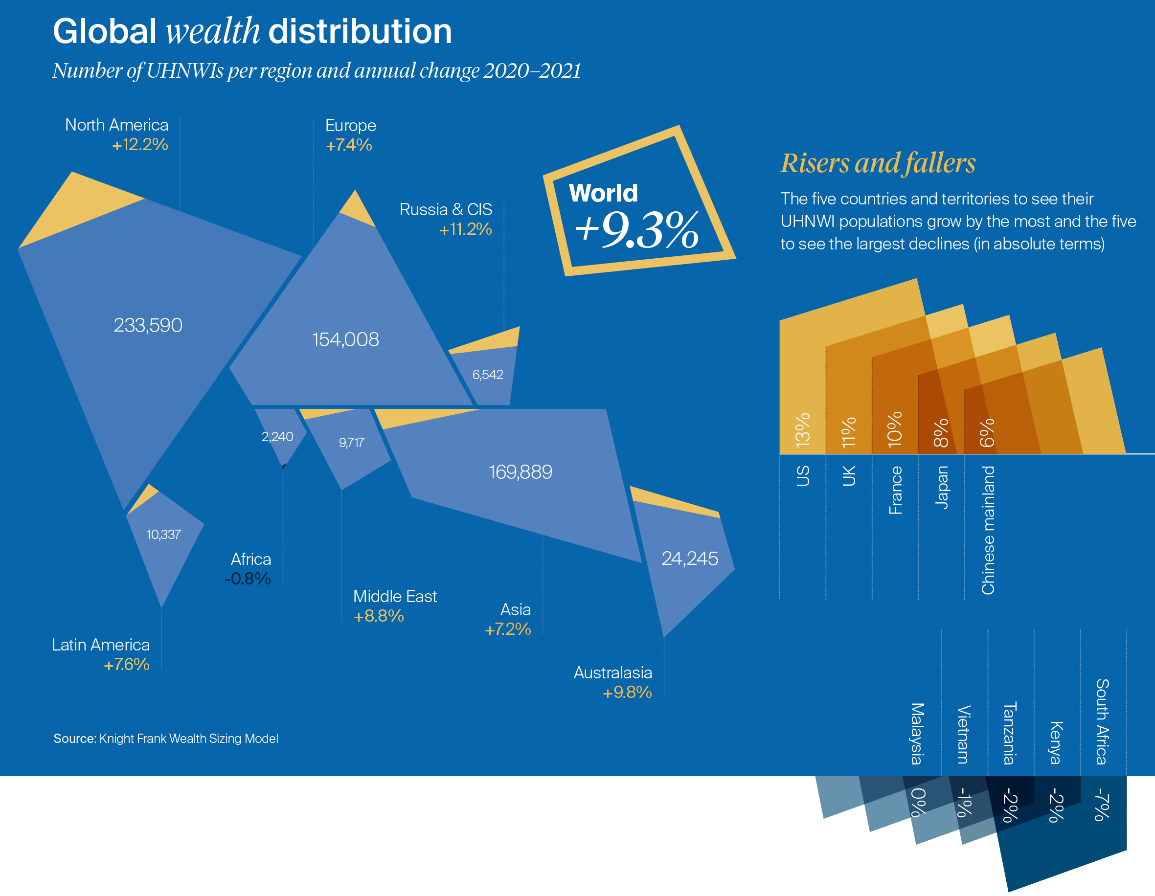
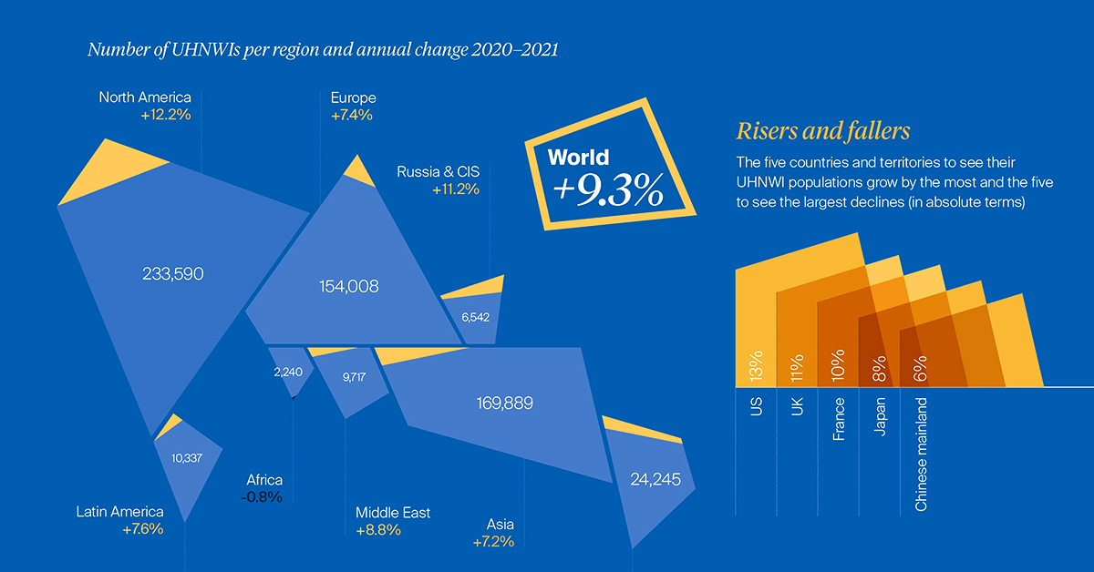
New data from this year’s Wealth Report by Knight Frank shows that the number of Ultra-High Net Worth Individuals (UHNWIs) grew 9.3% between 2020 and 2021. Nearly all regions saw an increase in ultra-wealthy people over the time period.
The above visualization from the report explores the global distribution of uber-affluent people. Below, we’ll also look at how the populations are projected to grow in the future.
The World’s Ultra-Wealthy, by Region
UHNWIs are defined as having net assets of $30 million or more, including their primary residence.
With over 230,000 UHNWIs in 2021, North America has the largest subset globally, followed by Asia at nearly 170,000. Over the last year, the ultra-wealthy population rose 12.2% and 7.2% across these regions, respectively.
| Region | UHNWIs (2021) | Change (2020–21) |
|---|---|---|
| North America | 233,590 | 12.2% |
| Asia | 169,889 | 7.2% |
| Europe | 154,008 | 7.4% |
| Australasia | 24,245 | 9.8% |
| Latin America | 10,337 | 7.6% |
| Middle East | 9,717 | 8.8% |
| Russia & CIS* | 6,542 | 11.2% |
| Africa | 2,240 | -0.8% |
| World | 610,569 | 9.3% |
*Commonwealth of Independent States
Following North America and Asia is Europe. In 2021, the top countries for the ultra-wealthy were France (30,000), Germany (28,000), U.K. (25,000) and Italy (17,000). On a per capita basis, Monaco is the highest worldwide, at five people per thousand residents.
Interestingly, the ultra-rich in Russia & CIS (6,500) grew the second fastest across all regions, at 11.2%. Rebounding oil prices, property prices, and stock market valuations likely bolstered this growth. However, the crippling sanctions and economic fallout resulting from the invasion of Ukraine could substantially impair oligarch wealth for many years to come.
Growing Fast
How will UHNWI populations change in the next five years?
Globally, the number of ultra-rich is projected to increase a staggering 28% by 2026. (Still, it’s worth noting that growth between 2016-2021 was almost three times this rate, at over 75%.)
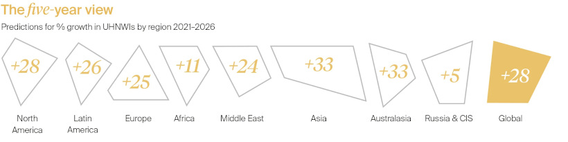
Asia is projected to have the highest growth rate, along with Australasia. In five years, UHNWIs are set to rise 33% in both regions. Singapore is projected to see its ultra-rich population grow 268%, while the ultra-rich living in mainland China are anticipated to grow over 42%.
Meanwhile, North America is projected to see 28% growth, or reaching a total of 300,000 UHNWIs by 2026.
Significant growth is also projected across Latin America. Amid rampant hyperinflation, Argentina is estimated to see a 38% expansion in its ultra-wealthy population.
Behind the Scenes
What is fueling this growth in UHNWIs worldwide?
Sky-high asset prices and a real estate boom are two drivers behind this trend, according to Knight Frank. Ultra-low interest rates, which declined during the pandemic, is another.
Given cheap borrowing costs, the ultra-wealthy have more leverage to build their wealth, such as buying more property or investing in financial assets. In fact, the average UHNWI owns 2.9 properties.
It’s worth noting that strong GDP projections often underlie wealth projections. The IMF predicts that a post-pandemic recovery will be robust. However the crisis in Ukraine could pose meaningful risks to the global economy, especially for inflation and financial markets.
For instance, Russia contributes 12% to the global oil supply, a key factor behind inflation. At the same time, Ukraine supplies 90% of America’s neon—an essential material used in the semiconductor industry—which could further exacerbate supply chain issues.


Money
How Debt-to-GDP Ratios Have Changed Since 2000
See how much the debt-to-GDP ratios of advanced economies have grown (or shrank) since the year 2000.


How Debt-to-GDP Ratios Have Changed Since 2000
This was originally posted on our Voronoi app. Download the app for free on Apple or Android and discover incredible data-driven charts from a variety of trusted sources.
Government debt levels have grown in most parts of the world since the 2008 financial crisis, and even more so after the COVID-19 pandemic.
To gain perspective on this long-term trend, we’ve visualized the debt-to-GDP ratios of advanced economies, as of 2000 and 2024 (estimated). All figures were sourced from the IMF’s World Economic Outlook.
Data and Highlights
The data we used to create this graphic is listed in the table below. “Government gross debt” consists of all liabilities that require payment(s) of interest and/or principal in the future.
| Country | 2000 (%) | 2024 (%) | Change (pp) |
|---|---|---|---|
| 🇯🇵 Japan | 135.6 | 251.9 | +116.3 |
| 🇸🇬 Singapore | 82.3 | 168.3 | +86.0 |
| 🇺🇸 United States | 55.6 | 126.9 | +71.3 |
| 🇬🇧 United Kingdom | 36.6 | 105.9 | +69.3 |
| 🇬🇷 Greece | 104.9 | 160.2 | +55.3 |
| 🇫🇷 France | 58.9 | 110.5 | +51.6 |
| 🇵🇹 Portugal | 54.2 | 104.0 | +49.8 |
| 🇪🇸 Spain | 57.8 | 104.7 | +46.9 |
| 🇸🇮 Slovenia | 25.9 | 66.5 | +40.6 |
| 🇫🇮 Finland | 42.4 | 76.5 | +34.1 |
| 🇭🇷 Croatia | 35.4 | 61.8 | +26.4 |
| 🇨🇦 Canada | 80.4 | 103.3 | +22.9 |
| 🇨🇾 Cyprus | 56.0 | 70.9 | +14.9 |
| 🇦🇹 Austria | 65.7 | 74.0 | +8.3 |
| 🇸🇰 Slovak Republic | 50.5 | 56.5 | +6.0 |
| 🇩🇪 Germany | 59.3 | 64.0 | +4.7 |
| 🇧🇪 Belgium | 109.6 | 106.8 | -2.8 |
| 🇮🇱 Israel | 77.4 | 56.8 | -20.6 |
| 🇮🇸 Iceland | 75.8 | 54.6 | -21.2 |
The debt-to-GDP ratio indicates how much a country owes compared to the size of its economy, reflecting its ability to manage and repay debts. Percentage point (pp) changes shown above indicate the increase or decrease of these ratios.
Countries with the Biggest Increases
Japan (+116 pp), Singapore (+86 pp), and the U.S. (+71 pp) have grown their debt as a percentage of GDP the most since the year 2000.
All three of these countries have stable, well-developed economies, so it’s unlikely that any of them will default on their growing debts. With that said, higher government debt leads to increased interest payments, which in turn can diminish available funds for future government budgets.
This is a rising issue in the U.S., where annual interest payments on the national debt have surpassed $1 trillion for the first time ever.
Only 3 Countries Saw Declines
Among this list of advanced economies, Belgium (-2.8 pp), Iceland (-21.2 pp), and Israel (-20.6 pp) were the only countries that decreased their debt-to-GDP ratio since the year 2000.
According to Fitch Ratings, Iceland’s debt ratio has decreased due to strong GDP growth and the use of its cash deposits to pay down upcoming maturities.
See More Debt Graphics from Visual Capitalist
Curious to see which countries have the most government debt in dollars? Check out this graphic that breaks down $97 trillion in debt as of 2023.

-

 Real Estate2 weeks ago
Visualizing America’s Shortage of Affordable Homes
-

 Technology1 week ago
Ranked: Semiconductor Companies by Industry Revenue Share
-

 Money1 week ago
Which States Have the Highest Minimum Wage in America?
-

 Real Estate1 week ago
Ranked: The Most Valuable Housing Markets in America
-

 Business2 weeks ago
Charted: Big Four Market Share by S&P 500 Audits
-

 AI2 weeks ago
The Stock Performance of U.S. Chipmakers So Far in 2024
-

 Misc2 weeks ago
Almost Every EV Stock is Down After Q1 2024
-

 Money2 weeks ago
Where Does One U.S. Tax Dollar Go?