VC+
Stay On Top of Market Trends With Our New VC+ Feature
In 2019, we launched our members’ program VC+, as a way to give our most passionate supporters even more visuals, data, and reports that help explain our complex world.

Being a data-driven brand, we’re constantly listening to and gathering insights from our thousands of subscribers in order to make the VC+ experience even more valuable.
Based on their feedback, we’re rolling out a new monthly feature at the beginning of each month, highlighting what you need to know about the coming month in markets.
Here’s a bit more information about this special monthly dispatch, and what it will entail:
“What To Know: Markets this Month”
SPECIAL DISPATCH: Everything You Need to Know for This Month in the Markets
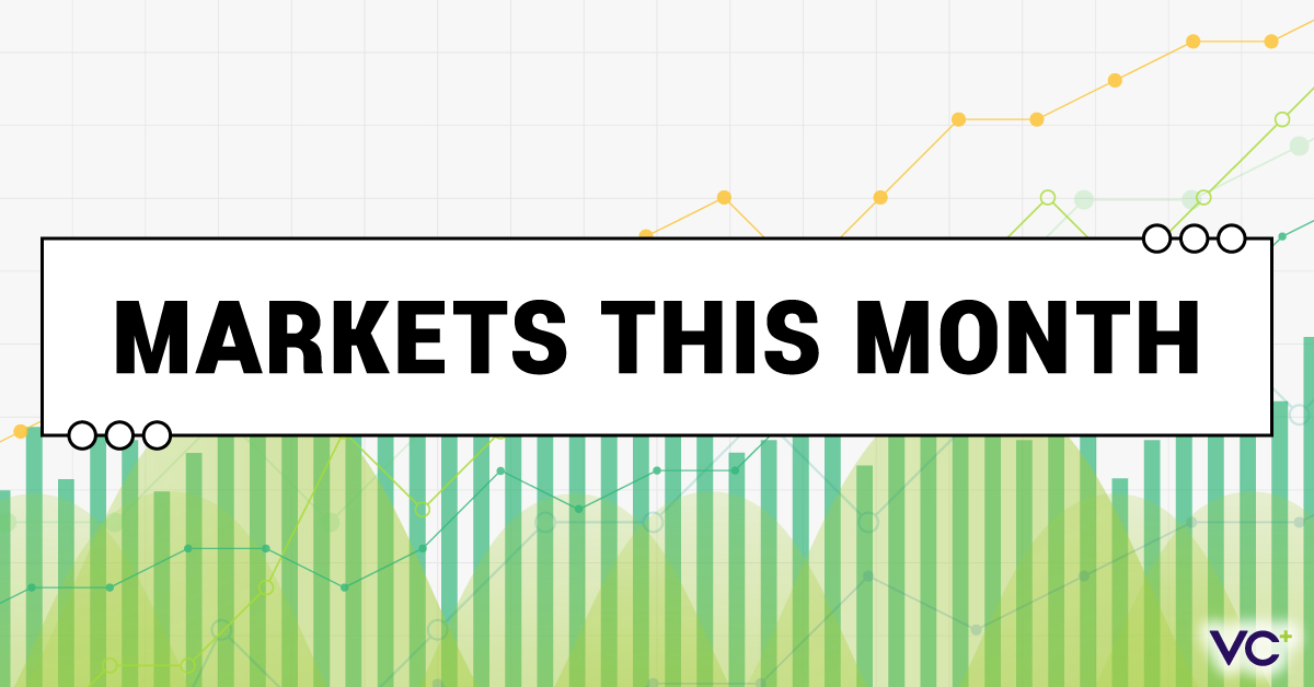
This VC+ Special Dispatch will provide a high-level summary of the most important global market trends to keep tabs on for the coming month. It’s our way of cutting through the noise and sending you data that matters—straight to your inbox.
The dispatch will include:
- An economic calendar of the biggest data and earnings releases to be aware of
- A look at how Big Tech stocks have fared since the start of 2021
- Why the mortgage rate rally might be just beginning
- And a handful of other essential charts you need to see
Coming Friday, May 6th, 2022 (Get VC+ to access)
Here’s what else is on for VC+ members in May 2022:
“Roundup: The Best of Space Content”
SPECIAL DISPATCH: Showcasing Our Favorite Graphics on Space Exploration
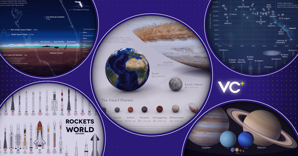
New tech and innovations are taking space exploration to new heights.
In this VC+ Special Dispatch, we’ll look back at some of our most popular space-related content, to help chronicle the latest happenings in the industry and shed light on what the future holds for galactic exploration.
Coming May 2022 (Get VC+ to access)
The Trendline
PREMIUM NEWSLETTER: Our Bi-Weekly Newsletter for VC+ Members
The Sunday Edition The Midweek Edition
The Best Visualizations Each Week The Best Data and Reports Each Week
>> View free sample >> View free sample
The Trendline is our premium newsletter sent to VC+ members twice a week.
On Sundays, we highlight the best visualizations on business, investing, and global trends that our editors have uncovered. On Thursdays in the Midweek Edition, we send you a round-up of the most interesting reports we find along with key charts and commentary.
The Trends Shaping the World—in Your Inbox
Get access to these upcoming features by becoming a VC+ member. And for a limited time, get 25% off, which makes your VC+ membership the same price as a coffee each month:
PS – We look forward to sending you even more great visuals and data!


VC+
VC+: Get Our Key Takeaways From the IMF’s World Economic Outlook
A sneak preview of the exclusive VC+ Special Dispatch—your shortcut to understanding IMF’s World Economic Outlook report.

Have you read IMF’s latest World Economic Outlook yet? At a daunting 202 pages, we don’t blame you if it’s still on your to-do list.
But don’t worry, you don’t need to read the whole April release, because we’ve already done the hard work for you.
To save you time and effort, the Visual Capitalist team has compiled a visual analysis of everything you need to know from the report—and our upcoming VC+ Special Dispatch will be available exclusively to VC+ members on Thursday, April 25th.
If you’re not already subscribed to VC+, make sure you sign up now to receive the full analysis of the IMF report, and more (we release similar deep dives every week).
For now, here’s what VC+ members can expect to receive.
Your Shortcut to Understanding IMF’s World Economic Outlook
With long and short-term growth prospects declining for many countries around the world, this Special Dispatch offers a visual analysis of the key figures and takeaways from the IMF’s report including:
- The global decline in economic growth forecasts
- Real GDP growth and inflation forecasts for major nations in 2024
- When interest rate cuts will happen and interest rate forecasts
- How debt-to-GDP ratios have changed since 2000
- And much more!

Get the Full Breakdown in the Next VC+ Special Dispatch
VC+ members will receive the full Special Dispatch on Thursday, April 25th.
Make sure you join VC+ now to receive exclusive charts and the full analysis of key takeaways from IMF’s World Economic Outlook.
Don’t miss out. Become a VC+ member today.
What You Get When You Become a VC+ Member
VC+ is Visual Capitalist’s premium subscription. As a member, you’ll get the following:
- Special Dispatches: Deep dive visual briefings on crucial reports and global trends
- Markets This Month: A snappy summary of the state of the markets and what to look out for
- The Trendline: Weekly curation of the best visualizations from across the globe
- Global Forecast Series: Our flagship annual report that covers everything you need to know related to the economy, markets, geopolitics, and the latest tech trends
- VC+ Archive: Hundreds of previously released VC+ briefings and reports that you’ve been missing out on, all in one dedicated hub
You can get all of the above, and more, by joining VC+ today.

-

 Money2 weeks ago
Which States Have the Highest Minimum Wage in America?
-

 Misc1 week ago
Airline Incidents: How Do Boeing and Airbus Compare?
-

 Environment1 week ago
Top Countries By Forest Growth Since 2001
-

 United States2 weeks ago
Where U.S. Inflation Hit the Hardest in March 2024
-

 Demographics2 weeks ago
The Smallest Gender Wage Gaps in OECD Countries
-

 Markets2 weeks ago
The Top 10 States by Real GDP Growth in 2023
-

 Countries2 weeks ago
Population Projections: The World’s 6 Largest Countries in 2075
-

 Travel2 weeks ago
Ranked: The World’s Top Flight Routes, by Revenue