Visual Capitalist
What’s Coming Up This Month on VC+?
If you’re a regular visitor to Visual Capitalist, you know that we’re your home base for data-driven, beautiful visuals that help explain a complex world.
But did you know there’s a way to get an even more out of Visual Capitalist, all while helping support the work we do?
Coming Soon on VC+
VC+ is our newly launched members program that gives you exclusive access to extra visual content and insightful special features. It also gets you access to The Trendline, our new members-only graphic newsletter.
So, what is getting sent to VC+ members in the coming days?
“The Juggling Act”
SPECIAL DISPATCH: How changing demographics are shaping our economic future
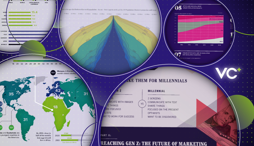
They say “demographics are destiny”…
And when it comes to predicting global trends in business, such a phrase could not ring more true. The fact is, the major shifts in populations that occur over time can be difference makers for the future of the global economy.
In this VC+ special dispatch, our editors have rounded up our very best infographics, charts, and data visualizations that show how the world is changing from this perspective, and the economic challenges these trends are creating.
Publishing date: Tomorrow, Nov 21 (Get VC+ to access)
The Evolution of a Visual Capitalist Concept
SPECIAL DISPATCH: How our “World Debt” chart came to be
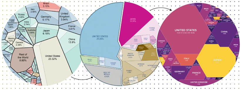
How does the Visual Capitalist team translate complex data into intuitive visual concepts?
There is no simple answer to this question, but in this upcoming special feature, we aim to put you behind the scenes in our process. Specifically, we will look at the evolution of our popular World Debt visualization, which has been a mainstay for years.
Publishing date: Dec 5, 2019 (Get VC+ to access)
The Trendline
PREMIUM NEWSLETTER: Our weekly members-only newsletter for VC+ members
Every week, VC+ members also get our premium graphic newsletter, The Trendline.
With The Trendline, we’ll send you the best visual content, datasets, and insightful reports relating to business that our editors find each week.
Publishing Date: Every Sunday
More Visuals. More Insight. More Understanding.
Get access to these upcoming features by becoming a VC+ member.
For a limited time, get 25% off, which makes your VC+ membership the same price as a coffee each month:
PS – We look forward to sending you even more great visuals and data!


Best of
Best Visualizations of March on the Voronoi App
We round up the most popular, most discussed, and most liked visualizations of the month on Voronoi, our new data storytelling platform.
At the end of 2023, we publicly launched Voronoi, our free new data discovery app!
The initial response from both users and creators has been incredible. We now have millions of in-app views, and there are already more than 700 interesting visualizations to discover, many of which will never be published on Visual Capitalist.
For that reason, we’ve chosen to highlight some of the most popular visualizations and creators from March in this roundup. To see them and many others, make sure to download the app!
Let’s take a look at a popular creator worth highlighting, as well as the most viewed, most discussed, and most liked posts of the month.
POPULAR CREATOR
Ehsan Soltani
Visual Capitalist isn’t the only creator on the Voronoi app.
Instead, it features incredible data-driven charts and stories from many of the world’s best creators, like Ehsan Soltani.
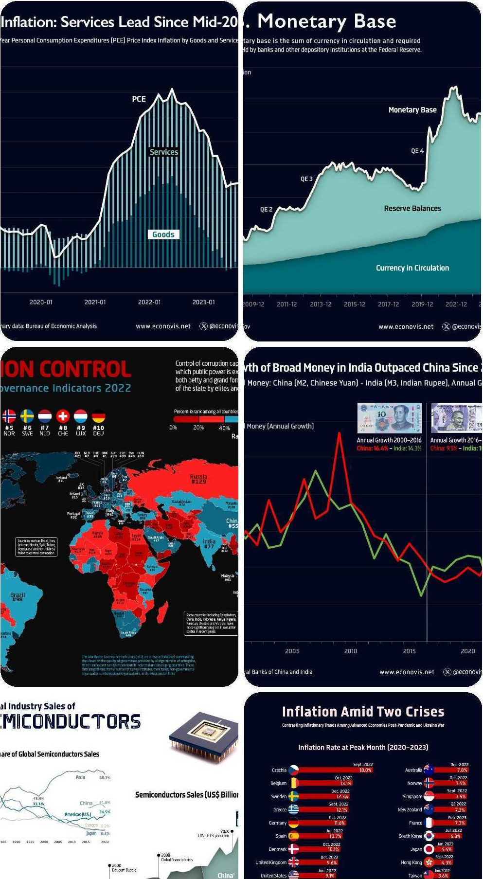
Ehsan is an economist, and one of the most prolific creators on Voronoi so far. He’s published 41 visualizations on wide-ranging subjects such as:
- The world’s biggest “money printer” economies
- Global commodity returns
- Corruption by country
- Inflation rates in advanced economies
For those interested in what’s happening with the global economy, Ehsan Soltani is definitely worth a follow!
![]() View all of Ehsan’s visuals on Voronoi today.
View all of Ehsan’s visuals on Voronoi today.
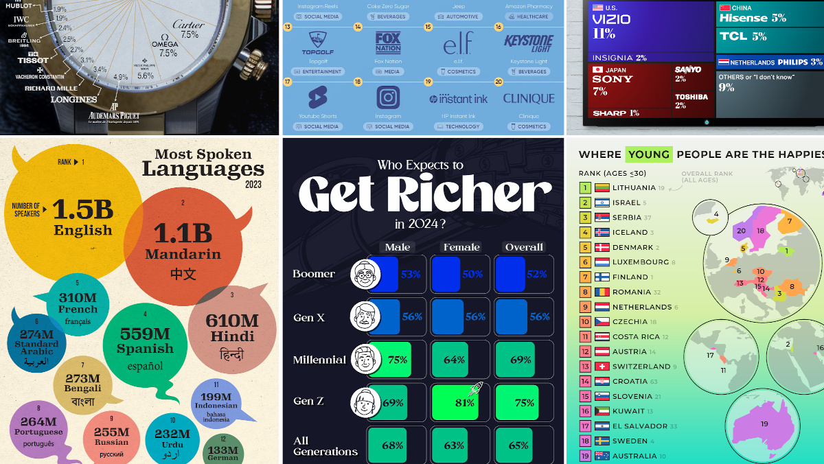
MOST VIEWED
The 12 Most Spoken Languages in 2023
Which languages are most commonly spoken around the world by native speakers?
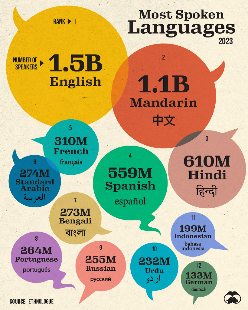
This visualization from Visual Capitalist was one of the most viewed by users, and it highlights the top languages spoken around the world.
Data here comes from the Ethnologue database, the most rigorous and comprehensive language database globally. It’s worth noting that it highlights languages spoken by native speakers only, so second languages are not counted here.
![]() Get the data behind this visual on Voronoi today.
Get the data behind this visual on Voronoi today.
MOST DISCUSSED
Where Young People are Happiest
The most commented on visualization from Visual Capitalist showed the countries with the happiest young people (under 30 years old).
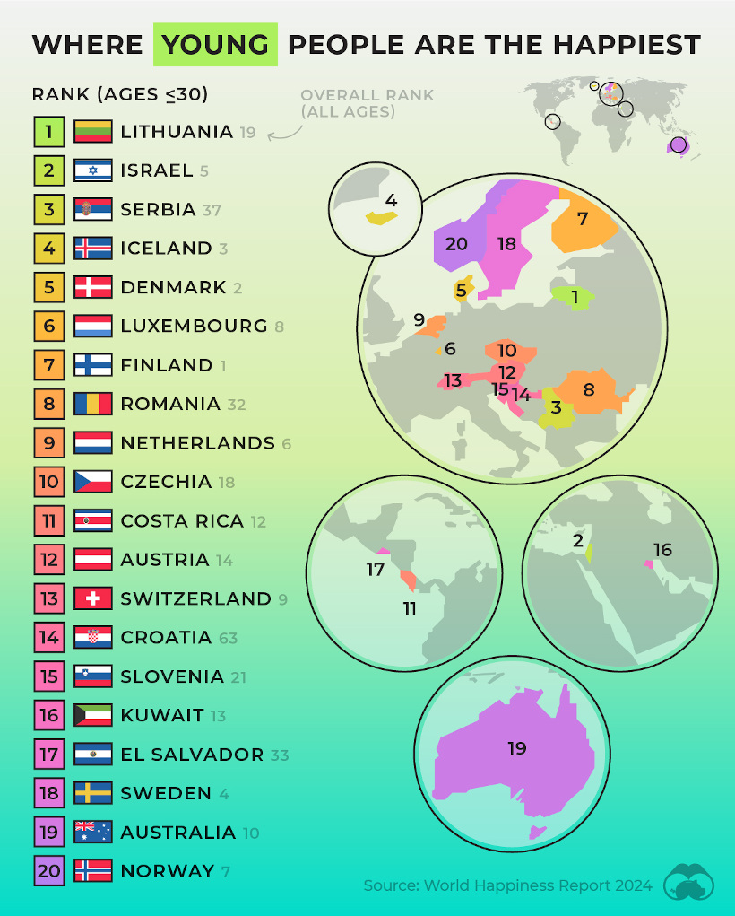
This comes from the World Happiness Report, which Visual Capitalist covers extensively every year.
In this year’s edition, one particularly interesting feature focused on happiness discrepancies between age groups. For example, in some countries, younger people were much happier than the average population—in others, older populations were far happier.
![]() To join the conversation, download Voronoi today.
To join the conversation, download Voronoi today.
MOST LIKED
The Fastest Growing Brands in the U.S.
The most liked visual on Voronoi in March came from Visual Capitalist, showing the brands that are growing the fastest in the United States.
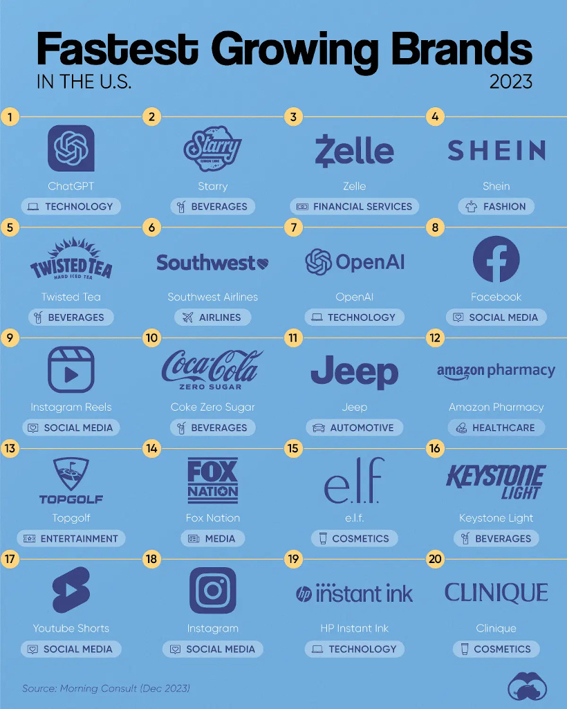
The data here comes from Morning Consult, and shows the share of customers that were considering purchasing a brand in October 1-24, 2023, and subtracted the share of those who said the same between Jan 1-31, 2023.
![]() Get the data behind this visual on Voronoi today.
Get the data behind this visual on Voronoi today.

-

 Real Estate2 weeks ago
Visualizing America’s Shortage of Affordable Homes
-

 Technology1 week ago
Ranked: Semiconductor Companies by Industry Revenue Share
-

 Money2 weeks ago
Which States Have the Highest Minimum Wage in America?
-

 Real Estate2 weeks ago
Ranked: The Most Valuable Housing Markets in America
-

 Business2 weeks ago
Charted: Big Four Market Share by S&P 500 Audits
-

 AI2 weeks ago
The Stock Performance of U.S. Chipmakers So Far in 2024
-

 Misc2 weeks ago
Almost Every EV Stock is Down After Q1 2024
-

 Money2 weeks ago
Where Does One U.S. Tax Dollar Go?