Datastream
What The Data Says About Wealth Inequality
The Briefing
- Today, the top 1% of U.S. households own 31.2% of total wealth
- Data going back over 200 years suggests that wealth inequality in both the U.S. and Europe reached its peak in the early 1900s
What The Data Says About Wealth Inequality
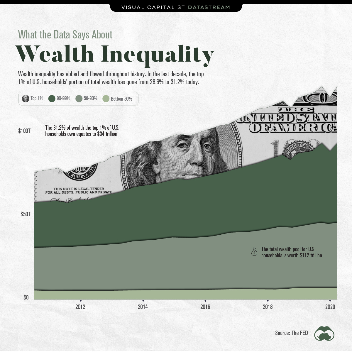
Wealth inequality has gone through peaks and troughs throughout history.
Most recently, in the decade between 2010 and 2020, the top 1% of U.S. households’ portion of wealth has gone from 28.6% to 31.2%.
However, when expressed in raw dollars, things begin to look different. Wealth during the same period for the 1% went from approximately $17.5 trillion to $35 trillion. Meanwhile, the total wealth pool rose from $60 trillion to $112 trillion.
In other words, all households by category have amassed wealth during the same period, albeit at different rates.
| Household Wealth Percentile | Annual Growth in Wealth (CAGR) |
|---|---|
| Top 1% | 6.54% |
| 90-99% | 5.75% |
| 50-90% | 4.97% |
| Bottom 50% | 3.30% |
Source: The Federal Reserve
Drivers Of Wealth Inequality
The longest bull market in history, which went from March 2009 to February 2020, has been a big driver for the recent divergence. The U.S. composition of wealth for the top 1% of households skews towards corporate equities and mutual funds, of which they collectively own $14 trillion. By contrast, the bottom 50% of households own $0.16 trillion.
It’s often said a stock market correction is long overdue. Since the top 1% of households clearly have the most skin in the game, if one were to transpire, wealth inequality would likely retract.
A Longer Term Look
Although the inequality of wealth is heavily discussed in today’s climate, the numbers have been higher before.
Wealth inequality, measured by the top 1% of U.S. households’ portion of wealth, was at its peak at the start of the 20th century. Back then, a harsh and more concrete class divide with lower rates of upward mobility were common themes.
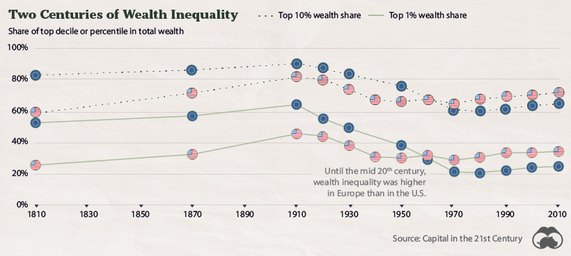
At its peak in 1910, the top 1% of U.S. households owned well over 40% of all wealth. Major world wars and the Great Depression seemed to be catalysts against this, and the years after WWII brought about some of the lowest levels of inequality seen in the modern era.
Wealth inequality has ebbed and flowed throughout history, but it has steadily crept back up in the last few decades. Today, its adverse effects continue to garner the attention of more people—including policy makers who are facing immense pressure to find a solution.
Where does this data come from?
Source: The Fed
Notes: This data covers Q2’2010-Q2’2020


Datastream
Can You Calculate Your Daily Carbon Footprint?
Discover how the average person’s carbon footprint impacts the environment and learn how carbon credits can offset your carbon footprint.
The Briefing
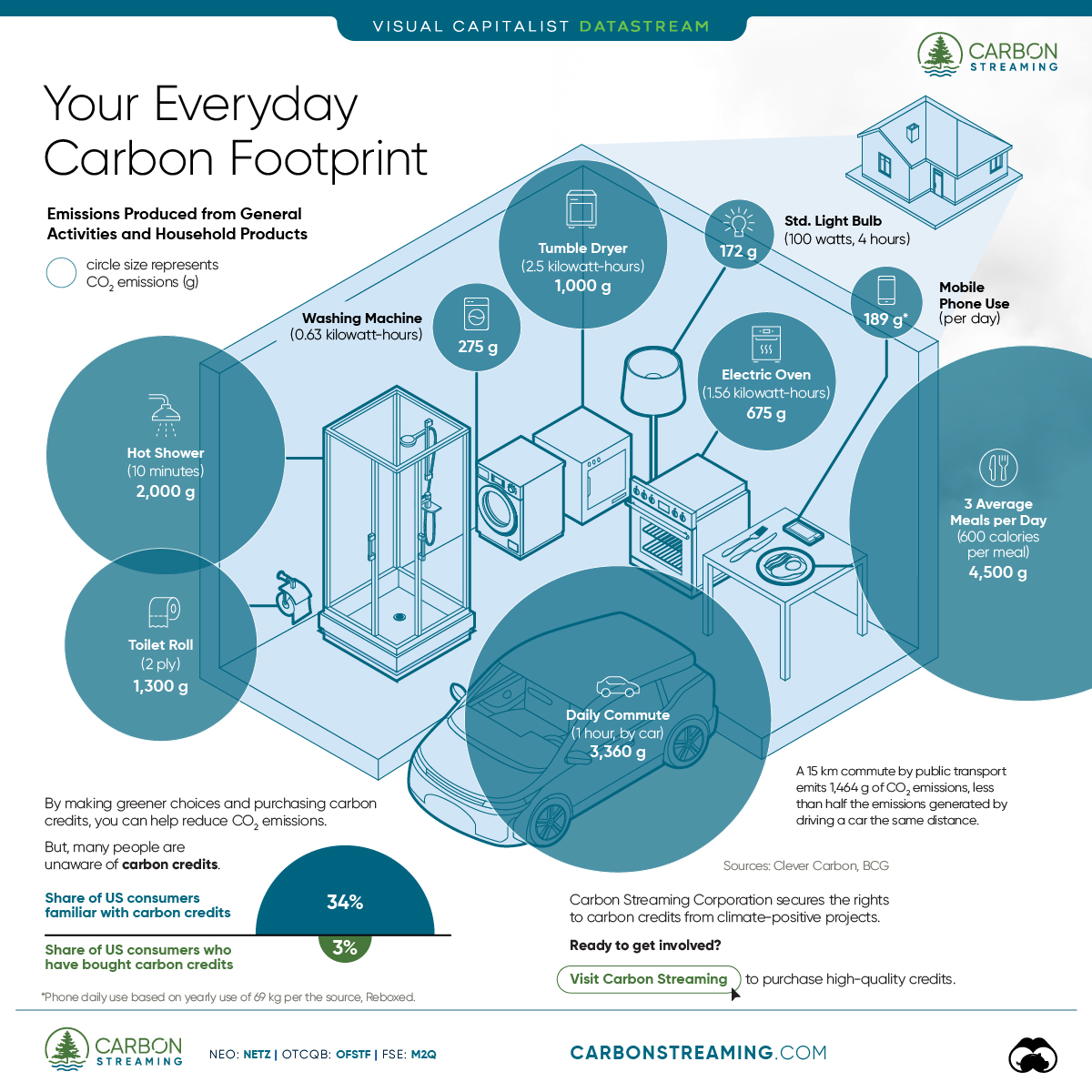
- A person’s carbon footprint is substantial, with activities such as food consumption creating as much as 4,500 g of CO₂ emissions daily.
- By purchasing carbon credits from Carbon Streaming Corporation, you can offset your own emissions and fund positive climate action.
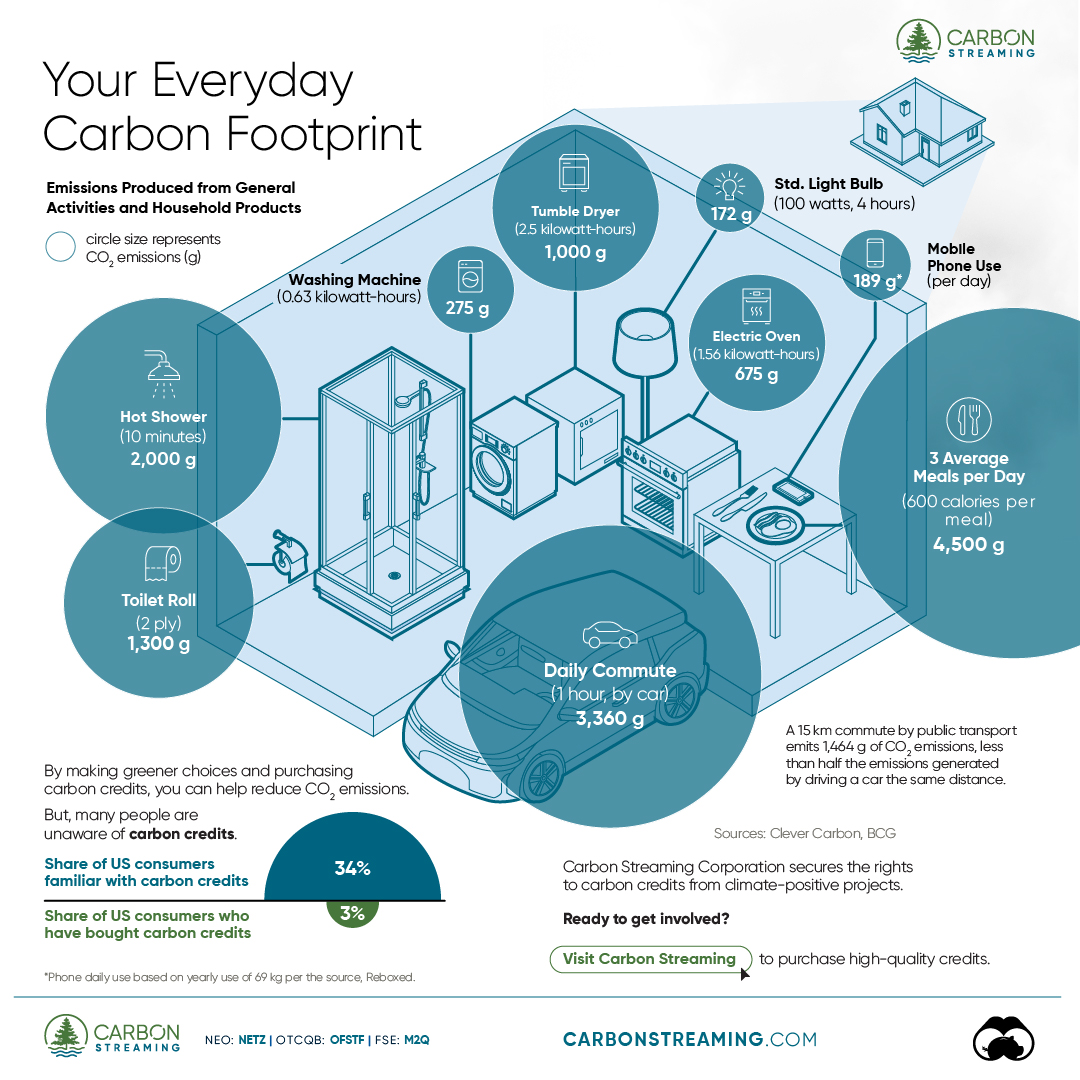
Your Everyday Carbon Footprint
While many large businesses and countries have committed to net-zero goals, it is essential to acknowledge that your everyday activities also contribute to global emissions.
In this graphic, sponsored by Carbon Streaming Corporation, we will explore how the choices we make and the products we use have a profound impact on our carbon footprint.
Carbon Emissions by Activity
Here are some of the daily activities and products of the average person and their carbon footprint, according to Clever Carbon.
| Household Activities & Products | CO2 Emissions (g) |
|---|---|
| 💡 Standard Light Bulb (100 watts, four hours) | 172 g |
| 📱 Mobile Phone Use (195 minutes per day)* | 189 g |
| 👕 Washing Machine (0.63 kWh) | 275 g |
| 🔥 Electric Oven (1.56 kWh) | 675 g |
| ♨️ Tumble Dryer (2.5 kWh) | 1,000 g |
| 🧻 Toilet Roll (2 ply) | 1,300 g |
| 🚿 Hot Shower (10 mins) | 2,000 g |
| 🚙 Daily Commute (one hour, by car) | 3,360 g |
| 🍽️ Average Daily Food Consumption (three meals of 600 calories) | 4,500 g |
| *Phone use based on yearly use of 69kg per the source, Reboxed | |
Your choice of transportation plays a crucial role in determining your carbon footprint. For instance, a 15 km daily commute to work on public transport generates an average of 1,464 g of CO₂ emissions. Compared to 3,360 g—twice the volume for a journey the same length by car.
By opting for more sustainable modes of transport, such as cycling, walking, or public transportation, you can significantly reduce your carbon footprint.
Addressing Your Carbon Footprint
One way to compensate for your emissions is by purchasing high-quality carbon credits.
Carbon credits are used to help fund projects that avoid, reduce or remove CO₂ emissions. This includes nature-based solutions such as reforestation and improved forest management, or technology-based solutions such as the production of biochar and carbon capture and storage (CCS).
While carbon credits offer a potential solution for individuals to help reduce global emissions, public awareness remains a significant challenge. A BCG-Patch survey revealed that only 34% of U.S. consumers are familiar with carbon credits, and only 3% have purchased them in the past.
About Carbon Streaming
By financing the creation or expansion of carbon projects, Carbon Streaming Corporation secures the rights to future carbon credits generated by these sustainable projects. You can then purchase these carbon credits to help fund climate solutions around the world and compensate for your own emissions.
Ready to get involved?
>> Learn more about purchasing carbon credits at Carbon Streaming

-

 Markets1 week ago
U.S. Debt Interest Payments Reach $1 Trillion
-

 Markets2 weeks ago
Ranked: The Most Valuable Housing Markets in America
-

 Money2 weeks ago
Which States Have the Highest Minimum Wage in America?
-

 AI2 weeks ago
Ranked: Semiconductor Companies by Industry Revenue Share
-

 Markets2 weeks ago
Ranked: The World’s Top Flight Routes, by Revenue
-

 Countries2 weeks ago
Population Projections: The World’s 6 Largest Countries in 2075
-

 Markets2 weeks ago
The Top 10 States by Real GDP Growth in 2023
-

 Money2 weeks ago
The Smallest Gender Wage Gaps in OECD Countries