Technology
What Happens in an Internet Minute in 2019?
During an average workday, a single minute might seem negligible.
If you’re lucky, a minute might buy you enough time to write a quick email, grab a coffee from the break room, or make small talk with a coworker.
But in other situations, a minute can also be quite extraordinary. Imagine being a quarterback in the Superbowl in overtime, or finding yourself in a life-and-death situation in which every second counts towards the outcome.
Visualizing an Internet Minute
When it comes to gauging the epic scale of the internet, it would seem that each minute leans closer to the extraordinary side of the spectrum.
Today’s infographic from @LoriLewis and @OfficiallyChadd aggregates the online activity of billions of people globally, to see what an internet minute looks like.
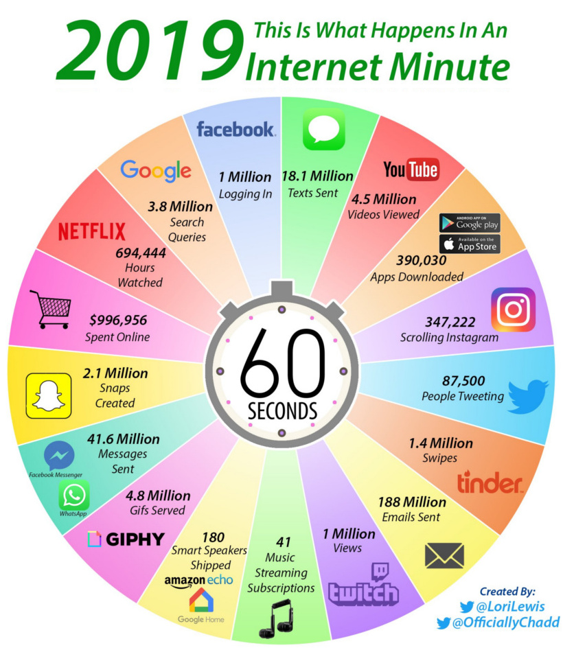
How is it possible that 188 millions of emails are sent every minute? How does Google process 3.8 million search queries in such a short span of time?
Simply put, the number of actions packed into just 60 seconds is extraordinary.
A Side-by-Side Comparison
The internet is incredibly dynamic, which means there are always new and interesting segments that are emerging out of the internet’s ether.
To get a sense of this, take a look at the comparison of last year’s version of this graphic with the more recent entry:
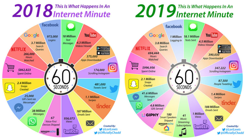
Platforms such as Instagram and Netflix continue to grow at a blistering pace, while new categories such as smart speakers are quickly building a strong foundation for the future.
Last year, for example, only 67 voice-first devices were being shipped per minute – and in 2019, there are now 180 smart speakers being shipped in the same window of time.
What will this look like in 2020?
Going Sideways or Backwards
Interestingly, even as more and more people gain access to the internet around the world each year, there are still parts of the web that are plateauing or even shrinking in size.
You’ll see that Facebook logins and Google searches both increased only incrementally from last year. Further, the amount of emails getting sent is also quite stagnant, likely thanks to to the rise of workplace collaboration tools such as Slack.
Snap is another story altogether. In the last year, the app saw a decrease in millions of users due to the infamous redesign that helped torpedo the app’s rising popularity.
Regardless, we’re certain that by this time next year, an internet minute will have changed significantly yet again!


Brands
How Tech Logos Have Evolved Over Time
From complete overhauls to more subtle tweaks, these tech logos have had quite a journey. Featuring: Google, Apple, and more.


How Tech Logos Have Evolved Over Time
This was originally posted on our Voronoi app. Download the app for free on iOS or Android and discover incredible data-driven charts from a variety of trusted sources.
One would be hard-pressed to find a company that has never changed its logo. Granted, some brands—like Rolex, IBM, and Coca-Cola—tend to just have more minimalistic updates. But other companies undergo an entire identity change, thus necessitating a full overhaul.
In this graphic, we visualized the evolution of prominent tech companies’ logos over time. All of these brands ranked highly in a Q1 2024 YouGov study of America’s most famous tech brands. The logo changes are sourced from 1000logos.net.
How Many Times Has Google Changed Its Logo?
Google and Facebook share a 98% fame rating according to YouGov. But while Facebook’s rise was captured in The Social Network (2010), Google’s history tends to be a little less lionized in popular culture.
For example, Google was initially called “Backrub” because it analyzed “back links” to understand how important a website was. Since its founding, Google has undergone eight logo changes, finally settling on its current one in 2015.
| Company | Number of Logo Changes |
|---|---|
| 8 | |
| HP | 8 |
| Amazon | 6 |
| Microsoft | 6 |
| Samsung | 6 |
| Apple | 5* |
Note: *Includes color changes. Source: 1000Logos.net
Another fun origin story is Microsoft, which started off as Traf-O-Data, a traffic counter reading company that generated reports for traffic engineers. By 1975, the company was renamed. But it wasn’t until 2012 that Microsoft put the iconic Windows logo—still the most popular desktop operating system—alongside its name.
And then there’s Samsung, which started as a grocery trading store in 1938. Its pivot to electronics started in the 1970s with black and white television sets. For 55 years, the company kept some form of stars from its first logo, until 1993, when the iconic encircled blue Samsung logo debuted.
Finally, Apple’s first logo in 1976 featured Isaac Newton reading under a tree—moments before an apple fell on his head. Two years later, the iconic bitten apple logo would be designed at Steve Jobs’ behest, and it would take another two decades for it to go monochrome.

-

 Maps1 week ago
The Largest Earthquakes in the New York Area (1970-2024)
-

 Money2 weeks ago
Where Does One U.S. Tax Dollar Go?
-

 Automotive2 weeks ago
Almost Every EV Stock is Down After Q1 2024
-

 AI2 weeks ago
The Stock Performance of U.S. Chipmakers So Far in 2024
-

 Markets2 weeks ago
Charted: Big Four Market Share by S&P 500 Audits
-

 Real Estate2 weeks ago
Ranked: The Most Valuable Housing Markets in America
-

 Money2 weeks ago
Which States Have the Highest Minimum Wage in America?
-

 AI2 weeks ago
Ranked: Semiconductor Companies by Industry Revenue Share