Money
The Wealthiest and Poorest County in Every State
View a high resolution version of this graphic.
The Wealthiest and Poorest County in Every U.S. State
View the high resolution version of today’s graphic by clicking here.
The average U.S. state is made up of 62 counties.
With so many counties spread throughout each state in the nation, it’s not surprising that we can find counties that exemplify almost any part of the American experience.
In this case, we’re comparing county-level data to look at the differences in economic opportunity within each state. More specifically, we are looking at the range of median household income, which is one proxy for the difference in economic status between counties.
Disparity by State
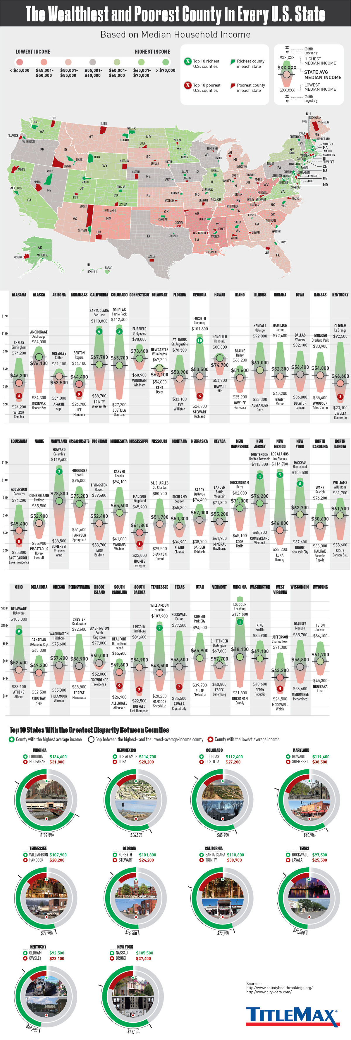
Today’s infographic comes to us from TitleMax, and it looks at the wealthiest and poorest counties in each individual U.S. state based on the measure of median household income.
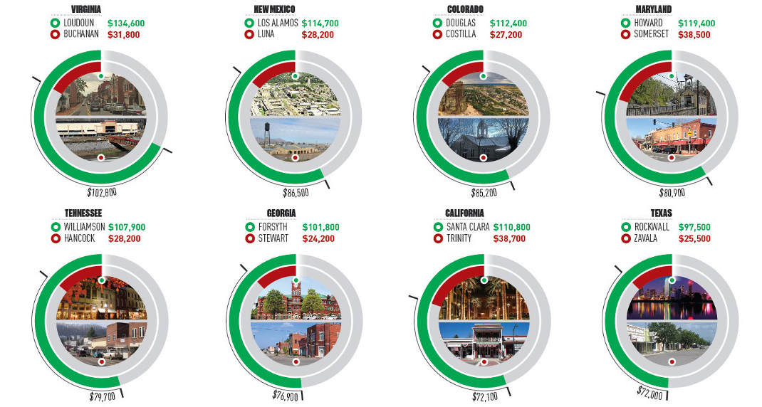
Here are the five states with the biggest disparity between rich and poor counties:
1. Virginia: $102,800
Loudoun is about an hour’s drive to D.C., and it also happens to be the richest county in the U.S. in terms of median income. Further west in the state, bordering Kentucky and West Virginia, lies Buchanan County, which has a median household income of just $31,800.
| County Name | Median Income | |
|---|---|---|
| Richest | Loudoun | $134,600 |
| Poorest | Buchanan | $31,800 |
| Differential | $102,800 |
2. New Mexico: $86,500
In Los Alamos, known as the birthplace of the atomic bomb, median household income has exploded to $114,700 – meanwhile, along the Mexico border lies Luna, the poorest county in the state.
| County Name | Median Income | |
|---|---|---|
| Richest | Los Alamos | $114,700 |
| Poorest | Luna | $28,200 |
| Differential | $86,500 |
3. Colorado: $85,200
Just like the Colorado has a difference in elevation, it also holds a large difference in median income. Folks in Douglas County, which lies between Denver and Colorado Springs, take home $112,400 in income on average, while folks in Costilla bring in about $27,200 per year.
| County Name | Median Income | |
|---|---|---|
| Richest | Douglas | $112,400 |
| Poorest | Costilla | $27,200 |
| Differential | $85,200 |
4. Maryland: $80,900
Howard County, which lies between Baltimore and Washington D.C., has the highest median household income in the state. Meanwhile, it’s Somerset County at the south of the Delmarva Peninsula that has the lowest.
| County Name | Median Income | |
|---|---|---|
| Richest | Howard | $119,400 |
| Poorest | Somerset | $38,500 |
| Differential | $80,900 |
5. Tennessee: $79,700
Just to the south of the Music City sits Williamson County – a wealthy part of the state with $107,900 in median income. Hancock County is the poorest, and it’s tucked away in the northeast corner of the state.
| County Name | Median Income | |
|---|---|---|
| Richest | Williamson | $107,900 |
| Poorest | Hancock | $28,200 |
| Differential | $79,700 |
A Note on Cost of Living
While median household income can help point to disparities between counties, it is just one indicator.
It’s worth noting that the cost of living can often be cheaper in counties with lower median incomes, and this can partially offset the difference in some instances. For example, while Trinity County is the poorest county in California by median income, it’s also far away from San Francisco, Los Angeles, or Sacramento, and has a much cheaper cost of living and a different way of life.
In some ways it is comparing apples to oranges. Trinity County is completely rural, holds zero incorporated cities, and holds just 3,600 people in its largest community (Weaverville) – a far cry from the urban sprawl of L.A. or the booming Bay Area.


Money
How Debt-to-GDP Ratios Have Changed Since 2000
See how much the debt-to-GDP ratios of advanced economies have grown (or shrank) since the year 2000.


How Debt-to-GDP Ratios Have Changed Since 2000
This was originally posted on our Voronoi app. Download the app for free on Apple or Android and discover incredible data-driven charts from a variety of trusted sources.
Government debt levels have grown in most parts of the world since the 2008 financial crisis, and even more so after the COVID-19 pandemic.
To gain perspective on this long-term trend, we’ve visualized the debt-to-GDP ratios of advanced economies, as of 2000 and 2024 (estimated). All figures were sourced from the IMF’s World Economic Outlook.
Data and Highlights
The data we used to create this graphic is listed in the table below. “Government gross debt” consists of all liabilities that require payment(s) of interest and/or principal in the future.
| Country | 2000 (%) | 2024 (%) | Change (pp) |
|---|---|---|---|
| 🇯🇵 Japan | 135.6 | 251.9 | +116.3 |
| 🇸🇬 Singapore | 82.3 | 168.3 | +86.0 |
| 🇺🇸 United States | 55.6 | 126.9 | +71.3 |
| 🇬🇧 United Kingdom | 36.6 | 105.9 | +69.3 |
| 🇬🇷 Greece | 104.9 | 160.2 | +55.3 |
| 🇫🇷 France | 58.9 | 110.5 | +51.6 |
| 🇵🇹 Portugal | 54.2 | 104.0 | +49.8 |
| 🇪🇸 Spain | 57.8 | 104.7 | +46.9 |
| 🇸🇮 Slovenia | 25.9 | 66.5 | +40.6 |
| 🇫🇮 Finland | 42.4 | 76.5 | +34.1 |
| 🇭🇷 Croatia | 35.4 | 61.8 | +26.4 |
| 🇨🇦 Canada | 80.4 | 103.3 | +22.9 |
| 🇨🇾 Cyprus | 56.0 | 70.9 | +14.9 |
| 🇦🇹 Austria | 65.7 | 74.0 | +8.3 |
| 🇸🇰 Slovak Republic | 50.5 | 56.5 | +6.0 |
| 🇩🇪 Germany | 59.3 | 64.0 | +4.7 |
| 🇧🇪 Belgium | 109.6 | 106.8 | -2.8 |
| 🇮🇱 Israel | 77.4 | 56.8 | -20.6 |
| 🇮🇸 Iceland | 75.8 | 54.6 | -21.2 |
The debt-to-GDP ratio indicates how much a country owes compared to the size of its economy, reflecting its ability to manage and repay debts. Percentage point (pp) changes shown above indicate the increase or decrease of these ratios.
Countries with the Biggest Increases
Japan (+116 pp), Singapore (+86 pp), and the U.S. (+71 pp) have grown their debt as a percentage of GDP the most since the year 2000.
All three of these countries have stable, well-developed economies, so it’s unlikely that any of them will default on their growing debts. With that said, higher government debt leads to increased interest payments, which in turn can diminish available funds for future government budgets.
This is a rising issue in the U.S., where annual interest payments on the national debt have surpassed $1 trillion for the first time ever.
Only 3 Countries Saw Declines
Among this list of advanced economies, Belgium (-2.8 pp), Iceland (-21.2 pp), and Israel (-20.6 pp) were the only countries that decreased their debt-to-GDP ratio since the year 2000.
According to Fitch Ratings, Iceland’s debt ratio has decreased due to strong GDP growth and the use of its cash deposits to pay down upcoming maturities.
See More Debt Graphics from Visual Capitalist
Curious to see which countries have the most government debt in dollars? Check out this graphic that breaks down $97 trillion in debt as of 2023.

-

 Green2 weeks ago
Ranked: Top Countries by Total Forest Loss Since 2001
-

 Travel1 week ago
Ranked: The World’s Top Flight Routes, by Revenue
-

 Technology2 weeks ago
Ranked: Semiconductor Companies by Industry Revenue Share
-

 Money2 weeks ago
Which States Have the Highest Minimum Wage in America?
-

 Real Estate2 weeks ago
Ranked: The Most Valuable Housing Markets in America
-

 Markets2 weeks ago
Charted: Big Four Market Share by S&P 500 Audits
-

 AI2 weeks ago
The Stock Performance of U.S. Chipmakers So Far in 2024
-

 Automotive2 weeks ago
Almost Every EV Stock is Down After Q1 2024