Urbanization
Visualizing the Material Impact of Global Urbanization
![]() Subscribe to the Elements free mailing list for more like this
Subscribe to the Elements free mailing list for more like this


Visualizing the Material Impact of Global Urbanization
This was originally posted on Elements. Sign up to the free mailing list to get beautiful visualizations on natural resource megatrends in your email every week.
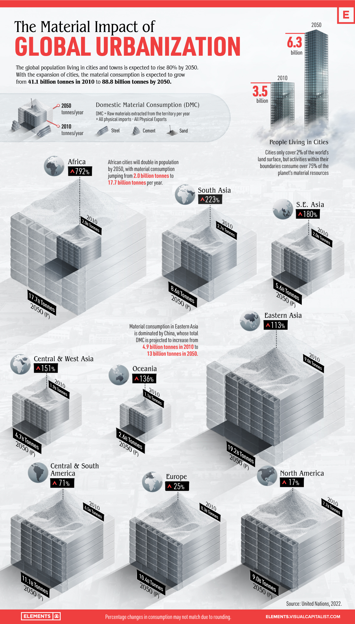
Cities only cover 2% of the world’s land surface, but activities within their boundaries consume over 75% of the planet’s material resources.
With the expansion of urban areas, the world’s material consumption is expected to grow from 41.1 billion tonnes in 2010 to about 89 billion tonnes by 2050.
In today’s graphic, we use data from the UN International Resource Panel to visualize the material impact of global urbanization.
How Material Consumption is Calculated
Today, more than 4.3 billion people or 55% of the world’s population live in urban settings, and the number is expected to rise to 80% by 2050.
Every year, the world produces an immense amount of materials in order to supply the continuous construction of human-built environments.
To calculate how much we use to build our cities, the UN uses the Domestic Material Consumption (DMC), a measure of all raw materials extracted from the domestic territory per year, plus all physical imports, minus all physical exports.
Generally, the material consumption is highly uneven across the different world regions. In terms of material footprint, the world’s wealthiest countries consume 10 times as much as the poorest and twice the global average.
Based on the total urban DMC, Eastern Asia leads the world in material consumption, with China consuming more than half of the world’s aluminum and concrete.
| Major Global Regions | 2010 Material Consumption (billion tonnes) | 2050P Material Consumption (billion tonnes) | % total urban DMC change (2010-2050P) |
|---|---|---|---|
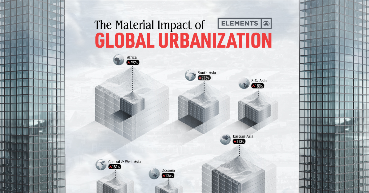
| Africa | 2.0 | 17.7 | 792% |
| Southern Asia | 2.7 | 8.6 | 223% |
| South-Eastern Asia | 2.0 | 5.6 | 180% |
| Central and Western Asia | 1.9 | 4.7 | 151% |
| Oceania | 1.1 | 2.6 | 136% |
| Eastern Asia | 9.0 | 19.2 | 113% |
| South and Central America | 6.5 | 11.1 | 71% |
| Europe | 8.3 | 10.4 | 25% |
| North America | 7.7 | 9.0 | 17% |
| World | 41.1 | 88.8 | 116% |
According to the UN, the bulk of urban growth will happen in the cities of the Global South, particularly in China, India, and Nigeria.
Consumption in Asia is set to increase as the continent hosts the majority of the world’s megacities—cities housing more than 10 million people.
However, the biggest jump in the next decades will happen in Africa. The continent is expected to double in population by 2050, with material consumption jumping from 2 billion tonnes to 17.7 billion tonnes per year.
A Resource-Efficient Future
Global urban DMC is already at a rate of 8–17 tonnes per capita per year.
With the world population expected to swell by almost two and a half billion people by 2050, new and existing cities must accommodate many of them.
This could exacerbate existing problems like pollution and carbon emissions, but it could equally be an opportunity to develop the low-carbon and resource-efficient cities of the future.


population
Vintage Viz: World Cities With 1 Million Residents (1800–1930)
From someone born in the 19th century, in the midst of historic population growth, comes this vintage visualization showing world cities growing ever bigger.
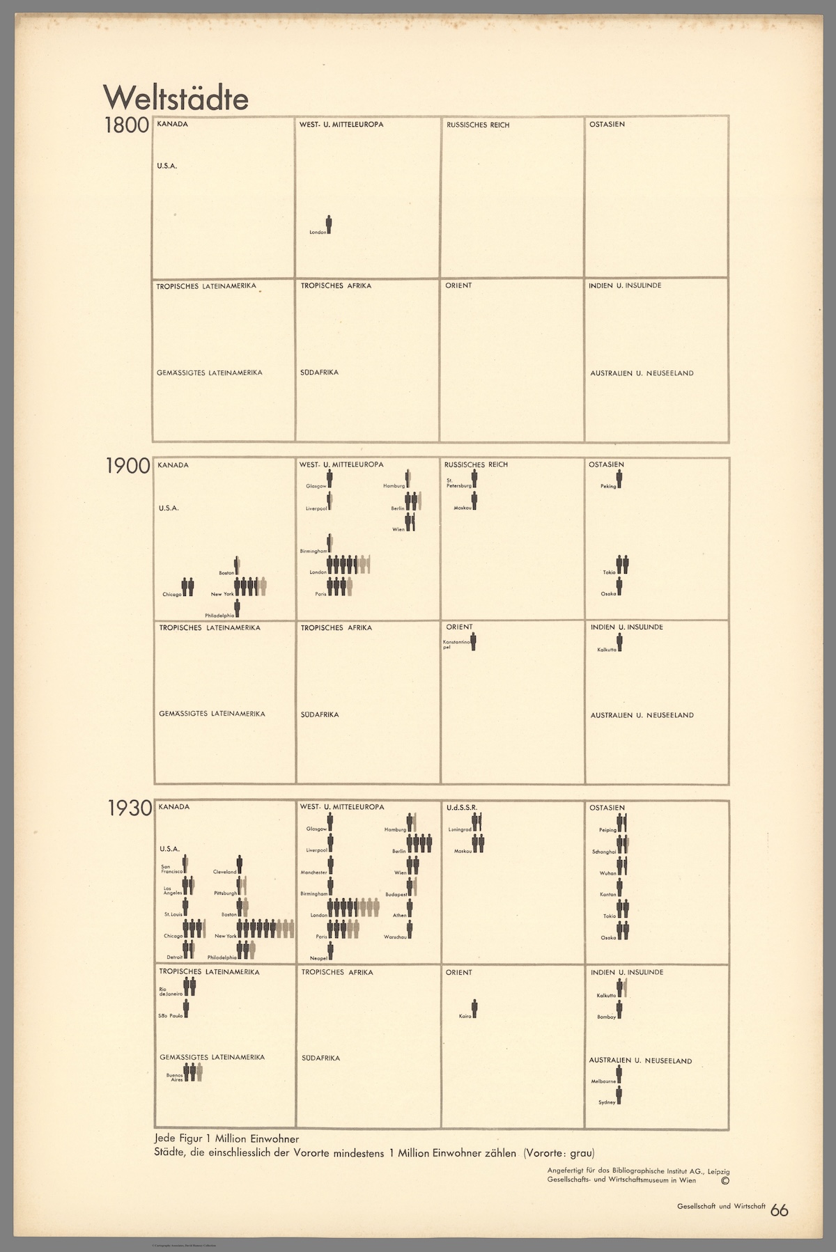
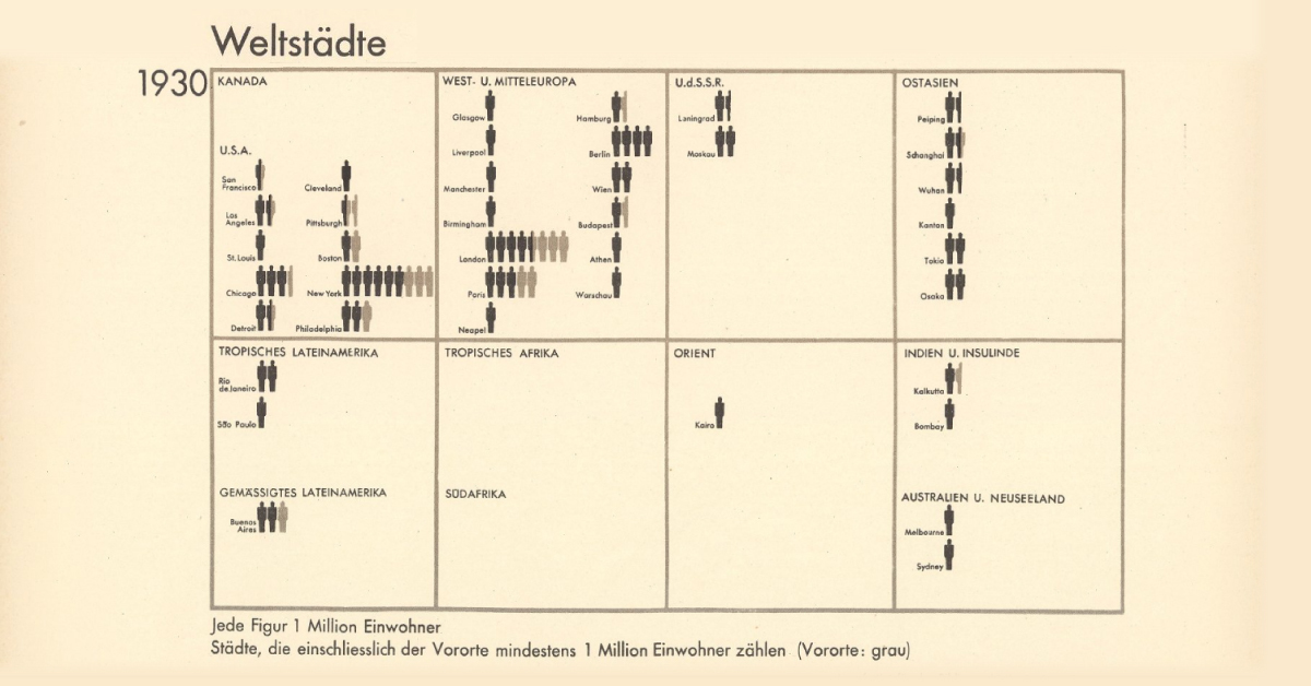
World Cities With At Least 1 Million Residents (1800–1930)
This chart is the latest in our Vintage Viz series, which presents historical visualizations along with the context needed to understand them.
The explosive world population boom in the last 300 years is common knowledge today. Much and more has been written about how and why it happened, why it was unusual, and how the specter of a declining population for the first time in three centuries could impact human society.
However, equally compelling, is how people in the past—those living in the midst of the early waves of this boom—were fascinated by what they were witnessing.
Evidence of this comes from today’s vintage visualization, denoting the increasing number of world cities with at least one million inhabitants through the years.
The above pictogram was made by Austrian philosopher and sociologist Otto Neurath (1882–1945), found in his book, Society and Economy, published in 1930.
World Population Doubles Between 1800 and 1930
In 1800, the world population crossed 1 billion for the first time ever.
In the next 130 years, it doubled past 2 billion.
The Second Agricultural Revolution, characterized by massive land and labor productivity, grew agricultural output more than the population and is one of the key drivers of this population growth.
And in the pictogram above, where one silhouette indicates one million inhabitants, this exponential population growth becomes far more vivid.
In 1800, for example, according to the creator’s estimates, only London had at least million residents. A century later, 15 cities now boasted of the same number. Then, three decades hence, 37 cities across the world had one million inhabitants.
| Year | Cities with One Million Residents |
|---|---|
| 1800 | 1 |
| 1900 | 15 |
| 1930 | 37 |
Importantly, the data above is based on the creator’s estimates from a century ago, and does not include Beijing (then referred to as Peking in English) in 1800. Historians now agree that the city had more than a million residents, and was the largest city in the world at the time.
Another phenomenon becoming increasingly apparent is growing urbanization—food surplus frees up large sections of the population from agriculture, driving specialization in other skills and trade, in turn leading to congregations in urban centers.
Other visualizations in the same book covered migration, Indigenous peoples, labor, religion, trade, and natural resources, reflecting the creator’s interest in the social life of individuals and their well-being.
Who Was Otto Neurath and What is His Legacy?
This vintage visualization might seem incredibly simple, simplistic even, considering how we map out population data today. But the creator Otto Neurath, and his wife Marie, were pioneers in the field of visual communication.
One of their notable achievements was the creation of the Vienna Method of pictorial statistics, which aimed to represent statistical information in a visually accessible way—the forerunner to modern-day infographics.
The Neuraths believed in using clear and simple visual language to convey complex information to a broad audience, an approach that laid the foundation for modern information design.
They fled Austria during the rise of the Nazi regime and spent their later years in various countries, including the UK. Otto Neurath’s influence on graphic design, visual communication, and the philosophy of language has endured, and his legacy is still recognized in these fields today.

-

 Green1 week ago
Ranked: The Countries With the Most Air Pollution in 2023
-

 Automotive2 weeks ago
Almost Every EV Stock is Down After Q1 2024
-

 AI2 weeks ago
The Stock Performance of U.S. Chipmakers So Far in 2024
-

 Markets2 weeks ago
Charted: Big Four Market Share by S&P 500 Audits
-

 Real Estate2 weeks ago
Ranked: The Most Valuable Housing Markets in America
-

 Money2 weeks ago
Which States Have the Highest Minimum Wage in America?
-

 AI2 weeks ago
Ranked: Semiconductor Companies by Industry Revenue Share
-

 Travel2 weeks ago
Ranked: The World’s Top Flight Routes, by Revenue