Markets
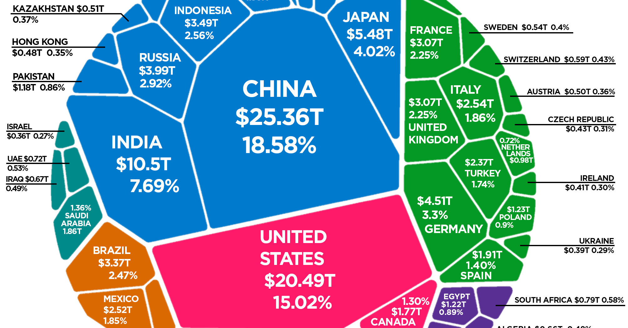
Visualizing the Composition of the World Economy by GDP (PPP)

The Composition of the World Economy by GDP (PPP)
Earlier this month, we showed you the world’s $86 trillion economy broken down by country, using nominal GDP calculations.
While this is one useful way to view the global economic picture, it’s not the only way.
Today’s visualization, which comes to us from HowMuch.net, is similar in that it also uses a Voronoi diagram to display the composition of the world economy by GDP. However, by adjusting data for purchasing power parity (PPP), it produces a very different view of how global productivity breaks down.
What is PPP?
Purchasing power parity, or PPP, is an economic theory that can be applied to adjust the prices of goods in a given market.
In essence, instead of using current market rates for prices (such as in nominal data), PPP tries to more accurately account for differences in the cost of living between countries – especially in places where labor and goods are far cheaper.
When applied to GDP measurements, PPP can help provide a more accurate picture of actual productivity. For example, a taxi ride in Bolivia may be far cheaper than one in New York City, even though it is the same service provided over the same distance.
Applying PPP to GDP figures can help correct for these types of differences.
Ranked: Economies by GDP (PPP)
After adjusting for PPP, how does the composition of the global economy change from the nominal numbers?
Below are the 15 largest economies by GDP (PPP), as well as how their ranking changed from the previous chart, which used nominal data.
| Rank | Country | GDP (2018, PPP) | Share of World Total | Change (vs. nominal rank) |
|---|---|---|---|---|
| #1 | 🇨🇳 China | $25.4 trillion | 18.6% | +1 |
| #2 | 🇺🇸 United States | $20.5 trillion | 15.0% | -1 |
| #3 | 🇮🇳 India | $10.5 trillion | 7.7% | +4 |
| #4 | 🇯🇵 Japan | $5.5 trillion | 4.0% | -1 |
| #5 | 🇩🇪 Germany | $4.5 trillion | 3.3% | -1 |
| #6 | 🇷🇺 Russia | $4.0 trillion | 2.9% | +5 |
| #7 | 🇮🇩 Indonesia | $3.5 trillion | 2.6% | +9 |
| #8 | 🇧🇷 Brazil | $3.4 trillion | 2.5% | +1 |
| #9 | 🇬🇧 United Kingdom | $3.1 trillion | 2.3% | -4 |
| #10 | 🇫🇷 France | $3.1 trillion | 2.3% | -4 |
| #11 | 🇮🇹 Italy | $2.5 trillion | 1.9% | -3 |
| #12 | 🇲🇽 Mexico | $2.5 trillion | 1.9% | +3 |
| #13 | 🇹🇷 Turkey | $2.4 trillion | 1.7% | +6 |
| #14 | 🇰🇷 Korea, Rep. | $2.1 trillion | 1.5% | -2 |
| #15 | 🇪🇸 Spain | $1.9 trillion | 1.4% | -1 |
Using GDP (PPP), the world economy is worth $136.5 trillion in current international U.S. dollars.
What changed the most from the nominal ranking?
With PPP, you can see Indonesia ($3.5 trillion) jumps up the ranking by nine spots to become the #7 ranked economy. Likewise, Turkey ($2.4 trillion) and India ($10.5 trillion) both climb the ranking by six and four spots respectively. China also switches with the U.S., to become the world’s largest economy.
On the flipside, it is often the more developed economies with strong currencies that see a drop in their rankings. After adjusting for PPP, the United States, Japan, Germany, France, Italy, South Korea, Spain, and the U.K. all slip from their previous positions.
For more on GDP (PPP), see the projections for the world’s largest 10 economies in 2030 that we published earlier this year.


Markets
U.S. Debt Interest Payments Reach $1 Trillion
U.S. debt interest payments have surged past the $1 trillion dollar mark, amid high interest rates and an ever-expanding debt burden.


U.S. Debt Interest Payments Reach $1 Trillion
This was originally posted on our Voronoi app. Download the app for free on iOS or Android and discover incredible data-driven charts from a variety of trusted sources.
The cost of paying for America’s national debt crossed the $1 trillion dollar mark in 2023, driven by high interest rates and a record $34 trillion mountain of debt.
Over the last decade, U.S. debt interest payments have more than doubled amid vast government spending during the pandemic crisis. As debt payments continue to soar, the Congressional Budget Office (CBO) reported that debt servicing costs surpassed defense spending for the first time ever this year.
This graphic shows the sharp rise in U.S. debt payments, based on data from the Federal Reserve.
A $1 Trillion Interest Bill, and Growing
Below, we show how U.S. debt interest payments have risen at a faster pace than at another time in modern history:
| Date | Interest Payments | U.S. National Debt |
|---|---|---|
| 2023 | $1.0T | $34.0T |
| 2022 | $830B | $31.4T |
| 2021 | $612B | $29.6T |
| 2020 | $518B | $27.7T |
| 2019 | $564B | $23.2T |
| 2018 | $571B | $22.0T |
| 2017 | $493B | $20.5T |
| 2016 | $460B | $20.0T |
| 2015 | $435B | $18.9T |
| 2014 | $442B | $18.1T |
| 2013 | $425B | $17.2T |
| 2012 | $417B | $16.4T |
| 2011 | $433B | $15.2T |
| 2010 | $400B | $14.0T |
| 2009 | $354B | $12.3T |
| 2008 | $380B | $10.7T |
| 2007 | $414B | $9.2T |
| 2006 | $387B | $8.7T |
| 2005 | $355B | $8.2T |
| 2004 | $318B | $7.6T |
| 2003 | $294B | $7.0T |
| 2002 | $298B | $6.4T |
| 2001 | $318B | $5.9T |
| 2000 | $353B | $5.7T |
| 1999 | $353B | $5.8T |
| 1998 | $360B | $5.6T |
| 1997 | $368B | $5.5T |
| 1996 | $362B | $5.3T |
| 1995 | $357B | $5.0T |
| 1994 | $334B | $4.8T |
| 1993 | $311B | $4.5T |
| 1992 | $306B | $4.2T |
| 1991 | $308B | $3.8T |
| 1990 | $298B | $3.4T |
| 1989 | $275B | $3.0T |
| 1988 | $254B | $2.7T |
| 1987 | $240B | $2.4T |
| 1986 | $225B | $2.2T |
| 1985 | $219B | $1.9T |
| 1984 | $205B | $1.7T |
| 1983 | $176B | $1.4T |
| 1982 | $157B | $1.2T |
| 1981 | $142B | $1.0T |
| 1980 | $113B | $930.2B |
| 1979 | $96B | $845.1B |
| 1978 | $84B | $789.2B |
| 1977 | $69B | $718.9B |
| 1976 | $61B | $653.5B |
| 1975 | $55B | $576.6B |
| 1974 | $50B | $492.7B |
| 1973 | $45B | $469.1B |
| 1972 | $39B | $448.5B |
| 1971 | $36B | $424.1B |
| 1970 | $35B | $389.2B |
| 1969 | $30B | $368.2B |
| 1968 | $25B | $358.0B |
| 1967 | $23B | $344.7B |
| 1966 | $21B | $329.3B |
Interest payments represent seasonally adjusted annual rate at the end of Q4.
At current rates, the U.S. national debt is growing by a remarkable $1 trillion about every 100 days, equal to roughly $3.6 trillion per year.
As the national debt has ballooned, debt payments even exceeded Medicaid outlays in 2023—one of the government’s largest expenditures. On average, the U.S. spent more than $2 billion per day on interest costs last year. Going further, the U.S. government is projected to spend a historic $12.4 trillion on interest payments over the next decade, averaging about $37,100 per American.
Exacerbating matters is that the U.S. is running a steep deficit, which stood at $1.1 trillion for the first six months of fiscal 2024. This has accelerated due to the 43% increase in debt servicing costs along with a $31 billion dollar increase in defense spending from a year earlier. Additionally, a $30 billion increase in funding for the Federal Deposit Insurance Corporation in light of the regional banking crisis last year was a major contributor to the deficit increase.
Overall, the CBO forecasts that roughly 75% of the federal deficit’s increase will be due to interest costs by 2034.

-

 Green1 week ago
Ranked: The Countries With the Most Air Pollution in 2023
-

 Automotive2 weeks ago
Almost Every EV Stock is Down After Q1 2024
-

 AI2 weeks ago
The Stock Performance of U.S. Chipmakers So Far in 2024
-

 Markets2 weeks ago
Charted: Big Four Market Share by S&P 500 Audits
-

 Real Estate2 weeks ago
Ranked: The Most Valuable Housing Markets in America
-

 Money2 weeks ago
Which States Have the Highest Minimum Wage in America?
-

 AI2 weeks ago
Ranked: Semiconductor Companies by Industry Revenue Share
-

 Travel2 weeks ago
Ranked: The World’s Top Flight Routes, by Revenue