Gold
Visualizing the Size of the U.S. National Debt
Visualizing the Size of the U.S. National Debt
The Money Project is an ongoing collaboration between Visual Capitalist and Texas Precious Metals that seeks to use intuitive visualizations to explore the origins, nature, and use of money.
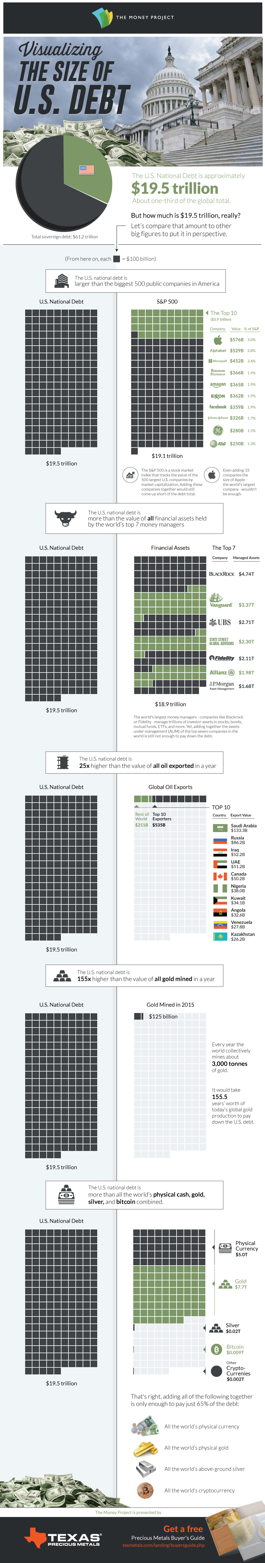
When numbers get into the billions or trillions, they start to lose context.
The U.S. national debt is one of those numbers. It currently sits at $19.5 trillion, which is actually such a large number that it is truly difficult for the average person to comprehend.
How big is the U.S. National Debt?
The best way to understand these large numbers? We believe it is to represent them visually, by plotting the data with comparable numbers that are easier to grasp.
Today’s data visualization plots the U.S. National Debt against everything from the assets managed by the world’s largest money managers, to the annual value of gold production.
1. The U.S. national debt is larger than the 500 largest public companies in America.
The S&P 500 is a stock market index that tracks the value of the 500 largest U.S. companies by market capitalization. It includes giant companies like Apple, Exxon Mobil, Microsoft, Alphabet, Facebook, Johnson & Johnson, and many others. In summer of 2016, the value of all of these 500 companies together added to $19.1 trillion – just short of the debt total.
2. The U.S. national debt is larger than all assets managed by the world’s top seven money managers.
The world’s largest money managers – companies like Blackrock, Vanguard, or Fidelity – manage trillions of investor assets in stocks, bonds, mutual funds, ETFs, and more. However, if we take the top seven of these companies and add all of their assets under management (AUM) together, it adds up to only $18.9 trillion.
3. The U.S. national debt is 25x larger than all global oil exports in 2015.
Yes, countries such as Saudi Arabia, Kuwait, and Russia make a killing off of selling their oil around the world. However, the numbers behind these exports are paltry in comparison to the debt. For example, you’d need the Saudis to donate the next 146 years of revenue from their oil exports to fully pay down the debt.
4. The U.S. national debt is 155x larger than all gold mined globally in a year.
Gold has symbolized money and wealth for a long time – but even the world’s annual production of roughly 3,000 tonnes (96 million oz) of the yellow metal barely puts a dent in the debt total. At market prices today, you’d need to somehow mine 155 years worth of gold at today’s rate to equal the debt.
5. In fact, the national debt is larger than all of the world’s physical currency, gold, silver, and bitcoin combined.
That’s right, if you rounded up every single dollar, euro, yen, pound, yuan, and any other global physical currency note or coin in existence, it only amounts to a measly $5 trillion. Adding the world’s physical gold ($7.7 trillion), silver ($20 billion), and cryptocurrencies ($11 billion) on top of that, you get to a total of $12.73 trillion. That’s equal to about 65% of the U.S. national debt.


Mining
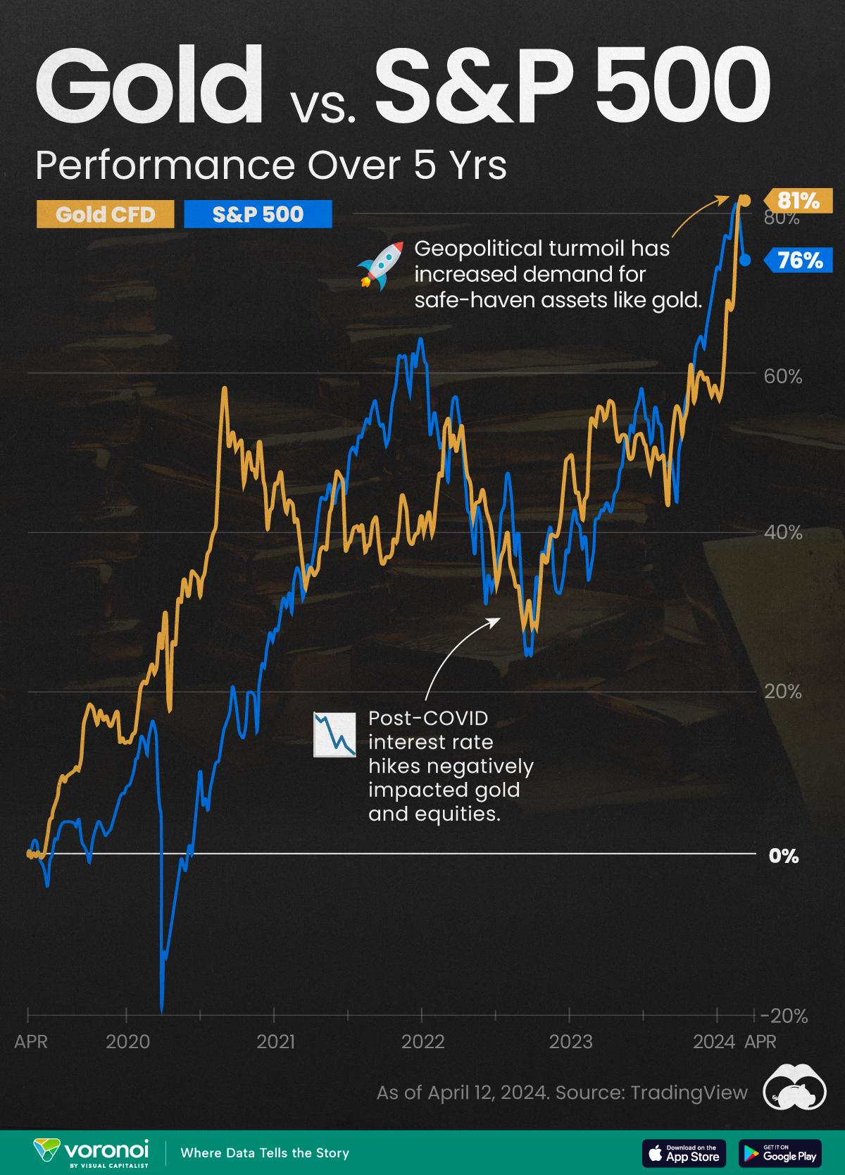
Gold vs. S&P 500: Which Has Grown More Over Five Years?
The price of gold has set record highs in 2024, but how has this precious metal performed relative to the S&P 500?
Gold vs. S&P 500: Which Has Grown More Over Five Years?
This was originally posted on our Voronoi app. Download the app for free on Apple or Android and discover incredible data-driven charts from a variety of trusted sources.
Gold is considered a unique asset due to its enduring value, historical significance, and application in various technologies like computers, spacecraft, and communications equipment.
Commonly regarded as a “safe haven asset”, gold is something investors typically buy to protect themselves during periods of global uncertainty and economic decline.
It is for this reason that gold has performed rather strongly in recent years, and especially in 2024. Persistent inflation combined with multiple wars has driven up demand for gold, helping it set a new all-time high of over $2,400 per ounce.
To put this into perspective, we visualized the performance of gold alongside the S&P 500. See the table below for performance figures as of April 12, 2024.
| Asset/Index | 1 Yr (%) | 5 Yr (%) |
|---|---|---|
| 🏆 Gold | +16.35 | +81.65 |
| 💼 S&P 500 | +25.21 | +76.22 |
Over the five-year period, gold has climbed an impressive 81.65%, outpacing even the S&P 500.
Get Your Gold at Costco
Perhaps a sign of how high the demand for gold is becoming, wholesale giant Costco is reportedly selling up to $200 million worth of gold bars every month in the United States. The year prior, sales only amounted to $100 million per quarter.
Consumers aren’t the only ones buying gold, either. Central banks around the world have been accumulating gold in very large quantities, likely as a hedge against inflation.
According to the World Gold Council, these institutions bought 1,136 metric tons in 2022, marking the highest level since 1950. Figures for 2023 came in at 1,037 metric tons.
See More Graphics on Gold
If you’re fascinated by gold, be sure to check out more Visual Capitalist content including 200 Years of Global Gold Production, by Country or Ranked: The Largest Gold Reserves by Country.

-

 Maps2 weeks ago
Mapped: Average Wages Across Europe
-

 Money1 week ago
Which States Have the Highest Minimum Wage in America?
-

 Real Estate1 week ago
Ranked: The Most Valuable Housing Markets in America
-

 Markets1 week ago
Charted: Big Four Market Share by S&P 500 Audits
-

 AI1 week ago
The Stock Performance of U.S. Chipmakers So Far in 2024
-

 Automotive1 week ago
Almost Every EV Stock is Down After Q1 2024
-

 Money2 weeks ago
Where Does One U.S. Tax Dollar Go?
-

 Green2 weeks ago
Ranked: Top Countries by Total Forest Loss Since 2001