Markets
Visualizing the Longest Bull Markets of the Modern Era
Visualizing the Longest Bull Markets of the Modern Era
The Chart of the Week is a weekly Visual Capitalist feature on Fridays.
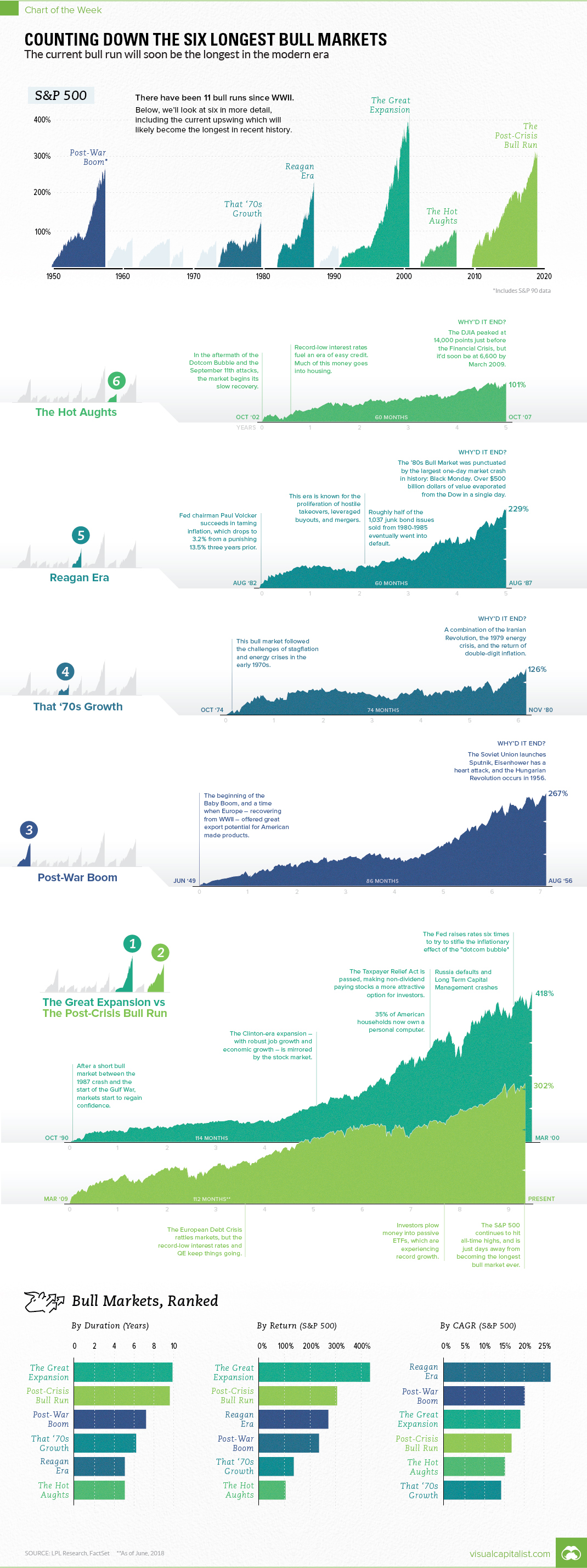
During the longest bull market in modern history, the S&P 500 surged a whopping 418% over the 9.5 years between November 1990 and March 2000.
This was during the famous economic expansion that took place during the Clinton era, in which job growth was robust, oil prices fell, stocks soared, and making money was as easy as throwing it in the stock market.
In mere months, this famed bull market may lose its title as the “longest” in the modern era.
That’s because, according to data and analysis from LDL Research, the current bull market will take over the claim to fame in late August 2018.
Ranking the Bulls
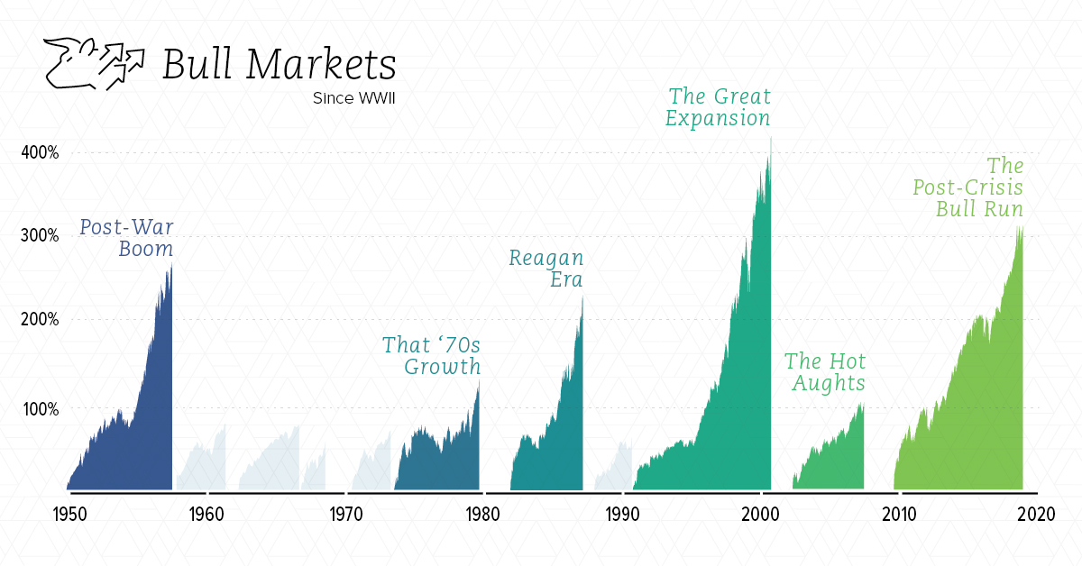
In today’s chart, we show every bull market since WWII, including the top six which are covered in more detail:
| Rank | Bull Market | Dates | Months | S&P 500 Return | Annualized Return |
|---|---|---|---|---|---|
| 1 | Great Expansion | '90-'00 | 114 | 418% | 19.0% |
| 2 | Post-Crisis Bull Run | '09-'18* | 112* | 302% | 16.7% |
| 3 | Post-War Boom | '49-'56 | 86 | 267% | 20.0% |
| 4 | That '70s Growth | '74-'80 | 74 | 126% | 14.1% |
| 5 | Reagan Era | '82-'87 | 60 | 229% | 26.7% |
| 6 | The Hot Aughts | '02-'07 | 60 | 101% | 15.0% |
*Still in progress.
By looking at duration, total rate of return, and annualized rate of return, it really gives a sense of how these bull markets compare.
The current run, which will soon become the longest, didn’t have the same level of intensity as other high-ranking bull markets. Critics would say that it was artificially propped up by ultra-low rates, QE, and other government actions that will make the market ultimately less robust heading forward.
Regardless, the current run ranks in fourth place among the markets above in terms of annualized return.
What Ended Each Bull?
The market psychology behind bull and bear markets can be fascinating.
Below we look at the events credited with “ending” each bull market – though of course, it is actually the actions of investors (buying or selling) that ultimately dictates market direction.
1. The Great Expansion
The bull run lasted 9.5 years, ultimately capitulating when the Dotcom Bubble burst. From the span of June 1999 and May 2000, the Fed raised interest rates six times to try and get a “soft landing”. Market uncertainty was worsened by the 9/11 attacks that occurred the year after.
2. The Post-Crisis Bull Run
Still ongoing…
3. The Post-War Boom
This boom occurred after WWII, and it ended in 1956. Some of the sources we looked at credited the launch of Sputnik, Eisenhower’s heart attack, and the Hungarian Revolution as possible sources of market fear.
4. That ’70s Growth
The Iranian Revolution, the 1979 Energy Crisis, and the return of double-digit inflation were the factors blamed for the end of this bull.
5. Reagan Era
This bull market had the highest annualized return at 26.7%, but the party came to an end on Black Monday in 1987 – one of the most infamous market crashes ever. Some of the causes cited for the crash: program trading, overvaluation, illiquidity and market psychology.
6. The Hot Aughts
Stocks did decently well during the era of cheap credit and rising housing prices. However, the Financial Crisis put an end to this growth, and would cut the DJIA from 14,000 points to below 6,600 points.


Economy
Economic Growth Forecasts for G7 and BRICS Countries in 2024
The IMF has released its economic growth forecasts for 2024. How do the G7 and BRICS countries compare?
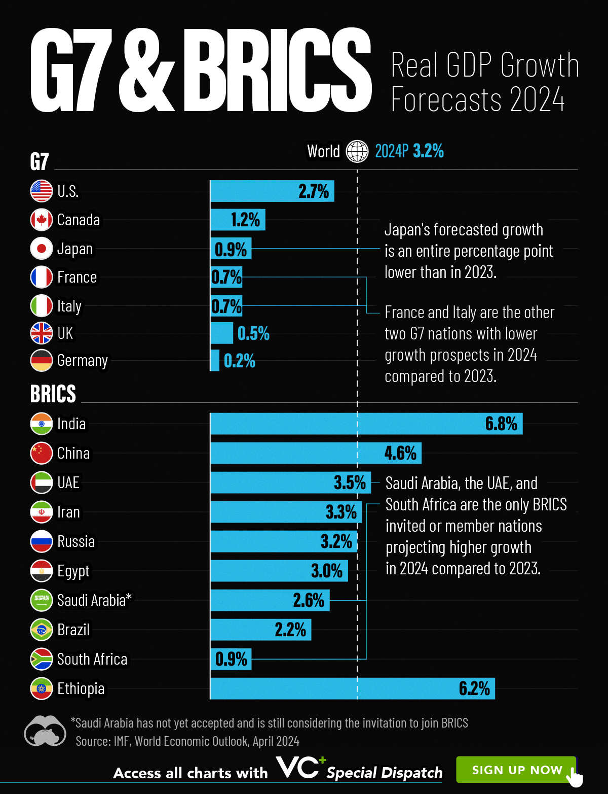
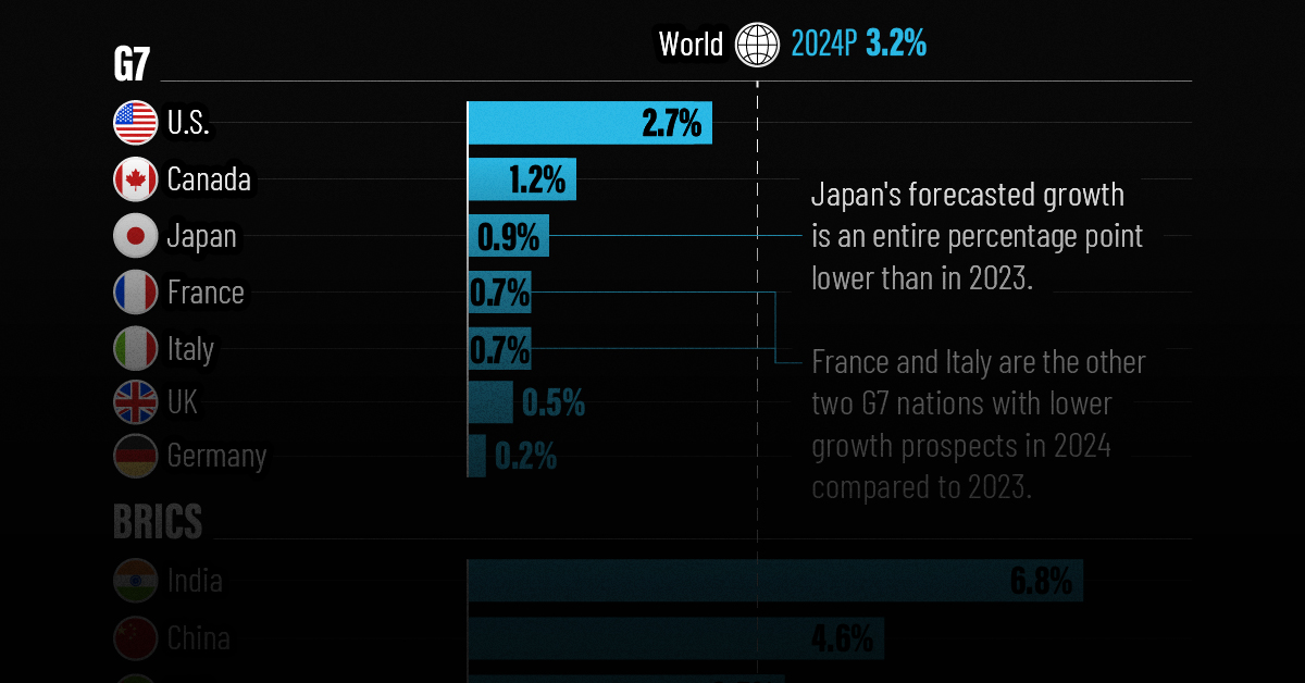
G7 & BRICS Real GDP Growth Forecasts for 2024
The International Monetary Fund’s (IMF) has released its real gross domestic product (GDP) growth forecasts for 2024, and while global growth is projected to stay steady at 3.2%, various major nations are seeing declining forecasts.
This chart visualizes the 2024 real GDP growth forecasts using data from the IMF’s 2024 World Economic Outlook for G7 and BRICS member nations along with Saudi Arabia, which is still considering an invitation to join the bloc.
Get the Key Insights of the IMF’s World Economic Outlook
Want a visual breakdown of the insights from the IMF’s 2024 World Economic Outlook report?
This visual is part of a special dispatch of the key takeaways exclusively for VC+ members.
Get the full dispatch of charts by signing up to VC+.
Mixed Economic Growth Prospects for Major Nations in 2024
Economic growth projections by the IMF for major nations are mixed, with the majority of G7 and BRICS countries forecasted to have slower growth in 2024 compared to 2023.
Only three BRICS-invited or member countries, Saudi Arabia, the UAE, and South Africa, have higher projected real GDP growth rates in 2024 than last year.
| Group | Country | Real GDP Growth (2023) | Real GDP Growth (2024P) |
|---|---|---|---|
| G7 | 🇺🇸 U.S. | 2.5% | 2.7% |
| G7 | 🇨🇦 Canada | 1.1% | 1.2% |
| G7 | 🇯🇵 Japan | 1.9% | 0.9% |
| G7 | 🇫🇷 France | 0.9% | 0.7% |
| G7 | 🇮🇹 Italy | 0.9% | 0.7% |
| G7 | 🇬🇧 UK | 0.1% | 0.5% |
| G7 | 🇩🇪 Germany | -0.3% | 0.2% |
| BRICS | 🇮🇳 India | 7.8% | 6.8% |
| BRICS | 🇨🇳 China | 5.2% | 4.6% |
| BRICS | 🇦🇪 UAE | 3.4% | 3.5% |
| BRICS | 🇮🇷 Iran | 4.7% | 3.3% |
| BRICS | 🇷🇺 Russia | 3.6% | 3.2% |
| BRICS | 🇪🇬 Egypt | 3.8% | 3.0% |
| BRICS-invited | 🇸🇦 Saudi Arabia | -0.8% | 2.6% |
| BRICS | 🇧🇷 Brazil | 2.9% | 2.2% |
| BRICS | 🇿🇦 South Africa | 0.6% | 0.9% |
| BRICS | 🇪🇹 Ethiopia | 7.2% | 6.2% |
| 🌍 World | 3.2% | 3.2% |
China and India are forecasted to maintain relatively high growth rates in 2024 at 4.6% and 6.8% respectively, but compared to the previous year, China is growing 0.6 percentage points slower while India is an entire percentage point slower.
On the other hand, four G7 nations are set to grow faster than last year, which includes Germany making its comeback from its negative real GDP growth of -0.3% in 2023.
Faster Growth for BRICS than G7 Nations
Despite mostly lower growth forecasts in 2024 compared to 2023, BRICS nations still have a significantly higher average growth forecast at 3.6% compared to the G7 average of 1%.
While the G7 countries’ combined GDP is around $15 trillion greater than the BRICS nations, with continued higher growth rates and the potential to add more members, BRICS looks likely to overtake the G7 in economic size within two decades.
BRICS Expansion Stutters Before October 2024 Summit
BRICS’ recent expansion has stuttered slightly, as Argentina’s newly-elected president Javier Milei declined its invitation and Saudi Arabia clarified that the country is still considering its invitation and has not joined BRICS yet.
Even with these initial growing pains, South Africa’s Foreign Minister Naledi Pandor told reporters in February that 34 different countries have submitted applications to join the growing BRICS bloc.
Any changes to the group are likely to be announced leading up to or at the 2024 BRICS summit which takes place October 22-24 in Kazan, Russia.
Get the Full Analysis of the IMF’s Outlook on VC+
This visual is part of an exclusive special dispatch for VC+ members which breaks down the key takeaways from the IMF’s 2024 World Economic Outlook.
For the full set of charts and analysis, sign up for VC+.

-

 Markets1 week ago
U.S. Debt Interest Payments Reach $1 Trillion
-

 Markets2 weeks ago
Ranked: The Most Valuable Housing Markets in America
-

 Money2 weeks ago
Which States Have the Highest Minimum Wage in America?
-

 AI2 weeks ago
Ranked: Semiconductor Companies by Industry Revenue Share
-

 Markets2 weeks ago
Ranked: The World’s Top Flight Routes, by Revenue
-

 Countries2 weeks ago
Population Projections: The World’s 6 Largest Countries in 2075
-

 Markets2 weeks ago
The Top 10 States by Real GDP Growth in 2023
-

 Money2 weeks ago
The Smallest Gender Wage Gaps in OECD Countries