Markets
Visualizing How COVID-19 Has Impacted Global Wages
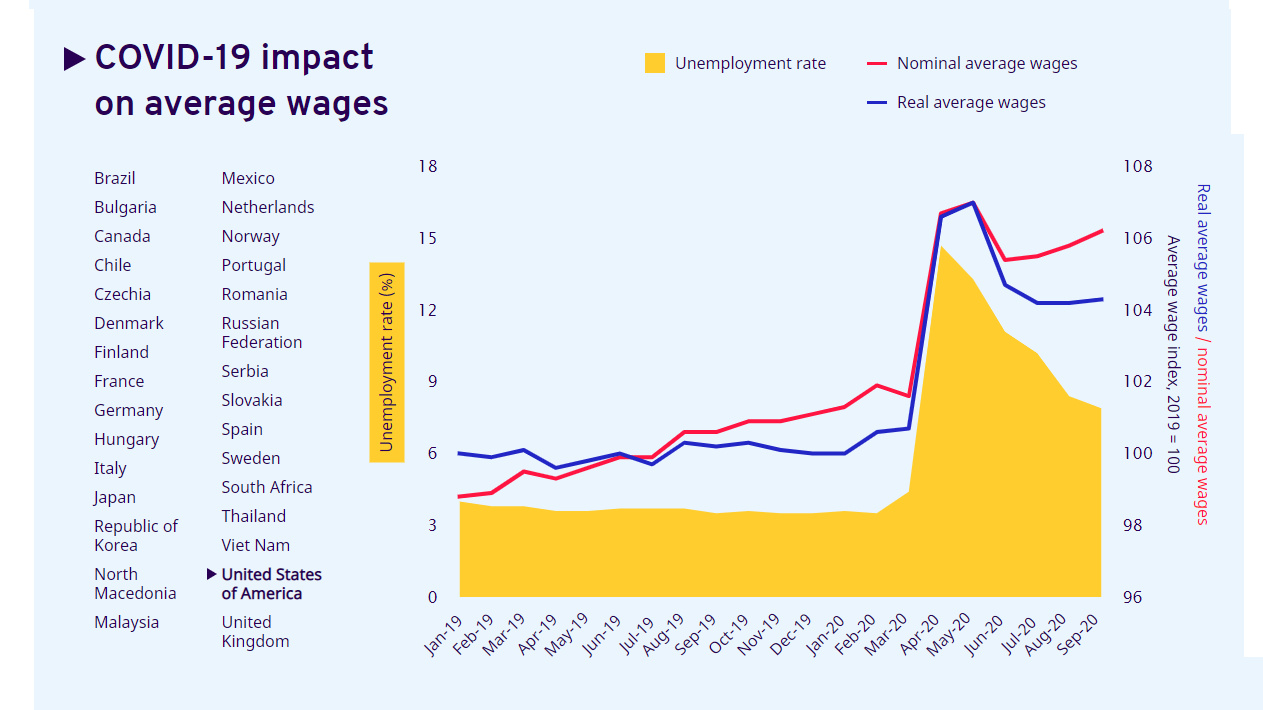
Visualizing How COVID-19 Impacted Global Wages
In the years leading up to the pandemic, annual global wage growth was fluctuating stably between 1.6%–2.2%. Now, income, working hours, and employment have all been impacted by COVID-19—but for those who have held onto their jobs, how have wages been affected?
This interactive chart from the International Labour Organization (ILO) reveals how the global pandemic has affected both nominal and real wages, as well as unemployment rates.
The date of data collection varies on a country-by-country basis, using the most recent available data. The most recent measurement of wage indices is from September 2020 in some countries and the least recent available data comes from Q2’2020. In select countries the date of unemployment rates and wage indices are different. As a point of reference, the average wage index in 2019 was 100.
Note: the ILO uses national statistics databases and only the select countries had enough recent, available data for all three elements: nominal wages, real wages, and unemployment.
Where Average Wages are Falling
Average wages in many countries either plateaued or decreased significantly during the global pandemic. Sharp declines happened across a number of European countries, as well as in South Africa and Japan, for example.
| Country | Unemployment Rate | Real Wage Index | Nominal Wage Index |
|---|---|---|---|
| 🇻🇳 Vietnam (as of Q2'2020) | 2.7% | 92.4 | 94.4 |
| 🇪🇸 Spain (as of Q2'2020) | 15.3% | 92.5 | 92.3 |
| 🇲🇽 Mexico (as of August 2020) | 5% | 94.4 | 98 |
| 🇿🇦 South Africa (as of Q2'2020) | 23.3% | 95.2 | 97.4 |
| 🇰🇷 South Korea (as of August 2020) | 3.1% | 96.2 | 96.8 |
| 🇷🇺 Russia (as of August 2020) | 6.4% | 96.9 | 100.5 |
| 🇨🇿 Czech Republic (as of Q2'2020) | 6.6% | 97.8 | 99.6 |
| 🇸🇰 Slovakia (as of Q2'2020) | 6.6% | 97.8 | 99.6 |
| 🇯🇵 Japan (as of August 2020) | 3% | 98.6 | 98.7 |
| 🇫🇮 Finland (as of August 2020) | 7.9% | 99.6 | 100.1 |
| 🇩🇪 Germany (as of Q2'2020) | 4.4% | 99.6 | 100.5 |
Falling wages, however, do not necessarily mean that people are receiving less money, as many subsidies have been put in place to help cushion income or job loss.
In many cases where wage indices declined, employment did not. This is because different job retention schemes were put in place, wherein workers were furloughed, but were given a portion of their wages from the national government. This allowed unemployment rates to remain steady while wages tapered off.
In Europe, where wages have dropped considerably in many countries, wage subsidies have compensated for nearly 40% of wage bill loss in select countries. But while high income countries can afford to inject stimulus into their economies, most lower income countries cannot. This has come to be described as the fiscal stimulus gap.
Where Average Wages are Rising
While perhaps counterintuitive, rising average wages are in no way an inherent sign of a recovering economy or labor market. Regardless, when compared to 2019, wages have actually increased in the majority of countries, such as Brazil, Canada, United States, Italy, and the UK.
| Country | Unemployment Rate | Real Wage Index | Nominal Wage Index |
|---|---|---|---|
| 🇨🇦 Canada (as of August 2020) | 10.6% | 107.6 | 108.4 |
| 🇲🇰 North Macedonia (Unemployment: Jun '20; wage data: Aug '20) | 16.7% | 107.6 | 109.7 |
| 🇧🇷 Brazil (as of Q2'2020) | 13.3% | 107.3 | 109.6 |
| 🇧🇬 Bulgaria (as of June 2020) | 5.9% | 106.9 | 107.8 |
| 🇭🇺 Hungary (as of August 2020) | 4.4% | 106.3 | 106.5 |
| 🇮🇹 Italy (as of Q2'2020) | 8.3% | 106.2 | 106.2 |
| 🇫🇷 France (as of Q2'2020) | 7.1% | 105.4 | 105.9 |
| 🇷🇸 Serbia (Unemployment: Jun '20; wage data: Aug '20) | 7.7% | 104.7 | 106.7 |
| 🇳🇴 Norway (as of Q2'2020) | 4.6% | 104.5 | 105.6 |
| 🇺🇸 U.S. (as of September 2020) | 7.9% | 104.3 | 106.2 |
| 🇵🇹 Portugal (as of June 2020) | 7.3% | 103.2 | 104.2 |
| 🇹🇭 Thailand (as of Q2'2020) | 2% | 103 | 100.6 |
| 🇷🇴 Romania (as of August 2020) | 5.3% | 102.5 | 105.2 |
| 🇳🇱 Netherlands (as of September 2020) | 4.4% | 102 | 103.6 |
| 🇬🇧 UK (as of September 2020) | 4.8% | 101.5 | 102.4 |
| 🇩🇰 Denmark (as of Q2'2020) | 5.3% | 101.4 | 101.5 |
| 🇸🇪 Sweden (as of August 2020) | 8.8% | 100.8 | 101.6 |
| 🇨🇱 Chile (as of August 2020) | 12.3% | 100.6 | 103.4 |
| 🇲🇾 Malaysia (as of June 2020) | 4.7% | 100.2 | 99 |
One reason for higher average wages is something called the compositional effect. The compositional effect is what occurs when wages are not actually increasing, but the makeup of employment changes. For example, the loss and subsequent absence of many lower paying jobs from the labor market due to COVID-19 can skew the average wage upwards.
Brazil is a prime example of the compositional effect. As both nominal and real wages increase, so does unemployment. Brazil’s current unemployment rate is 13.3%, while wages have skyrocketed to a real wage index of 107.3 during the first half of 2020.
The loss of these lower paying jobs has been extremely widespread, most negatively impacting informal workers, self-employed vendors, and migrant workers. Some policymakers have seen this as an opportunity to call for universal basic income. Even with job retention schemes to keep unemployment steady, many people are earning far less income and may never return to normal working hours in their current positions.


Markets
U.S. Debt Interest Payments Reach $1 Trillion
U.S. debt interest payments have surged past the $1 trillion dollar mark, amid high interest rates and an ever-expanding debt burden.


U.S. Debt Interest Payments Reach $1 Trillion
This was originally posted on our Voronoi app. Download the app for free on iOS or Android and discover incredible data-driven charts from a variety of trusted sources.
The cost of paying for America’s national debt crossed the $1 trillion dollar mark in 2023, driven by high interest rates and a record $34 trillion mountain of debt.
Over the last decade, U.S. debt interest payments have more than doubled amid vast government spending during the pandemic crisis. As debt payments continue to soar, the Congressional Budget Office (CBO) reported that debt servicing costs surpassed defense spending for the first time ever this year.
This graphic shows the sharp rise in U.S. debt payments, based on data from the Federal Reserve.
A $1 Trillion Interest Bill, and Growing
Below, we show how U.S. debt interest payments have risen at a faster pace than at another time in modern history:
| Date | Interest Payments | U.S. National Debt |
|---|---|---|
| 2023 | $1.0T | $34.0T |
| 2022 | $830B | $31.4T |
| 2021 | $612B | $29.6T |
| 2020 | $518B | $27.7T |
| 2019 | $564B | $23.2T |
| 2018 | $571B | $22.0T |
| 2017 | $493B | $20.5T |
| 2016 | $460B | $20.0T |
| 2015 | $435B | $18.9T |
| 2014 | $442B | $18.1T |
| 2013 | $425B | $17.2T |
| 2012 | $417B | $16.4T |
| 2011 | $433B | $15.2T |
| 2010 | $400B | $14.0T |
| 2009 | $354B | $12.3T |
| 2008 | $380B | $10.7T |
| 2007 | $414B | $9.2T |
| 2006 | $387B | $8.7T |
| 2005 | $355B | $8.2T |
| 2004 | $318B | $7.6T |
| 2003 | $294B | $7.0T |
| 2002 | $298B | $6.4T |
| 2001 | $318B | $5.9T |
| 2000 | $353B | $5.7T |
| 1999 | $353B | $5.8T |
| 1998 | $360B | $5.6T |
| 1997 | $368B | $5.5T |
| 1996 | $362B | $5.3T |
| 1995 | $357B | $5.0T |
| 1994 | $334B | $4.8T |
| 1993 | $311B | $4.5T |
| 1992 | $306B | $4.2T |
| 1991 | $308B | $3.8T |
| 1990 | $298B | $3.4T |
| 1989 | $275B | $3.0T |
| 1988 | $254B | $2.7T |
| 1987 | $240B | $2.4T |
| 1986 | $225B | $2.2T |
| 1985 | $219B | $1.9T |
| 1984 | $205B | $1.7T |
| 1983 | $176B | $1.4T |
| 1982 | $157B | $1.2T |
| 1981 | $142B | $1.0T |
| 1980 | $113B | $930.2B |
| 1979 | $96B | $845.1B |
| 1978 | $84B | $789.2B |
| 1977 | $69B | $718.9B |
| 1976 | $61B | $653.5B |
| 1975 | $55B | $576.6B |
| 1974 | $50B | $492.7B |
| 1973 | $45B | $469.1B |
| 1972 | $39B | $448.5B |
| 1971 | $36B | $424.1B |
| 1970 | $35B | $389.2B |
| 1969 | $30B | $368.2B |
| 1968 | $25B | $358.0B |
| 1967 | $23B | $344.7B |
| 1966 | $21B | $329.3B |
Interest payments represent seasonally adjusted annual rate at the end of Q4.
At current rates, the U.S. national debt is growing by a remarkable $1 trillion about every 100 days, equal to roughly $3.6 trillion per year.
As the national debt has ballooned, debt payments even exceeded Medicaid outlays in 2023—one of the government’s largest expenditures. On average, the U.S. spent more than $2 billion per day on interest costs last year. Going further, the U.S. government is projected to spend a historic $12.4 trillion on interest payments over the next decade, averaging about $37,100 per American.
Exacerbating matters is that the U.S. is running a steep deficit, which stood at $1.1 trillion for the first six months of fiscal 2024. This has accelerated due to the 43% increase in debt servicing costs along with a $31 billion dollar increase in defense spending from a year earlier. Additionally, a $30 billion increase in funding for the Federal Deposit Insurance Corporation in light of the regional banking crisis last year was a major contributor to the deficit increase.
Overall, the CBO forecasts that roughly 75% of the federal deficit’s increase will be due to interest costs by 2034.

-

 Mining2 weeks ago
Charted: The Value Gap Between the Gold Price and Gold Miners
-

 Real Estate1 week ago
Ranked: The Most Valuable Housing Markets in America
-

 Business1 week ago
Charted: Big Four Market Share by S&P 500 Audits
-

 AI1 week ago
The Stock Performance of U.S. Chipmakers So Far in 2024
-

 Misc1 week ago
Almost Every EV Stock is Down After Q1 2024
-

 Money2 weeks ago
Where Does One U.S. Tax Dollar Go?
-

 Green2 weeks ago
Ranked: Top Countries by Total Forest Loss Since 2001
-

 Real Estate2 weeks ago
Visualizing America’s Shortage of Affordable Homes