Technology
Visualizing the Diversity of the Tech Industry
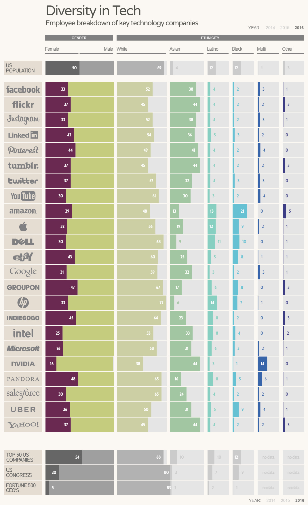
Visualizing the Diversity of the Tech Industry
With the recent leak of the “Google Manifesto” and the maelstrom of media backlash that followed, it seems that concerns around diversity in the technology industry have finally reached a boiling point.
Today’s infographic from Information is Beautiful breaks down the demographics of 23 major tech companies, based on statistics from 2016. It also provides comparisons to the composition of the U.S. population in general, the top 50 U.S. companies, Congress, and Fortune 500 CEOs.
Which Companies Employ the Most Women?
With just a focus on the major companies on this list, here is a breakdown that shows which companies employ the most women:
| Rank | Tech Company | % of Females |
|---|---|---|
| #1 | Pandora | 48% |
| #2 | Groupon | 47% |
| #3 | Indiegogo | 45% |
| #4 | 44% | |
| #5 | eBay | 43% |
| U.S. Population Avg. | 50% |
The above list already illustrates why diversity is such a concern for many observers of the industry: even the companies with the most women on their rosters have proportions lower than U.S. population average of 50%.
In contrast, here are the companies on the list that employ the fewest women, as a proportion of their workforce:
| Rank | Tech Company | % of Females |
|---|---|---|
| #18 (t) | Salesforce | 30% |
| #18 (t) | Youtube | 30% |
| #18 (t) | Dell | 30% |
| #21 | Microsoft | 26% |
| #22 | Intel | 25% |
| #23 | Nvidia | 16% |
Google, which is at the center of debate right now, did not make the list of the companies with the fewest women – but it’s not far off with a workforce comprised of 31% women.
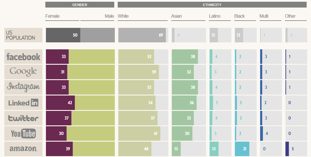
What’s Changed in the Last 12 Months?
According to Information is Beautiful, here is what has changed in the last 12 months as of their last update (April 2017):
- Facebook, Apple, eBay, and Microsoft all had their ratio of women increase by 1%.
- LinkedIn had their ratio of women increase by 3%.
- Google’s gender ratio stayed the same.
- Microsoft increased the ratio of non-white employees by 3%, and Facebook by 2%.
- Google, Apple, and eBay increased ratio of non-white employees by 1%.
- LinkedIn lost 3% of its non-white employees.
- Asian staff accounted for the majority of increases in ethnic diversity, while the ratio of Hispanic employees remained static.
To get an even better sense of the data, we recommend visiting the interactive version of Information is Beautiful’s graphic, which shows numbers for 2014 and 2015 as well.


Brands
How Tech Logos Have Evolved Over Time
From complete overhauls to more subtle tweaks, these tech logos have had quite a journey. Featuring: Google, Apple, and more.


How Tech Logos Have Evolved Over Time
This was originally posted on our Voronoi app. Download the app for free on iOS or Android and discover incredible data-driven charts from a variety of trusted sources.
One would be hard-pressed to find a company that has never changed its logo. Granted, some brands—like Rolex, IBM, and Coca-Cola—tend to just have more minimalistic updates. But other companies undergo an entire identity change, thus necessitating a full overhaul.
In this graphic, we visualized the evolution of prominent tech companies’ logos over time. All of these brands ranked highly in a Q1 2024 YouGov study of America’s most famous tech brands. The logo changes are sourced from 1000logos.net.
How Many Times Has Google Changed Its Logo?
Google and Facebook share a 98% fame rating according to YouGov. But while Facebook’s rise was captured in The Social Network (2010), Google’s history tends to be a little less lionized in popular culture.
For example, Google was initially called “Backrub” because it analyzed “back links” to understand how important a website was. Since its founding, Google has undergone eight logo changes, finally settling on its current one in 2015.
| Company | Number of Logo Changes |
|---|---|
| 8 | |
| HP | 8 |
| Amazon | 6 |
| Microsoft | 6 |
| Samsung | 6 |
| Apple | 5* |
Note: *Includes color changes. Source: 1000Logos.net
Another fun origin story is Microsoft, which started off as Traf-O-Data, a traffic counter reading company that generated reports for traffic engineers. By 1975, the company was renamed. But it wasn’t until 2012 that Microsoft put the iconic Windows logo—still the most popular desktop operating system—alongside its name.
And then there’s Samsung, which started as a grocery trading store in 1938. Its pivot to electronics started in the 1970s with black and white television sets. For 55 years, the company kept some form of stars from its first logo, until 1993, when the iconic encircled blue Samsung logo debuted.
Finally, Apple’s first logo in 1976 featured Isaac Newton reading under a tree—moments before an apple fell on his head. Two years later, the iconic bitten apple logo would be designed at Steve Jobs’ behest, and it would take another two decades for it to go monochrome.

-

 Green1 week ago
Ranked: The Countries With the Most Air Pollution in 2023
-

 Automotive2 weeks ago
Almost Every EV Stock is Down After Q1 2024
-

 AI2 weeks ago
The Stock Performance of U.S. Chipmakers So Far in 2024
-

 Markets2 weeks ago
Charted: Big Four Market Share by S&P 500 Audits
-

 Real Estate2 weeks ago
Ranked: The Most Valuable Housing Markets in America
-

 Money2 weeks ago
Which States Have the Highest Minimum Wage in America?
-

 AI2 weeks ago
Ranked: Semiconductor Companies by Industry Revenue Share
-

 Travel2 weeks ago
Ranked: The World’s Top Flight Routes, by Revenue