Markets
Visualizing Corruption Around the World
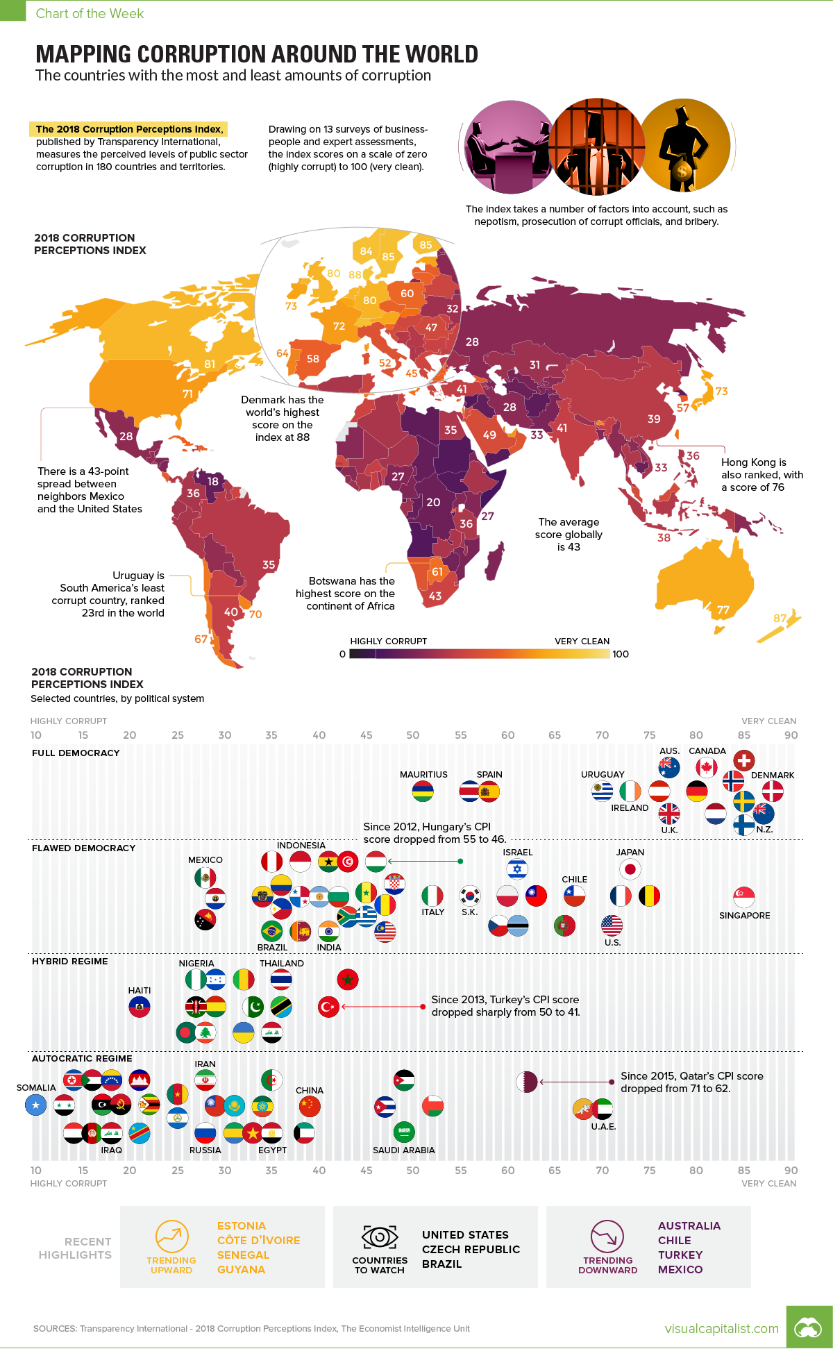
Visualizing Corruption Around the World
Growing levels of public sector corruption can stifle a country’s economic growth while also chipping away at political freedom.
Which parts of the world are perceived to be most corrupt – and further, how does this data differ between regions, and how has it trended over time?
The Corruption Perception Index (CPI)
Today’s chart pulls its numbers from the recent 2018 Corruption Perceptions Index report, which has been published by Transparency International annually since 1995. The report scores 180 countries, and is considered the world’s most widely-used barometer for corruption.
However, before we dive in to the data, it’s worth taking a quick look at the methodology behind the report:
Methodology:
- The CPI attempts to measure perceptions about corruption in a country, rather than corruption itself
- Specifically, it is focused on the public sector of countries, which includes governments and government-run institutions
- The CPI is a composite index, using the results from 13 separate reports and surveys to calculate an overall score
- Scores range from 0 (most corrupt) to 100 (most clean)
Finally, it’s also worth noting that in the chart, we’ve added in government types as rated by the Economist Intelligence Unit – they range from “Full Democracy” to “Autocratic Regime”.
The Most and Least Corrupt Places
What do experts and businesspeople see as the most and least corrupt global regions?
| Region | Average Score (CPI) |
|---|---|
| Western Europe & EU | 66 |
| Americas | 44 |
| Asia Pacific | 44 |
| Middle East & North Africa | 39 |
| Eastern Europe & Central Asia | 35 |
| Sub-Saharan Africa | 32 |
| Global | 43 |
Western Europe has the highest score on average, while Sub-Saharan Africa has the lowest (most corrupt) average score. The Americas ranks just above the global average score of 43, mainly because the average is skewed by the lower scores of many countries in Latin America (such as Venezuela) and the Caribbean (such as Haiti).
Now, let’s look at the top 10 countries overall:
| Rank | Country | Score (CPI) | Government type | Region |
|---|---|---|---|---|
| #1 | Denmark | 88 | Full democracy | Western Europe & EU |
| #2 | New Zealand | 87 | Full democracy | Asia Pacific |
| #3 | Finland | 85 | Full democracy | Western Europe & EU |
| #3 | Singapore | 85 | Flawed democracy | Asia Pacific |
| #3 | Sweden | 85 | Full democracy | Western Europe & EU |
| #3 | Switzerland | 85 | Full democracy | Western Europe & EU |
| #7 | Norway | 84 | Full democracy | Western Europe & EU |
| #8 | Netherlands | 82 | Full democracy | Western Europe & EU |
| #9 | Canada | 81 | Full democracy | Americas |
| #9 | Luxembourg | 81 | Full democracy | Western Europe & EU |
Here’s also a look at the world’s 20 most populous countries:
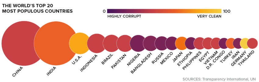
As the report notes, the relation between democracy and corruption appears to be quite clear: the more democratic a regime is, the less corrupt it is perceived to be. Using the Economist Intelligence Unit rankings, there are no “Hybrid” or “Autocratic” regimes that come anywhere near the top 10.
The closest may be the U.A.E. – which is classified as an Autocratic Regime – which has a CPI score of 70, good for 23rd place globally.
Trends Over Time
Over the last seven years, the report notes that there were a few specific countries that have consistently trended in one direction or another.
Hungary: The country has seen a -9 point change to its CPI score since 2012, dropping to 46 points in total. That’s just a notch above the global average.
Turkey: Turkey’s rating has deteriorated from 49 to 41 over the 2012-2018 time period.
Argentina: The South American nation has seen its score rise by eight points over the 2012-2018 time period.
Guyana: Guyana has gained nine points – a significant improvement over its original score of 28 at the start of that time period.
What will be the next country to jump up (or down) the list – and what factors will lead to this change in perception?
Note: The color-coding on the map has been updated to better reflect CPI scores. Ukraine was incorrectly classified as an Autocratic Regime.


Markets
U.S. Debt Interest Payments Reach $1 Trillion
U.S. debt interest payments have surged past the $1 trillion dollar mark, amid high interest rates and an ever-expanding debt burden.


U.S. Debt Interest Payments Reach $1 Trillion
This was originally posted on our Voronoi app. Download the app for free on iOS or Android and discover incredible data-driven charts from a variety of trusted sources.
The cost of paying for America’s national debt crossed the $1 trillion dollar mark in 2023, driven by high interest rates and a record $34 trillion mountain of debt.
Over the last decade, U.S. debt interest payments have more than doubled amid vast government spending during the pandemic crisis. As debt payments continue to soar, the Congressional Budget Office (CBO) reported that debt servicing costs surpassed defense spending for the first time ever this year.
This graphic shows the sharp rise in U.S. debt payments, based on data from the Federal Reserve.
A $1 Trillion Interest Bill, and Growing
Below, we show how U.S. debt interest payments have risen at a faster pace than at another time in modern history:
| Date | Interest Payments | U.S. National Debt |
|---|---|---|
| 2023 | $1.0T | $34.0T |
| 2022 | $830B | $31.4T |
| 2021 | $612B | $29.6T |
| 2020 | $518B | $27.7T |
| 2019 | $564B | $23.2T |
| 2018 | $571B | $22.0T |
| 2017 | $493B | $20.5T |
| 2016 | $460B | $20.0T |
| 2015 | $435B | $18.9T |
| 2014 | $442B | $18.1T |
| 2013 | $425B | $17.2T |
| 2012 | $417B | $16.4T |
| 2011 | $433B | $15.2T |
| 2010 | $400B | $14.0T |
| 2009 | $354B | $12.3T |
| 2008 | $380B | $10.7T |
| 2007 | $414B | $9.2T |
| 2006 | $387B | $8.7T |
| 2005 | $355B | $8.2T |
| 2004 | $318B | $7.6T |
| 2003 | $294B | $7.0T |
| 2002 | $298B | $6.4T |
| 2001 | $318B | $5.9T |
| 2000 | $353B | $5.7T |
| 1999 | $353B | $5.8T |
| 1998 | $360B | $5.6T |
| 1997 | $368B | $5.5T |
| 1996 | $362B | $5.3T |
| 1995 | $357B | $5.0T |
| 1994 | $334B | $4.8T |
| 1993 | $311B | $4.5T |
| 1992 | $306B | $4.2T |
| 1991 | $308B | $3.8T |
| 1990 | $298B | $3.4T |
| 1989 | $275B | $3.0T |
| 1988 | $254B | $2.7T |
| 1987 | $240B | $2.4T |
| 1986 | $225B | $2.2T |
| 1985 | $219B | $1.9T |
| 1984 | $205B | $1.7T |
| 1983 | $176B | $1.4T |
| 1982 | $157B | $1.2T |
| 1981 | $142B | $1.0T |
| 1980 | $113B | $930.2B |
| 1979 | $96B | $845.1B |
| 1978 | $84B | $789.2B |
| 1977 | $69B | $718.9B |
| 1976 | $61B | $653.5B |
| 1975 | $55B | $576.6B |
| 1974 | $50B | $492.7B |
| 1973 | $45B | $469.1B |
| 1972 | $39B | $448.5B |
| 1971 | $36B | $424.1B |
| 1970 | $35B | $389.2B |
| 1969 | $30B | $368.2B |
| 1968 | $25B | $358.0B |
| 1967 | $23B | $344.7B |
| 1966 | $21B | $329.3B |
Interest payments represent seasonally adjusted annual rate at the end of Q4.
At current rates, the U.S. national debt is growing by a remarkable $1 trillion about every 100 days, equal to roughly $3.6 trillion per year.
As the national debt has ballooned, debt payments even exceeded Medicaid outlays in 2023—one of the government’s largest expenditures. On average, the U.S. spent more than $2 billion per day on interest costs last year. Going further, the U.S. government is projected to spend a historic $12.4 trillion on interest payments over the next decade, averaging about $37,100 per American.
Exacerbating matters is that the U.S. is running a steep deficit, which stood at $1.1 trillion for the first six months of fiscal 2024. This has accelerated due to the 43% increase in debt servicing costs along with a $31 billion dollar increase in defense spending from a year earlier. Additionally, a $30 billion increase in funding for the Federal Deposit Insurance Corporation in light of the regional banking crisis last year was a major contributor to the deficit increase.
Overall, the CBO forecasts that roughly 75% of the federal deficit’s increase will be due to interest costs by 2034.

-

 Green2 weeks ago
Ranked: Top Countries by Total Forest Loss Since 2001
-

 Travel1 week ago
Ranked: The World’s Top Flight Routes, by Revenue
-

 Technology1 week ago
Ranked: Semiconductor Companies by Industry Revenue Share
-

 Money2 weeks ago
Which States Have the Highest Minimum Wage in America?
-

 Real Estate2 weeks ago
Ranked: The Most Valuable Housing Markets in America
-

 Markets2 weeks ago
Charted: Big Four Market Share by S&P 500 Audits
-

 AI2 weeks ago
The Stock Performance of U.S. Chipmakers So Far in 2024
-

 Automotive2 weeks ago
Almost Every EV Stock is Down After Q1 2024