Energy
Visualizing China’s Dominance in the Solar Panel Supply Chain
![]() Subscribe to the Elements free mailing list for more like this
Subscribe to the Elements free mailing list for more like this


China’s Dominance in the Solar Panel Supply Chain
This was originally posted on Elements. Sign up to the free mailing list to get beautiful visualizations on natural resource megatrends in your email every week.
Many governments are investing in renewable energy sources like solar power, but who controls the manufacturing of solar photovoltaic (PV) panels?
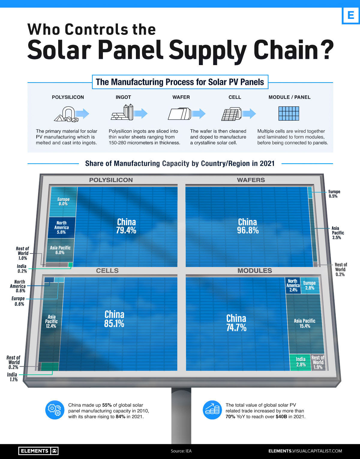
As it turns out, China owns the vast majority of the world’s solar panel supply chain, controlling at least 75% of every single key stage of solar photovoltaic panel manufacturing and processing.
This visualization shows the shares held by different countries and regions of the key stages of solar panel manufacturing, using data from the International Energy Agency (IEA).
Solar Panel Manufacturing, by Country and Stage
From polysilicon production to soldering finished solar cells and modules onto panels, China has the largest share in every stage of solar panel manufacturing.
Even back in 2010, the country made the majority of the world’s solar panels, but over the past 12 years, its average share of the solar panel supply chain has gone from 55% to 84%.
China also continues to lead in terms of investment, making up almost two-thirds of global large-scale solar investment. In the first half of 2022, the country invested $41 billion, a 173% increase from the year before.
| Country/Region | Solar Panel Demand | Average Share of Solar Panel Manufacturing Capacity |
|---|---|---|
| China | 36.4% | 84.0% |
| Europe | 16.8% | 2.9% |
| North America | 17.6% | 2.8% |
| Asia-Pacific | 13.2% | 9.1% |
| India | 6.9% | 1.3% |
| Rest of the World | 9.1% | 0.8% |
Source: IEA
Note: Percentages may not add up to 100% due to rounding
After China, the next leading nation in solar panel manufacturing is India, which makes up almost 3% of solar module manufacturing and 1% of cell manufacturing. To help meet the country’s goal of 280 gigawatts (GW) of installed solar power capacity by 2030 (currently 57.9 GW), in 2022 the Indian government allocated an additional $2.6 billion to its production-linked incentive scheme that supports domestic solar PV panel manufacturing.
Alongside China and India, the Asia-Pacific region also makes up significant amounts of solar panel manufacturing, especially modules and cells at 15.4% and 12.4% respectively.
While Europe and North America make up more than one-third of the global demand for solar panels, both regions make up an average of just under 3% each across all stages of actually manufacturing solar panels.
Too Little Too Late to Diversify?
China’s dominance of solar photovoltaic panel manufacturing is not the only stranglehold the country has on renewable energy infrastructure and materials.
When it comes to wind, in 2021 China built more offshore wind turbines than all other countries combined over the past five years, and the country is also the leading producer and processor of the rare earth minerals essential for the magnets that power turbine generators.
In its full report on solar panel manufacturing, the IEA emphasized the importance of distributing global solar panel manufacturing capacity. Recent unexpected manufacturing halts in China have resulted in the price of polysilicon rising to 10-year highs, revealing the world’s dependence on China for the supply of key materials.
As the world builds out its solar and wind energy capacity, will it manage to avoid repeating Europe’s mistakes of energy import overdependence when it comes to the materials and manufacturing of renewable energy infrastructure?


Lithium
Ranked: The Top 10 EV Battery Manufacturers in 2023
Asia dominates this ranking of the world’s largest EV battery manufacturers in 2023.
The Top 10 EV Battery Manufacturers in 2023
This was originally posted on our Voronoi app. Download the app for free on iOS or Android and discover incredible data-driven charts from a variety of trusted sources.
Despite efforts from the U.S. and EU to secure local domestic supply, all major EV battery manufacturers remain based in Asia.
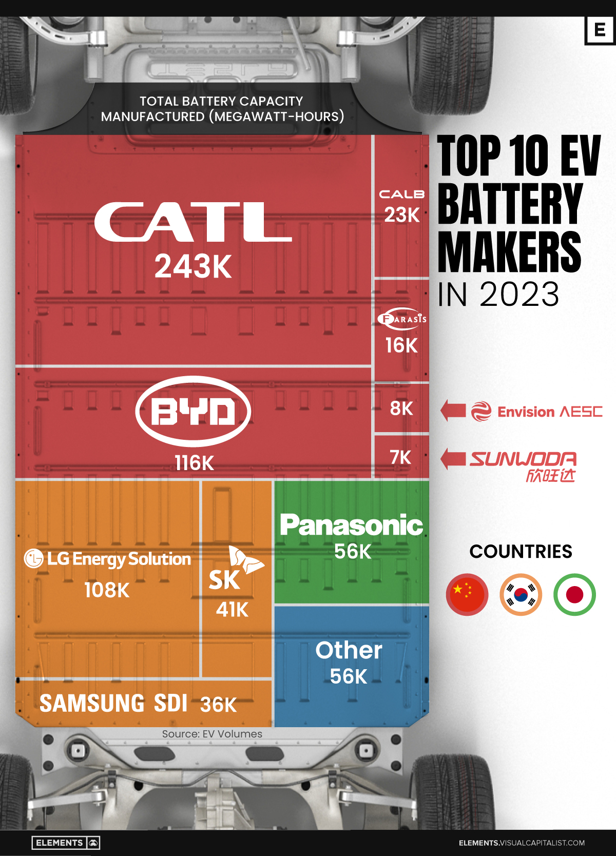
In this graphic we rank the top 10 EV battery manufacturers by total battery deployment (measured in megawatt-hours) in 2023. The data is from EV Volumes.
Chinese Dominance
Contemporary Amperex Technology Co. Limited (CATL) has swiftly risen in less than a decade to claim the title of the largest global battery group.
The Chinese company now has a 34% share of the market and supplies batteries to a range of made-in-China vehicles, including the Tesla Model Y, SAIC’s MG4/Mulan, and various Li Auto models.
| Company | Country | 2023 Production (megawatt-hour) | Share of Total Production |
|---|---|---|---|
| CATL | 🇨🇳 China | 242,700 | 34% |
| BYD | 🇨🇳 China | 115,917 | 16% |
| LG Energy Solution | 🇰🇷 Korea | 108,487 | 15% |
| Panasonic | 🇯🇵 Japan | 56,560 | 8% |
| SK On | 🇰🇷 Korea | 40,711 | 6% |
| Samsung SDI | 🇰🇷 Korea | 35,703 | 5% |
| CALB | 🇨🇳 China | 23,493 | 3% |
| Farasis Energy | 🇨🇳 China | 16,527 | 2% |
| Envision AESC | 🇨🇳 China | 8,342 | 1% |
| Sunwoda | 🇨🇳 China | 6,979 | 1% |
| Other | - | 56,040 | 8% |
In 2023, BYD surpassed LG Energy Solution to claim second place. This was driven by demand from its own models and growth in third-party deals, including providing batteries for the made-in-Germany Tesla Model Y, Toyota bZ3, Changan UNI-V, Venucia V-Online, as well as several Haval and FAW models.
The top three battery makers (CATL, BYD, LG) collectively account for two-thirds (66%) of total battery deployment.
Once a leader in the EV battery business, Panasonic now holds the fourth position with an 8% market share, down from 9% last year. With its main client, Tesla, now sourcing batteries from multiple suppliers, the Japanese battery maker seems to be losing its competitive edge in the industry.
Overall, the global EV battery market size is projected to grow from $49 billion in 2022 to $98 billion by 2029, according to Fortune Business Insights.

-

 Travel1 week ago
Airline Incidents: How Do Boeing and Airbus Compare?
-

 Markets3 weeks ago
Visualizing America’s Shortage of Affordable Homes
-

 Green3 weeks ago
Ranked: Top Countries by Total Forest Loss Since 2001
-

 Money2 weeks ago
Where Does One U.S. Tax Dollar Go?
-

 Misc2 weeks ago
Almost Every EV Stock is Down After Q1 2024
-

 AI2 weeks ago
The Stock Performance of U.S. Chipmakers So Far in 2024
-

 Markets2 weeks ago
Charted: Big Four Market Share by S&P 500 Audits
-

 Real Estate2 weeks ago
Ranked: The Most Valuable Housing Markets in America