Energy
Visualizing America’s Energy Use, in One Giant Chart
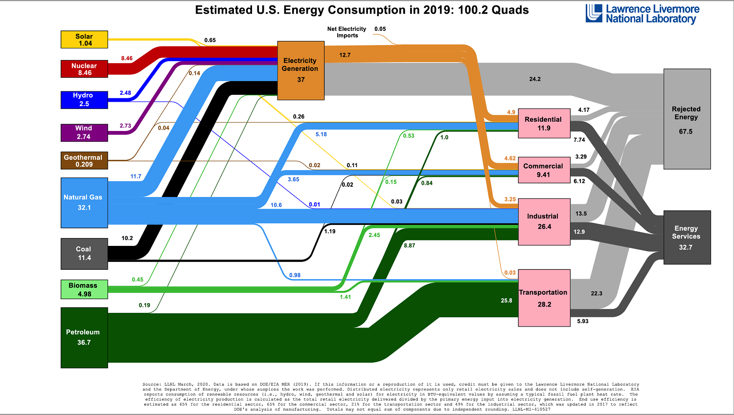
Visualizing America’s Energy Use, in One Giant Chart
Have you ever wondered where the country’s energy comes from, and how exactly it gets used?
Luckily, the Lawrence Livermore National Laboratory (LLNL) crunches the numbers every year, outputting an incredible flow diagram that covers the broad spectrum of U.S. energy use.
The 2019 version of this comprehensive diagram gives us an in-depth picture of the U.S. energy ecosystem, showing not only where energy originates by fuel source (i.e. wind, oil, natural gas, etc.) but also how it’s ultimately consumed by sector.
In Perspective: 2019 Energy Use
Below, we’ll use the unit of quads, with each quad worth 1 quadrillion BTUs, to compare data for the last five years of energy use in the United States. Each quad has roughly the same amount of energy as contained in 185 million barrels of crude oil.
| Year | Energy Consumption | Change (yoy) | Fossil Fuels in Mix |
|---|---|---|---|
| 2019 | 100.2 quads | -1.0 | 80.0% |
| 2018 | 101.2 quads | +3.5 | 80.2% |
| 2017 | 97.7 quads | +0.4 | 80.0% |
| 2016 | 97.3 quads | +0.1 | 80.8% |
| 2015 | 97.2 quads | -1.1 | 81.6% |
Interestingly, overall energy use in the U.S. actually decreased to 100.2 quads in 2019, similar to a decrease last seen in 2015.
It’s also worth noting that the percentage of fossil fuels used in the 2019 energy mix decreased by 0.2% from last year to make up 80.0% of the total. This effectively negates the small rise of fossil fuel usage that occurred in 2018.
Energy Use by Source
Which sources of energy are seeing more use, as a percentage of the total energy mix?
| 2015 | 2016 | 2017 | 2018 | 2019 | Change ('15-'19) | |
|---|---|---|---|---|---|---|
| Oil | 36.3% | 36.9% | 37.1% | 36.5% | 36.6% | +0.3% |
| Natural Gas | 29.0% | 29.3% | 28.7% | 30.6% | 32.0% | +3.0% |
| Coal | 16.1% | 14.6% | 14.3% | 13.1% | 11.4% | -4.7% |
| Nuclear | 8.6% | 8.7% | 8.6% | 8.3% | 8.4% | -0.2% |
| Biomass | 4.8% | 4.9% | 5.0% | 5.1% | 5.0% | +0.2% |
| Wind | 1.9% | 2.2% | 2.4% | 2.5% | 2.7% | +0.8% |
| Hydro | 2.5% | 2.5% | 2.8% | 2.7% | 2.5% | +0.0% |
| Solar | 0.5% | 0.6% | 0.8% | 0.9% | 1.0% | +0.5% |
| Geothermal | 0.2% | 0.2% | 0.2% | 0.2% | 0.2% | +0.0% |
Since 2015, natural gas has grown from 29% to 32% of the U.S. energy mix — while coal’s role in the mix has dropped by 4.7%.
In these terms, it can be hard to see growth in renewables, but looking at the data in more absolute terms can tell a different story. For example, in 2015 solar added 0.532 quads of energy to the mix, while in 2019 it accounted for 1.04 quads — a 95% increase.
Energy Consumption
Finally, let’s take a look at where energy goes by end consumption, and whether or not this is evolving over time.
| 2015 | 2016 | 2017 | 2018 | 2019 | Change ('15-'19) | |
|---|---|---|---|---|---|---|
| Residential | 15.6% | 15.2% | 14.7% | 15.7% | 15.7% | +0.1% |
| Commercial | 12.1% | 12.5% | 12.3% | 12.4% | 12.4% | +0.3% |
| Industrial | 33.9% | 33.8% | 34.5% | 34.6% | 34.8% | +0.9% |
| Transportation | 38.4% | 38.5% | 38.5% | 37.3% | 37.1% | -1.3% |
Residential, commercial, and industrial sectors are all increasing their use of energy, while the transportation sector is seeing a drop in energy use — likely thanks to more fuel efficient cars, EVs, public transport, and other factors.
The COVID-19 Effect on Energy Use
The energy mix is incredibly difficult to change overnight, so over the years these flow diagrams created by the Lawrence Livermore National Laboratory (LLNL) have not changed much.
One exception to this will be in 2020, which has seen an unprecedented shutdown of the global economy. As a result, imagining the next iteration of this energy flow diagram is basically anybody’s guess.
We can likely all agree that it’ll include increased levels of energy consumption in households and shortfalls everywhere else, especially in the transportation sector. However, the total amount of energy used — and where it comes from — might be a significant deviation from past years.


Energy
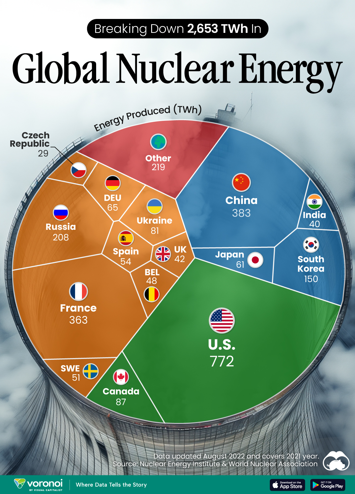
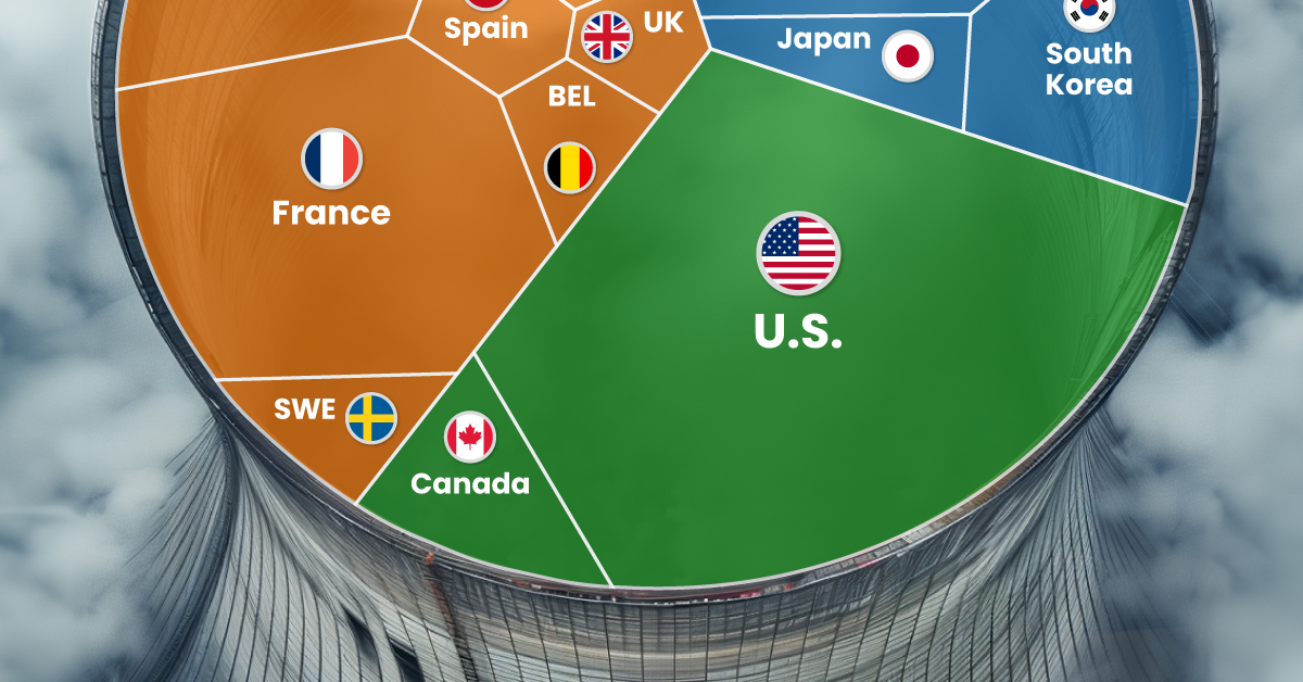
The World’s Biggest Nuclear Energy Producers
China has grown its nuclear capacity over the last decade, now ranking second on the list of top nuclear energy producers.
The World’s Biggest Nuclear Energy Producers
This was originally posted on our Voronoi app. Download the app for free on Apple or Android and discover incredible data-driven charts from a variety of trusted sources.
Scientists in South Korea recently broke a record in a nuclear fusion experiment. For 48 seconds, they sustained a temperature seven times that of the sun’s core.
But generating commercially viable energy from nuclear fusion still remains more science fiction than reality. Meanwhile, its more reliable sibling, nuclear fission, has been powering our world for many decades.
In this graphic, we visualized the top producers of nuclear energy by their share of the global total, measured in terawatt hours (TWh). Data for this was sourced from the Nuclear Energy Institute, last updated in August 2022.
Which Country Generates the Most Nuclear Energy?
Nuclear energy production in the U.S. is more than twice the amount produced by China (ranked second) and France (ranked third) put together. In total, the U.S. accounts for nearly 30% of global nuclear energy output.
However, nuclear power only accounts for one-fifth of America’s electricity supply. This is in contrast to France, which generates 60% of its electricity from nuclear plants.
| Rank | Country | Nuclear Energy Produced (TWh) | % of Total |
|---|---|---|---|
| 1 | 🇺🇸 U.S. | 772 | 29% |
| 2 | 🇨🇳 China | 383 | 14% |
| 3 | 🇫🇷 France | 363 | 14% |
| 4 | 🇷🇺 Russia | 208 | 8% |
| 5 | 🇰🇷 South Korea | 150 | 6% |
| 6 | 🇨🇦 Canada | 87 | 3% |
| 7 | 🇺🇦 Ukraine | 81 | 3% |
| 8 | 🇩🇪 Germany | 65 | 2% |
| 9 | 🇯🇵 Japan | 61 | 2% |
| 10 | 🇪🇸 Spain | 54 | 2% |
| 11 | 🇸🇪 Sweden | 51 | 2% |
| 12 | 🇧🇪 Belgium | 48 | 2% |
| 13 | 🇬🇧 UK | 42 | 2% |
| 14 | 🇮🇳 India | 40 | 2% |
| 15 | 🇨🇿 Czech Republic | 29 | 1% |
| N/A | 🌐 Other | 219 | 8% |
| N/A | 🌍 Total | 2,653 | 100% |
Another highlight is how China has rapidly grown its nuclear energy capabilities in the last decade. Between 2016 and 2021, for example, it increased its share of global nuclear energy output from less than 10% to more than 14%, overtaking France for second place.
On the opposite end, the UK’s share has slipped to 2% over the same time period.
Meanwhile, Ukraine has heavily relied on nuclear energy to power its grid. In March 2022, it lost access to its key Zaporizhzhia Nuclear Power Station after Russian forces wrested control of the facility. With six 1,000 MW reactors, the plant is one of the largest in Europe. It is currently not producing any power, and has been the site of recent drone attacks.

-

 Real Estate2 weeks ago
Visualizing America’s Shortage of Affordable Homes
-

 Technology1 week ago
Ranked: Semiconductor Companies by Industry Revenue Share
-

 Money1 week ago
Which States Have the Highest Minimum Wage in America?
-

 Real Estate1 week ago
Ranked: The Most Valuable Housing Markets in America
-

 Business2 weeks ago
Charted: Big Four Market Share by S&P 500 Audits
-

 AI2 weeks ago
The Stock Performance of U.S. Chipmakers So Far in 2024
-

 Misc2 weeks ago
Almost Every EV Stock is Down After Q1 2024
-

 Money2 weeks ago
Where Does One U.S. Tax Dollar Go?