Misc
Visualizing 200 Years of U.S. Population Density
Visualizing 200 Years of U.S. Population Density
At the moment, there are around 326 million people living in the United States, a country that’s 3.5 million square miles (9.8 million sq km) in land area.
But throughout the nation’s history, neither of these numbers have stayed constant.
Not only did the population boom as a result of births and immigrants, but the borders of the country kept changing as well – especially in the country’s early years as settlers moved westwards.
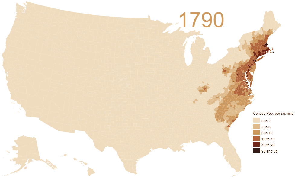
U.S. Population Density Over Time
From a big picture perspective, here is how population density has changed for the country as a whole over the last 200 years or so:
[table “404” not found /]But today’s animated map, which comes to us from Vivid Maps, takes things a step further.
It plots U.S. population density numbers over the time period of 1790-2010 based on U.S. Census data and Jonathan Schroeder’s county-level decadal estimates for population. In essence, it gives a more precise view of who moved where and when over the course of the nation’s history.
Note: While U.S. Census data is granular and dates back to 1790, it comes with certain limitations. One obvious drawback, for example, is that such data is not able to properly account for Native American populations.
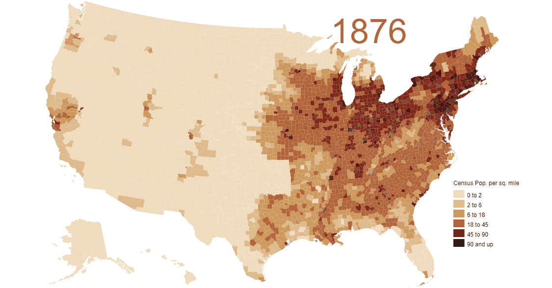
“Go West, Young Man”
As you might notice in the animation, there is one anomaly that appears in the late-1800s: the area around modern-day Oklahoma is colored in, but the state itself is an “empty gap” on the map.
The reason for this? The area was originally designated as Indian Territory – land reserved for the forced re-settlement of Native Americans. However, in 1889, the land was opened up to a massive land rush, and approximately 50,000 pioneers lined up to grab a piece of the two million acres (8,000 km²) opened for settlement.
While settlers flocking to Oklahoma is one specific event that ties into this animation, really the map shows the history of a much broader land rush in general: Manifest Destiny.
You can see pioneers landing in Louisiana in the early 1800s, the first settlements in California and Oregon, and the gradual filling up of the states in the middle of the country.
By the mid-20th century, the distribution of the population starts to resemble that of modern America.
Population Density Today
The average population density in the U.S. is now 92 people per square mile, although this changes dramatically based on where you are located:
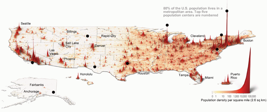
If you are in Alaska, the state with the lowest population density, there is just one person per square mile – but if you’re in New York City there are 27,000 people per square mile, the highest of any major city in the country.


VC+
VC+: Get Our Key Takeaways From the IMF’s World Economic Outlook
A sneak preview of the exclusive VC+ Special Dispatch—your shortcut to understanding IMF’s World Economic Outlook report.

Have you read IMF’s latest World Economic Outlook yet? At a daunting 202 pages, we don’t blame you if it’s still on your to-do list.
But don’t worry, you don’t need to read the whole April release, because we’ve already done the hard work for you.
To save you time and effort, the Visual Capitalist team has compiled a visual analysis of everything you need to know from the report—and our upcoming VC+ Special Dispatch will be available exclusively to VC+ members on Thursday, April 25th.
If you’re not already subscribed to VC+, make sure you sign up now to receive the full analysis of the IMF report, and more (we release similar deep dives every week).
For now, here’s what VC+ members can expect to receive.
Your Shortcut to Understanding IMF’s World Economic Outlook
With long and short-term growth prospects declining for many countries around the world, this Special Dispatch offers a visual analysis of the key figures and takeaways from the IMF’s report including:
- The global decline in economic growth forecasts
- Real GDP growth and inflation forecasts for major nations in 2024
- When interest rate cuts will happen and interest rate forecasts
- How debt-to-GDP ratios have changed since 2000
- And much more!

Get the Full Breakdown in the Next VC+ Special Dispatch
VC+ members will receive the full Special Dispatch on Thursday, April 25th.
Make sure you join VC+ now to receive exclusive charts and the full analysis of key takeaways from IMF’s World Economic Outlook.
Don’t miss out. Become a VC+ member today.
What You Get When You Become a VC+ Member
VC+ is Visual Capitalist’s premium subscription. As a member, you’ll get the following:
- Special Dispatches: Deep dive visual briefings on crucial reports and global trends
- Markets This Month: A snappy summary of the state of the markets and what to look out for
- The Trendline: Weekly curation of the best visualizations from across the globe
- Global Forecast Series: Our flagship annual report that covers everything you need to know related to the economy, markets, geopolitics, and the latest tech trends
- VC+ Archive: Hundreds of previously released VC+ briefings and reports that you’ve been missing out on, all in one dedicated hub
You can get all of the above, and more, by joining VC+ today.

-

 Travel1 week ago
Airline Incidents: How Do Boeing and Airbus Compare?
-

 Markets2 weeks ago
Visualizing America’s Shortage of Affordable Homes
-

 Green2 weeks ago
Ranked: Top Countries by Total Forest Loss Since 2001
-

 Money2 weeks ago
Where Does One U.S. Tax Dollar Go?
-

 Misc2 weeks ago
Almost Every EV Stock is Down After Q1 2024
-

 AI2 weeks ago
The Stock Performance of U.S. Chipmakers So Far in 2024
-

 Markets2 weeks ago
Charted: Big Four Market Share by S&P 500 Audits
-

 Real Estate2 weeks ago
Ranked: The Most Valuable Housing Markets in America