Economy
The U.S. States with the Top Tech Salaries in 2021
The U.S. States with the Top Tech Salaries in 2021
In 2020, despite the economic turmoil caused by the global pandemic, America’s tech sector experienced rapid growth. Last year, the total number of U.S. tech jobs grew by 60,000.
Because of this demand, U.S. employers are willing to pay for the right talent—on average, tech workers in the U.S. earn about 61% more than the average salary. But some tech workers make more than others, depending on where they live.
This graphic by business.org uses data from the Bureau of Labor Statistics (BLS) to highlight the average annual tech salaries in each state, compared to the average salary of other occupations. We’ll also touch on the top-paying metro areas, and what type of tech jobs offer the highest compensation across the country.
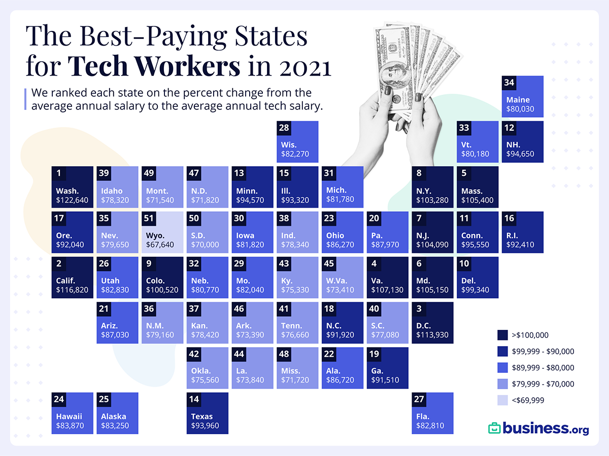
Average U.S. Tech Salaries by State
Perhaps unsurprisingly, Washington and California have the highest average salaries, largely because of the high job density in those areas.
However, when it comes to the difference in tech salary versus average salary, Alabama takes the top spot—on average, tech jobs pay 85% more than other occupations in that state.
| Rank | State | Average hourly wage for tech workers | Average salary for tech workers | % more that tech workers earn than all occupations |
|---|---|---|---|---|
| 1 | Alabama | $41.69 | $86,720 | 85% |
| 2 | Washington | $58.96 | $122,640 | 83% |
| 3 | North Carolina | $44.19 | $91,920 | 80% |
| 4 | Texas | $45.04 | $93,690 | 79% |
| 5 | Virginia | $51.50 | $107,130 | 78% |
| 6 | California | $56.16 | $116,820 | 78% |
| 7 | Georgia | $44.00 | $91,510 | 76% |
| 8 | Delaware | $47.76 | $99,340 | 75% |
| 9 | Mississippi | $34.48 | $71,720 | 72% |
| 10 | Ohio | $41.48 | $86,270 | 67% |
| 11 | Idaho | $37.65 | $78,320 | 67% |
| 12 | New Hampshire | $45.50 | $94,650 | 67% |
| 13 | South Carolina | $37.06 | $77,080 | 67% |
| 14 | Iowa | $39.34 | $81,820 | 66% |
| 15 | Florida | $39.81 | $82,810 | 66% |
| 16 | Maryland | $50.55 | $105,150 | 65% |
| 17 | Colorado | $48.33 | $100,520 | 65% |
| 18 | Arkansas | $35.28 | $73,390 | 64% |
| 19 | Kentucky | $36.21 | $75,330 | 64% |
| 20 | Missouri | $39.44 | $82,040 | 64% |
| 21 | New Jersey | $50.04 | $104,090 | 63% |
| 22 | Pennsylvania | $42.29 | $87,970 | 63% |
| 23 | Arizona | $41.84 | $87,030 | 63% |
| 24 | Oregon | $44.25 | $92,040 | 62% |
| 25 | West Virginia | $35.29 | $73,410 | 62% |
| 26 | Kansas | $37.70 | $78,420 | 61% |
| 27 | Tennessee | $36.86 | $76,660 | 61% |
| 28 | Utah | $39.82 | $82,830 | 61% |
| 29 | Minnesota | $45.47 | $94,570 | 61% |
| 30 | Indiana | $37.66 | $78,340 | 61% |
| 31 | Nebraska | $38.83 | $80,770 | 61% |
| 32 | Illinois | $44.87 | $93,320 | 61% |
| 33 | Wisconsin | $39.55 | $82,270 | 61% |
| 34 | Oklahoma | $36.33 | $75,560 | 60% |
| 35 | New Mexico | $38.06 | $79,160 | 59% |
| 36 | Louisiana | $35.50 | $73,840 | 59% |
| 37 | Nevada | $38.29 | $79,650 | 58% |
| 38 | Maine | $38.48 | $80,030 | 56% |
| 39 | South Dakota | $33.65 | $70,000 | 56% |
| 40 | Rhode Island | $44.43 | $92,410 | 53% |
| 41 | Michigan | $39.32 | $81,780 | 53% |
| 42 | New York | $49.65 | $103,280 | 52% |
| 43 | Montana | $34.40 | $71,540 | 51% |
| 44 | Massachusetts | $50.67 | $105,400 | 51% |
| 45 | Vermont | $38.55 | $80,180 | 50% |
| 46 | Connecticut | $45.94 | $95,550 | 46% |
| 47 | Hawaii | $40.32 | $83,870 | 44% |
| 48 | North Dakota | $34.53 | $71,820 | 37% |
| 49 | Alaska | $40.02 | $83,250 | 35% |
| 50 | Wyoming | $32.52 | $67,640 | 32% |
| 51 | District of Columbia | $54.78 | $113,930 | 20% |
Why are tech workers so generously compensated in Alabama? It could be because the area’s talent pool is not keeping up with demand.
In 2021, Huntsville, Alabama is expected to see 25,000 new jobs in aerospace, logistics, defense, and other tech-related industries. But these jobs could be difficult to fill given the area’s low unemployment rate.
On the other end of the spectrum, the District of Columbia has the smallest discrepancy between tech and other salaries. But at $95,330, the area has the highest average yearly salary for other occupations in the country—and tech workers still make 20% more.
Top 10 Metro Areas for Tech Salaries
Some of the highest-paying states are also home to the highest-paying metro areas.
For instance, when it comes to pay differences in tech, two of the top 10 metro areas are located in Washington state, while three are in California. The graphic below shows the metros with the highest difference between the area’s average salary and the average salary of tech jobs.
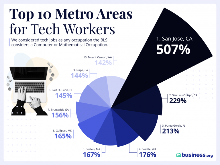
The highest pay difference between tech jobs vs the average salary is in San Jose, where tech workers make 507% more on average. This figure is almost certainly skewed because of the area’s high concentration of tech millionaires and top tier programmers.
Highest Paying Tech Jobs Nationally
Of course, location isn’t the only factor that plays into salary—the type of job is important, too. Here’s a look at U.S. tech salaries, organized by job type:
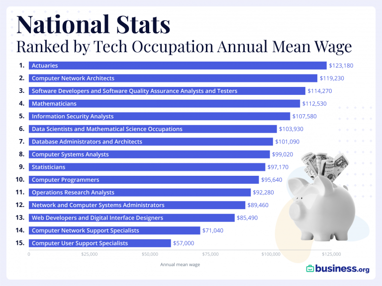
In this analysis, which looked at jobs in computer science as well as mathematics, actuaries are the highest paid professionals on average.
While actuaries are more on the mathematical and financial side of the equation, more commonly associated jobs with tech are all over the list as well: software developers, computer network architects, information security analysts, data scientists, computer programmers, web developers, computer systems analysts, and so on.
The Future of Tech is Bright
America’s information technology sector, worth about $1.6 trillion, is expected to grow to $5 trillion by the end of 2021. And as this fast-growing industry continues to boom, jobs in this sector are likely to remain in high supply.
Augmented Reality (AR) in the U.S. is looking especially promising and is projected to grow by a CAGR of 100% between 2021-2025.
In short, tech is expected to keep growing. And salaries will likely follow suit.


Economy
The Bloc Effect: International Trade with Geopolitical Allies on the Rise
Rising geopolitical tensions are shaping the future of international trade, but what is the effect on trading among G7 and BRICS countries?


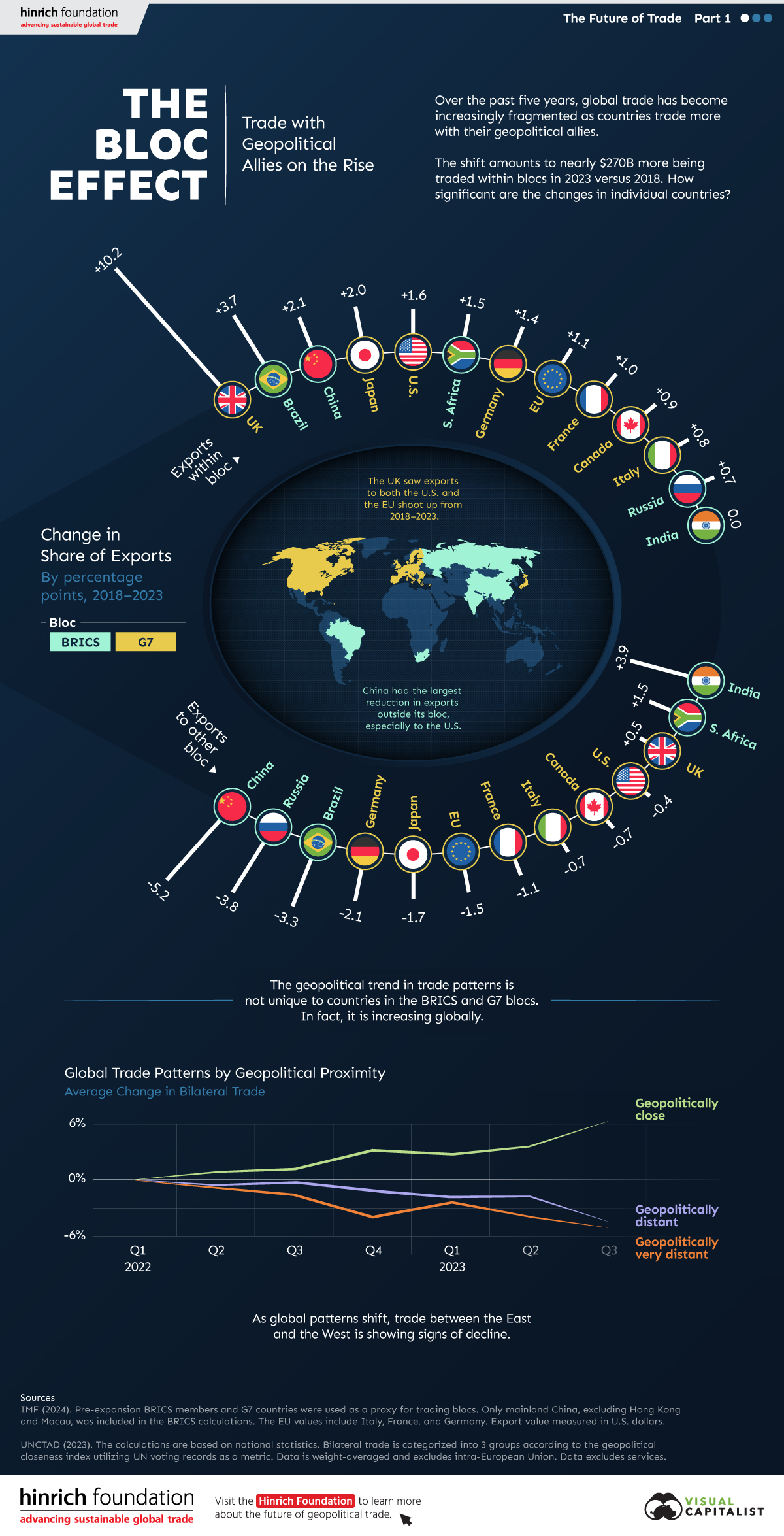
The Bloc Effect: International Trade with Allies on the Rise
International trade has become increasingly fragmented over the last five years as countries have shifted to trading more with their geopolitical allies.
This graphic from The Hinrich Foundation, the first in a three-part series covering the future of trade, provides visual context to the growing divide in trade in G7 and pre-expansion BRICS countries, which are used as proxies for geopolitical blocs.
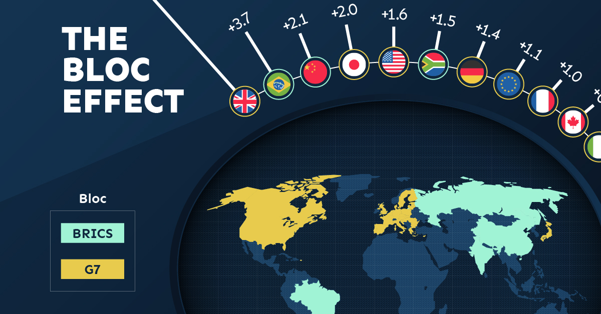
Trade Shifts in G7 and BRICS Countries
This analysis uses IMF data to examine differences in shares of exports within and between trading blocs from 2018 to 2023. For example, we looked at the percentage of China’s exports with other BRICS members as well as with G7 members to see how these proportions shifted in percentage points (pp) over time.
Countries traded nearly $270 billion more with allies in 2023 compared to 2018. This shift came at the expense of trade with rival blocs, which saw a decline of $314 billion.
Country Change in Exports Within Bloc (pp) Change in Exports With Other Bloc (pp)
🇮🇳 India 0.0 3.9
🇷🇺 Russia 0.7 -3.8
🇮🇹 Italy 0.8 -0.7
🇨🇦 Canada 0.9 -0.7
🇫🇷 France 1.0 -1.1
🇪🇺 EU 1.1 -1.5
🇩🇪 Germany 1.4 -2.1
🇿🇦 South Africa 1.5 1.5
🇺🇸 U.S. 1.6 -0.4
🇯🇵 Japan 2.0 -1.7
🇨🇳 China 2.1 -5.2
🇧🇷 Brazil 3.7 -3.3
🇬🇧 UK 10.2 0.5
All shifts reported are in percentage points. For example, the EU saw its share of exports to G7 countries rise from 74.3% in 2018 to 75.4% in 2023, which equates to a 1.1 percentage point increase.
The UK saw the largest uptick in trading with other countries within the G7 (+10.2 percentage points), namely the EU, as the post-Brexit trade slump to the region recovered.
Meanwhile, the U.S.-China trade dispute caused China’s share of exports to the G7 to fall by 5.2 percentage points from 2018 to 2023, the largest decline in our sample set. In fact, partly as a result of the conflict, the U.S. has by far the highest number of harmful tariffs in place.
The Russia-Ukraine War and ensuing sanctions by the West contributed to Russia’s share of exports to the G7 falling by 3.8 percentage points over the same timeframe.
India, South Africa, and the UK bucked the trend and continued to witness advances in exports with the opposing bloc.
Average Trade Shifts of G7 and BRICS Blocs
Though results varied significantly on a country-by-country basis, the broader trend towards favoring geopolitical allies in international trade is clear.
Bloc Change in Exports Within Bloc (pp) Change in Exports With Other Bloc (pp)
Average 2.1 -1.1
BRICS 1.6 -1.4
G7 incl. EU 2.4 -1.0
Overall, BRICS countries saw a larger shift away from exports with the other bloc, while for G7 countries the shift within their own bloc was more pronounced. This implies that though BRICS countries are trading less with the G7, they are relying more on trade partners outside their bloc to make up for the lost G7 share.
A Global Shift in International Trade and Geopolitical Proximity
The movement towards strengthening trade relations based on geopolitical proximity is a global trend.
The United Nations categorizes countries along a scale of geopolitical proximity based on UN voting records.
According to the organization’s analysis, international trade between geopolitically close countries rose from the first quarter of 2022 (when Russia first invaded Ukraine) to the third quarter of 2023 by over 6%. Conversely, trade with geopolitically distant countries declined.
The second piece in this series will explore China’s gradual move away from using the U.S. dollar in trade settlements.
Visit the Hinrich Foundation to learn more about the future of geopolitical trade

-

 Markets1 week ago
Ranked: The Largest U.S. Corporations by Number of Employees
We visualized the top U.S. companies by employees, revealing the massive scale of retailers like Walmart, Target, and Home Depot.
-

 United States2 weeks ago
Where U.S. Inflation Hit the Hardest in March 2024
We visualized product categories that saw the highest % increase in price due to U.S. inflation as of March 2024.
-

 Economy4 weeks ago
G20 Inflation Rates: Feb 2024 vs COVID Peak
We visualize inflation rates across G20 countries as of Feb 2024, in the context of their COVID-19 pandemic peak.
-

 Jobs4 weeks ago
Mapped: Unemployment Claims by State
This visual heatmap of unemployment claims by state highlights New York, California, and Alaska leading the country by a wide margin.
-

 Economy2 months ago
Confidence in the Global Economy, by Country
Will the global economy be stronger in 2024 than in 2023?
-

 Africa2 months ago
Mapped: Breaking Down the $3 Trillion African Economy by Country
The top three economic powerhouses of Africa contribute more than one-third to the African economy. We rank the nations of the world’s second-largest continent by 2024…

-

 Green1 week ago
Ranking the Top 15 Countries by Carbon Tax Revenue
-

 Technology2 weeks ago
The Stock Performance of U.S. Chipmakers So Far in 2024
-

 Markets2 weeks ago
Charted: Big Four Market Share by S&P 500 Audits
-

 Real Estate2 weeks ago
Ranked: The Most Valuable Housing Markets in America
-

 Money2 weeks ago
Which States Have the Highest Minimum Wage in America?
-

 AI2 weeks ago
Ranked: Semiconductor Companies by Industry Revenue Share
-

 Travel2 weeks ago
Ranked: The World’s Top Flight Routes, by Revenue
-

 Countries2 weeks ago
Population Projections: The World’s 6 Largest Countries in 2075