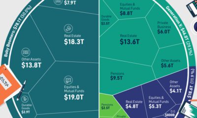
Misc
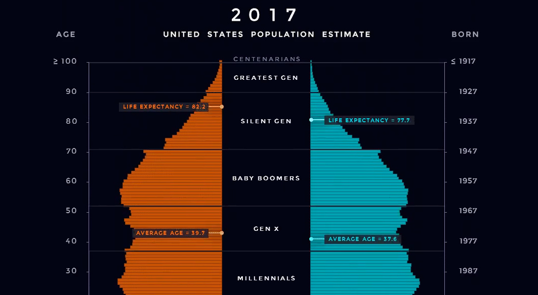
Animation: U.S. Population Pyramid From 1980-2050
It’s no secret that an aging population will be the source of major demographic challenges in the coming years.
In 1975, the median age in the United States was just 28 years old. However, it’s been rising fast as the Baby Boomers age, and it’s expected to break the 40 year mark by 2030.
This shift is so fundamental that its ripples will be felt in almost every area imaginable. How we manage this change will have implications on the economy, culture, and politics – and it will almost certainly affect our personal wealth and investments, as well.
Visualizing Age in the U.S.
We’ve previously compared the population pyramids of China and India, but today we’re going to key in on the U.S. using a similar type of animation.
Below is an animated population pyramid that shows how the U.S. population has been shifting, including projections up until 2050 based on data from the U.S. Census Bureau and World Bank.
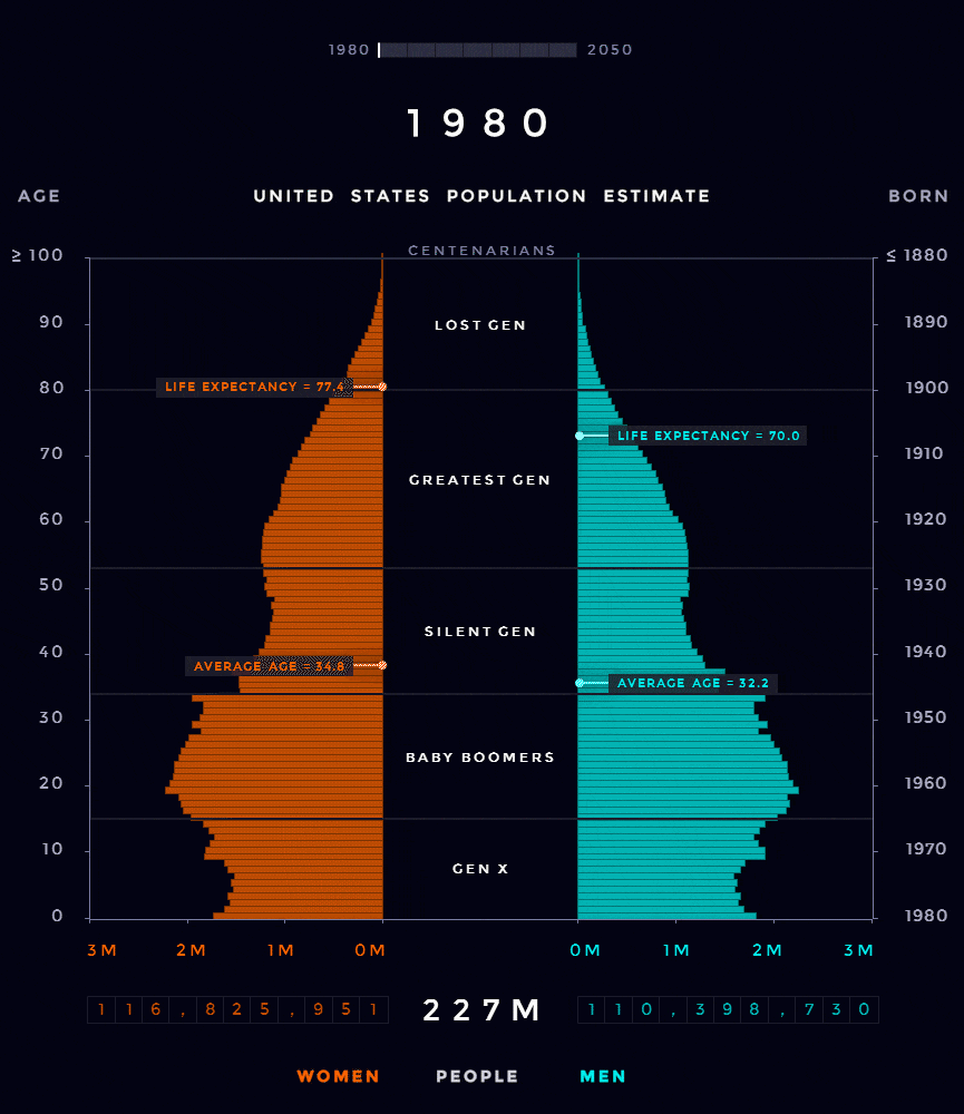
Credit: Reddit user milamiso
By 2050, the U.S. population will close in on 400 million people.
As with most demographic data, viewing changes in the composition of this population through a visual lens helps to provide perspective.
Aging Population
One of the biggest differences in this particular chart can be seen in the 65+ year region. In the 1980s, only a small portion of the population fits there – but by the end, it’s becoming quite crowded.
In more numerical terms – the number of Americans aged 65+ is projected to jump from 46 million today to over 98 million by 2060, and the 65+ age group’s share of the total population will rise to nearly 24%. This is mainly a function of a big generation (Baby Boomers) hitting their later years, and improved life expectancy and healthcare.
According to the Population Reference Bureau, aging Baby Boomers could mean a massive 75% increase in number of Americans requiring nursing home care, from 1.3 million in 2010 to 2.3 million in 2030.
Social Security and Medicare expenditures will also increase from 8% to 12% of GDP by 2050.
Fewer Babies
Another factor in the population equation is also lower fertility rates.
U.S. Fertility Rate (births per woman)
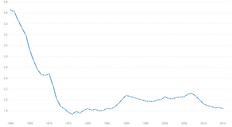
In the United States, the fertility rates that led to the Baby Boomer generation (born 1946-1964) have been long-gone for many decades now.
Lately, fertility has been hovering closer to 1.8 births per woman.
For reference, the replacement fertility rate is about 2.1 – meaning that without taking into account net immigration, each new generation will be smaller than the last. Unless something changes here (or with immigration policy), a more mature population will increasingly become the norm for the country.


Misc
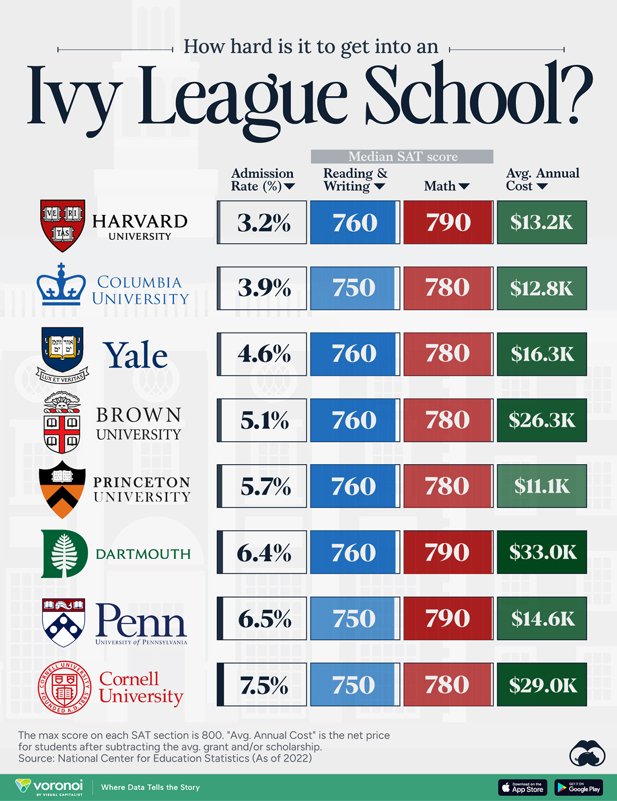
How Hard Is It to Get Into an Ivy League School?
We detail the admission rates and average annual cost for Ivy League schools, as well as the median SAT scores required to be accepted.
How Hard Is It to Get Into an Ivy League School?
This was originally posted on our Voronoi app. Download the app for free on iOS or Android and discover incredible data-driven charts from a variety of trusted sources.
Ivy League institutions are renowned worldwide for their academic excellence and long-standing traditions. But how hard is it to get into one of the top universities in the U.S.?
In this graphic, we detail the admission rates and average annual cost for Ivy League schools, as well as the median SAT scores required to be accepted. The data comes from the National Center for Education Statistics and was compiled by 24/7 Wall St.
Note that “average annual cost” represents the net price a student pays after subtracting the average value of grants and/or scholarships received.
Harvard is the Most Selective
The SAT is a standardized test commonly used for college admissions in the United States. It’s taken by high school juniors and seniors to assess their readiness for college-level academic work.
When comparing SAT scores, Harvard and Dartmouth are among the most challenging universities to gain admission to. The median SAT scores for their students are 760 for reading and writing and 790 for math. Still, Harvard has half the admission rate (3.2%) compared to Dartmouth (6.4%).
| School | Admission rate (%) | SAT Score: Reading & Writing | SAT Score: Math | Avg Annual Cost* |
|---|---|---|---|---|
| Harvard University | 3.2 | 760 | 790 | $13,259 |
| Columbia University | 3.9 | 750 | 780 | $12,836 |
| Yale University | 4.6 | 760 | 780 | $16,341 |
| Brown University | 5.1 | 760 | 780 | $26,308 |
| Princeton University | 5.7 | 760 | 780 | $11,080 |
| Dartmouth College | 6.4 | 760 | 790 | $33,023 |
| University of Pennsylvania | 6.5 | 750 | 790 | $14,851 |
| Cornell University | 7.5 | 750 | 780 | $29,011 |
*Costs after receiving federal financial aid.
Additionally, Dartmouth has the highest average annual cost at $33,000. Princeton has the lowest at $11,100.
While student debt has surged in the United States in recent years, hitting $1.73 trillion in 2023, the worth of obtaining a degree from any of the schools listed surpasses mere academics. This is evidenced by the substantial incomes earned by former students.
Harvard grads, for example, have the highest average starting salary in the country, at $91,700.

-

 Real Estate2 weeks ago
Visualizing America’s Shortage of Affordable Homes
-

 Technology1 week ago
Ranked: Semiconductor Companies by Industry Revenue Share
-

 Money1 week ago
Which States Have the Highest Minimum Wage in America?
-

 Real Estate1 week ago
Ranked: The Most Valuable Housing Markets in America
-

 Business2 weeks ago
Charted: Big Four Market Share by S&P 500 Audits
-

 AI2 weeks ago
The Stock Performance of U.S. Chipmakers So Far in 2024
-

 Misc2 weeks ago
Almost Every EV Stock is Down After Q1 2024
-

 Money2 weeks ago
Where Does One U.S. Tax Dollar Go?