Markets
Made in America: Goods Exports by State
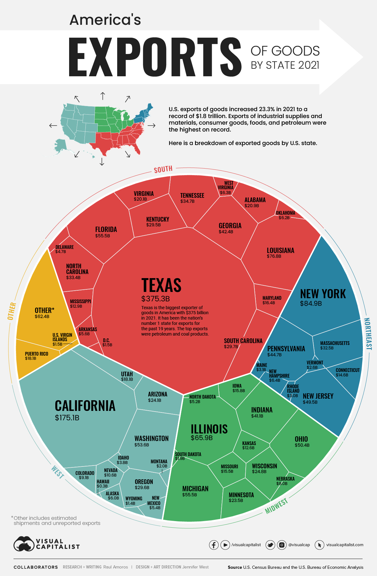


Made in America: Goods Exports by State
After China, the U.S. is the next largest exporter of goods in the world, shipping out $1.8 trillion worth of goods in 2021—an increase of 23% over the previous year.
Of course, that massive number doesn’t tell the whole story. The U.S. economy is multifaceted, with varying levels of trade activity taking place all across the nation.
Using the latest data on international trade from the U.S. Census Bureau and the U.S. Bureau of Economic Analysis, we’ve visualized the value of America’s goods exports by state.
Top 10 Exporter States
Here are the top 10 American states that exported the highest dollar value worth of goods during 2021. Combined, these export-leading states represent 59.4% of the nation’s total exports.
| Rank | State | Total Exports Value | % share |
|---|---|---|---|
| #1 | Texas | $375.3 billion | 21.4% |
| #2 | California | $175.1 billion | 10.0% |
| #3 | New York | $84.9 billion | 4.8% |
| #4 | Louisiana | $76.8 billion | 4.4% |
| #5 | Illinois | $65.9 billion | 3.8% |
| #6 | Michigan | $55.5 billion | 3.2% |
| #7 | Florida | $55.5 billion | 3.2% |
| #8 | Washington | $53.6 billion | 3.1% |
| #9 | Ohio | $50.4 billion | 2.9% |
| #10 | New Jersey | $49.5 billion | 2.8% |
| Top 10 States | $1.04 trillion | 59.4% |
Texas has been the top exporting state in the U.S. for an incredible 20 years in a row.
Last year, Texas exported $375 billion worth of goods, which is more than California ($175 billion), New York ($85 billion), and Louisiana ($77 billion) combined. The state’s largest manufacturing export category is petroleum and coal products, but it’s also important to mention that Texas led the nation in tech exports for the ninth straight year.
California was the second highest exporter of goods in 2021 with a total value of $175 billion, an increase of 12% from the previous year. The state’s main export by value was computer and electronic product manufacturing, representing 17.8% of the total U.S. exports of that industry. California was also second among all states in exports of machinery manufacturing, accounting for 13.9% of the U.S. total.
What Type of Goods are Exported?
Here is a breakdown of the biggest U.S. export categories by value in 2021.
| Rank | Product Group | Annual Export Value (2021) | Share of Total Exports |
|---|---|---|---|
| 1 | Mineral fuels including oil | $239.8 billion | 13.7% |
| 2 | Machinery including computers | $209.3 billion | 11.9% |
| 3 | Electrical machinery, equipment | $185.4 billion | 10.6% |
| 4 | Vehicles | $122.2 billion | 7.0% |
| 5 | Optical, technical, medical apparatus | $91.7 billion | 5.2% |
| 6 | Aircraft, spacecraft | $89.1 billion | 5.1% |
| 7 | Gems, precious metals | $82.3 billion | 4.7% |
| 8 | Pharmaceuticals | $78 billion | 4.4% |
| 9 | Plastics, plastic articles | $74.3 billion | 4.2% |
| 10 | Organic chemicals | $42.9 billion | 2.4% |
These top 10 export categories alone represent almost 70% of America’s total exports.
The biggest grower among this list is mineral fuels, up by 59% from last year. Pharmaceuticals saw the second biggest one-year increase (45%).
Top 10 U.S. Exports by Country of Destination
So who is buying “Made in America” products?
Unsurprisingly, neighboring countries Canada (17.5%) and Mexico (15.8%) are the two biggest buyers of American goods. Together, they purchase one-third of American exports.
| Rank | Destination Country | Share of U.S. Goods Exports |
|---|---|---|
| 1 | 🇨🇦 Canada | 17.5% |
| 2 | 🇲🇽 Mexico | 15.8% |
| 3 | 🇨🇳 China | 8.6% |
| 4 | 🇯🇵 Japan | 4.3% |
| 5 | 🇰🇷 South Korea | 3.7% |
| 6 | 🇩🇪 Germany | 3.7% |
| 7 | 🇬🇧 United Kingdom | 3.5% |
| 8 | 🇳🇱 Netherlands | 3.1% |
| 9 | 🇧🇷 Brazil | 2.7% |
| 10 | 🇮🇳 India | 2.3% |
Three Asian countries round out the top five list: China (8.6%), Japan (4.3%), and South Korea (3.7%). Together, the top five countries account for around half of all goods exports.


Markets
U.S. Debt Interest Payments Reach $1 Trillion
U.S. debt interest payments have surged past the $1 trillion dollar mark, amid high interest rates and an ever-expanding debt burden.


U.S. Debt Interest Payments Reach $1 Trillion
This was originally posted on our Voronoi app. Download the app for free on iOS or Android and discover incredible data-driven charts from a variety of trusted sources.
The cost of paying for America’s national debt crossed the $1 trillion dollar mark in 2023, driven by high interest rates and a record $34 trillion mountain of debt.
Over the last decade, U.S. debt interest payments have more than doubled amid vast government spending during the pandemic crisis. As debt payments continue to soar, the Congressional Budget Office (CBO) reported that debt servicing costs surpassed defense spending for the first time ever this year.
This graphic shows the sharp rise in U.S. debt payments, based on data from the Federal Reserve.
A $1 Trillion Interest Bill, and Growing
Below, we show how U.S. debt interest payments have risen at a faster pace than at another time in modern history:
| Date | Interest Payments | U.S. National Debt |
|---|---|---|
| 2023 | $1.0T | $34.0T |
| 2022 | $830B | $31.4T |
| 2021 | $612B | $29.6T |
| 2020 | $518B | $27.7T |
| 2019 | $564B | $23.2T |
| 2018 | $571B | $22.0T |
| 2017 | $493B | $20.5T |
| 2016 | $460B | $20.0T |
| 2015 | $435B | $18.9T |
| 2014 | $442B | $18.1T |
| 2013 | $425B | $17.2T |
| 2012 | $417B | $16.4T |
| 2011 | $433B | $15.2T |
| 2010 | $400B | $14.0T |
| 2009 | $354B | $12.3T |
| 2008 | $380B | $10.7T |
| 2007 | $414B | $9.2T |
| 2006 | $387B | $8.7T |
| 2005 | $355B | $8.2T |
| 2004 | $318B | $7.6T |
| 2003 | $294B | $7.0T |
| 2002 | $298B | $6.4T |
| 2001 | $318B | $5.9T |
| 2000 | $353B | $5.7T |
| 1999 | $353B | $5.8T |
| 1998 | $360B | $5.6T |
| 1997 | $368B | $5.5T |
| 1996 | $362B | $5.3T |
| 1995 | $357B | $5.0T |
| 1994 | $334B | $4.8T |
| 1993 | $311B | $4.5T |
| 1992 | $306B | $4.2T |
| 1991 | $308B | $3.8T |
| 1990 | $298B | $3.4T |
| 1989 | $275B | $3.0T |
| 1988 | $254B | $2.7T |
| 1987 | $240B | $2.4T |
| 1986 | $225B | $2.2T |
| 1985 | $219B | $1.9T |
| 1984 | $205B | $1.7T |
| 1983 | $176B | $1.4T |
| 1982 | $157B | $1.2T |
| 1981 | $142B | $1.0T |
| 1980 | $113B | $930.2B |
| 1979 | $96B | $845.1B |
| 1978 | $84B | $789.2B |
| 1977 | $69B | $718.9B |
| 1976 | $61B | $653.5B |
| 1975 | $55B | $576.6B |
| 1974 | $50B | $492.7B |
| 1973 | $45B | $469.1B |
| 1972 | $39B | $448.5B |
| 1971 | $36B | $424.1B |
| 1970 | $35B | $389.2B |
| 1969 | $30B | $368.2B |
| 1968 | $25B | $358.0B |
| 1967 | $23B | $344.7B |
| 1966 | $21B | $329.3B |
Interest payments represent seasonally adjusted annual rate at the end of Q4.
At current rates, the U.S. national debt is growing by a remarkable $1 trillion about every 100 days, equal to roughly $3.6 trillion per year.
As the national debt has ballooned, debt payments even exceeded Medicaid outlays in 2023—one of the government’s largest expenditures. On average, the U.S. spent more than $2 billion per day on interest costs last year. Going further, the U.S. government is projected to spend a historic $12.4 trillion on interest payments over the next decade, averaging about $37,100 per American.
Exacerbating matters is that the U.S. is running a steep deficit, which stood at $1.1 trillion for the first six months of fiscal 2024. This has accelerated due to the 43% increase in debt servicing costs along with a $31 billion dollar increase in defense spending from a year earlier. Additionally, a $30 billion increase in funding for the Federal Deposit Insurance Corporation in light of the regional banking crisis last year was a major contributor to the deficit increase.
Overall, the CBO forecasts that roughly 75% of the federal deficit’s increase will be due to interest costs by 2034.

-

 Mining2 weeks ago
Charted: The Value Gap Between the Gold Price and Gold Miners
-

 Real Estate1 week ago
Ranked: The Most Valuable Housing Markets in America
-

 Business1 week ago
Charted: Big Four Market Share by S&P 500 Audits
-

 AI1 week ago
The Stock Performance of U.S. Chipmakers So Far in 2024
-

 Misc1 week ago
Almost Every EV Stock is Down After Q1 2024
-

 Money2 weeks ago
Where Does One U.S. Tax Dollar Go?
-

 Green2 weeks ago
Ranked: Top Countries by Total Forest Loss Since 2001
-

 Real Estate2 weeks ago
Visualizing America’s Shortage of Affordable Homes