Markets
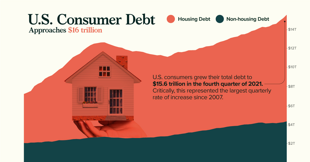
Charted: U.S. Consumer Debt Approaches $16 Trillion
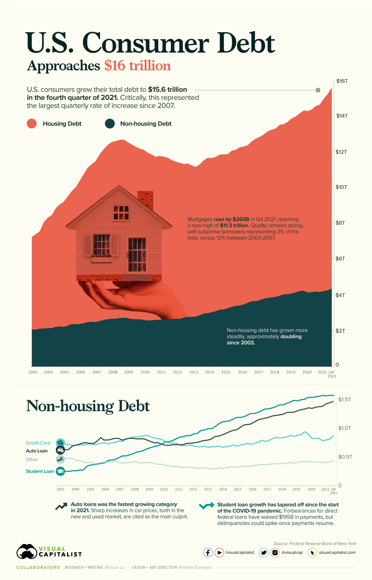


Charted: U.S. Consumer Debt Approaches $16 Trillion
According to the Federal Reserve (Fed), U.S. consumer debt is approaching a record-breaking $16 trillion. Critically, the rate of increase in consumer debt for the fourth quarter of 2021 was also the highest seen since 2007.
This graphic provides context into the consumer debt situation using data from the end of 2021.
Housing Vs. Non-Housing Debt
The following table includes the data used in the above graphic. Housing debt covers mortgages, while non-housing debt covers auto loans, student loans, and credit card balances.
| Date | Housing Debt (USD trillions) | Non-Housing Debt (USD trillions) | Total Consumer Debt (USD trillions) |
|---|---|---|---|
| Q1 2003 | 5.18 | 2.05 | 7.23 |
| Q2 2003 | 5.34 | 2.04 | 7.38 |
| Q3 2003 | 5.45 | 2.10 | 7.55 |
| Q4 2003 | 5.96 | 2.10 | 8.06 |
| Q1 2004 | 6.17 | 2.13 | 8.30 |
| Q2 2004 | 6.34 | 2.12 | 8.46 |
| Q3 2004 | 6.64 | 2.20 | 8.84 |
| Q4 2004 | 6.83 | 2.22 | 9.05 |
| Q1 2005 | 7.01 | 2.19 | 9.20 |
| Q2 2005 | 7.23 | 2.26 | 9.49 |
| Q3 2005 | 7.45 | 2.35 | 9.80 |
| Q4 2005 | 7.67 | 2.34 | 10.01 |
| Q1 2006 | 8.02 | 2.36 | 10.38 |
| Q2 2006 | 8.35 | 2.40 | 10.75 |
| Q3 2006 | 8.65 | 2.46 | 11.11 |
| Q4 2006 | 8.83 | 2.48 | 11.31 |
| Q1 2007 | 9.03 | 2.46 | 11.49 |
| Q2 2007 | 9.33 | 2.53 | 11.86 |
| Q3 2007 | 9.56 | 2.58 | 12.14 |
| Q4 2007 | 9.75 | 2.63 | 12.38 |
| Q1 2008 | 9.89 | 2.65 | 12.54 |
| Q2 2008 | 9.95 | 2.65 | 12.60 |
| Q3 2008 | 9.98 | 2.69 | 12.67 |
| Q4 2008 | 9.97 | 2.71 | 12.68 |
| Q1 2009 | 9.85 | 2.68 | 12.53 |
| Q2 2009 | 9.77 | 2.63 | 12.40 |
| Q3 2009 | 9.65 | 2.62 | 12.27 |
| Q4 2009 | 9.55 | 2.62 | 12.17 |
| Q1 2010 | 9.53 | 2.58 | 12.11 |
| Q2 2010 | 9.38 | 2.55 | 11.93 |
| Q3 2010 | 9.28 | 2.56 | 11.84 |
| Q4 2010 | 9.12 | 2.59 | 11.71 |
| Q1 2011 | 9.18 | 2.58 | 11.76 |
| Q2 2011 | 9.14 | 2.58 | 11.72 |
| Q3 2011 | 9.04 | 2.62 | 11.66 |
| Q4 2011 | 8.90 | 2.63 | 11.53 |
| Q1 2012 | 8.80 | 2.64 | 11.44 |
| Q2 2012 | 8.74 | 2.64 | 11.38 |
| Q3 2012 | 8.60 | 2.71 | 11.31 |
| Q4 2012 | 8.59 | 2.75 | 11.34 |
| Q1 2013 | 8.48 | 2.75 | 11.23 |
| Q2 2013 | 8.38 | 2.77 | 11.15 |
| Q3 2013 | 8.44 | 2.85 | 11.29 |
| Q4 2013 | 8.58 | 2.94 | 11.52 |
| Q1 2014 | 8.70 | 2.96 | 11.66 |
| Q2 2014 | 8.62 | 3.02 | 11.64 |
| Q3 2014 | 8.64 | 3.07 | 11.71 |
| Q4 2014 | 8.68 | 3.16 | 11.84 |
| Q1 2015 | 8.68 | 3.17 | 11.85 |
| Q2 2015 | 8.62 | 3.24 | 11.86 |
| Q3 2015 | 8.75 | 3.31 | 12.06 |
| Q4 2015 | 8.74 | 3.37 | 12.11 |
| Q1 2016 | 8.86 | 3.39 | 12.25 |
| Q2 2016 | 8.84 | 3.45 | 12.29 |
| Q3 2016 | 8.82 | 3.54 | 12.36 |
| Q4 2016 | 8.95 | 3.63 | 12.58 |
| Q1 2017 | 9.09 | 3.64 | 12.73 |
| Q2 2017 | 9.14 | 3.69 | 12.83 |
| Q3 2017 | 9.19 | 3.77 | 12.96 |
| Q4 2017 | 9.32 | 3.82 | 13.14 |
| Q1 2018 | 9.38 | 3.85 | 13.23 |
| Q2 2018 | 9.43 | 3.87 | 13.30 |
| Q3 2018 | 9.56 | 3.95 | 13.51 |
| Q4 2018 | 9.53 | 4.01 | 13.54 |
| Q1 2019 | 9.65 | 4.02 | 13.67 |
| Q2 2019 | 9.81 | 4.06 | 13.87 |
| Q3 2019 | 9.84 | 4.13 | 13.97 |
| Q4 2019 | 9.95 | 4.20 | 14.15 |
| Q1 2020 | 10.10 | 4.21 | 14.31 |
| Q2 2020 | 10.15 | 4.12 | 14.27 |
| Q3 2020 | 10.22 | 4.14 | 14.36 |
| Q4 2020 | 10.39 | 4.17 | 14.56 |
| Q1 2021 | 10.50 | 4.14 | 14.64 |
| Q2 2021 | 10.76 | 4.20 | 14.96 |
| Q3 2021 | 10.99 | 4.24 | 15.23 |
| Q4 2021 | 11.25 | 4.34 | 15.59 |
Source: Federal Reserve
Trends in Housing Debt
Home prices have experienced upward pressure since the beginning of the COVID-19 pandemic. This is evidenced by the Case-Shiller U.S. National Home Price Index, which has increased by 34% since the start of the pandemic.
Driving this growth are various pandemic-related impacts. For example, the cost of materials such as lumber have seen enormous spikes. We’ve covered this story in a previous graphic, which showed how many homes could be built with $50,000 worth of lumber. In most cases, these higher costs are passed on to the consumer.
Another key factor here is mortgage rates, which fell to all-time lows in 2020. When rates are low, consumers are able to borrow in larger quantities. This increases the demand for homes, which in turn inflates prices.
Ultimately, higher home prices translate to more mortgage debt being incurred by families.
No Need to Worry, Though
Economists believe that today’s housing debt isn’t a cause for concern. This is because the quality of borrowers is much stronger than it was between 2003 and 2007, in the years leading up to the financial crisis and subsequent housing crash.
In the chart below, subprime borrowers (those with a credit score of 620 and below) are represented by the red-shaded bars:
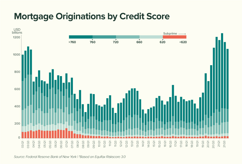
We can see that subprime borrowers represent very little (2%) of today’s total originations compared to the period between 2003 to 2007 (12%). This suggests that American homeowners are, on average, less likely to default on their mortgage.
Economists have also noted a decline in the household debt service ratio, which measures the percentage of disposable income that goes towards a mortgage. This is shown in the table below, along with the average 30-year fixed mortgage rate.
| Year | Mortgage Payments as a % of Disposable Income | Average 30-Year Fixed Mortgage Rate |
|---|---|---|
| 2000 | 12.0% | 8.2% |
| 2004 | 12.2% | 5.4% |
| 2008 | 12.8% | 5.8% |
| 2012 | 9.8% | 3.9% |
| 2016 | 9.9% | 3.7% |
| 2020 | 9.4% | 3.5% |
| 2021 | 9.3% | 3.2% |
Source: Federal Reserve
While it’s true that Americans are less burdened by their mortgages, we must acknowledge the decrease in mortgage rates that took place over the same period.
With the Fed now increasing rates to calm inflation, Americans could see their mortgages begin to eat up a larger chunk of their paycheck. In fact, mortgage rates have already risen for seven consecutive weeks.
Trends in Non-Housing Consumer Debt
The key stories in non-housing consumer debt are student loans and auto loans.
The former category of debt has grown substantially over the past two decades, with growth tapering off during the pandemic. This can be attributed to COVID relief measures which have temporarily lowered the interest rate on direct federal student loans to 0%.
Additionally, these loans were placed into forbearance, meaning 37 million borrowers have not been required to make payments. As of April 2022, the value of these waived payments has reached $195 billion.
Over the course of the pandemic, very few direct federal borrowers have made voluntary payments to reduce their loan principal. When payments eventually resume, and the 0% interest rate is reverted, economists believe that delinquencies could rise significantly.
Auto loans, on the other hand, are following a similar trajectory as mortgages. Both new and used car prices have risen due to the global chip shortage, which is hampering production across the entire industry.
To put this in numbers, the average price of a new car has climbed from $35,600 in 2019, to over $47,000 today. Over a similar timeframe, the average price of a used car has grown from $19,800, to over $28,000.


Markets
U.S. Debt Interest Payments Reach $1 Trillion
U.S. debt interest payments have surged past the $1 trillion dollar mark, amid high interest rates and an ever-expanding debt burden.


U.S. Debt Interest Payments Reach $1 Trillion
This was originally posted on our Voronoi app. Download the app for free on iOS or Android and discover incredible data-driven charts from a variety of trusted sources.
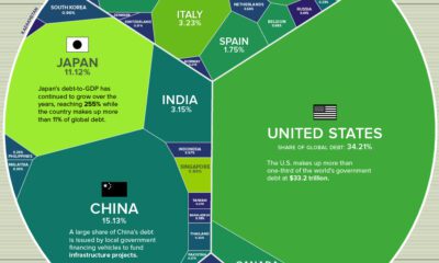
The cost of paying for America’s national debt crossed the $1 trillion dollar mark in 2023, driven by high interest rates and a record $34 trillion mountain of debt.
Over the last decade, U.S. debt interest payments have more than doubled amid vast government spending during the pandemic crisis. As debt payments continue to soar, the Congressional Budget Office (CBO) reported that debt servicing costs surpassed defense spending for the first time ever this year.
This graphic shows the sharp rise in U.S. debt payments, based on data from the Federal Reserve.
A $1 Trillion Interest Bill, and Growing
Below, we show how U.S. debt interest payments have risen at a faster pace than at another time in modern history:
| Date | Interest Payments | U.S. National Debt |
|---|---|---|
| 2023 | $1.0T | $34.0T |
| 2022 | $830B | $31.4T |
| 2021 | $612B | $29.6T |
| 2020 | $518B | $27.7T |
| 2019 | $564B | $23.2T |
| 2018 | $571B | $22.0T |
| 2017 | $493B | $20.5T |
| 2016 | $460B | $20.0T |
| 2015 | $435B | $18.9T |
| 2014 | $442B | $18.1T |
| 2013 | $425B | $17.2T |
| 2012 | $417B | $16.4T |
| 2011 | $433B | $15.2T |
| 2010 | $400B | $14.0T |
| 2009 | $354B | $12.3T |
| 2008 | $380B | $10.7T |
| 2007 | $414B | $9.2T |
| 2006 | $387B | $8.7T |
| 2005 | $355B | $8.2T |
| 2004 | $318B | $7.6T |
| 2003 | $294B | $7.0T |
| 2002 | $298B | $6.4T |
| 2001 | $318B | $5.9T |
| 2000 | $353B | $5.7T |
| 1999 | $353B | $5.8T |
| 1998 | $360B | $5.6T |
| 1997 | $368B | $5.5T |
| 1996 | $362B | $5.3T |
| 1995 | $357B | $5.0T |
| 1994 | $334B | $4.8T |
| 1993 | $311B | $4.5T |
| 1992 | $306B | $4.2T |
| 1991 | $308B | $3.8T |
| 1990 | $298B | $3.4T |
| 1989 | $275B | $3.0T |
| 1988 | $254B | $2.7T |
| 1987 | $240B | $2.4T |
| 1986 | $225B | $2.2T |
| 1985 | $219B | $1.9T |
| 1984 | $205B | $1.7T |
| 1983 | $176B | $1.4T |
| 1982 | $157B | $1.2T |
| 1981 | $142B | $1.0T |
| 1980 | $113B | $930.2B |
| 1979 | $96B | $845.1B |
| 1978 | $84B | $789.2B |
| 1977 | $69B | $718.9B |
| 1976 | $61B | $653.5B |
| 1975 | $55B | $576.6B |
| 1974 | $50B | $492.7B |
| 1973 | $45B | $469.1B |
| 1972 | $39B | $448.5B |
| 1971 | $36B | $424.1B |
| 1970 | $35B | $389.2B |
| 1969 | $30B | $368.2B |
| 1968 | $25B | $358.0B |
| 1967 | $23B | $344.7B |
| 1966 | $21B | $329.3B |
Interest payments represent seasonally adjusted annual rate at the end of Q4.
At current rates, the U.S. national debt is growing by a remarkable $1 trillion about every 100 days, equal to roughly $3.6 trillion per year.
As the national debt has ballooned, debt payments even exceeded Medicaid outlays in 2023—one of the government’s largest expenditures. On average, the U.S. spent more than $2 billion per day on interest costs last year. Going further, the U.S. government is projected to spend a historic $12.4 trillion on interest payments over the next decade, averaging about $37,100 per American.
Exacerbating matters is that the U.S. is running a steep deficit, which stood at $1.1 trillion for the first six months of fiscal 2024. This has accelerated due to the 43% increase in debt servicing costs along with a $31 billion dollar increase in defense spending from a year earlier. Additionally, a $30 billion increase in funding for the Federal Deposit Insurance Corporation in light of the regional banking crisis last year was a major contributor to the deficit increase.
Overall, the CBO forecasts that roughly 75% of the federal deficit’s increase will be due to interest costs by 2034.

-

 Green2 weeks ago
Ranked: Top Countries by Total Forest Loss Since 2001
-

 Travel1 week ago
Ranked: The World’s Top Flight Routes, by Revenue
-

 Technology1 week ago
Ranked: Semiconductor Companies by Industry Revenue Share
-

 Money2 weeks ago
Which States Have the Highest Minimum Wage in America?
-

 Real Estate2 weeks ago
Ranked: The Most Valuable Housing Markets in America
-

 Markets2 weeks ago
Charted: Big Four Market Share by S&P 500 Audits
-

 AI2 weeks ago
The Stock Performance of U.S. Chipmakers So Far in 2024
-

 Automotive2 weeks ago
Almost Every EV Stock is Down After Q1 2024