Money
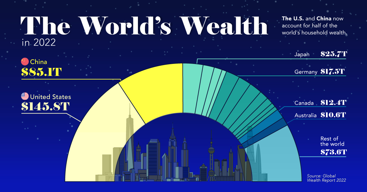
The U.S. and China Account for Half the World’s Household Wealth
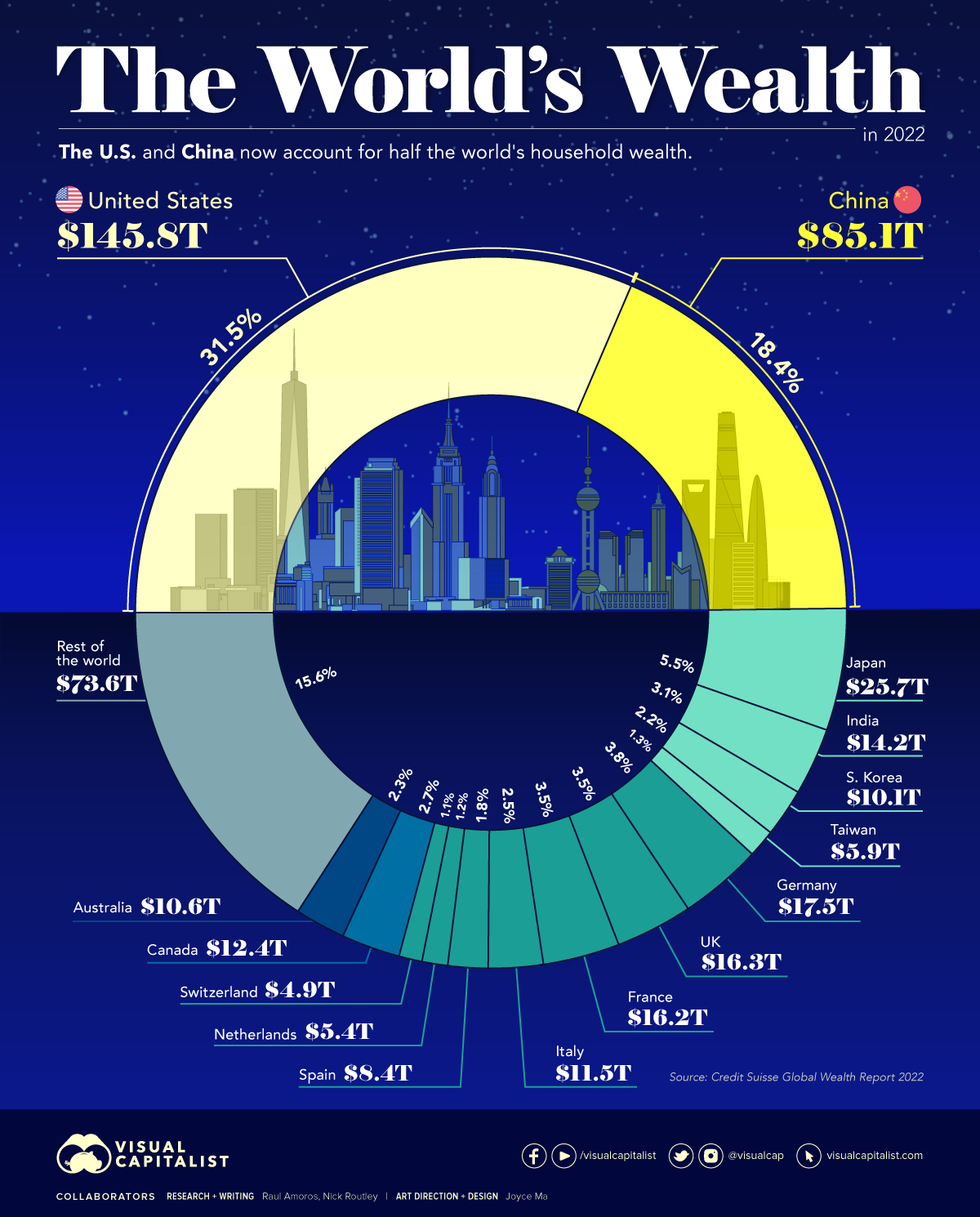


The U.S. and China Account for Half the World’s Household Wealth
Measures like GDP are commonly used to understand the overall wealth and size of the economy. While looking at economic output on an annual basis is useful, there are other metrics to consider when evaluating the wealth of a nation.
Household wealth statistics reveal which country’s citizens are accruing the highest level of money and assets worldwide.
This visual utilizes data from Credit Suisse’s annual Global Wealth Report to break down the latest estimates for household wealth by country.
Household Wealth, by Country
Here’s how the world’s $463 trillion in household wealth is distributed:
| Rank | Country | Household Wealth (2022) | % of World Total |
|---|---|---|---|
| #1 | 🇺🇸 United States | $145.8T | 31.5% |
| #2 | 🇨🇳 China | $85.1T | 18.4% |
| #3 | 🇯🇵 Japan | $25.7T | 5.5% |
| #4 | 🇩🇪 Germany | $17.5T | 3.8% |
| #5 | 🇬🇧 United Kingdom | $16.3T | 3.5% |
| #6 | 🇫🇷 France | $16.2T | 3.5% |
| #7 | 🇮🇳 India | $14.2T | 3.1% |
| #8 | 🇨🇦 Canada | $12.4T | 2.7% |
| #9 | 🇮🇹 Italy | $11.5T | 2.5% |
| #10 | 🇦🇺 Australia | $10.6T | 2.3% |
| #11 | 🇰🇷 South Korea | $10.1T | 2.2% |
| #12 | 🇪🇸 Spain | $8.4T | 1.8% |
| #13 | 🇹🇼 Taiwan | $5.9T | 1.3% |
| #14 | 🇳🇱 Netherlands | $5.4T | 1.2% |
| #15 | 🇨🇭 Switzerland | $4.9T | 1.1% |
| Rest of World | $73.6T | 15.6% | |
| Total: | $463.6T | 100.0% |
As the table above demonstrates, global household wealth is far from being distributed equally.
Country-Level Wealth Concentration
Much of global wealth is concentrated in the biggest economies, with households in China and the U.S. combining to make up half of all personal wealth in the world. This differs slightly from using GDP as a measure, where the U.S. and China make up 24% and 19% of the world economy in nominal terms, respectively.
Today, just 10 countries account for 75% of total household wealth.
One of the biggest changes in recent years is the rise of wealth in China. A decade ago, China’s citizens were estimated to hold just 9% of the world’s wealth. That figure has now more than doubled, while median wealth in the country has skyrocketed from $3,111 to $26,752 between 2000 and 2021.
A Regional Look at Household Wealth
From a regional standpoint, wealth is equally split three ways, between North America, Asia, and everywhere else.
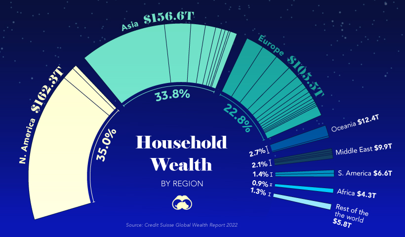
In just one decade, Europe’s share of household wealth dropped by eight percentage points, which is due, in part, to the economic momentum of China.
Surprisingly, the regions of Africa, South America, Oceania, and the Middle East combine only for about 11% of the world’s total household wealth.
Where does this data come from?
Source: Global Wealth Report by Credit Suisse
Data note: There is no straightforward way of estimating household wealth in various countries, so the report utilizes three main measures including: a country’s average level of wealth, the patterns of a country’s wealth holdings, and Forbes list of billionaires.


Money
How Debt-to-GDP Ratios Have Changed Since 2000
See how much the debt-to-GDP ratios of advanced economies have grown (or shrank) since the year 2000.


How Debt-to-GDP Ratios Have Changed Since 2000
This was originally posted on our Voronoi app. Download the app for free on Apple or Android and discover incredible data-driven charts from a variety of trusted sources.
Government debt levels have grown in most parts of the world since the 2008 financial crisis, and even more so after the COVID-19 pandemic.
To gain perspective on this long-term trend, we’ve visualized the debt-to-GDP ratios of advanced economies, as of 2000 and 2024 (estimated). All figures were sourced from the IMF’s World Economic Outlook.
Data and Highlights
The data we used to create this graphic is listed in the table below. “Government gross debt” consists of all liabilities that require payment(s) of interest and/or principal in the future.
| Country | 2000 (%) | 2024 (%) | Change (pp) |
|---|---|---|---|
| 🇯🇵 Japan | 135.6 | 251.9 | +116.3 |
| 🇸🇬 Singapore | 82.3 | 168.3 | +86.0 |
| 🇺🇸 United States | 55.6 | 126.9 | +71.3 |
| 🇬🇧 United Kingdom | 36.6 | 105.9 | +69.3 |
| 🇬🇷 Greece | 104.9 | 160.2 | +55.3 |
| 🇫🇷 France | 58.9 | 110.5 | +51.6 |
| 🇵🇹 Portugal | 54.2 | 104.0 | +49.8 |
| 🇪🇸 Spain | 57.8 | 104.7 | +46.9 |
| 🇸🇮 Slovenia | 25.9 | 66.5 | +40.6 |
| 🇫🇮 Finland | 42.4 | 76.5 | +34.1 |
| 🇭🇷 Croatia | 35.4 | 61.8 | +26.4 |
| 🇨🇦 Canada | 80.4 | 103.3 | +22.9 |
| 🇨🇾 Cyprus | 56.0 | 70.9 | +14.9 |
| 🇦🇹 Austria | 65.7 | 74.0 | +8.3 |
| 🇸🇰 Slovak Republic | 50.5 | 56.5 | +6.0 |
| 🇩🇪 Germany | 59.3 | 64.0 | +4.7 |
| 🇧🇪 Belgium | 109.6 | 106.8 | -2.8 |
| 🇮🇱 Israel | 77.4 | 56.8 | -20.6 |
| 🇮🇸 Iceland | 75.8 | 54.6 | -21.2 |
The debt-to-GDP ratio indicates how much a country owes compared to the size of its economy, reflecting its ability to manage and repay debts. Percentage point (pp) changes shown above indicate the increase or decrease of these ratios.
Countries with the Biggest Increases
Japan (+116 pp), Singapore (+86 pp), and the U.S. (+71 pp) have grown their debt as a percentage of GDP the most since the year 2000.
All three of these countries have stable, well-developed economies, so it’s unlikely that any of them will default on their growing debts. With that said, higher government debt leads to increased interest payments, which in turn can diminish available funds for future government budgets.
This is a rising issue in the U.S., where annual interest payments on the national debt have surpassed $1 trillion for the first time ever.
Only 3 Countries Saw Declines
Among this list of advanced economies, Belgium (-2.8 pp), Iceland (-21.2 pp), and Israel (-20.6 pp) were the only countries that decreased their debt-to-GDP ratio since the year 2000.
According to Fitch Ratings, Iceland’s debt ratio has decreased due to strong GDP growth and the use of its cash deposits to pay down upcoming maturities.
See More Debt Graphics from Visual Capitalist
Curious to see which countries have the most government debt in dollars? Check out this graphic that breaks down $97 trillion in debt as of 2023.

-

 Green2 weeks ago
Ranked: Top Countries by Total Forest Loss Since 2001
-

 Travel1 week ago
Ranked: The World’s Top Flight Routes, by Revenue
-

 Technology2 weeks ago
Ranked: Semiconductor Companies by Industry Revenue Share
-

 Money2 weeks ago
Which States Have the Highest Minimum Wage in America?
-

 Real Estate2 weeks ago
Ranked: The Most Valuable Housing Markets in America
-

 Markets2 weeks ago
Charted: Big Four Market Share by S&P 500 Audits
-

 AI2 weeks ago
The Stock Performance of U.S. Chipmakers So Far in 2024
-

 Automotive2 weeks ago
Almost Every EV Stock is Down After Q1 2024