Money
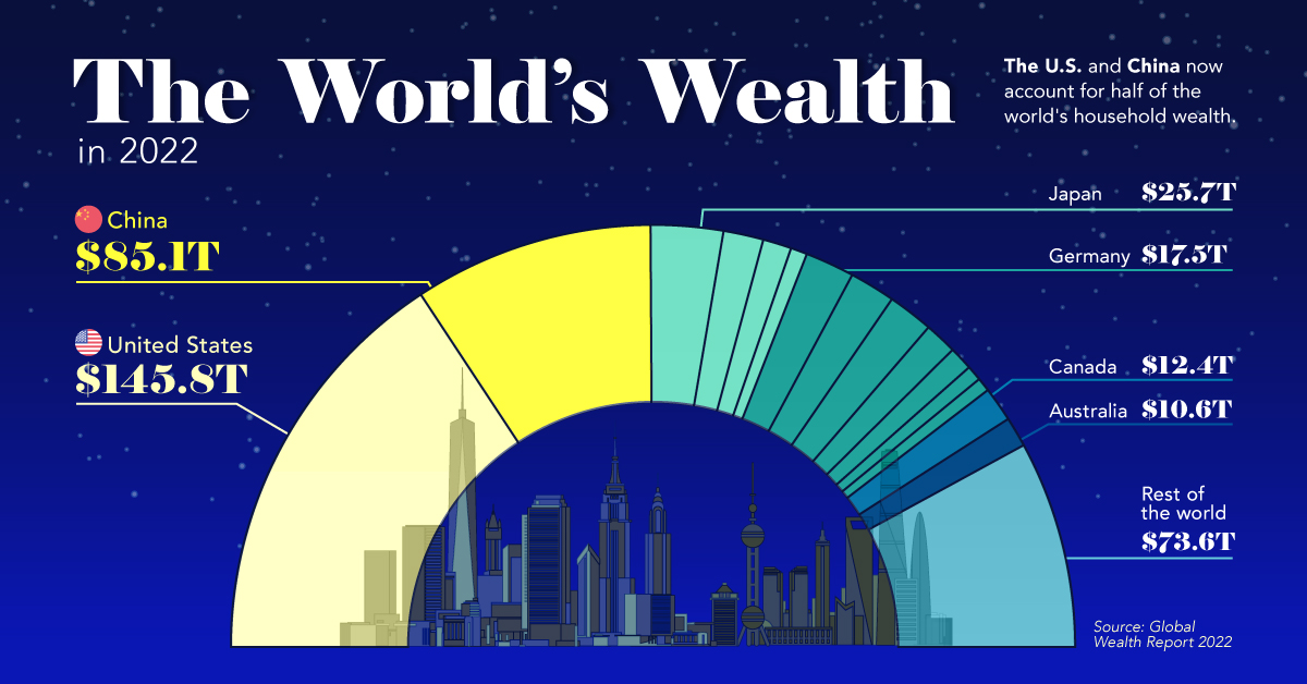
The U.S. and China Account for Half the World’s Household Wealth
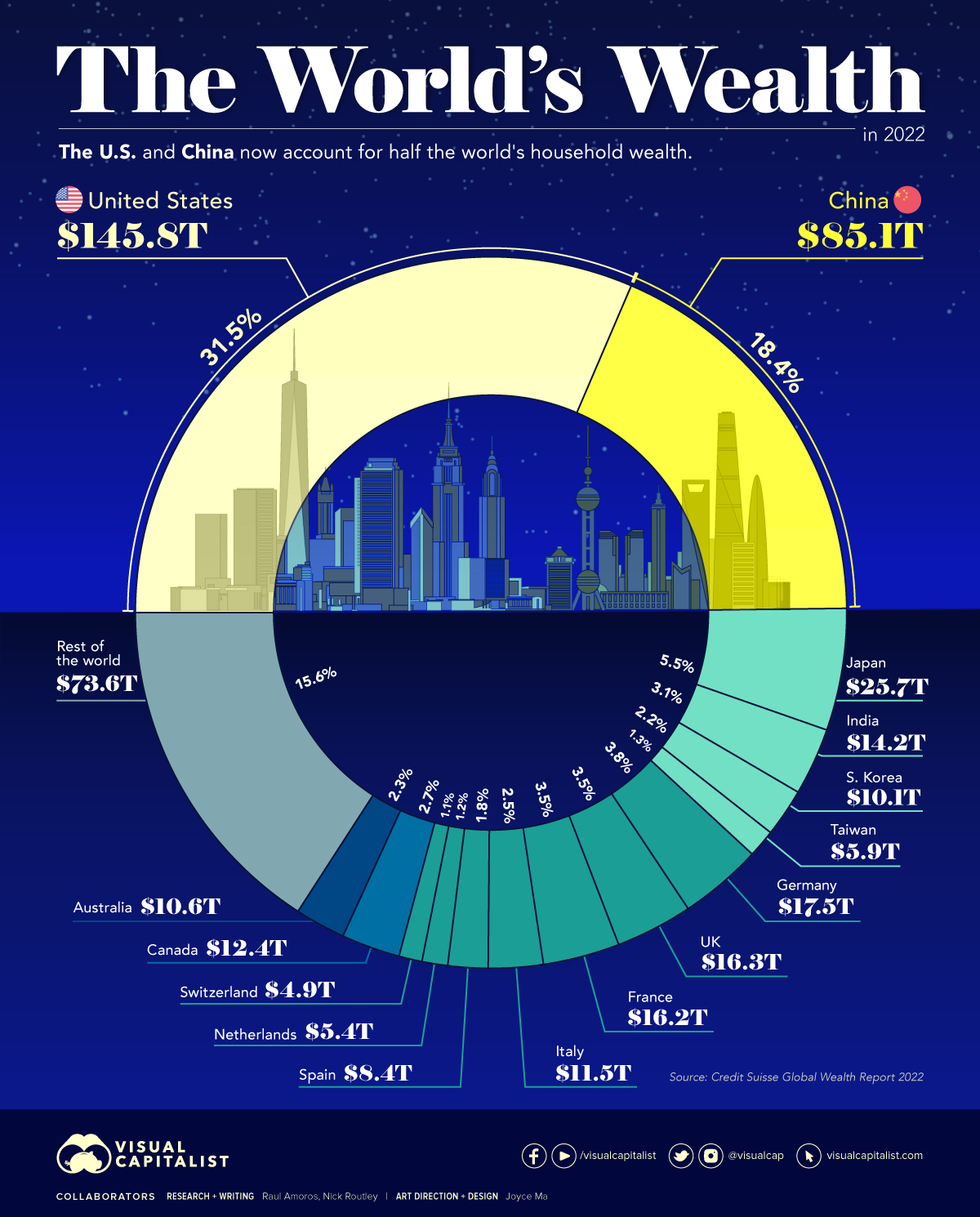


The U.S. and China Account for Half the World’s Household Wealth
Measures like GDP are commonly used to understand the overall wealth and size of the economy. While looking at economic output on an annual basis is useful, there are other metrics to consider when evaluating the wealth of a nation.
Household wealth statistics reveal which country’s citizens are accruing the highest level of money and assets worldwide.
This visual utilizes data from Credit Suisse’s annual Global Wealth Report to break down the latest estimates for household wealth by country.
Household Wealth, by Country
Here’s how the world’s $463 trillion in household wealth is distributed:
| Rank | Country | Household Wealth (2022) | % of World Total |
|---|---|---|---|
| #1 | 🇺🇸 United States | $145.8T | 31.5% |
| #2 | 🇨🇳 China | $85.1T | 18.4% |
| #3 | 🇯🇵 Japan | $25.7T | 5.5% |
| #4 | 🇩🇪 Germany | $17.5T | 3.8% |
| #5 | 🇬🇧 United Kingdom | $16.3T | 3.5% |
| #6 | 🇫🇷 France | $16.2T | 3.5% |
| #7 | 🇮🇳 India | $14.2T | 3.1% |
| #8 | 🇨🇦 Canada | $12.4T | 2.7% |
| #9 | 🇮🇹 Italy | $11.5T | 2.5% |
| #10 | 🇦🇺 Australia | $10.6T | 2.3% |
| #11 | 🇰🇷 South Korea | $10.1T | 2.2% |
| #12 | 🇪🇸 Spain | $8.4T | 1.8% |
| #13 | 🇹🇼 Taiwan | $5.9T | 1.3% |
| #14 | 🇳🇱 Netherlands | $5.4T | 1.2% |
| #15 | 🇨🇭 Switzerland | $4.9T | 1.1% |
| Rest of World | $73.6T | 15.6% | |
| Total: | $463.6T | 100.0% |
As the table above demonstrates, global household wealth is far from being distributed equally.
Country-Level Wealth Concentration
Much of global wealth is concentrated in the biggest economies, with households in China and the U.S. combining to make up half of all personal wealth in the world. This differs slightly from using GDP as a measure, where the U.S. and China make up 24% and 19% of the world economy in nominal terms, respectively.
Today, just 10 countries account for 75% of total household wealth.
One of the biggest changes in recent years is the rise of wealth in China. A decade ago, China’s citizens were estimated to hold just 9% of the world’s wealth. That figure has now more than doubled, while median wealth in the country has skyrocketed from $3,111 to $26,752 between 2000 and 2021.
A Regional Look at Household Wealth
From a regional standpoint, wealth is equally split three ways, between North America, Asia, and everywhere else.
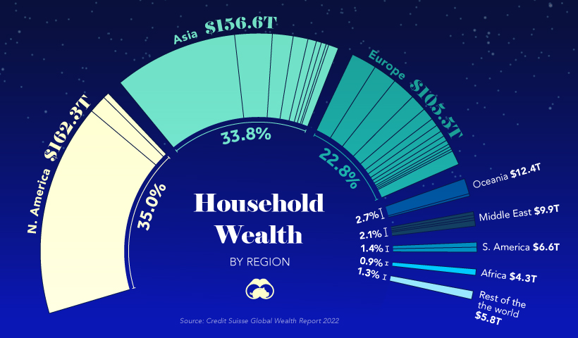
In just one decade, Europe’s share of household wealth dropped by eight percentage points, which is due, in part, to the economic momentum of China.
Surprisingly, the regions of Africa, South America, Oceania, and the Middle East combine only for about 11% of the world’s total household wealth.
Where does this data come from?
Source: Global Wealth Report by Credit Suisse
Data note: There is no straightforward way of estimating household wealth in various countries, so the report utilizes three main measures including: a country’s average level of wealth, the patterns of a country’s wealth holdings, and Forbes list of billionaires.


Money
Charted: Who Has Savings in This Economy?
Older, better-educated adults are winning the savings game, reveals a January survey by the National Opinion Research Center at the University of Chicago.
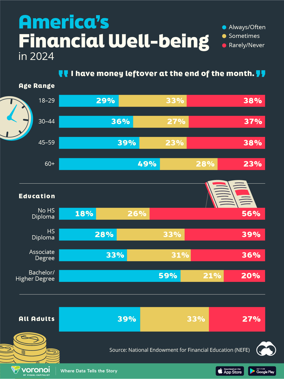
Who Has Savings in This Economy?
This was originally posted on our Voronoi app. Download the app for free on iOS or Android and discover incredible data-driven charts from a variety of trusted sources.
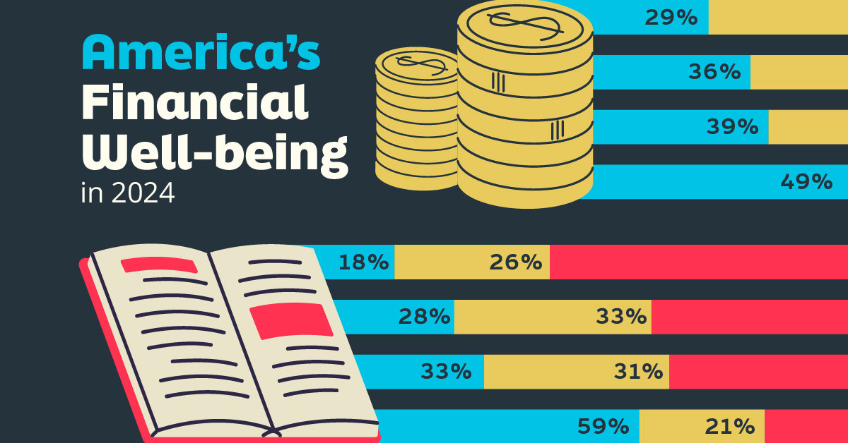
Two full years of inflation have taken their toll on American households. In 2023, the country’s collective credit card debt crossed $1 trillion for the first time. So who is managing to save money in the current economic environment?
We visualize the percentage of respondents to the statement “I have money leftover at the end of the month” categorized by age and education qualifications. Data is sourced from a National Endowment for Financial Education (NEFE) report, published last month.
The survey for NEFE was conducted from January 12-14, 2024, by the National Opinion Research Center at the University of Chicago. It involved 1,222 adults aged 18+ and aimed to be representative of the U.S. population.
Older Americans Save More Than Their Younger Counterparts
General trends from this dataset indicate that as respondents get older, a higher percentage of them are able to save.
| Age | Always/Often | Sometimes | Rarely/Never |
|---|---|---|---|
| 18–29 | 29% | 33% | 38% |
| 30–44 | 36% | 27% | 37% |
| 45–59 | 39% | 23% | 38% |
| Above 60 | 49% | 28% | 23% |
| All Adults | 39% | 33% | 27% |
Note: Percentages are rounded and may not sum to 100.
Perhaps not surprisingly, those aged 60+ are the age group with the highest percentage saying they have leftover money at the end of the month. This age group spent the most time making peak earnings in their careers, are more likely to have investments, and are more likely to have paid off major expenses like a mortgage or raising a family.
The Impact of Higher Education on Earnings and Savings
Based on this survey, higher education dramatically improves one’s ability to save. Shown in the table below, those with a bachelor’s degree or higher are three times more likely to have leftover money than those without a high school diploma.
| Education | Always/Often | Sometimes | Rarely/Never |
|---|---|---|---|
| No HS Diploma | 18% | 26% | 56% |
| HS Diploma | 28% | 33% | 39% |
| Associate Degree | 33% | 31% | 36% |
| Bachelor/Higher Degree | 59% | 21% | 20% |
| All Adults | 39% | 33% | 27% |
Note: Percentages are rounded and may not sum to 100.
As the Bureau of Labor Statistics notes, earnings improve with every level of education completed.
For example, those with a high school diploma made 25% more than those without in 2022. And as the qualifications increase, the effects keep stacking.
Meanwhile, a Federal Reserve study also found that those with more education tended to make financial decisions that contributed to building wealth, of which the first step is to save.

-

 Markets1 week ago
U.S. Debt Interest Payments Reach $1 Trillion
-

 Markets2 weeks ago
Ranked: The Most Valuable Housing Markets in America
-

 Money2 weeks ago
Which States Have the Highest Minimum Wage in America?
-

 AI2 weeks ago
Ranked: Semiconductor Companies by Industry Revenue Share
-

 Markets2 weeks ago
Ranked: The World’s Top Flight Routes, by Revenue
-

 Countries2 weeks ago
Population Projections: The World’s 6 Largest Countries in 2075
-

 Markets2 weeks ago
The Top 10 States by Real GDP Growth in 2023
-

 Money2 weeks ago
The Smallest Gender Wage Gaps in OECD Countries