Money
Where the World’s Ultra Rich Population Lives
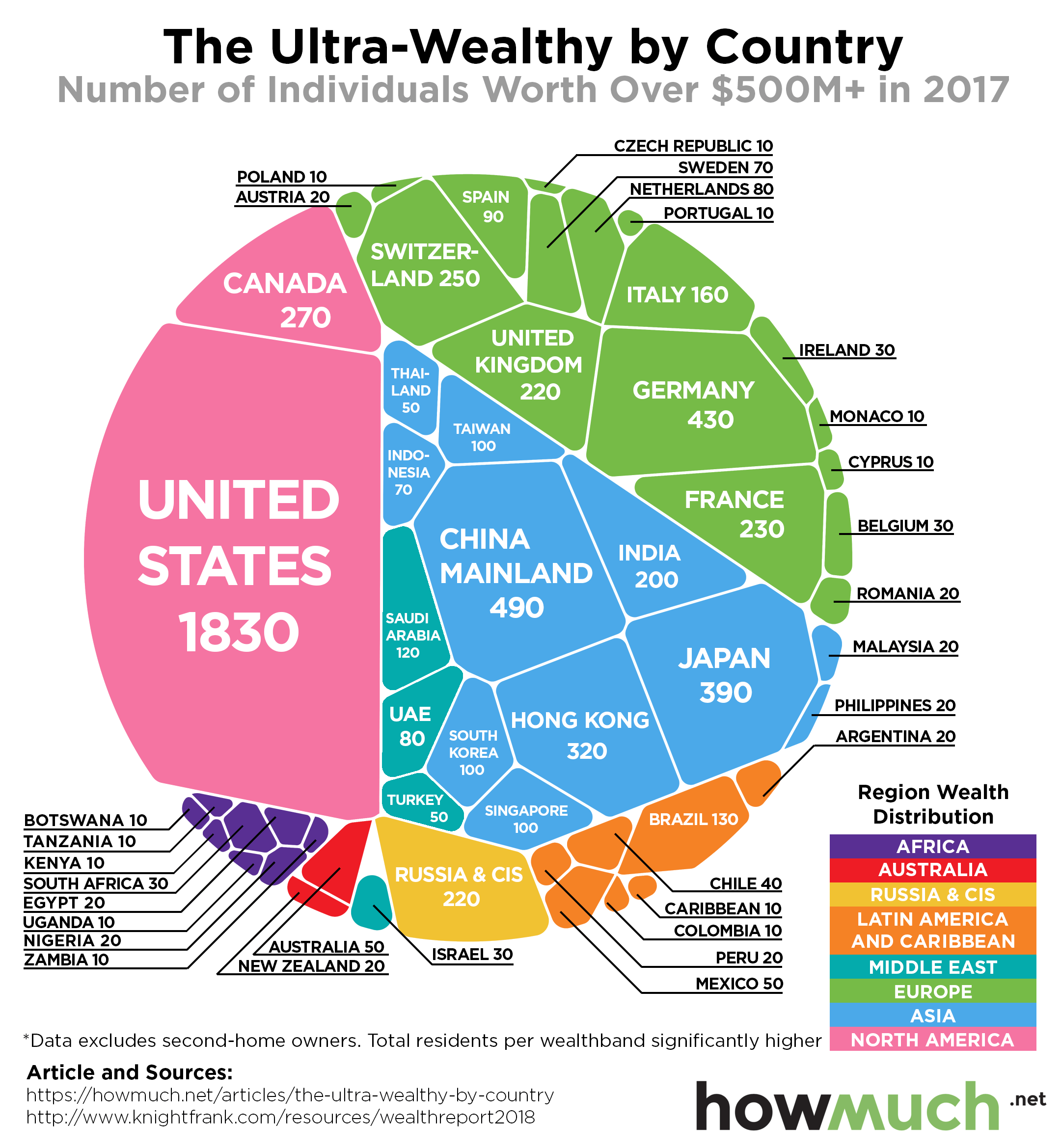
Where the World’s Ultra Rich Population Lives
We’ve recently broken down data on the global population of millionaires by city, and even the residences of the world’s top 50 billionaires.
But still, there’s something extremely interesting about dissecting the lifestyles of the ultra rich – particularly in looking at where they live, and also how they tend to migrate when local conditions are not conducive to wealth-building or the safety of their fortunes and families.
Ultra Rich: By Region
Today’s infographic comes to us from HowMuch.net, and it breaks down the population of ultra high net worth individuals that have personal wealth levels exceeding the $500 million mark. It uses information from the 2018 edition of the Knight Frank Wealth Report.
First, we’ll look at these totals on a regional level:
| Region | Population (>$500M wealth) | % of Global Pop |
|---|---|---|
| North America | 2,100 | 31.8% |
| Asia | 1,860 | 28.1% |
| Europe | 1,680 | 25.4% |
| Middle East | 280 | 4.2% |
| Latin America & Caribbean | 280 | 4.2% |
| Russia & CIS | 220 | 3.3% |
| Africa | 120 | 1.8% |
| Australasia | 70 | 1.1% |
| 6,610 | 100.0% |
As you can see, the vast amount of half-billionaires are located in North America (31.8%), Asia (28.1%), and Europe (25.4%). That means that fewer than 15% of these ultra rich live in the Middle East, Australasia, Russia & CIS, Latin America, and Africa combined.
Ultra Rich: By Country
Now, we’ll look at the 14 countries that have greater than 100 ultra rich people (>$500 million) as residents:
| Rank | Country | Region | Population (>$500M wealth) |
|---|---|---|---|
| #1 | United States | North America | 1,830 |
| #2 | China (Mainland) | Asia | 490 |
| #3 | Germany | Europe | 430 |
| #4 | Japan | Asia | 390 |
| #5 | Hong Kong | Asia | 320 |
| #6 | Canada | North America | 270 |
| #7 | Switzerland | Europe | 250 |
| #8 | France | Europe | 230 |
| #9 | Russia & CIS | Russia & CIS | 220 |
| #10 | United Kingdom | Europe | 220 |
| #11 | India | Asia | 200 |
| #12 | Italy | Europe | 160 |
| #13 | Brazil | Latin America | 130 |
| #14 | Saudi Arabia | Middle East | 120 |
Note: this list excludes second-home owners.
Sitting at the top of the list is the United States with 1,830 people that hold fortunes larger than $500 million. That’s equal to roughly 28% of the global half-billionaire population.
Following the U.S. is China, which counts 810 people as having a wealth over $500 million. These numbers are broken down into Mainland China and Hong Kong on the graph and table, because they were tallied using different sources.
Canada tallies surprisingly high here – the country only ranks #10 globally based on its number of (billionaires), but ranks #6 in terms of half-billionaires with 270 in total.
Lastly, it should be noted that just missing the cut-off on the above list were Taiwan, South Korea, and Singapore, three Asian countries that tied with 100 half-billionaires each.


Money
How Debt-to-GDP Ratios Have Changed Since 2000
See how much the debt-to-GDP ratios of advanced economies have grown (or shrank) since the year 2000.


How Debt-to-GDP Ratios Have Changed Since 2000
This was originally posted on our Voronoi app. Download the app for free on Apple or Android and discover incredible data-driven charts from a variety of trusted sources.
Government debt levels have grown in most parts of the world since the 2008 financial crisis, and even more so after the COVID-19 pandemic.
To gain perspective on this long-term trend, we’ve visualized the debt-to-GDP ratios of advanced economies, as of 2000 and 2024 (estimated). All figures were sourced from the IMF’s World Economic Outlook.
Data and Highlights
The data we used to create this graphic is listed in the table below. “Government gross debt” consists of all liabilities that require payment(s) of interest and/or principal in the future.
| Country | 2000 (%) | 2024 (%) | Change (pp) |
|---|---|---|---|
| 🇯🇵 Japan | 135.6 | 251.9 | +116.3 |
| 🇸🇬 Singapore | 82.3 | 168.3 | +86.0 |
| 🇺🇸 United States | 55.6 | 126.9 | +71.3 |
| 🇬🇧 United Kingdom | 36.6 | 105.9 | +69.3 |
| 🇬🇷 Greece | 104.9 | 160.2 | +55.3 |
| 🇫🇷 France | 58.9 | 110.5 | +51.6 |
| 🇵🇹 Portugal | 54.2 | 104.0 | +49.8 |
| 🇪🇸 Spain | 57.8 | 104.7 | +46.9 |
| 🇸🇮 Slovenia | 25.9 | 66.5 | +40.6 |
| 🇫🇮 Finland | 42.4 | 76.5 | +34.1 |
| 🇭🇷 Croatia | 35.4 | 61.8 | +26.4 |
| 🇨🇦 Canada | 80.4 | 103.3 | +22.9 |
| 🇨🇾 Cyprus | 56.0 | 70.9 | +14.9 |
| 🇦🇹 Austria | 65.7 | 74.0 | +8.3 |
| 🇸🇰 Slovak Republic | 50.5 | 56.5 | +6.0 |
| 🇩🇪 Germany | 59.3 | 64.0 | +4.7 |
| 🇧🇪 Belgium | 109.6 | 106.8 | -2.8 |
| 🇮🇱 Israel | 77.4 | 56.8 | -20.6 |
| 🇮🇸 Iceland | 75.8 | 54.6 | -21.2 |
The debt-to-GDP ratio indicates how much a country owes compared to the size of its economy, reflecting its ability to manage and repay debts. Percentage point (pp) changes shown above indicate the increase or decrease of these ratios.
Countries with the Biggest Increases
Japan (+116 pp), Singapore (+86 pp), and the U.S. (+71 pp) have grown their debt as a percentage of GDP the most since the year 2000.
All three of these countries have stable, well-developed economies, so it’s unlikely that any of them will default on their growing debts. With that said, higher government debt leads to increased interest payments, which in turn can diminish available funds for future government budgets.
This is a rising issue in the U.S., where annual interest payments on the national debt have surpassed $1 trillion for the first time ever.
Only 3 Countries Saw Declines
Among this list of advanced economies, Belgium (-2.8 pp), Iceland (-21.2 pp), and Israel (-20.6 pp) were the only countries that decreased their debt-to-GDP ratio since the year 2000.
According to Fitch Ratings, Iceland’s debt ratio has decreased due to strong GDP growth and the use of its cash deposits to pay down upcoming maturities.
See More Debt Graphics from Visual Capitalist
Curious to see which countries have the most government debt in dollars? Check out this graphic that breaks down $97 trillion in debt as of 2023.

-

 Real Estate2 weeks ago
Visualizing America’s Shortage of Affordable Homes
-

 Technology1 week ago
Ranked: Semiconductor Companies by Industry Revenue Share
-

 Money1 week ago
Which States Have the Highest Minimum Wage in America?
-

 Real Estate1 week ago
Ranked: The Most Valuable Housing Markets in America
-

 Business2 weeks ago
Charted: Big Four Market Share by S&P 500 Audits
-

 AI2 weeks ago
The Stock Performance of U.S. Chipmakers So Far in 2024
-

 Misc2 weeks ago
Almost Every EV Stock is Down After Q1 2024
-

 Money2 weeks ago
Where Does One U.S. Tax Dollar Go?