Demographics
Visualizing Two Centuries of U.S. Immigration
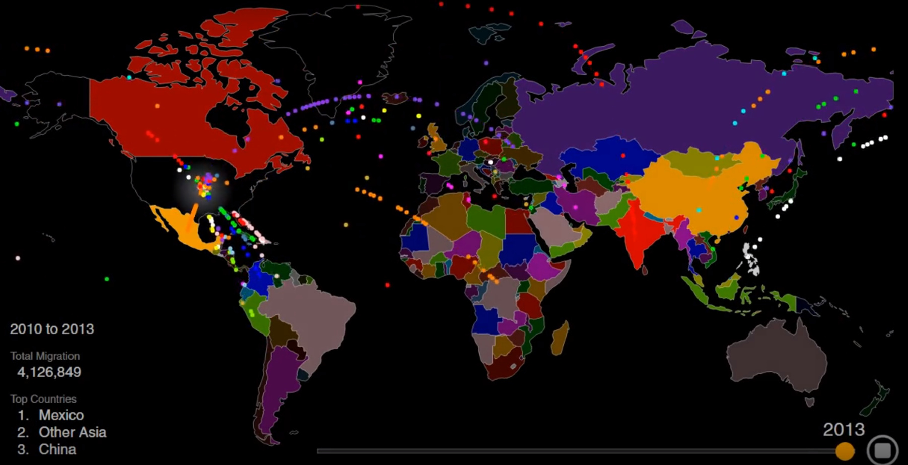
Animation: Visualizing Two Centuries of U.S. Immigration
America is a nation of immigrants, and though the country has seen a lot of new arrivals over the past two centuries, the rate of immigration has been far from steady.
War, famine, economic boom and bust, religious persecution, and government intervention have all caused wild swings in the rate of immigration from countries around the world.
Today’s striking animation, by Max Galka, is a great way to see changes in immigration over time. Inflows from specific countries rise and fall, and the top three countries of origin change numerous times over the years.
Below, is another way to look at the ebb and flow of American immigration since the early 1800s.
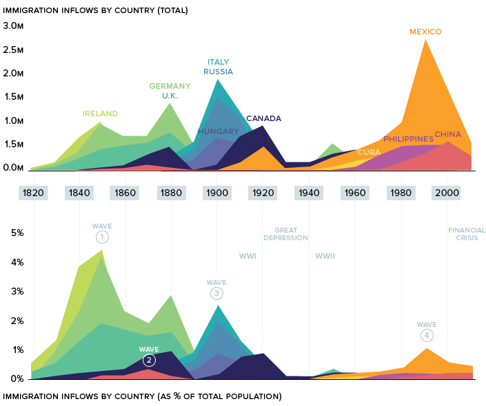
An important note. This data excludes forced migration (slavery) and illegal immigration.
Let’s look at the “waves” in more detail.
Wave one: The Old Immigration
From 1820 to 1870, over 7.5 million immigrants made their way over to the United States, effectively doubling the young country’s population in only half a decade.
Ireland, which was in the throes of the Potato Famine, saw half its population set sail for the U.S. during that time. This wave of immigration can still be seen in today’s demographics. There are now more Irish-Americans than there are Irish nationals.
The magnetic pull of the New World was profoundly felt in Germany as well. Growing public unrest in the region, caused by heavy taxation and political censorship, culminated in the German revolutions of 1848-49. Faced with severe hardship at home, millions of Germans made their way to America over the 1800s. It’s estimated that one-third of the total ethnic German population in the world now lives in the United States.
Wave Two: Gold Rush
Much of America’s early immigration was from various points in Europe, but there was one prominent exception: China.
The discovery of gold in California inspired Chinese workers to seek their fortune in America. After a crop failure in Southern China in 1852, tens of thousands of Chinese immigrants flooded into San Francisco.
Although the State of California was making millions of dollars off its Foreign Miners Tax, sentiment towards Chinese workers began to sour. Gold mines were being tapped out and white Californians blamed the Chinese for driving wages down.
Chinamen are getting to be altogether too plentiful in this country.
– John Bigler, Governor of California (1852-1856)
By 1882, the newly enacted the Chinese Exclusion Act had a chilling effect on Chinese immigration. The Exclusion Act has the dubious distinction of being the only American law barring a specific group from immigrating to the United States.
Wave Three: The New Immigration
The wave of immigration leading into the 20th century is referred to as The New Immigration.
In 1890, Ellis Island was designated as the main point of entry for newcomers entering the United States. In 1907 alone, Ellis Island processed a staggering 1,285,349 immigrants. To put this number in perspective, if all of those people settled in one place, they would’ve formed America’s fourth largest city almost overnight.
This massive influx of people into New York had profound implications on the city itself. In 1910, Manhattan’s population density was an astronomical 101,548 humans per square mile.
The immigrants arriving during this period – heavily represented by Italians, Hungarians, and Russians – were seeking religious freedom and economic opportunity. Certain industries, such as steel, meat-packing, and mining, were staffed by many new arrivals to the country.
During this time, one in four American workers were foreign-born.
The Great Depression
The National Origins Act’s quota system, which took effect in 1929, essentially slammed the door on most immigrants from Southern and Eastern Europe. Shortly after, the Great Depression further put a damper on immigration that would last well into the 20th century.
Wave Four: Mexico
After decades of sluggish immigration, the United States’ percentage of foreign-born citizens reached a low of 4.7% in 1970. But that was all about to change.
During the next decade, the number of states where Mexico was the top country of origin doubled in a single decade, and Mexicans became the dominant foreign-born population in the country. This migration was fueled by the Latin American debt crisis and later by NAFTA. The influx of cheap corn into Mexico caused hundreds of thousands of Mexicans from rural areas to search for more favorable economic opportunities. America was the obvious choice, particularly during the economic expansion of the 1990s.
This wave of immigration has shifted the country’s demographics considerably. Today, nearly one in five people in the United States are Hispanic.
Current Trends
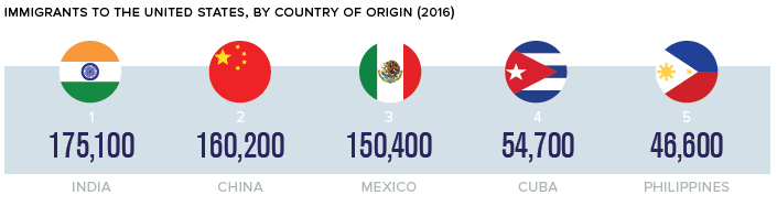
Immigration trends are continually evolving, and America’s newest immigrants are often more likely to come from China or India. In fact, both countries surpassed Mexico as countries of origin for immigrants arriving in the U.S. in 2013. Today, the trend is even more pronounced.
Recent immigration numbers indicate that Asian immigrants will continue to shift America’s demographics in a new direction. Perhaps a new wave in the making?


Demographics
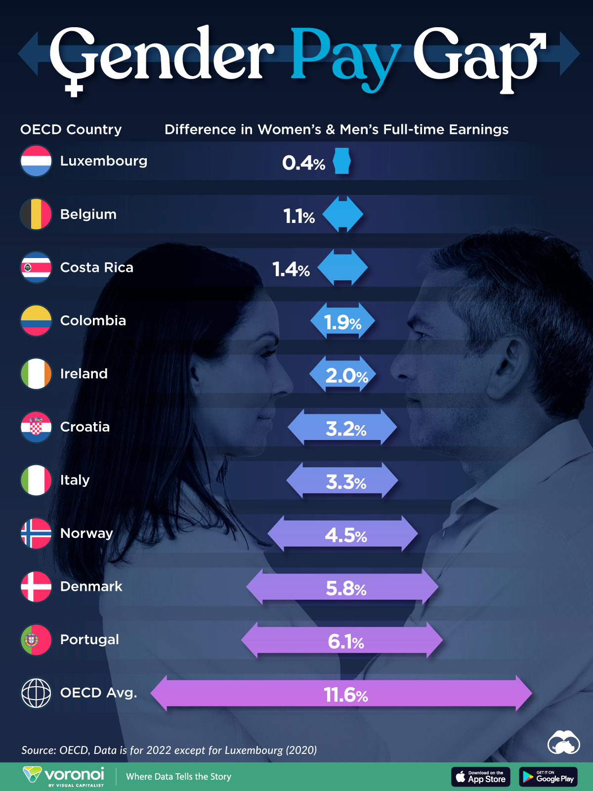
The Smallest Gender Wage Gaps in OECD Countries
Which OECD countries have the smallest gender wage gaps? We look at the 10 countries with gaps lower than the average.
The Smallest Gender Pay Gaps in OECD Countries
This was originally posted on our Voronoi app. Download the app for free on iOS or Android and discover incredible data-driven charts from a variety of trusted sources.
Among the 38 member countries in the Organization for Economic Cooperation and Development (OECD), several have made significant strides in addressing income inequality between men and women.
In this graphic we’ve ranked the OECD countries with the 10 smallest gender pay gaps, using the latest data from the OECD for 2022.
The gender pay gap is calculated as the difference between median full-time earnings for men and women divided by the median full-time earnings of men.
Which Countries Have the Smallest Gender Pay Gaps?
Luxembourg’s gender pay gap is the lowest among OECD members at only 0.4%—well below the OECD average of 11.6%.
| Rank | Country | Percentage Difference in Men's & Women's Full-time Earnings |
|---|---|---|
| 1 | 🇱🇺 Luxembourg | 0.4% |
| 2 | 🇧🇪 Belgium | 1.1% |
| 3 | 🇨🇷 Costa Rica | 1.4% |
| 4 | 🇨🇴 Colombia | 1.9% |
| 5 | 🇮🇪 Ireland | 2.0% |
| 6 | 🇭🇷 Croatia | 3.2% |
| 7 | 🇮🇹 Italy | 3.3% |
| 8 | 🇳🇴 Norway | 4.5% |
| 9 | 🇩🇰 Denmark | 5.8% |
| 10 | 🇵🇹 Portugal | 6.1% |
| OECD Average | 11.6% |
Notably, eight of the top 10 countries with the smallest gender pay gaps are located in Europe, as labor equality laws designed to target gender differences have begun to pay off.
The two other countries that made the list were Costa Rica (1.4%) and Colombia (1.9%), which came in third and fourth place, respectively.
How Did Luxembourg (Nearly) Eliminate its Gender Wage Gap?
Luxembourg’s virtually-non-existent gender wage gap in 2020 can be traced back to its diligent efforts to prioritize equal pay. Since 2016, firms that have not complied with the Labor Code’s equal pay laws have been subjected to penalizing fines ranging from €251 to €25,000.
Higher female education rates also contribute to the diminishing pay gap, with Luxembourg tied for first in the educational attainment rankings of the World Economic Forum’s Global Gender Gap Index Report for 2023.
See More Graphics about Demographics and Money
While these 10 countries are well below the OECD’s average gender pay gap of 11.6%, many OECD member countries including the U.S. are significantly above the average. To see the full list of the top 10 OECD countries with the largest gender pay gaps, check out this visualization.

-

 Maps2 weeks ago
Mapped: Average Wages Across Europe
-

 Money1 week ago
Which States Have the Highest Minimum Wage in America?
-

 Real Estate1 week ago
Ranked: The Most Valuable Housing Markets in America
-

 Markets1 week ago
Charted: Big Four Market Share by S&P 500 Audits
-

 AI1 week ago
The Stock Performance of U.S. Chipmakers So Far in 2024
-

 Automotive2 weeks ago
Almost Every EV Stock is Down After Q1 2024
-

 Money2 weeks ago
Where Does One U.S. Tax Dollar Go?
-

 Green2 weeks ago
Ranked: Top Countries by Total Forest Loss Since 2001