Money
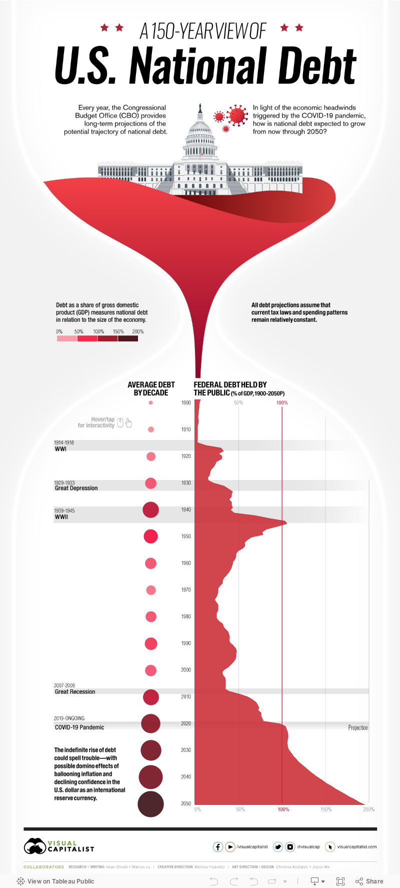
Timeline: 150 Years of U.S. National Debt
This interactive visualization uses debt held by the public for its calculations, which excludes intragovernmental holdings.

var divElement = document.getElementById(‘viz1710977392473’); var vizElement = divElement.getElementsByTagName(‘object’)[0]; vizElement.style.width=’1200px’;vizElement.style.height=’2647px’; var scriptElement = document.createElement(‘script’); scriptElement.src = ‘https://public.tableau.com/javascripts/api/viz_v1.js’; vizElement.parentNode.insertBefore(scriptElement, vizElement);


Looking Back at 150 Years of U.S. Debt
The total U.S. national debt reached an all-time high of $28 trillion* in March 2021, the largest amount ever recorded.
Recent increases to the debt have been fueled by massive fiscal stimulus bills like the CARES Act ($2.2 trillion in March 2020), the Consolidated Appropriations Act ($2.3 trillion in December 2020), and most recently, the American Rescue Plan ($1.9 trillion in March 2021).
To see how America’s debt has gotten to its current point, we’ve created an interactive timeline using data from the Congressional Budget Office (CBO). It’s crucial to note that the data set uses U.S. national debt held by the public, which excludes intergovernmental holdings.
*Editor’s note: This top level figure includes intragovernmental holdings, or the roughly $6 trillion of debt owed within the government to itself.
What Influences U.S. Debt?
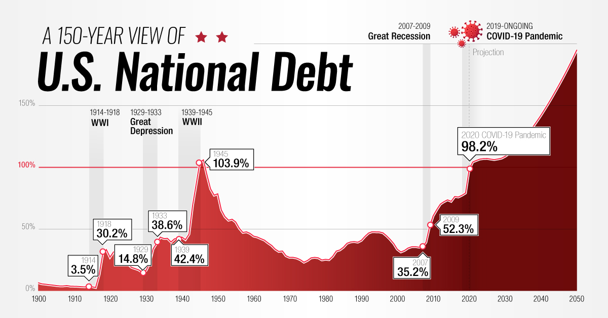
It’s worth pointing out that the national debt hasn’t always been this large.
Looking back 150 years, we can see that its size relative to GDP has fluctuated greatly, hitting multiple peaks and troughs. These movements generally correspond with events such as wars and recessions.
| Decade | Gross debt at start of decade (USD billions) | Avg. Debt Held By Public Throughout Decade (% of GDP) | Major Events |
|---|---|---|---|
| 1900 | - | 4.8% | - |
| 1910 | - | 10.0% | World War I |
| 1920 | - | 22.9% | The Great Depression |
| 1930 | $16 | 36.4% | President Roosevelt's New Deal |
| 1940 | $40 | 75.1% | World War II |
| 1950 | $257 | 56.8% | Korean War |
| 1960 | $286 | 37.3% | Vietnam War |
| 1970 | $371 | 26.1% | Stagflation (inflation + high unemployment) |
| 1980 | $908 | 33.7% | President Reagan's tax cuts |
| 1990 | $3,233 | 44.7% | Gulf War |
| 2000 | $5,674 | 36.6% | 9/11 attacks & Global Financial Crisis |
| 2010 | $13,562 | 72.4% | Debt ceiling is raised by Congress |
| 2020 | $27,748 | 105.6% | COVID-19 pandemic |
| 2030P | - | 121.8% | - |
| 2040P | - | 164.7% | - |
| 2050P | - | 195.2% | - |
Source: CBO, The Balance
To gain further insight into the history of the U.S. national debt, let’s review some key economic events in America’s history.
The Great Depression
After its WWI victory, the U.S. enjoyed a period of post-war prosperity commonly referred to as the Roaring Twenties.
This led to the creation of a stock market bubble which would eventually burst in 1929, causing massive damage to the U.S. economy. The country’s GDP was cut in half (partially due to deflation), while the unemployment rate rose to 25%.
Government revenues dipped as a result, pushing debt held by the public as a % of GDP from its low of 15% in 1929, to a high of 44% in 1934.
World War II
WWII quickly brought the U.S. back to full employment, but it was an incredibly expensive endeavor. The total cost of the war is estimated to be over $4 trillion in today’s dollars.
To finance its efforts, the U.S. relied heavily on war bonds, a type of bond that is marketed to citizens during armed conflicts. These bonds were sold in various denominations ranging from $25-$10,000 and had a 2.9% interest rate compounded semiannually.
Over 85 million Americans purchased these bonds, helping the U.S. government to raise $186 billion (not adjusted for inflation). This pushed debt above 100% of GDP for the first time ever, but was also enough to cover 63% of the war’s total cost.
The Postwar Period
Following World War II, the U.S. experienced robust economic growth.
Despite involvement in the Korea and Vietnam wars, debt-to-GDP declined to a low of 23% in 1974—largely because these wars were financed by raising taxes rather than borrowing.
The economy eventually slowed in the early 1980s, prompting President Reagan to slash taxes on corporations and high earning individuals. Income taxes on the top bracket, for example, fell from 70% to 50%.
2008 Global Financial Crisis
The Global Financial Crisis served as a precursor for today’s debt landscape.
Interest rates were reduced to near-zero levels to speed up the economic recovery, enabling the government to borrow with relative ease. Rates remained at these suppressed levels from 2008 to 2015, and debt-to-GDP grew from 39% to 73%.
It’s important to note that even before 2008, the U.S. government had been consistently running annual budget deficits. This means that the government spends more than it earns each year through taxes.
The National Debt Today
The COVID-19 pandemic damaged many areas of the global economy, forcing governments to drastically increase their spending. At the same time, many central banks once again reduced interest rates to zero.
This has resulted in a growing snowball of government debt that shows little signs of shrinking, even though the worst of the pandemic is already behind us.
In the U.S., federal debt has reached or surpassed WWII levels. When excluding intragovernmental holdings, it now sits at 104% of GDP—and including those holdings, it sits at 128% of GDP. But while the debt is expected to grow even further, the cost of servicing this debt has actually decreased in recent years.
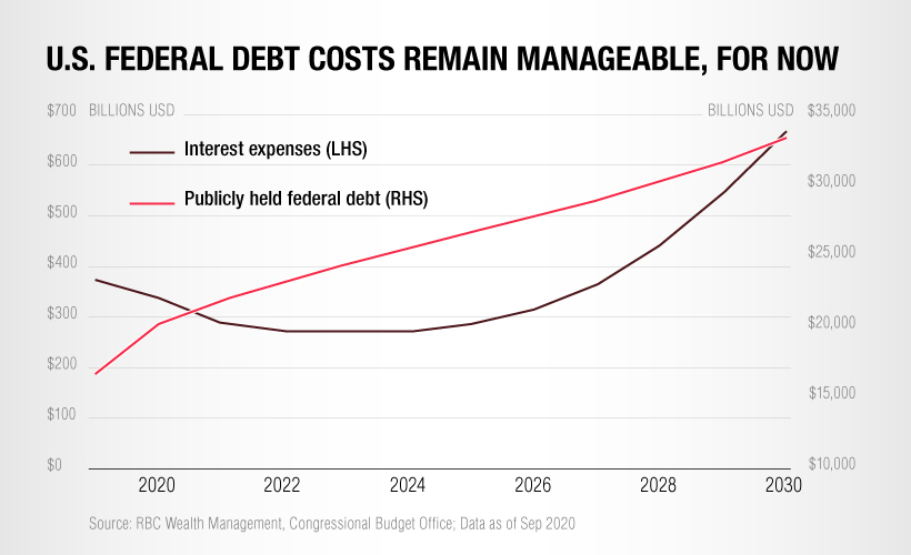
This is because existing government bonds, which were originally issued at higher rates, are now maturing and being refinanced to take advantage of today’s lower borrowing costs.
The key takeaway from this is that the U.S. national debt will remain manageable for the foreseeable future. Longer term, however, interest expenses are expected to grow significantly—especially if interest rates begin to rise again.


Money
How Debt-to-GDP Ratios Have Changed Since 2000
See how much the debt-to-GDP ratios of advanced economies have grown (or shrank) since the year 2000.


How Debt-to-GDP Ratios Have Changed Since 2000
This was originally posted on our Voronoi app. Download the app for free on Apple or Android and discover incredible data-driven charts from a variety of trusted sources.
Government debt levels have grown in most parts of the world since the 2008 financial crisis, and even more so after the COVID-19 pandemic.
To gain perspective on this long-term trend, we’ve visualized the debt-to-GDP ratios of advanced economies, as of 2000 and 2024 (estimated). All figures were sourced from the IMF’s World Economic Outlook.
Data and Highlights
The data we used to create this graphic is listed in the table below. “Government gross debt” consists of all liabilities that require payment(s) of interest and/or principal in the future.
| Country | 2000 (%) | 2024 (%) | Change (pp) |
|---|---|---|---|
| 🇯🇵 Japan | 135.6 | 251.9 | +116.3 |
| 🇸🇬 Singapore | 82.3 | 168.3 | +86.0 |
| 🇺🇸 United States | 55.6 | 126.9 | +71.3 |
| 🇬🇧 United Kingdom | 36.6 | 105.9 | +69.3 |
| 🇬🇷 Greece | 104.9 | 160.2 | +55.3 |
| 🇫🇷 France | 58.9 | 110.5 | +51.6 |
| 🇵🇹 Portugal | 54.2 | 104.0 | +49.8 |
| 🇪🇸 Spain | 57.8 | 104.7 | +46.9 |
| 🇸🇮 Slovenia | 25.9 | 66.5 | +40.6 |
| 🇫🇮 Finland | 42.4 | 76.5 | +34.1 |
| 🇭🇷 Croatia | 35.4 | 61.8 | +26.4 |
| 🇨🇦 Canada | 80.4 | 103.3 | +22.9 |
| 🇨🇾 Cyprus | 56.0 | 70.9 | +14.9 |
| 🇦🇹 Austria | 65.7 | 74.0 | +8.3 |
| 🇸🇰 Slovak Republic | 50.5 | 56.5 | +6.0 |
| 🇩🇪 Germany | 59.3 | 64.0 | +4.7 |
| 🇧🇪 Belgium | 109.6 | 106.8 | -2.8 |
| 🇮🇱 Israel | 77.4 | 56.8 | -20.6 |
| 🇮🇸 Iceland | 75.8 | 54.6 | -21.2 |
The debt-to-GDP ratio indicates how much a country owes compared to the size of its economy, reflecting its ability to manage and repay debts. Percentage point (pp) changes shown above indicate the increase or decrease of these ratios.
Countries with the Biggest Increases
Japan (+116 pp), Singapore (+86 pp), and the U.S. (+71 pp) have grown their debt as a percentage of GDP the most since the year 2000.
All three of these countries have stable, well-developed economies, so it’s unlikely that any of them will default on their growing debts. With that said, higher government debt leads to increased interest payments, which in turn can diminish available funds for future government budgets.
This is a rising issue in the U.S., where annual interest payments on the national debt have surpassed $1 trillion for the first time ever.
Only 3 Countries Saw Declines
Among this list of advanced economies, Belgium (-2.8 pp), Iceland (-21.2 pp), and Israel (-20.6 pp) were the only countries that decreased their debt-to-GDP ratio since the year 2000.
According to Fitch Ratings, Iceland’s debt ratio has decreased due to strong GDP growth and the use of its cash deposits to pay down upcoming maturities.
See More Debt Graphics from Visual Capitalist
Curious to see which countries have the most government debt in dollars? Check out this graphic that breaks down $97 trillion in debt as of 2023.

-

 Maps2 weeks ago
Mapped: Average Wages Across Europe
-

 Money1 week ago
Which States Have the Highest Minimum Wage in America?
-

 Real Estate1 week ago
Ranked: The Most Valuable Housing Markets in America
-

 Markets1 week ago
Charted: Big Four Market Share by S&P 500 Audits
-

 AI1 week ago
The Stock Performance of U.S. Chipmakers So Far in 2024
-

 Automotive2 weeks ago
Almost Every EV Stock is Down After Q1 2024
-

 Money2 weeks ago
Where Does One U.S. Tax Dollar Go?
-

 Green2 weeks ago
Ranked: Top Countries by Total Forest Loss Since 2001