Misc
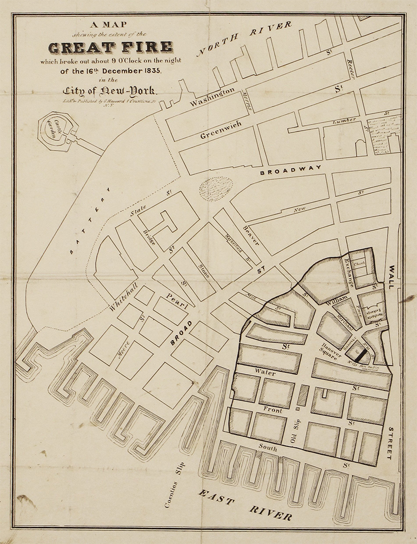
This Clever Map is a Window into 19th Century New York City
The early 19th century was a time of great change for New York, which had already cemented its status as America’s largest city.
The opening of the Erie Canal helped turn the city into a shipping powerhouse, and there was a building boom on the horizon. Cholera epidemics, fires, and riots swept through the city at various points.
This fascinating interactive map, from Esri, is a snapshot of New York City during the tumultuous time (1836 to be exact), overlaid on the modern-day satellite map.
Getting the Lay of the Land
The base map used above is the stunning “Topographical Map Of The City and County Of New–York, and the adjacent Country”, published by the prodigious mapmaker, Joseph Colton.
For easy viewing, the map’s legend is below:

This map includes all the usual features, such as roads and prominent buildings, but it also has some clever secondary information built in as well. For one, shading indicates ares that were more built-up at the time. There are also a number of visual techniques to indicate topographical features as well. After all, NYC wasn’t as extensive as it is today, and much of the land depicted in the map is still undeveloped.
The full map is well worth exploring as well, as there are a number of beautiful illustrations throughout.
Tool tip: Click the X on the info bar to hide it. (Mobile: Click the map, then the magnifying glass.)
The Big Picture: New York City in 1836
At this point in time, development in Lower Manhattan extended until about 14th Street, where buildings began to give way to open spaces. The city’s grid pattern was beginning to take shape, following the Commissioners’ Plan laid out in 1811. At the time, New York was anticipating massive growth, and the straightforward grid pattern was an efficient way to prepare the city for rapid expansion.
In the 1800s, fire was an ever-present danger for city dwellers. In fact, a major fire tore through Lower Manhattan a year prior to when this map was published.
Points of Interest
There are a number of points worth visiting on this map.
Transit Begins to Take Shape
In the 1830s, New York City’s first railroad line—horse powered for its first few years—connected Prince Street to the Harlem River, accelerating the city’s expansion northward from Lower Manhattan. This route is still recognizable today as the Harlem Line.
Evolving Shorelines
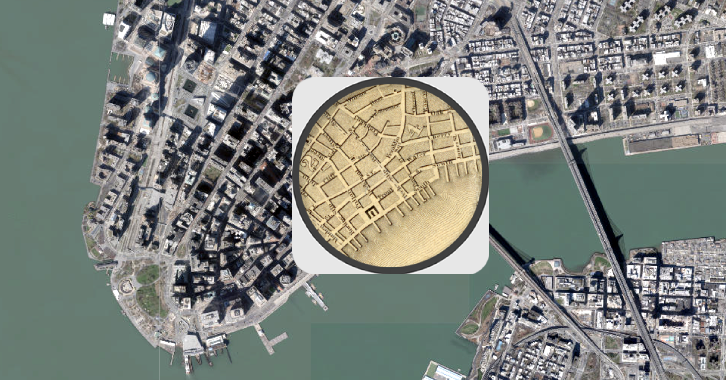
One very obvious difference between the two maps is how much land has been reclaimed along shorelines in the area. Battery Park City, on the west side of downtown, and the Brooklyn Navy Yard are two prominent examples of infill. Randall’s Island, located near the top of Manhattan, is also an interesting place to observe changes in topography. Randall’s Island is actually made up of three islands that were eventually conjoined in the 1960s.
This interactive map is a great place to explore changes to NYC’s shoreline over time.
Taming the Landscape
Midtown Manhattan is worth zooming into for a couple of reasons. First, the outline of Central Park is visible, although the park would officially be approved until almost 20 years later.
As well, this topographical map clearly shows the numerous outcroppings spread across the island. Manhattan was far from flat in the 1800s, and it took a tremendous amount of effort—starting with gunpowder, pickaxes, and horse-drawn carts—to level the land.
Looking at these historical maps is a reminder that the New York City we know today is the product of hundreds of years of human effort, and that cities continue to evolve over time.


VC+
VC+: Get Our Key Takeaways From the IMF’s World Economic Outlook
A sneak preview of the exclusive VC+ Special Dispatch—your shortcut to understanding IMF’s World Economic Outlook report.

Have you read IMF’s latest World Economic Outlook yet? At a daunting 202 pages, we don’t blame you if it’s still on your to-do list.
But don’t worry, you don’t need to read the whole April release, because we’ve already done the hard work for you.
To save you time and effort, the Visual Capitalist team has compiled a visual analysis of everything you need to know from the report—and our VC+ Special Dispatch is available exclusively to VC+ members. All you need to do is log into the VC+ Archive.
If you’re not already subscribed to VC+, make sure you sign up now to access the full analysis of the IMF report, and more (we release similar deep dives every week).
For now, here’s what VC+ members get to see.
Your Shortcut to Understanding IMF’s World Economic Outlook
With long and short-term growth prospects declining for many countries around the world, this Special Dispatch offers a visual analysis of the key figures and takeaways from the IMF’s report including:
- The global decline in economic growth forecasts
- Real GDP growth and inflation forecasts for major nations in 2024
- When interest rate cuts will happen and interest rate forecasts
- How debt-to-GDP ratios have changed since 2000
- And much more!

Get the Full Breakdown in the Next VC+ Special Dispatch
VC+ members can access the full Special Dispatch by logging into the VC+ Archive, where you can also check out previous releases.
Make sure you join VC+ now to see exclusive charts and the full analysis of key takeaways from IMF’s World Economic Outlook.
Don’t miss out. Become a VC+ member today.
What You Get When You Become a VC+ Member
VC+ is Visual Capitalist’s premium subscription. As a member, you’ll get the following:
- Special Dispatches: Deep dive visual briefings on crucial reports and global trends
- Markets This Month: A snappy summary of the state of the markets and what to look out for
- The Trendline: Weekly curation of the best visualizations from across the globe
- Global Forecast Series: Our flagship annual report that covers everything you need to know related to the economy, markets, geopolitics, and the latest tech trends
- VC+ Archive: Hundreds of previously released VC+ briefings and reports that you’ve been missing out on, all in one dedicated hub
You can get all of the above, and more, by joining VC+ today.

-

 Mining1 week ago
Gold vs. S&P 500: Which Has Grown More Over Five Years?
-

 Markets2 weeks ago
Ranked: The Most Valuable Housing Markets in America
-

 Money2 weeks ago
Which States Have the Highest Minimum Wage in America?
-

 AI2 weeks ago
Ranked: Semiconductor Companies by Industry Revenue Share
-

 Markets2 weeks ago
Ranked: The World’s Top Flight Routes, by Revenue
-

 Countries2 weeks ago
Population Projections: The World’s 6 Largest Countries in 2075
-

 Markets2 weeks ago
The Top 10 States by Real GDP Growth in 2023
-

 Demographics2 weeks ago
The Smallest Gender Wage Gaps in OECD Countries