Culture
The World’s Most Used Apps, by Downstream Traffic
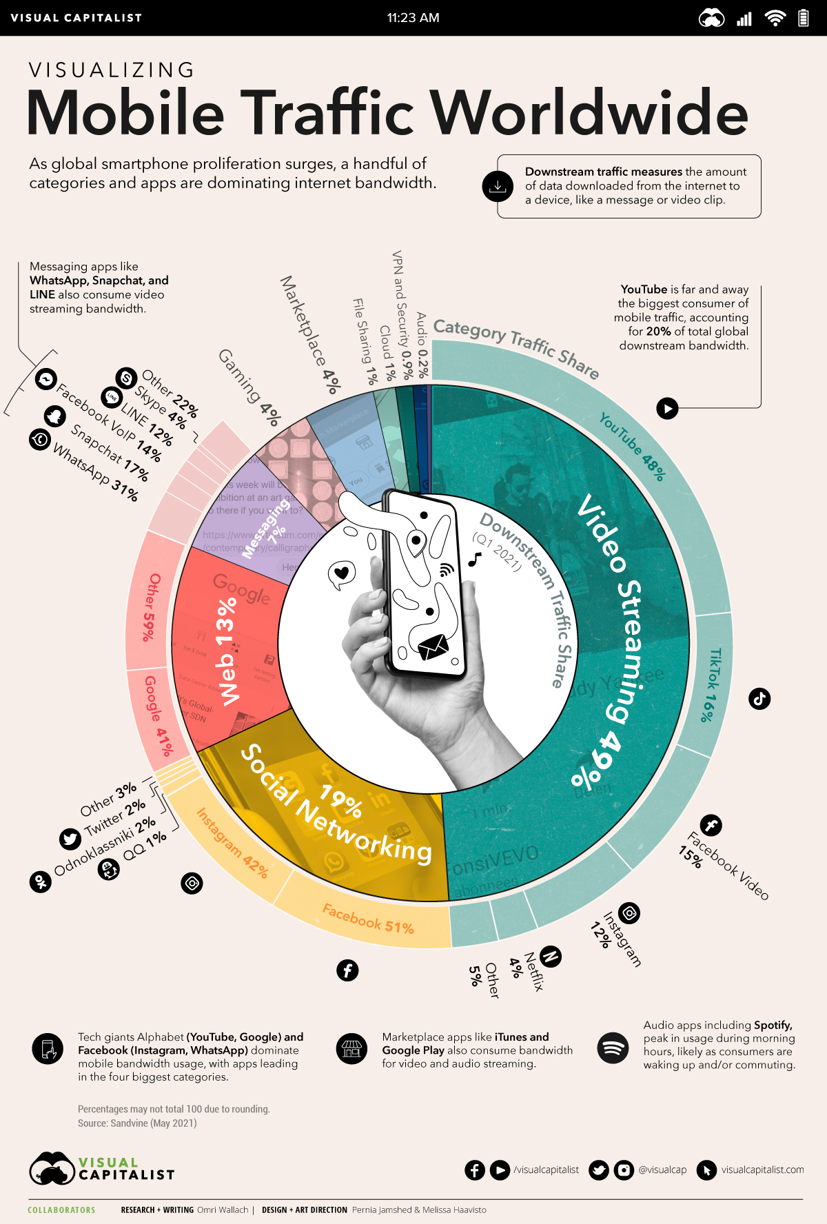


The World’s Most Used Apps, by Downstream Traffic
Of the millions of apps available around the world, just a small handful of the most used apps dominate global internet traffic.
Everything connected to the internet takes bandwidth to view. When you look at something on your smartphone—whether it’s a new message on Instagram or the next few seconds of a YouTube video—your device is downloading the data in the background.
And the bigger the files, the more bandwidth is utilized. In this chart, we break down of the most used apps by category, using Sandvine’s global mobile traffic report for 2021 Q1.
Video Drives Global Mobile Internet Traffic
The biggest files use the most data, and video files take the cake.
According to Android Central, streaming video ranges from about 0.7GB per hour of data for a 480p video to 1.5GB per hour for 1080. A 4K stream, the highest resolution currently offered by most providers, uses around 7.2GB per hour.
That’s miles bigger than audio files, where high quality 320kbps music streams use an average of just 0.12GB per hour. Social network messages are usually just a few KB, while the pictures found on them can range from a few hundred KB for a low resolution image to hundreds of MB for high resolution.
Understandably, breaking down mobile downstream traffic by app category shows that video is on top by a long shot:
| Category | Downstream Traffic Share (2021 Q1) |
|---|---|
| Video Streaming | 48.9% |
| Social Networking | 19.3% |
| Web | 13.1% |
| Messaging | 6.7% |
| Gaming | 4.3% |
| Marketplace | 4.1% |
| File Sharing | 1.3% |
| Cloud | 1.1% |
| VPN and Security | 0.9% |
| Audio | 0.2% |
Video streaming accounts for almost half of mobile downstream traffic worldwide at 49%. Audio streaming, including music and podcasts, accounts for just 0.2%.
Comparatively, social network and web browsing combined make up one third of downstream internet traffic. Games, marketplace apps, and file sharing, despite their large file sizes, only require one-time downloads that don’t put as big of a strain on traffic as video does.
A Handful of Companies Own the Most Used Apps
Though internet traffic data is broken down by category, it’s worth noting that many apps consume multiple types of bandwidth.
For example, messaging and social network apps, like WhatsApp, Instagram, and Snapchat, allow consumers to stream video, social network, and message.
Even marketplace apps like iTunes and Google Play consume bandwidth for video and audio streaming, and together account for 6.3% of total mobile downstream traffic.
But no single app had a bigger footprint than YouTube, which accounts for 20.4% of total global downstream bandwidth.
| Category | Top Apps (Category Traffic) | Category Traffic Share |
|---|---|---|
| Video Streaming | YouTube | 47.9% |
| Video Streaming | TikTok | 16.1% |
| Video Streaming | Facebook Video | 14.6% |
| Video Streaming | 12.1% | |
| Video Streaming | Netflix | 4.3% |
| Video Streaming | Other | 5.0% |
| Social Networking | 50.5% | |
| Social Networking | 41.9% | |
| Social Networking | 2.4% | |
| Social Networking | Odnoklassniki | 1.9% |
| Social Networking | 0.7% | |
| Social Networking | Other | 2.9% |
| Messaging | 31.4% | |
| Messaging | Snapchat | 16.5% |
| Messaging | Facebook VoIP | 14.3% |
| Messaging | LINE | 12.1% |
| Messaging | Skype | 4.1% |
| Messaging | Other | 21.6% |
| Web | 41.2% | |
| Web | Other | 58.8% |
The world’s tech giants had the leading app in the four biggest data streaming categories. Alphabet’s YouTube and Google made up almost half of all video streaming and web browsing traffic, while Facebook’s own app, combined with Instagram and WhatsApp, accounted for 93% of global social networking traffic and 45% of messaging traffic.
Traffic usage by app highlights the data monopoly of tech giants and internet providers. Since just a few companies account for a majority of global smartphone internet traffic, they have a lot more bartering power (and responsibility) when it comes to our general internet consumption.


Brands
How Tech Logos Have Evolved Over Time
From complete overhauls to more subtle tweaks, these tech logos have had quite a journey. Featuring: Google, Apple, and more.


How Tech Logos Have Evolved Over Time
This was originally posted on our Voronoi app. Download the app for free on iOS or Android and discover incredible data-driven charts from a variety of trusted sources.
One would be hard-pressed to find a company that has never changed its logo. Granted, some brands—like Rolex, IBM, and Coca-Cola—tend to just have more minimalistic updates. But other companies undergo an entire identity change, thus necessitating a full overhaul.
In this graphic, we visualized the evolution of prominent tech companies’ logos over time. All of these brands ranked highly in a Q1 2024 YouGov study of America’s most famous tech brands. The logo changes are sourced from 1000logos.net.
How Many Times Has Google Changed Its Logo?
Google and Facebook share a 98% fame rating according to YouGov. But while Facebook’s rise was captured in The Social Network (2010), Google’s history tends to be a little less lionized in popular culture.
For example, Google was initially called “Backrub” because it analyzed “back links” to understand how important a website was. Since its founding, Google has undergone eight logo changes, finally settling on its current one in 2015.
| Company | Number of Logo Changes |
|---|---|
| 8 | |
| HP | 8 |
| Amazon | 6 |
| Microsoft | 6 |
| Samsung | 6 |
| Apple | 5* |
Note: *Includes color changes. Source: 1000Logos.net
Another fun origin story is Microsoft, which started off as Traf-O-Data, a traffic counter reading company that generated reports for traffic engineers. By 1975, the company was renamed. But it wasn’t until 2012 that Microsoft put the iconic Windows logo—still the most popular desktop operating system—alongside its name.
And then there’s Samsung, which started as a grocery trading store in 1938. Its pivot to electronics started in the 1970s with black and white television sets. For 55 years, the company kept some form of stars from its first logo, until 1993, when the iconic encircled blue Samsung logo debuted.
Finally, Apple’s first logo in 1976 featured Isaac Newton reading under a tree—moments before an apple fell on his head. Two years later, the iconic bitten apple logo would be designed at Steve Jobs’ behest, and it would take another two decades for it to go monochrome.

-

 Maps1 week ago
The Largest Earthquakes in the New York Area (1970-2024)
-

 Money2 weeks ago
Where Does One U.S. Tax Dollar Go?
-

 Automotive2 weeks ago
Almost Every EV Stock is Down After Q1 2024
-

 AI2 weeks ago
The Stock Performance of U.S. Chipmakers So Far in 2024
-

 Markets2 weeks ago
Charted: Big Four Market Share by S&P 500 Audits
-

 Real Estate2 weeks ago
Ranked: The Most Valuable Housing Markets in America
-

 Money2 weeks ago
Which States Have the Highest Minimum Wage in America?
-

 AI2 weeks ago
Ranked: Semiconductor Companies by Industry Revenue Share