Maps
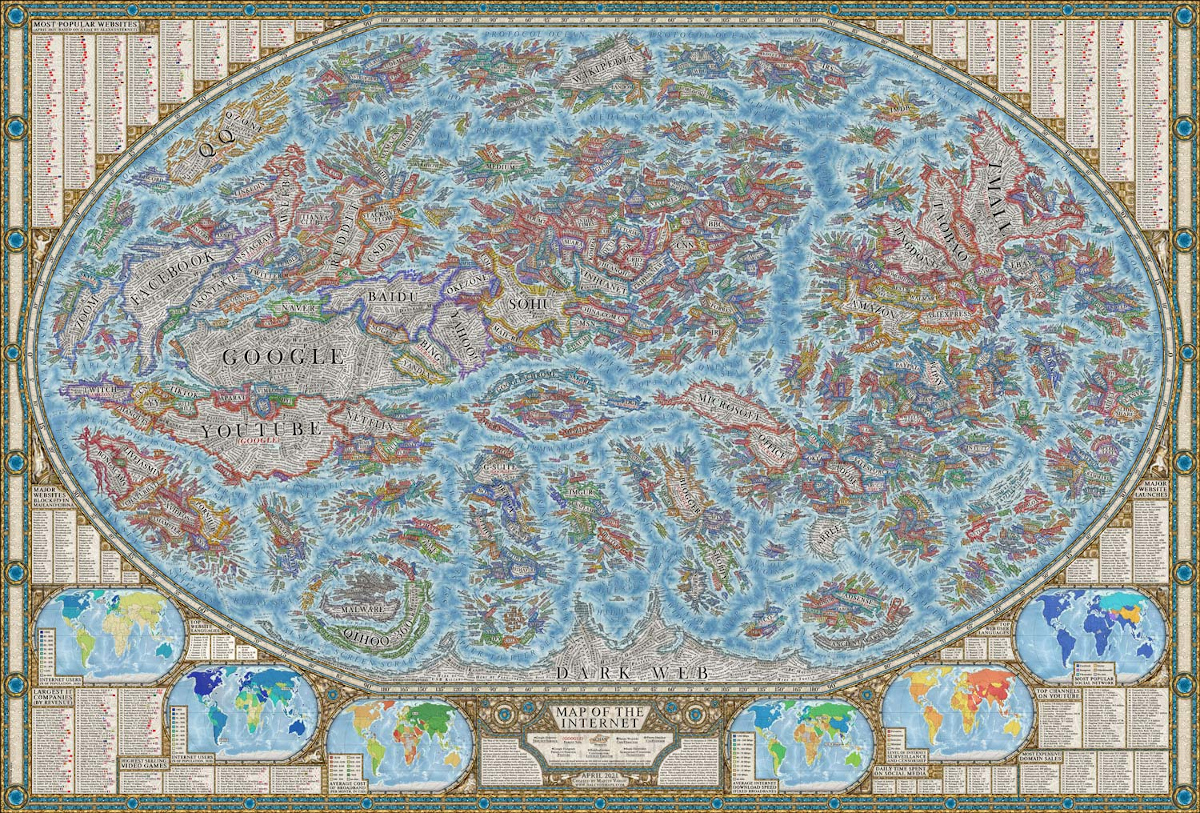
A Map of the Online World in Incredible Detail
View the giant full-size (20 MB) version of this map.
A Map of the Online World in Incredible Detail
The internet is intangible, and because you can’t see it, it can be hard to comprehend its sheer vastness. As well, it’s difficult to gauge the relative size of different web properties. However, this map of the internet by Halcyon Maps offers a unique solution to these problems.
Inspired by the look and design of historical maps, this graphic provides a snapshot of the current state of the World Wide Web, as of April 2021. Let’s take a closer look!
But First, Methodology
Before diving into an analysis, it’s worth touching on the methodology behind this graphic’s design.
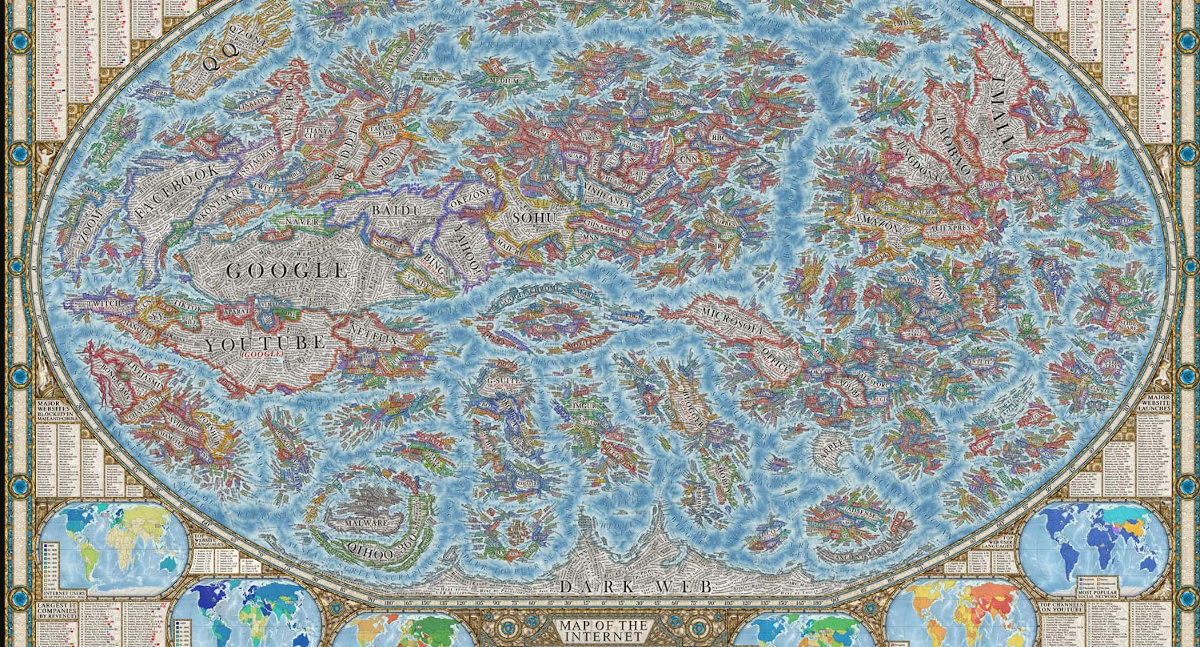
This map highlights thousands of the world’s most popular websites by visualizing them as “countries.” These “countries” are organized into clusters that are grouped by their content type (whether it’s a news website, search engine, e-commerce platform, etc).
 Editor’s fun fact: Can you spot Visual Capitalist? We’re right in between TechCrunch and The Guardian above.
The colored borders represent a website’s logo or user interface. In terms of scale, each website’s territory size is based on its average Alexa web traffic ranking. The data is a yearly average, measured from January 2020 to January 2021.
Along the borders of the map, you can find additional information, from ranked lists of social media consumption to a mini-map of average download speeds across the globe.
According to the designer Martin Vargic, this map took about a year to complete.
Top 50 Most Popular Websites
Google and YouTube take up a lot of space, which is unsurprising—they’re the two highest-ranked websites on the list:
| Rank | Website | Country |
|---|---|---|
| 1 | Google.com | 🇺🇲 U.S. |
| 2 | Youtube.com | 🇺🇲 U.S. |
| 3 | Tmall.com | 🇨🇳 China |
| 4 | Baidu.com | 🇨🇳 China |
| 5 | QQ.com | 🇨🇳 China |
| 6 | Sohu.com | 🇨🇳 China |
| 7 | Facebook.com | 🇺🇲 U.S. |
| 8 | Taobao.com | 🇨🇳 China |
| 9 | Amazon.com | 🇺🇲 U.S. |
| 10 | 360.cn | 🇨🇳 China |
| 11 | Yahoo.com | 🇺🇲 U.S. |
| 12 | Jd.com | 🇨🇳 China |
| 13 | Zoom.us | 🇺🇲 U.S. |
| 14 | Wikipedia.com | 🇺🇲 U.S. |
| 15 | Weibo.com | 🇨🇳 China |
| 16 | Sina.com.cn | 🇨🇳 China |
| 17 | Live.com | 🇺🇲 U.S. |
| 18 | Xinhuanet.com | 🇨🇳 China |
| 19 | Microsoft.com | 🇺🇲 U.S. |
| 20 | Reddit.com | 🇺🇲 U.S. |
| 21 | Office.com | 🇺🇲 U.S. |
| 22 | Netflix.com | 🇺🇲 U.S. |
| 23 | Microsoftonline.com | 🇺🇲 U.S. |
| 24 | Panda.tv | 🇨🇳 China |
| 25 | Zhanqi.tv | 🇨🇳 China |
| 26 | Instagram.com | 🇺🇲 U.S. |
| 27 | Force.com | 🇺🇲 U.S. |
| 28 | Google.com.hk | 🇭🇰 Hong Kong |
| 29 | VK.com | 🇷🇺 Russia |
| 30 | Alipay.com | 🇨🇳 China |
| 31 | Csdn.net | 🇨🇳 China |
| 32 | Myshopify.com | 🇨🇦 Canada |
| 33 | Okezone.com | 🇮🇩 Indonesia |
| 34 | Bing.com | 🇺🇲 U.S. |
| 35 | Yahoo.co.jp | 🇯🇵 Japan |
| 36 | Naver.com | 🇰🇷 South Korea |
| 37 | Adobe.com | 🇺🇲 U.S. |
| 38 | Salesforce.com | 🇺🇲 U.S. |
| 39 | Ebay.com | 🇺🇲 U.S. |
| 40 | Twitch.tv | 🇺🇲 U.S. |
| 41 | Bongacams.com | 🇳🇱 Netherlands |
| 42 | Twitter.com | 🇺🇲 U.S. |
| 43 | Apple.com | 🇺🇲 U.S. |
| 44 | Amazon.in | 🇮🇳 India |
| 45 | Amazon.co.jp | 🇯🇵 Japan |
| 46 | Aliexpress.com | 🇨🇳 China |
| 47 | Aparat.com | 🇮🇷 Iran |
| 48 | Linkedin.com | 🇺🇲 U.S. |
| 49 | Huanqiu.com | 🇨🇳 China |
| 50 | YY.com | 🇨🇳 China |
Google has held the title as the internet’s most popular website since 2010. While Google’s popularity is well understood, the company’s dominance might be even more widespread than you’d think—across all Google-owned platforms (including YouTube) the company accounts for 90% of all internet searches.
The third highest ranked website is Tmall. For those who don’t know, Tmall is a Chinese e-commerce platform, owned by Alibaba Group. It focuses on Business-to-Consumer (B2C) transactions, and has established itself as the most popular e-commerce website in China—in Q1 2021, Tmall accounted for more than 50% of China’s B2C online transactions.
A High Level Look
When it comes to the top 50 websites overall, a majority are either social networking platforms, search engines, or online marketplaces—while this may not come as a surprise, it’s still powerful to see visualized. For instance, even a huge, well-known website like the New York Times is just a tiny country on this map.
And of course, a map of the internet isn’t complete without mention of the dark web.
While it’s challenging to determine its true size, research indicates that the dark web accounts for a large portion of the internet’s true size. And apparently, it’s growing steadily, with the help of anonymous cryptocurrencies like Bitcoin.
For the most part, it’s believed that the dark web is used for unsavory reasons—however, it’s not all bad. Because of its anonymous nature, it can be used as a safe space for whistleblowing or activism.
Overall, this map, and the internet as a whole, has many places for us to explore. When you dive in, what “countries” catch your eye?


Maps
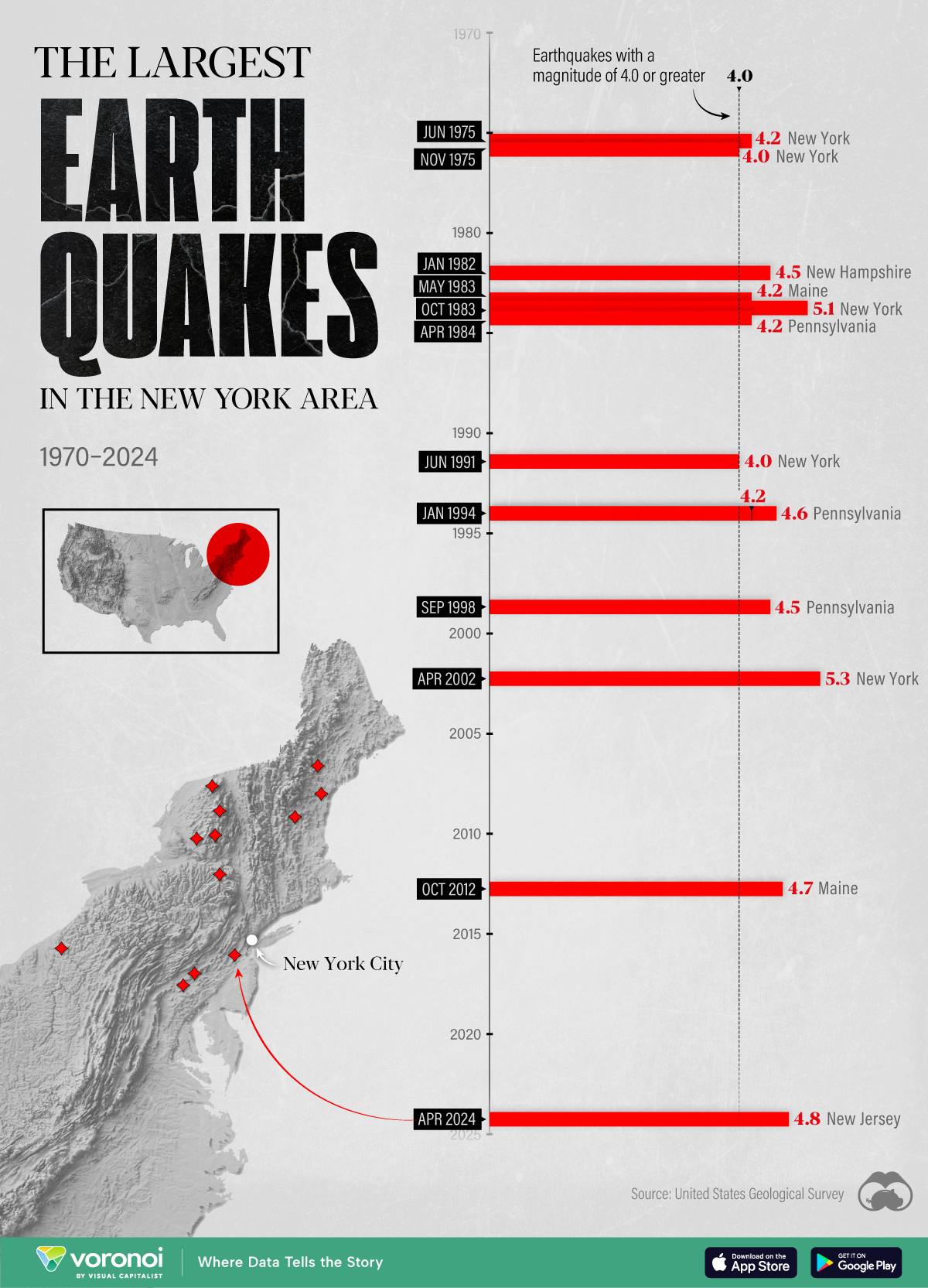
The Largest Earthquakes in the New York Area (1970-2024)
The earthquake that shook buildings across New York in April 2024 was the third-largest quake in the Northeast U.S. over the past 50 years.
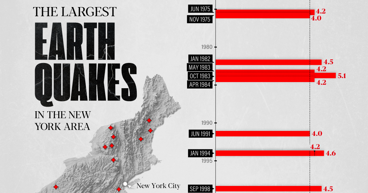
The Largest Earthquakes in the New York Area
This was originally posted on our Voronoi app. Download the app for free on Apple or Android and discover incredible data-driven charts from a variety of trusted sources.
The 4.8 magnitude earthquake that shook buildings across New York on Friday, April 5th, 2024 was the third-largest quake in the U.S. Northeast area over the past 50 years.
In this map, we illustrate earthquakes with a magnitude of 4.0 or greater recorded in the Northeastern U.S. since 1970, according to the United States Geological Survey (USGS).
Shallow Quakes and Older Buildings
The earthquake that struck the U.S. Northeast in April 2024 was felt by millions of people from Washington, D.C., to north of Boston. It even caused a full ground stop at Newark Airport.
The quake, occurring just 5 km beneath the Earth’s surface, was considered shallow, which is what contributed to more intense shaking at the surface.
According to the USGS, rocks in the eastern U.S. are significantly older, denser, and harder than those on the western side, compressed by time. This makes them more efficient conduits for seismic energy. Additionally, buildings in the Northeast tend to be older and may not adhere to the latest earthquake codes.
Despite disrupting work and school life, the earthquake was considered minor, according to the Michigan Technological University magnitude scale:
| Magnitude | Earthquake Effects | Estimated Number Each Year |
|---|---|---|
| 2.5 or less | Usually not felt, but can be recorded by seismograph. | Millions |
| 2.5 to 5.4 | Often felt, but only causes minor damage. | 500,000 |
| 5.5 to 6.0 | Slight damage to buildings and other structures. | 350 |
| 6.1 to 6.9 | May cause a lot of damage in very populated areas. | 100 |
| 7.0 to 7.9 | Major earthquake. Serious damage. | 10-15 |
| 8.0 or greater | Great earthquake. Can totally destroy communities near the epicenter. | One every year or two |
The largest earthquake felt in the area over the past 50 years was a 5.3 magnitude quake that occurred in Au Sable Forks, New York, in 2002. It damaged houses and cracked roads in a remote corner of the Adirondack Mountains, but caused no injuries.
| Date | Magnitude | Location | State |
|---|---|---|---|
| April 20, 2002 | 5.3 | Au Sable Forks | New York |
| October 7, 1983 | 5.1 | Newcomb | New York |
| April 5, 2024 | 4.8 | Whitehouse Station | New Jersey |
| October 16, 2012 | 4.7 | Hollis Center | Maine |
| January 16, 1994 | 4.6 | Sinking Spring | Pennsylvania |
| January 19, 1982 | 4.5 | Sanbornton | New Hampshire |
| September 25, 1998 | 4.5 | Adamsville | Pennsylvania |
| June 9, 1975 | 4.2 | Altona | New York |
| May 29, 1983 | 4.2 | Peru | Maine |
| April 23, 1984 | 4.2 | Conestoga | Pennsylvania |
| January 16, 1994 | 4.2 | Sinking Spring | Pennsylvania |
| November 3, 1975 | 4 | Long Lake | New York |
| June 17, 1991 | 4 | Worcester | New York |
The largest earthquake in U.S. history, however, was the 1964 Good Friday quake in Alaska, measuring 9.2 magnitude and killing 131 people.

-

 Green1 week ago
Ranked: The Countries With the Most Air Pollution in 2023
-

 Automotive2 weeks ago
Almost Every EV Stock is Down After Q1 2024
-

 AI2 weeks ago
The Stock Performance of U.S. Chipmakers So Far in 2024
-

 Markets2 weeks ago
Charted: Big Four Market Share by S&P 500 Audits
-

 Real Estate2 weeks ago
Ranked: The Most Valuable Housing Markets in America
-

 Money2 weeks ago
Which States Have the Highest Minimum Wage in America?
-

 AI2 weeks ago
Ranked: Semiconductor Companies by Industry Revenue Share
-

 Travel2 weeks ago
Ranked: The World’s Top Flight Routes, by Revenue