Investor Education
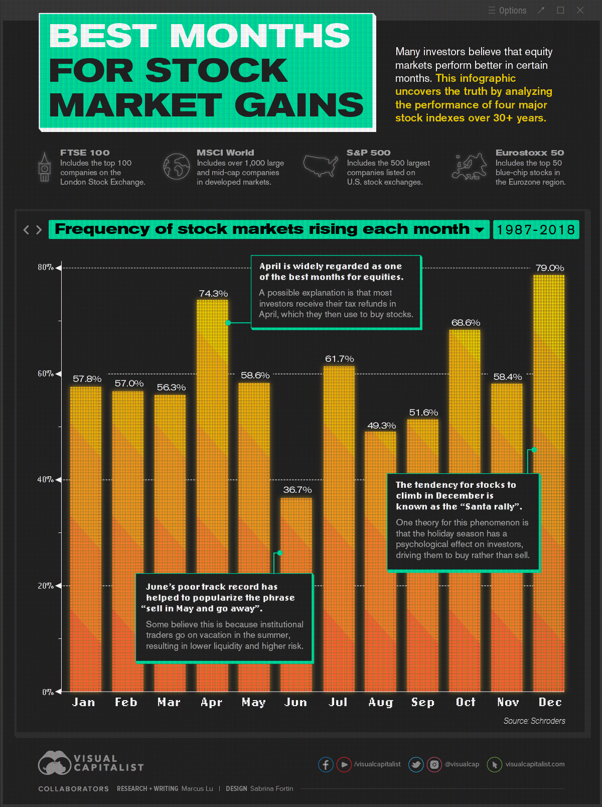
The Best Months for Stock Market Gains


The Best Months for Stock Market Gains
Many investors believe that equity markets perform better during certain times of the year.
Is there any truth to these claims, or is it superstitious nonsense? This infographic uses data gathered by Schroders, a British asset management firm, to investigate.
What the Data Says
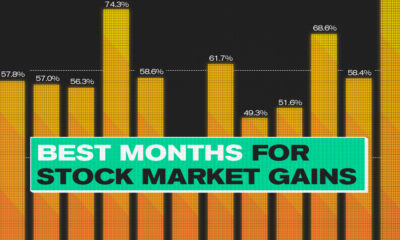
This analysis is based on 31 years of performance across four major stock indexes:
- FTSE 100: An index of the top 100 companies on the London Stock Exchange (LSE)
- MSCI World: An index of over 1,000 large and mid-cap companies within developed markets
- S&P 500: An index of the 500 largest companies that trade on U.S. stock exchanges
- Eurostoxx 50: An index of the top 50 blue-chip stocks within the Eurozone region
The percentages in the following table represent the historical frequency of these indexes rising in a given month, between the years 1987 and 2018. Months are ordered from best to worst, in descending order.
| Rank | Month of Year | Frequency of Growth (%) | Difference from Mean (p.p.) | |
|---|---|---|---|---|
| #1 | December | 79.0% | +19.9 | |
| #2 | April | 74.3% | +15.2 | |
| #3 | October | 68.6% | +9.5 | |
| #4 | July | 61.7% | +2.6 | |
| #5 | May | 58.6% | -0.5 | |
| #6 | November | 58.4% | -0.7 | |
| #7 | January | 57.8% | -1.3 | |
| #8 | February | 57.0% | -2.1 | |
| #9 | March | 56.3% | -2.8 | |
| #10 | September | 51.6% | -7.5 | |
| #11 | August | 49.3% | -9.8 | |
| #12 | June | 36.7% | -22.4 | |
| Average | 59.1% | n/a |
There are some outliers in this dataset that we’ll focus on below.
The Strong Months
In terms of frequency of growth, December has historically been the best month to own stocks. This lines up with a phenomenon known as the “Santa Claus Rally”, which suggests that equity markets rally over Christmas.
One theory is that the holiday season has a psychological effect on investors, driving them to buy rather than sell. We can also hypothesize that many institutional investors are on vacation during this time. This could give bullish retail investors more sway over the direction of the market.
The second best month was April, which is commonly regarded as a strong month for the stock market. One theory is that many investors receive their tax refunds in April, which they then use to buy stocks. The resulting influx of cash pushes prices higher.
Speaking of higher prices, we can also look at this trend from the perspective of returns. Focusing on the S&P 500, and looking back to 1928, April has generated an average return of 0.88%. This is well above the all-month average of 0.47%.
The Weak Months
The three worst months to own stocks, according to this analysis, are June, August, and September. Is it a coincidence that they’re all in the summer?
One theory for the season’s relative weakness is that institutional traders are on vacation, similar to December. Without the holiday cheer, however, the market is less frothy and the reduced liquidity leads to increased risk.
Whether you believe this or not, the data does show a convincing pattern. It’s for this reason that the phrase “sell in May and go away” has become popularized.
Key Takeaways
Investors should remember that this data is based on historical results, and should not be used to make forward-looking decisions in the stock market.
Anomalies like the COVID-19 pandemic in 2020 can have a profound impact on the world, and the market as a whole. Stock market performance during these times may deviate greatly from their historical averages seen above.
Regardless, this analysis can still be useful to investors who are trying to understand market movements. For example, if stocks rise in December without any clear catalyst, it could be the famed Santa Claus Rally at work.


Investor Education
How MSCI Builds Thematic Indexes: A Step-by-Step Guide
From developing an index objective to choosing relevant stocks, this graphic breaks down how MSCI builds thematic indexes using examples.

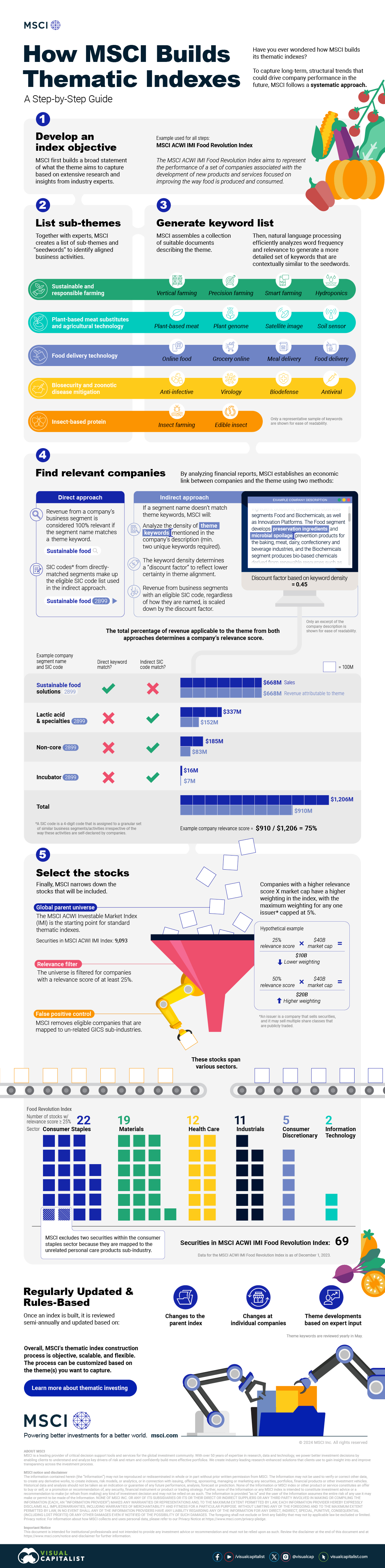
How MSCI Builds Thematic Indexes: A Step-by-Step Guide
Have you ever wondered how MSCI builds its thematic indexes?
To capture long-term, structural trends that could drive business performance in the future, the company follows a systematic approach. This graphic from MSCI breaks down each step in the process used to create its thematic indexes.
Step 1: Develop an Index Objective
MSCI first builds a broad statement of what the theme aims to capture based on extensive research and insights from industry experts.
Steps 2 and 3: List Sub-Themes, Generate Keyword List
Together with experts, MSCI creates a list of sub-themes or “seedwords” to identify aligned business activities.
The team then assembles a collection of suitable documents describing the theme. Natural language processing efficiently analyzes word frequency and relevance to generate a more detailed set of keywords contextually similar to the seedwords.
Step 4: Find Relevant Companies
By analyzing financial reports, MSCI picks companies relevant to the theme using two methods:
- Direct approach: Revenue from a company’s business segment is considered 100% relevant if the segment name matches a theme keyword. Standard Industrial Classification (SIC) codes from these directly-matched segments make up the eligible SIC code list used in the indirect approach.
- Indirect approach: If a segment name doesn’t match theme keywords, MSCI will:
- Analyze the density of theme keywords mentioned in the company’s description. A minimum of two unique keywords is required.
- The keyword density determines a “discount factor” to reflect lower certainty in theme alignment.
- Revenue from business segments with an eligible SIC code, regardless of how they are named, is scaled down by the discount factor.
The total percentage of revenue applicable to the theme from both approaches determines a company’s relevance score.
Step 5: Select the Stocks
Finally, MSCI narrows down the stocks that will be included:
- Global parent universe: The ACWI Investable Market Index (IMI) is the starting point for standard thematic indexes.
- Relevance filter: The universe is filtered for companies with a relevance score of at least 25%.
- False positive control: Eligible companies that are mapped to un-related GICS sub-industries are removed.
Companies with higher relevance scores and market caps have a higher weighting in the index, with the maximum weighting for any one issuer capped at 5%. The final selected stocks span various sectors.
MSCI Thematic Indexes: Regularly Updated and Rules-Based
Once an index is built, it is reviewed semi-annually and updated based on:
- Changes to the parent index
- Changes at individual companies
- Theme developments based on expert input
Theme keywords are reviewed yearly in May. Overall, MSCI’s thematic index construction process is objective, scalable, and flexible. The process can be customized based on the theme(s) you want to capture.
Learn more about MSCI’s thematic indexes.

-

 Investor Education6 months ago
The 20 Most Common Investing Mistakes, in One Chart
Here are the most common investing mistakes to avoid, from emotionally-driven investing to paying too much in fees.
-

 Investor Education10 months ago
Visualizing BlackRock’s Top Equity Holdings
BlackRock is the world’s largest asset manager, with over $9 trillion in holdings. Here are the company’s top equity holdings.
-
 Investor Education10 months ago
10-Year Annualized Forecasts for Major Asset Classes
This infographic visualizes 10-year annualized forecasts for both equities and fixed income using data from Vanguard.
-
 Investor Education1 year ago
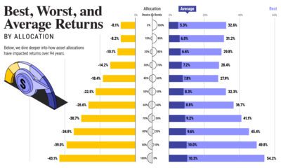
Visualizing 90 Years of Stock and Bond Portfolio Performance
How have investment returns for different portfolio allocations of stocks and bonds compared over the last 90 years?
-
 Markets2 years ago
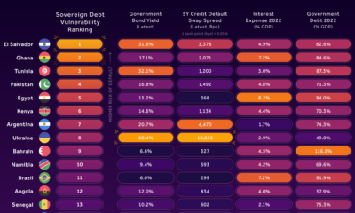
Countries with the Highest Default Risk in 2022
In this infographic, we examine new data that ranks the top 25 countries by their default risk.
-
 Investor Education2 years ago
The Best Months for Stock Market Gains
This infographic analyzes over 30 years of stock market performance to identify the best and worst months for gains.


-

 Maps1 week ago
The Largest Earthquakes in the New York Area (1970-2024)
-

 Money2 weeks ago
Where Does One U.S. Tax Dollar Go?
-

 Misc2 weeks ago
Almost Every EV Stock is Down After Q1 2024
-

 AI2 weeks ago
The Stock Performance of U.S. Chipmakers So Far in 2024
-

 Markets2 weeks ago
Charted: Big Four Market Share by S&P 500 Audits
-

 Real Estate2 weeks ago
Ranked: The Most Valuable Housing Markets in America
-

 Money2 weeks ago
Which States Have the Highest Minimum Wage in America?
-

 AI2 weeks ago
Ranked: Semiconductor Companies by Industry Revenue Share