Technology
Visualizing the Length of the Fine Print, for 14 Popular Apps
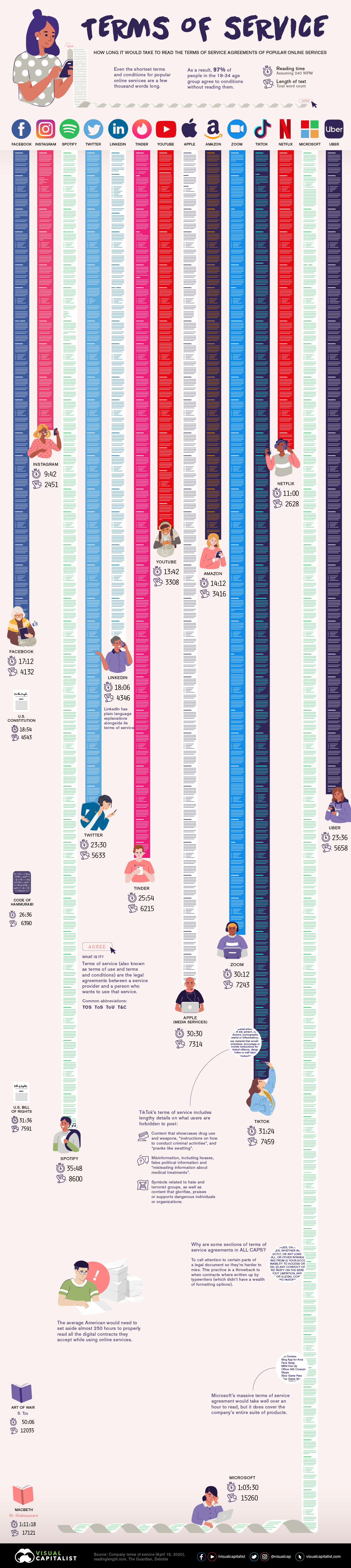


Terms of Service: The Length of Common Digital Contracts
Do you take the time to read the terms of service before you agree to when downloading the latest app or software?
Of course you do…
The world is awash with apps and internet services that ask potential users to agree to a service agreement. Most people click on ‘agree’ and move on, knowing that reading the service agreements could put them to sleep and defer their favorite internet fix.
Taking inspiration from designer Dima Yarovinsky’s project titled I Agree, today’s post visualizes the length of service agreements, by counting the words and calculating how long it would take users to read each one.
Ain’t Nobody Got Time for That
The average reading speed of most adults is 200 to 250 words per minute (wpm). College students, probably because they are very studious and not skimming, move that pace up to around 300 words per minute. For the sake of this analysis, we calculated reading times based on 240 wpm.
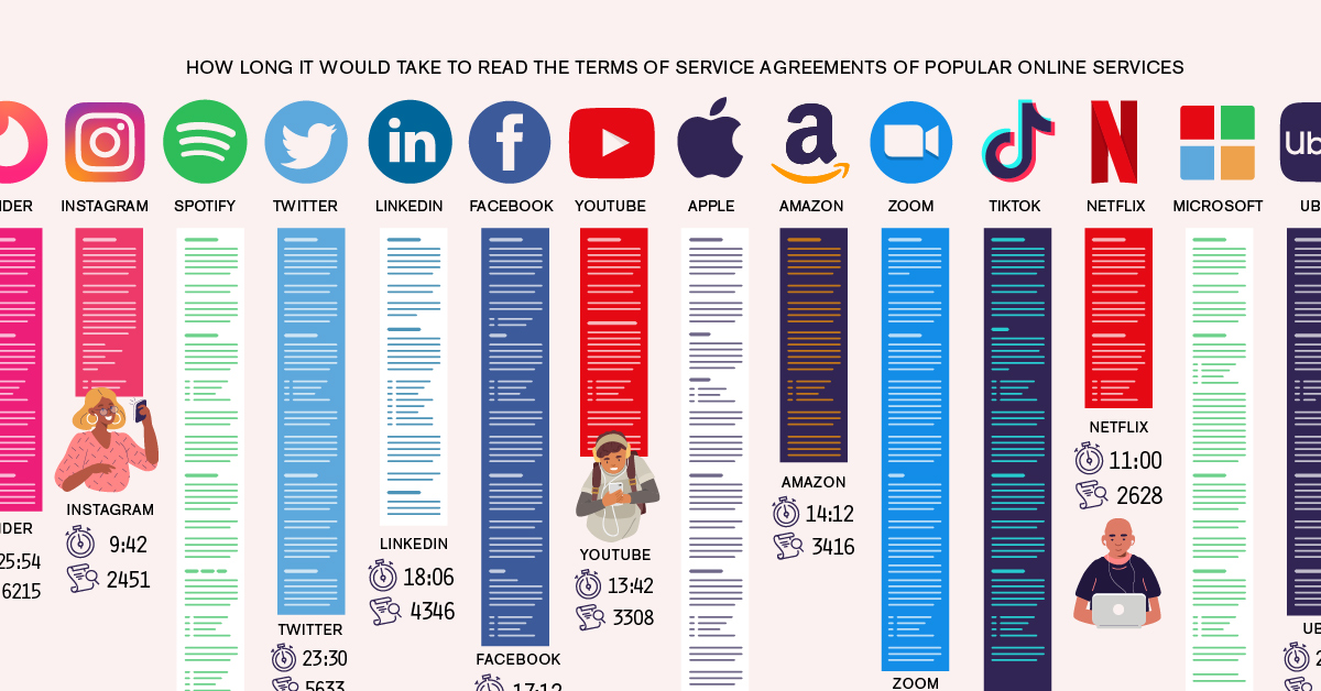
| App/Service | Word Count | How many minutes to read? (240 wpm) |
|---|---|---|
| Microsoft | 15,260 | 63.5 |
| Spotify | 8,600 | 35.8 |
| Niantic (Pokemon Go) | 8,466 | 35.2 |
| TikTok | 7,459 | 31.4 |
| Apple (Media Services) | 7,314 | 30.5 |
| Zoom | 6,891 | 28.7 |
| Tinder | 6,215 | 25.9 |
| Slack | 5,782 | 24.1 |
| Uber | 5,658 | 23.6 |
| 5,633 | 23.5 | |
| Bumble | 5,442 | 22.7 |
| Snapchat | 4,935 | 20.6 |
| 4,346 | 18.1 | |
| 4,132 | 17.2 | |
| 3,459 | 14.4 | |
| Amazon | 3,416 | 14.2 |
| YouTube | 3,308 | 13.7 |
| 3,267 | 13.6 | |
| Dropbox | 2,704 | 11.3 |
| Netflix | 2,628 | 11.0 |
| 2,451 | 9.7 |
The service agreement for Microsoft stands out at the top of the list with an agreement that would take over an hour to read — a bit less time than it would take to read Shakespeare’s Macbeth. To be fair, this service agreement does seem to cover the company’s entire suite of products.
These agreements are an insight into the legal mumbo jumbo that exists when it comes to regulating the use of these apps. There are a multitude of agreements that go even further into depth about what rules govern developers, online cash transactions and much more. The average American would need to set aside almost 250 hours to properly read all the digital contracts they accept while using online services.
Regardless, users may feel like they are wasting time reviewing a contract that can neither change or refuse—or more vitally, even comprehend.
Not All Text is Equal: The Flesch Reading-Ease Test
Apparently dealing with some of his own textual frustration, a Dr. Rudolf Flesch observed that some text, in particular legal language, appeared to be written to make reading as difficult as humanly possible.
Long sentences filled with arcane words can drag out simple sentences and discourage comprehension. Flesch wanted to measure the variability in reading comprehension — and by studying different kinds of writing, he developed a formula to determine readability and forever scorn lawyers.
In the Flesch Reading-Ease test, higher scores indicate material that is easier to read. Lower numbers mark passages that are more difficult to read. The formula for the Flesch Reading-Ease Score (FRES) test is:
The readability score uses two metrics:
- The numbers of words per sentence
- The number of syllables per word
Based on this score, a text would correspond to a particular education level.
| Score | Grade | Avg. Words per sentence | Syllables per 100 words |
|---|---|---|---|
| 100-90 | 5th grade | 8 | 123 |
| 90.0-80.0 | 6th grade | 11 | 131 |
| 90.0-70.0 | 7th grade | 14 | 139 |
| 70.0-60.0 | 8th and 9th grade | 17 | 147 |
| 60.0-50.0 | 10 to 12th grade | 21 | 155 |
| 50.0-30.0 | College | 25 | 167 |
| 30.0-0.0 | College graduate | 29 | 192 |
So how do the service agreements in our sample rank in terms of the Flesch Reading-Ease test?
| App/Service | Flesch Reading Ease Score | Equivalent Grade Level |
|---|---|---|
| 56 | 10 to 12th grade | |
| 56 | 10 to 12th grade | |
| 54 | 10 to 12th grade | |
| 54 | 10 to 12th grade | |
| Microsoft | 54 | 10 to 12th grade |
| Snapchat | 54 | 10 to 12th grade |
| Dropbox | 51 | 10 to 12th grade |
| Bumble | 50 | College level |
| YouTube | 50 | College level |
| 48 | College level | |
| Apple Media Services | 47 | College level |
| Tinder | 46 | College level |
| Amazon | 45 | College level |
| Netflix | 45 | College level |
| TikTok | 44 | College level |
| Spotify | 44 | College level |
| Zoom | 42 | College level |
| Uber | 40 | College level |
| 39 | College level | |
| Niantic (Pokemon Go) | 39 | College level |
| Slack | 36 | College level |
While not the most difficult to read, they definitely include a fair amount of legalese that helps discourage reading. The length and the difficulty of reading these agreements makes them practically useless to the average person.
This is a problem because it undermines basic concepts of contracts and informed consent. Users are giving up their rights without their knowledge.
Terms of Service: You Are the Product
These apps and software are the forefront of the data collection for a multi-billion dollar industry.
Individual user activity and information get easily collected and stored, creating databases of user patterns. This type of behavioral information makes marketers salivate, allowing them target their products to their ideal audience at lower costs than traditional advertising.
Do you know what you have agreed to?


Brands
How Tech Logos Have Evolved Over Time
From complete overhauls to more subtle tweaks, these tech logos have had quite a journey. Featuring: Google, Apple, and more.


How Tech Logos Have Evolved Over Time
This was originally posted on our Voronoi app. Download the app for free on iOS or Android and discover incredible data-driven charts from a variety of trusted sources.
One would be hard-pressed to find a company that has never changed its logo. Granted, some brands—like Rolex, IBM, and Coca-Cola—tend to just have more minimalistic updates. But other companies undergo an entire identity change, thus necessitating a full overhaul.
In this graphic, we visualized the evolution of prominent tech companies’ logos over time. All of these brands ranked highly in a Q1 2024 YouGov study of America’s most famous tech brands. The logo changes are sourced from 1000logos.net.
How Many Times Has Google Changed Its Logo?
Google and Facebook share a 98% fame rating according to YouGov. But while Facebook’s rise was captured in The Social Network (2010), Google’s history tends to be a little less lionized in popular culture.
For example, Google was initially called “Backrub” because it analyzed “back links” to understand how important a website was. Since its founding, Google has undergone eight logo changes, finally settling on its current one in 2015.
| Company | Number of Logo Changes |
|---|---|
| 8 | |
| HP | 8 |
| Amazon | 6 |
| Microsoft | 6 |
| Samsung | 6 |
| Apple | 5* |
Note: *Includes color changes. Source: 1000Logos.net
Another fun origin story is Microsoft, which started off as Traf-O-Data, a traffic counter reading company that generated reports for traffic engineers. By 1975, the company was renamed. But it wasn’t until 2012 that Microsoft put the iconic Windows logo—still the most popular desktop operating system—alongside its name.
And then there’s Samsung, which started as a grocery trading store in 1938. Its pivot to electronics started in the 1970s with black and white television sets. For 55 years, the company kept some form of stars from its first logo, until 1993, when the iconic encircled blue Samsung logo debuted.
Finally, Apple’s first logo in 1976 featured Isaac Newton reading under a tree—moments before an apple fell on his head. Two years later, the iconic bitten apple logo would be designed at Steve Jobs’ behest, and it would take another two decades for it to go monochrome.

-

 Maps1 week ago
The Largest Earthquakes in the New York Area (1970-2024)
-

 Money2 weeks ago
Where Does One U.S. Tax Dollar Go?
-

 Automotive2 weeks ago
Almost Every EV Stock is Down After Q1 2024
-

 AI2 weeks ago
The Stock Performance of U.S. Chipmakers So Far in 2024
-

 Markets2 weeks ago
Charted: Big Four Market Share by S&P 500 Audits
-

 Real Estate2 weeks ago
Ranked: The Most Valuable Housing Markets in America
-

 Money2 weeks ago
Which States Have the Highest Minimum Wage in America?
-

 AI2 weeks ago
Ranked: Semiconductor Companies by Industry Revenue Share