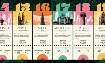

This ranking of the world's wealthiest cities leverages a robust data set that tracks the location and net worth of ultra-wealthy individuals
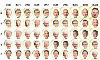

This visualization looks at the ballooning wealth and ranking of the top 10 billionaires over the past 10 years.
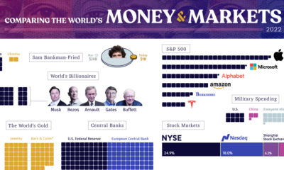

From the wealth held to billionaires to all debt in the global financial system, we look at the vast universe of money and markets in 2022.
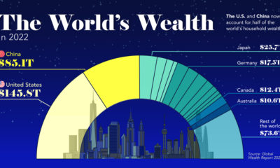

This visualization breaks down how household wealth is distributed around the world. Just 10 countries now account for 75% of total household wealth.
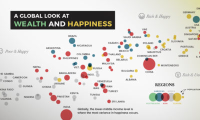

Can money really buy happiness? In this chart, we compare most of the world's countries to examine the relationship between wealth and happiness.
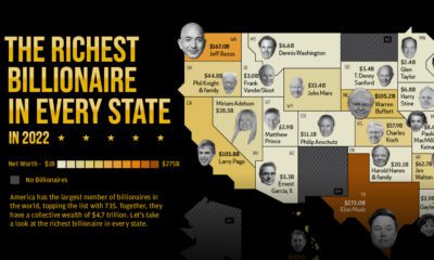

America is home to the most billionaires in the world. But which billionaire is the richest in each state?
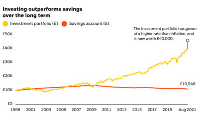

First-time investors are faced with an overwhelming amount of information and choices. See how BlackRock is simplifying the process.
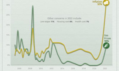

Many Americans are feeling the sting of inflation as everyday items like food and fuel have seen big price increases.
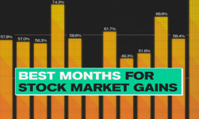

This infographic analyzes over 30 years of stock market performance to identify the best and worst months for gains.
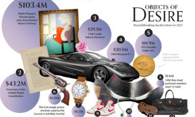

Do you have an eye for rare collectibles? See which items made the list of biggest auction sales in 2021.


