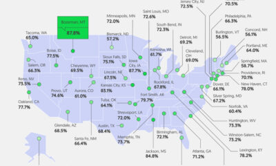

Good pay can help manage first-job worries. We visualize how geography affects entry-level pay across the U.S.
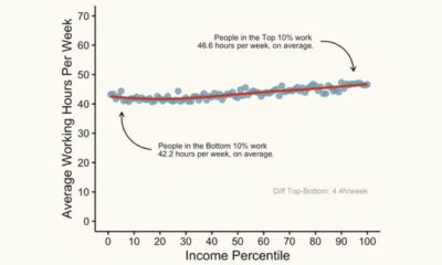

This graphic shows the average working hours between higher and lower-income groups in America, based on income percentile.
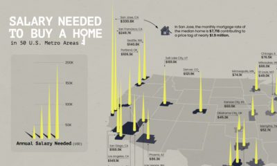

Is owning a home still realistic? This map lays out the salary you'd need to buy a home in 50 different U.S. metro areas.
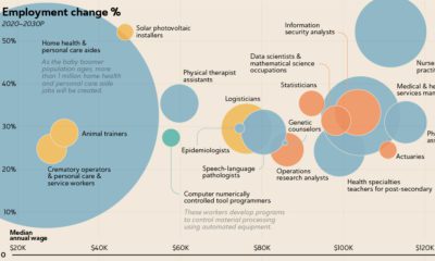

The U.S. Bureau of Labor Statistics predicts an overall job growth rate of 7.7%. Here, we show the fastest growing jobs and how much they pay.
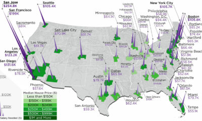

The annual salary needed to buy a home in the U.S. ranges from $38k to $255k, depending on the metropolitan area you are looking in.
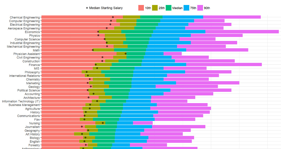
How do different college degrees compare for earning potential? This chart uses a data set from 1.2 million past students to compare 50 different majors.