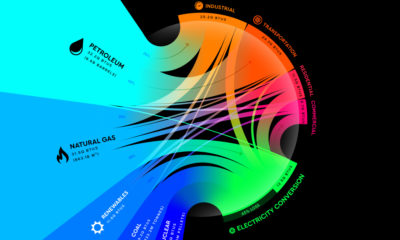

From renewables to fossil fuels, we've visualized the diverse mix of energy sources that powered U.S. energy consumption in 2020.
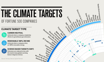

A growing number of companies are taking climate action, but when will they meet their goals? This timeline provides a holistic overview.
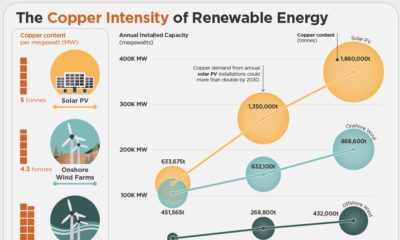

Copper is critical for the transition to clean energy. This infographic charts the copper usage of renewable energy technologies.
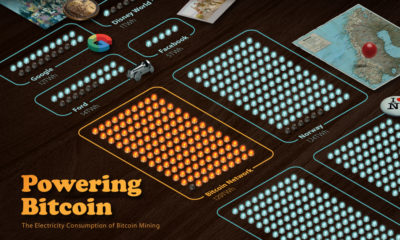

Bitcoin mining requires significant amounts of energy, but what does this consumption look like when compared to countries and companies?
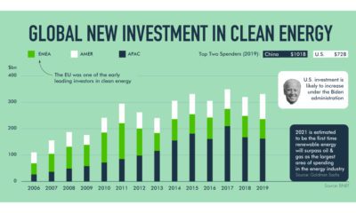

How is the renewable energy shift unfolding? This exploration highlights the market and governmental forces in action.
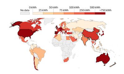

This visualization highlights the growth in solar energy consumption per capita over 54 years. Which countries are leading the way?
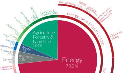

World emissions have reached almost 50 billion tonnes of greenhouse gases (GHGs) and counting. Which major sectors do they originate from?
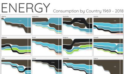

For the last 50 years, fossil fuels have dominated energy consumption. This chart looks at how the energy mix is changing in over 60+ countries.
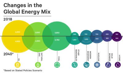

See how the world's future energy mix is expected to change by 2040, using projections based on two different policy scenarios.

The emergence of the world’s renewable energy sector is setting the stage for a commodity boom - here's the bull case for 12 different metals going...


