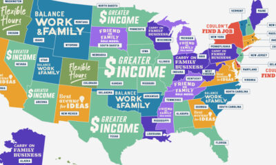

Is it for greater flexibility, more income, or something else? These graphics answer the question, why do people start businesses?
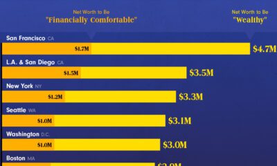

This graphic shows what it takes to be wealthy in America today—and how this can significantly shift based on the city you live in.
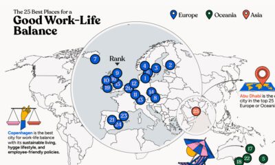

In this infographic, we explore which cities around the world excel in prioritizing work–life balance.
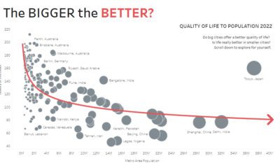

Are big cities all they’re cracked up to be? These interactive charts about population size question whether bigger always equals better.

The Quality of Life Index is made using seven factors: safety, healthcare, consumer prices, purchasing power, traffic commute, pollution, and property price to income ratio.


 Creator Program