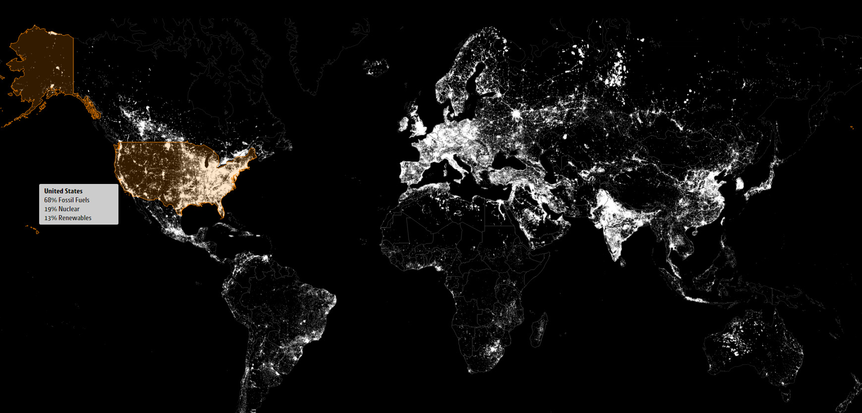
These satellite maps visualize where different energy sources, like fossil fuels, nuclear, or renewables, are used to generate electricity.
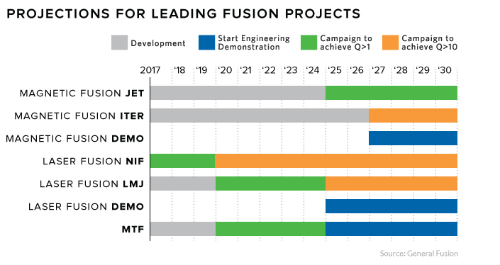
Fusion is the epitome of 'high risk, high reward' research. Each new technological breakthrough brings us a step closer to power that's too cheap to meter.
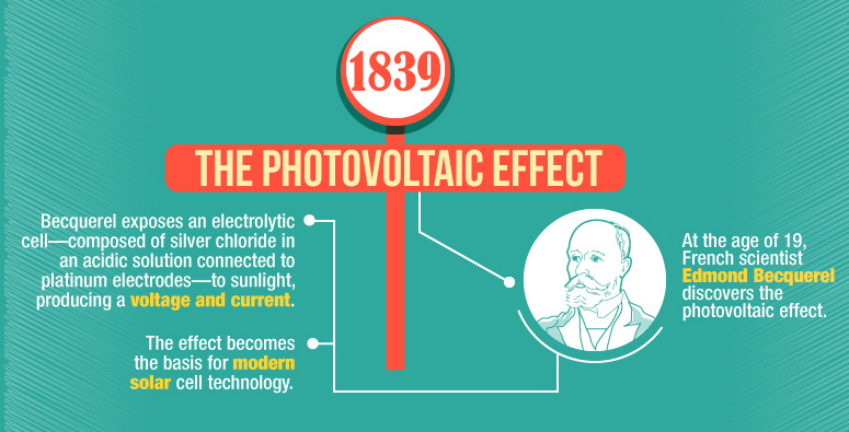
This infographic shows the many technological advances made throughout the history of solar energy - going all the way back to the Neolithic Era in China.
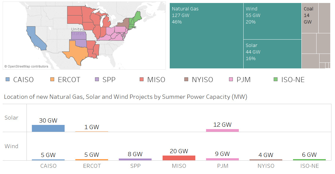
Nearly 100 GW of new power coming online is from solar and wind, making up 36% of new electrical capacity being added in these jurisdictions.
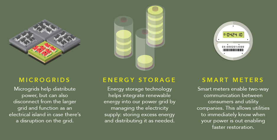
How does electricity to your home? This infographic shows how the power grid works, along with the brand new innovations coming to a grid near you.
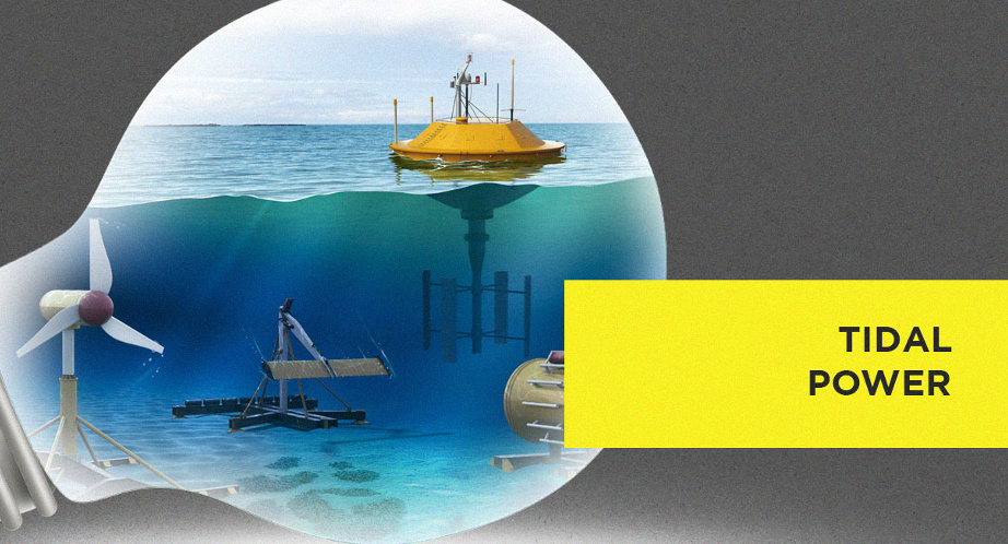
Which new sources of energy have promise? This infographic highlights the upcoming technologies that may provide the alternative energy sources of the future.
The majority of the 391 nuclear reactors in global operation were built many years ago, and aging reactors are beginning to be a problem for the...
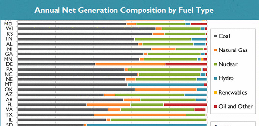
See in this .gif animation how much the U.S. electricity grid has evolved over the last two decades.
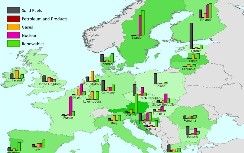
This series of charts and maps show an overview of Europe's energy consumption, as well as consumption (per capita) by country and source.
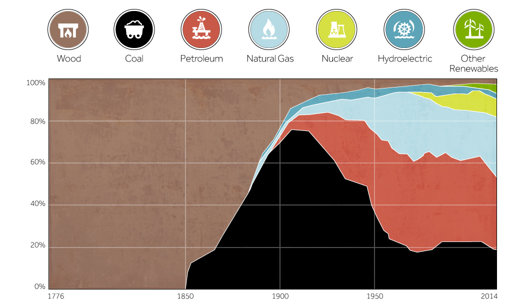
This chart shows the history of America's energy supply based on energy source. This brief history covers all from wood-powered locomotives to solar panels.


